 Chicago Board of Trade || 1999
The above photograph depicts Chicago board of trade in the form of a repeated and superimposed photograph which I viewed in Tate Liverpool. The scale of this work is 1574 x 2840 mm which is important as it gives the viewer more opportunity to understand what is going on in the work.
So if I was to scale this down it would alter the way it would then be viewed by the public and become a form of distortion in order to cause confusion. Perhaps complication of the artwork would make the viewer more intrigued about the concept and add to the already disruptive nature.
Author Archives: Tamar Phillips
Task 11
Research and Communication Skills has given me the opportunity to gain new skills that have influenced my practice outside of this module. Appropriation in particular was not a term that I had come across, I didn’t realise it was a way that some artists liked to work. I found this to be a valuable task as it taught me about a different way of working that I hadn’t previously considered. Another task I engaged with was a choice of different artworks to analyse, I chose Nikki. S. Lee Part 14 2002 it inspired me to look at photography within my own work and that it could be used as a sole way of working and showed me how much could be read by the viewer from cleverly composed photograph.
In my opinion the two stated tasks made more of an impact on me than others such as task 7 which I found quite challenging to understand. However it taught me that perhaps I need to improve my knowledge of the English language to allow me to progress further in my practice.
Task 10
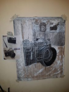
EMOTION LOVE EXPOSURE WOMEN APPEARANCE EXPRESSION POSSESSION CONFUSION VULNERABLITY JUDGEMENT
I believe it is my most recent piece that best embodies my way of working at this time and the words chosen reflect the issues I am currently addressing in my practice. I like to combine paint and other mediums such as charcoal and in this particular work, I have done so in an expressive way to enable me to release my emotions in relation to the words above. With the use of a self portrait in the form of a photograph as reference I worked on an exposing scale which allows me to be free and focus less on the appearance or the idea of perfection.
I liken my practice to an explorer, traveling on a journey to expand my vision, I choose not to limit my work to a particular medium such as paint, using whatever I deem to be appropriate to create the desired appearance. At this moment in time, I am motivated by issues in relation to feminism, using it to reflect my own negative experiences as a woman.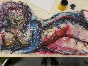
Task 9 – Feminist Theory
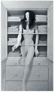
Sandy Orgel Linen Closet
This piece of work challenges gender inequality with the concept of the linen closet being somewhere the women belongs to repeat her daily tasks over and over again. It is quoted on http://www.womanhouse.net/works/cy7vej61ep9fy2qzp4p8bnq66z0s6k “This is exactly where women have always been—in between the sheets and on the shelf.” Said by a visitor I think it is an interesting statement because it is implying women are only good for being used either for sexual pleasure or to complete daily duties and then stored away to be neither seen nor heard. I imagine this would have been more relevant at the time this work was created compared to how women live today, although in many households the women will still do the majority of cleaning and maintaining tasks as well as going out to work.
The use of a mannequin makes me think of a doll and how easily it can be used or manipulated to then be stored away to ‘play’ with later. A mannequin is silent and wont argue back or show any emotions and in some ways I believe this is how women were expected to behave. It seems to me that women weren’t seen as real people during this time and seemed to have a robotic exterior.
Task 8
With the use of imagery found in a catalogue I photocopied the film strips of famous male and female actors and collaged the images together with a clear divide down the central point. I decided to use the images in this way to try to show the clear divide between men and women in all aspects of life including acting.
If you look at the particular imagery used to show famous men they have the appearance of being strong this is visible with the body language and facial expressions they are using such as, square shoulders, leaning towards whoever they are conversing with and the different looks of contempt. The suggestion that men are interested in violence is evident with the use of guns and aggressive facial stills which in some cases seem to be taunting the viewer. A still image in particular that caught my eye is on the bottom left, the man seems to be topless lying down and as a viewer it gives me the impression of him being the ruler as though you should be worshipping him.
The film stills used to show women make them seem vulnerable with the amount of shots showing them crying or looking troubled. Some of them appear to be on the phone and it makes you wonder who are they calling? Especially with the particular facial expressions they are wearing, it makes me think of a women being reliant on a man and perhaps always waiting for his call. It also looks at women from the side of being beautiful, in many of the shots the women are dressed up perhaps on a date.
Overall I think the focus has been on the stereotypes associated with men and women, men born to rule and protect and women born to be vulnerable and beautiful.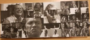
Task 7
The first text looks at Leo Steinbergs book of essays ‘Other Criteria’ it talks about how in the 1950s work could still be hung on the wall but it made no difference. They still became flat being referred to as a ‘symbolic allusion to hard surfaces’ where things may be placed on top of them or pressed into them. There is also mention of how at this time work changed from vertical to horizontal as being a shift from nature to culture. Robert Rauschenberg’s work in the early 1950s brought about change with the ‘flatbed or work-surface picture plane. He erased a drawing created by Willem de Kooning and named it ‘Drawing by Willem de Kooning erased by Robert Rauschenberg’ this then changed the work into something original with what was once there no longer to be seen, it had now become flat.
The text titled ‘Richard Serra from The Yale Lecture’ discusses how he became well-known for his three-dimensional work in the 1960’s with the use of heavy materials and industry works. With his reliance on others his work is created, without the interest in using steel to make a picture but rather as a building material with structure. His work is site specific and cannot be supported by its surroundings. Sculptures built away from the site or that haven’t been specifically made for a site always have to be adjusted in order to fit in with their surroundings.
In both of these texts they talk about artists practising in an unconventional way compared to what others were doing at the time. Robert Rauschenberg’s work could be described as a shift from nature to culture and abandoned the typical portrait way of working. Richard Serra created a practical structure rather than making something that could be looked at like a picture. It should also be noted that both of these artists were practising around the same time.
Task 6
My mode of practice combines two of the most commonly used processes within art, these are painting and drawing. Although it sounds incredibly simple to fuse them together there is skill involved behind it and it can be challenging to create balance that is pleasing to the eye for both the audience and artist. This is something I tried last year but mainly stuck to drawing with paint rather than painting and I want to take this a step further at university this year.
I hope that these processes can be used within my contemporary project as I feel that with the experience I already have with this idea, I could create a successful piece of artwork and include more paint than I previously did. The end result would be a hybrid art piece with influences from Fiona Rae, I hope to apply paint in a similar way to her but remove the abstract nature and instead focus on layers and how she creates mood within her work. I feel as though Aleksandra Mir is an influence to the drawing side of this practice as she uses marker pen to create large-scale textured drawings that I believe would complement the use of paint. With the combination of Fiona Rae and Aleksandra Mir I would be able to make an interesting contemporary piece.
Task 5
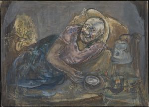
Exploring The Tate Liverpool I came across a painting created in 1975 titled ‘From Night into Day’ by the artist ‘Marie-Louise Von Motesiczky’. Immediately I was sucked in by this disturbing looking figure, I felt as though her eyes were on me forcing me to come closer. I don’t remember exactly how long I stood in front of this work but I felt I couldn’t take my eyes off of it, something about it made me want to study it further.
The lady is lying on the bed and seemingly knows that you are watching her as she looks right back at you, however it is so intrusive viewing her in this way like looking through her bedroom window. And when you notice the deer with its front legs resting on her you begin to wonder if this has been taken from some sort of fairy tale. Proportions aren’t accurate so her bed seems very short and to almost be tilting her out of it, which made me think that maybe this work had been drawn from memory or imagination rather than life. Muddy brown paint has been applied as an underlying colour with the figure and objects in the room painted on top which seem to lack clarity. I believe this makes it obvious that the work was created through memory rather than observation, looking at her body some areas are flat particularly her lower half. It seems the artist spent more time on the face as it stands out from the rest of the painting.
Along with information available to the gallery and research, I discovered that this work is of the artists mother who was aged 93. She lies in bed struggling to sleep and often would lie awake at night. The artist chose not to sit and paint her mother but instead incorporated memory along with small amounts of observation. I don’t believe viewing an image of the painting can quite match the whole experience of discovering it in the flesh, it doesn’t allow the viewer a true representation of the scale or emotion conjured up by the work.
Task 4
On a visit to The Tate in Liverpool I came across the exhibition of Aleksandra Mir’s work, this was an artist that I hadn’t identified previously. The size of her work was overwhelming and something I couldn’t have appreciated if I was viewing the work in a book or on a screen. My first impressions were, Mir had used black marker pen creating a contrast with the crisp white background of the paper and I questioned how she had managed to create such large scale pieces of work on her own. This was a question that would be answered with further research of the artist, I discovered that she works collaboratively with young artists and students making each pen stroke unique to the individual and each separate piece of work exclusive.
Texture was visible on each of the works, some being clouds and others being planets that came to life on paper. Marker pen is such an uncertain medium to use as a mistake could so easily be made and be quite noticeable if looking carefully. Stood in the gallery space looking up at all the work I had this overpowering feeling of insignificance, everything seemed so much larger than I was especially with the references to outer space.
Task 3
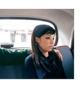
Nikki. S. Lee Part 14 2002
This photograph consists of a lady who could be sat in the back of a taxi with what appears to be her partner, however the viewer is only granted access to the arm of this individual which is placed stiffly over her shoulder. This is because the second person sat on the backseat has been cropped out of the photograph, all that is visible is their hand and the green long-sleeved shirt they are wearing. With the intense light streaming from the back window it becomes full of shadows and adds a gloomy appearance overall, the only key focal points seem to be her face and the partner’s hand.
I believe this piece of photography is aiming to show the relationship of this couple, although they are physically connected the expression on her face speaks of emotional detachment. She shows no signs of reciprocating the gesture and her body language looks incredibly unresponsive to their touch. If you look at the shoulder nearest to the partner it almost seems as though she is turning her body away from them.
From the series named ‘Parts’ the artist appears in scenes showing herself with her partner but physically removes them from the photograph. She aims to show ‘intimate details of a relationship’ and it is quoted that whilst being interviewed Lee stated ‘the purpose of the cut is to make people curious about the missing person and to think how his identity has affected the woman who is left behind. It forces people to examine the relationship itself, even if it is only part of the story’. As a viewer I agree that you begin to make up your own narrative in your head as you study the photograph, more hints begin to arise as you scrutinize the work more carefully.
https://nmwa.org/blog/2013/11/01/fluid-identities-the-parts-and-projects-of-nikki-lee/
http://www.realityandretrospect.com/blog/2013/11/6/contemporary-artist-nikki-lee-on-nmwas-blog

