
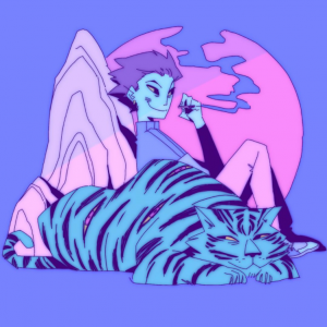
The first image I’ve chosen is a digitally illustrated piece by bourx on Instagram, to me its appeal is in its simplicity everything in it is minimal, shading, scenery, colour pallet even line art.
It has a slight fuzzy feel to it like it came off a VHS tape or something it softens that overall feel of the picture making it more aesthetically pleasing.
I later found out this effect is created by copying the line art layer blurring it ans setting it to a slightly different colour under the original, simple but effective much like the overall image.
It contrasts nicely in its artificiality with my second chosen image a bath full of all natural fruits and other paraphernalia.
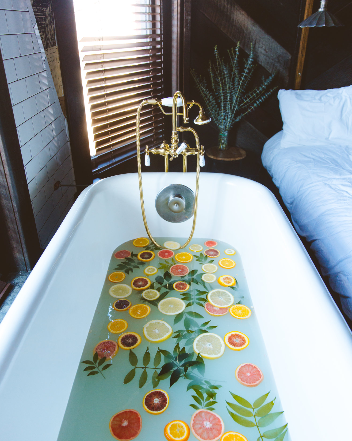
I took this from Emily Blincoe’s blog, which is full of artsy photography like this one.
I chose this one on particular because it shares some of its appeal with the first image the soft look of both the scene and the milky water,both images passively tell a story, both subject to interpretation.
The most similar element in my personal opinion would be the sense of aesthetic, not in the traditional sense but more in the genre that the word aesthetic has become, something artsy and probably meaningless that looks nice, I would even go so far as to say these image are both a part of my aesthetic despite them representing vastly different areas of my interest, I like the colours, the look and the feel. each image presents a minor mystery, to me at least.
sources:
1st image https://www.instagram.com/p/BZZkT7dhYtS/?taken-by=bourx
2nd image http://www.emilyblincoe.com/blog/2017/2/3/on-a-saturday