Author Archives: Karen Shek

Final Summary

Over these pasts few weeks, Research and Communication Skills has allowed me to research and explore a number of topics which has increased my knowledge and have a deeper understanding of the four pathways. Also, it has improved my critical thinking, analysing and evaluation into past and contemporary artists/ designers work and ideas.

By learning the knowledge and exploring the History of Graphic Arts it has given me insight of the gradually development as to how past designers have responded to political, social and cultural issues in society through their artwork. Also, throughout these lectures I have learnt that past design movements influence and form the design movements that we have today. Also, I can use these ideas as a starting point when I start a new project or need an inspiration.

One area of the lectures that I particularly enjoyed was watching the Netflix series ‘Abstract’ especially the episode that featured Paula Scher as she was talking about how typography is a language that is used in everyday life such as in supermarkets, on the streets and in shops. After researching further into Paula Scher work, it has really sparked my interest in Typography and the way type can be arranged so that it can engage with its audience and viewer. Also, I like the way Scher has brought the typography forward in a poster and pulled the background back making the typography the main focal point in a poster.

By researching and exploring these ideas into depth I can now see the connection between Research and Communication Skills and Studio Based Practice as practitioners take inspiration and ideas from past design movements which can influence the way they perceive things. Also, it encourages me as an aspiring practitioner to experiment and play around with the ideas as it helps me communicate how individual ideas or different ideas combined together works to create a successful outcome.

I believe great ideas and designs come from looking at other artists work as we analyse and evaluate other people’s work and compare it to our own work. By doing so, it makes us see and understand how from another artists perspective their ideas are different to your own.

One of the lectures that has particularly stood out to me was ‘Can artwork be truly authentic? I believe there is a fine line between what is truly authentic and what is copying some else’s work. As an aspiring practitioner, I take inspiration and ideas that surrounds me in which I will need to research and develop further so that it no longer resembles the original idea during my Studio Based Practice.

As an aspiring practitioner, giving credit and reference in your work is important as it is acknowledging the work of others.

Overall, I think this module has allowed me to discover my interests in Graphic Arts and has improved my critical thinking and analysis. Also, I have learnt the theoretical and contextual ideas that links into my Studio Based Practice.


Publish or Perish !

I have chosen this image because I think the message the designer wants to communicate across to its audience is effective. In the poster, it shows a penguin melting away due to climate change and global warming. These effects are due to the actions of humans and natural disasters that are slowly destroying these animal’s habitats which slowly makes them go into extinction. I think this poster creates a sense of protectiveness, in which we need to protect these endangered animals from going into extinction. However, changes into protecting endangered animals are slow due to capitalism plays a role in contributing climate change. According to Naomi Klein (2014) ‘…capitalism is winning hands down. It wins every time the need for economic growth is used as an excuse for putting off climate action yet again or for breaking emission reduction commitments already made.’ From this quote, this meant that capitalism and economic growth is more important than climate change which meant that it is putting endangered animals into extinction due to big companies are exploiting the environment to increase their profits.


For the second image, I have chosen this photograph taken by John Coplans.In this photograph, it seems to be representing the ageing process that the human body goes through as we get older. As the photograph is in black and white, it has captured the fine details that is on the hands and knees such as fine hair and the skin texture which contrasts with the background. With the monochrome effect, it draws the viewer attention towards the centre of the photograph.


For the third image, I have chosen this illustration designed by a Graphic Designer known as Kai Tsang. In this image, it is illustrating deforestation as trees are being cut down and buildings are being built to accommodate the growing population. However, the process of burning/ cutting down trees it destroys the habitats that live in those forests. In this illustration, it communicates a story and message across to its audience that deforestation is a problem destroying habitats, animals and damaging the environment further.


  • WWF (2015), Global Warming, Pinterest.co.uk [Image] Available at:

https://www.pinterest.co.uk/pin/320951910927421821/  [Accessed 3 Dec.2017]

  • KLEIN.N (2014) This Changes Everything : Capitalism Vs The Climate , London, Penguin, Pg 22


  • John Coplans (1985), Self Portrait – Hands Spread on Knees, Artsy.net [Image] Available at:

https://www.artsy.net/artwork/john-coplans-self-portrait-hands-spread-on-knees

[Accessed 3 Dec. 2017]

  • ‘Self-Portrait (Hands Spread on Knees)’, John Coplans, 1985 | Tate, Tate [Online] Available at:

http://www.tate.org.uk/art/artworks/coplans-self-portrait-hands-spread-on-knees-p11673

[Accessed 3 Dec. 2017]

  • Kai Tsang (2017), Deforestation, Behance.net [Image] Available at:

https://www.behance.net/gallery/56346409/Deforestation [Accessed 3. Dec 2017]


Postmodernism

Postmodernism is defined as ‘a reaction against modernism which had dominated art theory and practice since the beginning of the twentieth century.’ (Tate 2017)


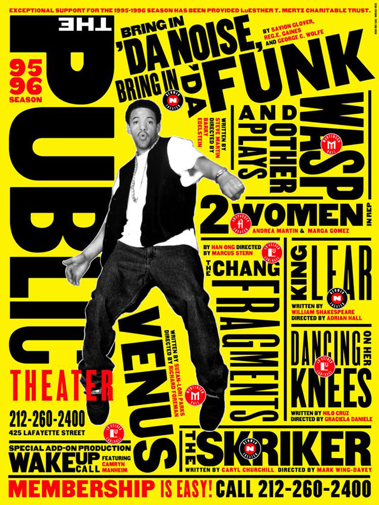
I have chosen this poster designed by Paula Scher due to how she has brought the typography forward with the use of a bright bold background which contrast well with the black typography. The use of typography and colour used in this poster can easily grab the viewers’ attention as it’s something different with the poster being text heavy with text in varies of sizes making the poster more eye catching. I think this poster has portrayed what the experience of the theatre is like, based on the typography she has chosen to use as it shows and reveals the theatre is loud, visible and urban.


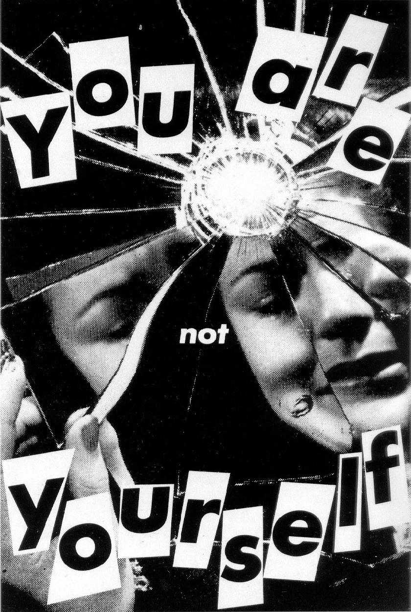
For the second image, I have chosen this poster designed by Barbara Kruger. In this image, it shows the text ‘You Are Not Yourself’ with a woman looking into the mirror but the mirror is shattered. I like this poster created by Kruger as it communicates a message across to its viewer that women in society are not truly themselves as women are misled into believing ‘You Are Yourself’. The poster illustrates that women in society are made up of shattered pieces in which the pieces represent the expectations that society put upon women. However, it is impossible for women to be themselves due to the expectations society want them to be. I think this poster has showed and revealed to the viewer what women in society are experiencing.


For the third image, I have chosen this magazine cover designed by David Carson. I like this magazine cover because the cover doesn’t seem to have a grid/ structure as to where the images and typography is laid on the page. I particularly like how Carson has moved away from legible traditional printed messages that offer little visual appeal to its readers into something that makes the cover visually engaging and appealing. I think this magazine cover has shown other designers that visually engaging with the audience is important as it can draw the viewers’ attention.


  • Postmodernism – Art Term | Tate (2017), Tate [Online]  Available at:

http://www.tate.org.uk/art/art-terms/p/postmodernism

  • Paula Scher (1995), Da Noise Bring in Da Funk, moma.org [Image] Available at:

https://www.moma.org/collection/works/8838

  • Barbara Kruger (1981), You Are Not Yourself, En.wikipedia.org [Image] Available at:

https://en.wikipedia.org/wiki/You_Are_Not_Yourself

  • David Carson (1998), #58 Ray Gun, Pinterest.co.uk [Image] Available at:

Counter Culture


I have chosen this image because as an aspiring practitioner, typography holds a great interest to me. In my opinion, this music album cover designed by Reid Miles was able to communicate the passion of jazz music through the use of typography and at the sometime make it look visually appealing. I think this album cover has in cooperated sensibility as music enthusiasts are able to appreciate the song lyrics that is on the front of the album. Also, I think the album cover has created meaning in the sense that it was able to converse something that is not directly expressed. I particularly like the colours being used and the way the typography has been arranged as it makes your vision follow onto the next line. Through this album I can see typography being more focused and the background such as photographs have gone back in the background and are not as prominent.  


For the second image, I particularly like the use of illustration and typography as it straightway draws your attention towards the image wondering what the image is about. This particular image is a poster designed by Wes Wilson. The style for this poster is psychedelic art in which in the 1960’s it was argued for an ‘open mind and consciousness for global solutions in the society.’ (Psychedelic worldwide 2016) This type of art was very popular as it was used in rock concert posters, music album covers etc. The whole is filled page is filled with one half filled with elaborately ornate lettering and the other half has an illustration of an Indian mask. The Indian mask is the dominant feature when you look at the poster. I think this poster holds spirit as it was voiced the meaning without verbally communicating.


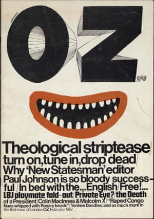
For the third image, I have chosen this magazine cover known as ‘Oz’ and was Britain’s well known underground magazine. I particularly like the typography that went from having thick weight and height to a thin typeface. I think this magazine cover hold spirit and meaning due to it was able to communicate the intentions through the use of type. For this particular magazine, I can see that typography are more prominent than illustration.


  •  Reid Miles (1965), Talkin’ About ! En.wikipedia.org [Image] Available at :

 https://en.wikipedia.org/wiki/Talkin%27_About!  [Accessed 14 Nov. 2017]

  • Psychedelic Poster Pioneer Wes Wilson on The Beatles, Doors, and Bill Graham (2011), Collectors Weekly. [online] Available at:

https://www.collectorsweekly.com/articles/psychedelic-poster-pioneer-wes-wilson/

[ Accessed 14 Nov. 2017]

  • Wes Wilson (1967), Moby Grape. Wolfgangs.com. [Image] Available at:

https://www.wolfgangs.com/moby-grape/posters/proof/BG056.html [Accessed 14 Nov.2017]

  • Psychedelic Art – the best artists worldwide (2016), mushroom-magazine.com. [Online] Available at:

https://www.mushroom-magazine.com/psychedelic-art/      [Accessed 14 Nov. 2017]

  • Oz Magazine (1967), The Guardian. [Image] Available at:

https://www.theguardian.com/media/shortcuts/2016/mar/06/return-oz-most-controversial-magazine-60s-goes-online

[Accessed 14 Nov. 2017]


Authenticity

The definition of Authentic is defined by Walter Benjamin ‘to describe the qualities of an original work of art as opposed to a reproduction.’

Art in any shape or form asks the question of whether original artwork produced by artists and designers can ever be truly authentic?

In my opinion, I believe artists and designers can be truly authentic as long as the idea that has inspired/ interested them to create the work has understood the concept and has developed it further enough so that it doesn’t resemble the original artwork. As art is everywhere, we as practitioners are exposed to so many different forms and shapes of art that surrounds us, that even when we come up with an original concept, it appears to be copied.

Artists and designers who copyright their work can be seen as authentic, as they own the artwork. To those that reproduce the original work it wouldn’t be seen as authentic as it is copying someone else’s work. Eg, Marc Quinn – Blood heads would be seen as authentic because it’s original and personal to the artist as it made by a cast of his own head filled with his blood.

In today’s society, modernism still plays a part in contemporary practice as it is still currently being used. However, the influence of modernism could may make it relatively difficult for artists and designers to be original with their work. Modernism still surrounds as in the sense of form where sometimes ‘less is more.’

Design movements such as Dadaism still influence artists today with its innovation with type, making type visually interesting, exciting and artistic.


  • Authenticity – Art Term| Tate (2017), Tate. Available at:

http://www.tate.org.uk/art/art-terms/a/authenticity         [Accessed 1 Nov. 2017]

  • Marc Quinn (2017), En.wikipedia.org. Available at:

https://en.wikipedia.org/wiki/Marc_Quinn      [Accessed 1 Nov. 2017]

  • Ludwig Mies Van Der Rohe (2017), En.wikipedia.org. Available at:

https://en.wikipedia.org/wiki/Ludwig_Mies_van_der_Rohe      [Accessed 1 Nov. 2017]

  • Dada and It’s Influence (2009), Cross Section. Available at:

https://rebeccareilering.wordpress.com/2009/01/30/dada-and-its-influence/

[Accessed 1 Nov. 2017]


‘Technology is the Mortal Enemy of Art’

‘Technology is the mortal enemy of art’

(100 Artists’ Manifestos: From the Futurists to the Stuckists 2011)


I believe this quote is somewhat true and untrue as nowadays technology plays a huge role in the way artists create their work. Artists are using new medium transitioning from traditional materials such as painting, drawing and sculpture into using 3D software, Adobe Photoshop, illustrator etc. Previously, photographs that were taken were in black and white and were taken on a device that was not portable. But due to advance in technology, photographers are now able to take high quality photographs through a device that is lighter and can be taken wherever we go. A quote that Karl Lagerfeld mentioned was ‘What I like about photographs is that they capture a moment that’s gone forever, impossible to reproduce.’ (Eric Wilson 2007) I believe it is due to technological change that has allowed as to capture high quality moments that are special to us.

The short film ‘Terminal Bar’ that documents a bar in New York, featured the photographs that were taken over a decade allowed the viewer to see the changes that has happened. The photographs that was taken are high quality which enables the viewer to look into the soul of the individuals through their eyes and read the emotion on their faces. With the advance in internet, people from all across the web are able to see the changes that has occurred, through social media and people sharing the short film.

However, I believe that technology has distorted the way artist create their work through using editing software that hides the flaws that they don’t want the audience to see.


  •  DANCHEV.A (2011), 100 Artists’ Manifestos: From the Futurists to the Stuckists, Penguin Classic


  • WILSON.E (2007), In Orbit Around Lagerfeld, Nytimes.com [Online] Available at:

http://www.nytimes.com/2007/10/25/fashion/shows/25ROW.html

[ Accessed 24 Oct. 2017]

  • Terminal Bar (2002), Short Film, Directed by Stefan Nadelman, Available at:

[ Accessed 24 Oct. 2017]


Task 2 – Comparing Images

This image I have looked at relates to illustration which uses more of a traditional medium e.g. graphite pencils and colour pencils compared to modern mediums which includes drawing digitally. This illustration is created by an artist called Peony Yip in which she has illustrated the similarity between animal and humans as the model and animal have the same facial expression and motion. The animal that was illustrated is a tiger drawn on top of a females face with their mouths wide open, which could imply that females are strong and has a will power of their own and are not submissive to men as society is dominated by men. I particularly like the contrast between red and grey as the colour red usually represent anger, pain, love and danger which is what females may feel due to a patriarchal society. The work is simple and minimalistic as it has a white background which makes who ever view the work focus on to the centre of the work.

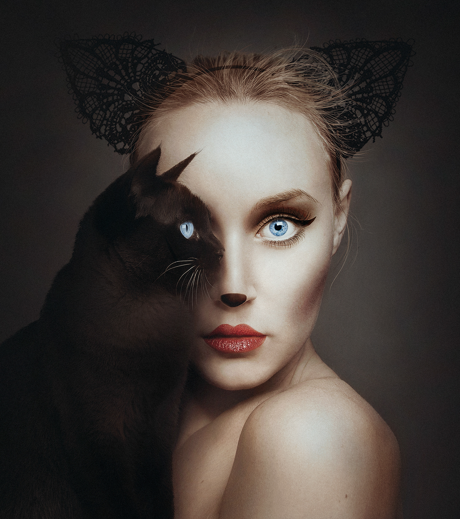
To compare this illustration, I have come across this image which relates to photography. This image is created by photographer called Flora Borsi in which she has took self-portraits of herself with a cat sitting sideways to her face replacing one of her eyes with the cats. The photograph looks natural as Borsi has matched her make up similar with the cat’s eye. Similar to the image above it shows us that we have similar features to animals and that we are not completely different.


  • Peony yip (2013), Wildlife, Behance.net. [Image]  Available at:

https://www.behance.net/gallery/9973189/Wildlife    [ Accessed 16 Oct. 2017]

  • Flora Borsi (2016) , Animeyed (Self Portraits), Behance.net. [Image]   Available at:

https://www.behance.net/gallery/32763127/Animeyed-(Self-Portraits)    [ Accessed 16 Oct. 2017]


Terminal Bar

The short film ‘Terminal Bar’ is a documentary focused on a bar in New York and featured the many customers / neighbourhood regulars that visited the bar. The film shows photographs that were collected over a decade which takes the viewer on a journey showing us how time has changed for those individuals. Lights played an important part in the photographs as it is in black and white which allows the viewer to look into the soul of the individuals through their eyes.

Along with the photographs, the film has in cooperated the use of text, interviews and narrative. The use of narrative reading a newspaper extract helps provide the viewer with more context and visual aid.

The music that goes with the film was upbeat and was visually connecting with the images which breaks up the narrative at the same time.

At the end of the film, it brings the audience back in to the modern world and showed how over time nothing has really changed according to Stefan Nadelman’s father.This feature has made the film more interesting as it combined old style filmmaking along with the modern which brings back the idea of past and present.

In my own projects, I could in cooperate the similar processes that the film director has used, for example I might compare my work at the beginning of a project to the end of the project as this can show how over time I have developed from my original idea/concept to the end product.

Terminal Bar (2002), Short Film, Directed by Stefan Nadelman, Available at: