
 I have chosen this image because as an aspiring practitioner, typography holds a great interest to me. In my opinion, this music album cover designed by Reid Miles was able to communicate the passion of jazz music through the use of typography and at the sometime make it look visually appealing. I think this album cover has in cooperated sensibility as music enthusiasts are able to appreciate the song lyrics that is on the front of the album. Also, I think the album cover has created meaning in the sense that it was able to converse something that is not directly expressed. I particularly like the colours being used and the way the typography has been arranged as it makes your vision follow onto the next line. Through this album I can see typography being more focused and the background such as photographs have gone back in the background and are not as prominent.

For the second image, I particularly like the use of illustration and typography as it straightway draws your attention towards the image wondering what the image is about. This particular image is a poster designed by Wes Wilson. The style for this poster is psychedelic art in which in the 1960’s it was argued for an ‘open mind and consciousness for global solutions in the society.’ (Psychedelic worldwide 2016) This type of art was very popular as it was used in rock concert posters, music album covers etc. The whole is filled page is filled with one half filled with elaborately ornate lettering and the other half has an illustration of an Indian mask. The Indian mask is the dominant feature when you look at the poster. I think this poster holds spirit as it was voiced the meaning without verbally communicating.
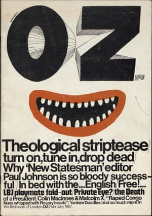
For the third image, I have chosen this magazine cover known as ‘Oz’ and was Britain’s well known underground magazine. I particularly like the typography that went from having thick weight and height to a thin typeface. I think this magazine cover hold spirit and meaning due to it was able to communicate the intentions through the use of type. For this particular magazine, I can see that typography are more prominent than illustration.
- Reid Miles (1965), Talkin’ About ! En.wikipedia.org [Image] Available at :
https://en.wikipedia.org/wiki/Talkin%27_About! [Accessed 14 Nov. 2017]
- Psychedelic Poster Pioneer Wes Wilson on The Beatles, Doors, and Bill Graham (2011), Collectors Weekly. [online] Available at:
https://www.collectorsweekly.com/articles/psychedelic-poster-pioneer-wes-wilson/
[ Accessed 14 Nov. 2017]
- Wes Wilson (1967), Moby Grape. Wolfgangs.com. [Image] Available at:
https://www.wolfgangs.com/moby-grape/posters/proof/BG056.html [Accessed 14 Nov.2017]
- Psychedelic Art – the best artists worldwide (2016), mushroom-magazine.com. [Online] Available at:
https://www.mushroom-magazine.com/psychedelic-art/ [Accessed 14 Nov. 2017]
- Oz Magazine (1967), The Guardian. [Image] Available at:
https://www.theguardian.com/media/shortcuts/2016/mar/06/return-oz-most-controversial-magazine-60s-goes-online
[Accessed 14 Nov. 2017]