
Postmodernism is defined as ‘a reaction against modernism which had dominated art theory and practice since the beginning of the twentieth century.’ (Tate 2017)
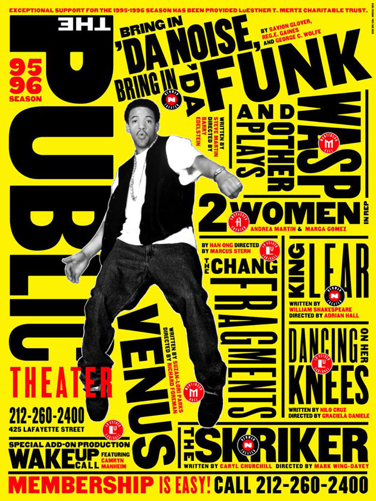
I have chosen this poster designed by Paula Scher due to how she has brought the typography forward with the use of a bright bold background which contrast well with the black typography. The use of typography and colour used in this poster can easily grab the viewers’ attention as it’s something different with the poster being text heavy with text in varies of sizes making the poster more eye catching. I think this poster has portrayed what the experience of the theatre is like, based on the typography she has chosen to use as it shows and reveals the theatre is loud, visible and urban.
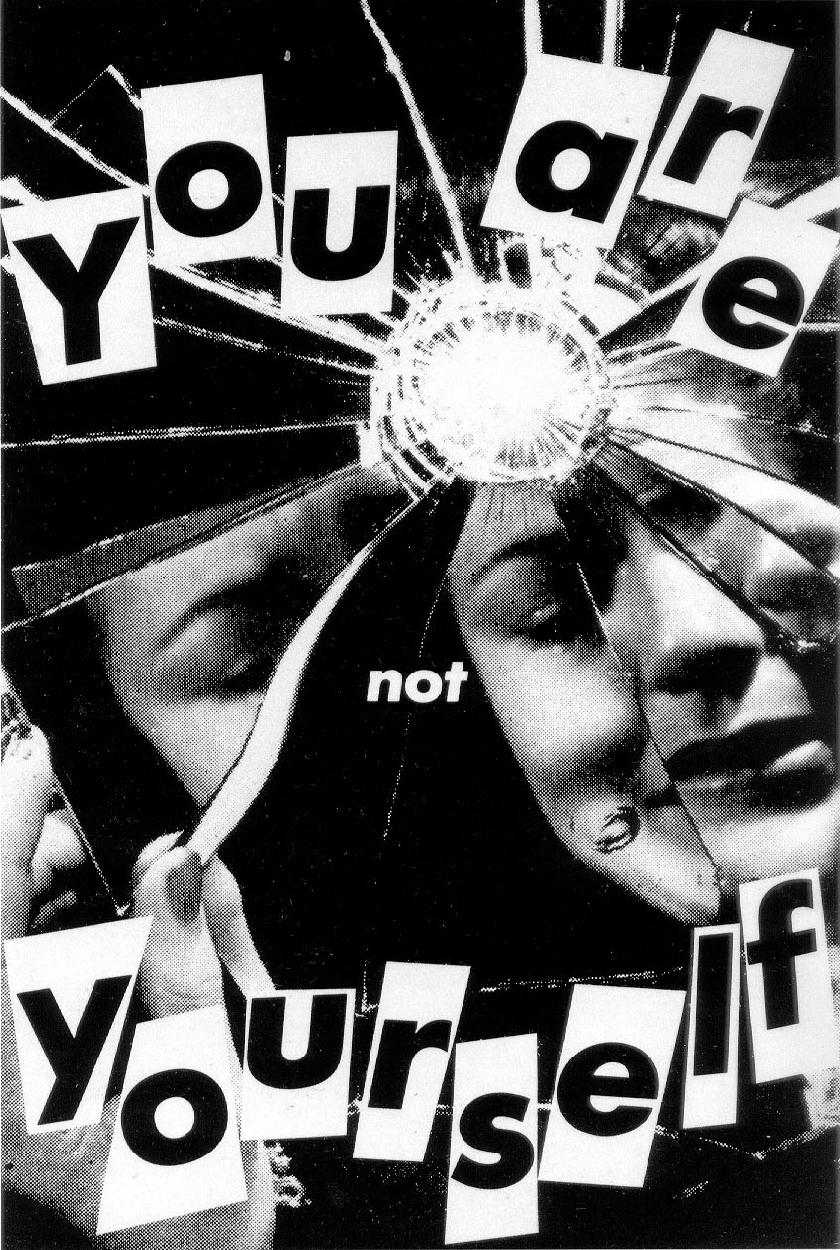 For the second image, I have chosen this poster designed by Barbara Kruger. In this image, it shows the text ‘You Are Not Yourself’ with a woman looking into the mirror but the mirror is shattered. I like this poster created by Kruger as it communicates a message across to its viewer that women in society are not truly themselves as women are misled into believing ‘You Are Yourself’. The poster illustrates that women in society are made up of shattered pieces in which the pieces represent the expectations that society put upon women. However, it is impossible for women to be themselves due to the expectations society want them to be. I think this poster has showed and revealed to the viewer what women in society are experiencing.

For the third image, I have chosen this magazine cover designed by David Carson. I like this magazine cover because the cover doesn’t seem to have a grid/ structure as to where the images and typography is laid on the page. I particularly like how Carson has moved away from legible traditional printed messages that offer little visual appeal to its readers into something that makes the cover visually engaging and appealing. I think this magazine cover has shown other designers that visually engaging with the audience is important as it can draw the viewers’ attention.
- Postmodernism – Art Term | Tate (2017), Tate [Online] Available at:
http://www.tate.org.uk/art/art-terms/p/postmodernism
- Paula Scher (1995), Da Noise Bring in Da Funk, moma.org [Image] Available at:
https://www.moma.org/collection/works/8838
- Barbara Kruger (1981), You Are Not Yourself, En.wikipedia.org [Image] Available at:
https://en.wikipedia.org/wiki/You_Are_Not_Yourself
- David Carson (1998), #58 Ray Gun, Pinterest.co.uk [Image] Available at: