

Japanese artist Hirohiko Araki created this first piece of artwork. “Rohan At The Louvre” is the graphic novel created by Araki from which this image comes from. This poster is a hand drawing and through Araki’s unique art style where he likes to use these harsh lines and black areas to create depth and contrast on the page; this creates a vintage tone in his work that appeals to me. The use of colour is one of the most striking aspects of this poster, the purples contrast against the blues yet at the same time these colours work well with each other. These colours unify the page top to bottom. In fact the way Araki uses his colours reminds me of Victor Moscoso, these colourful and psychedelic arrangements that immediately catch the eye. The compassion and angle of even how this drawing was formed is quieting dramatic, adding to the bizarre features that caught my attention.
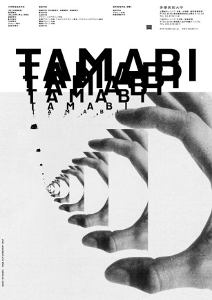
This next poster was created by another Japanese artist, this time a graphics designer named Kenjiro Sano. Kenjiro Sano made this poster for the Tama Art University, if was a collective series of posters called “Made by Hands” and this specific poster is one of 40 variations. Between these two posters I feel like they represent the two sides of my own interest of design. Kenjiro Sano’s poster is minimal; the use of black and white keeps the simple tone. It’s through the creative use of typography and imagery where the design excels, the repetition of the lettering and images creates this mirror illusion on the page.
Bibliography
Hirohiko Araki “Rohan At The Louvre”, (2009) : https://www.reddit.com/r/StardustCrusaders/comments/5tbaoe/absolutely_glorious_kishibe_rohan_pose/
Kenjiro Sano “Made by Hands”, (2013) : http://www.spoon-tamago.com/2013/05/09/made-by-hands-tama-art-university-ads-by-kenjiro-sano/