Author Archives: Helia Nasrollahi Malek

Final summary

During this research and communication course I have made great progress in analysing artists, advertisement,books etc. I have developed on referencing my work and looking more thoroughly into what inspires me and why. These tasks made me realise how much I don’t analyse my work or look into research as much as I should. Now knowing this I will improve these skills further for future projects that I get given.

I have learned to question what, where and why to establish my work more and more because you cannot ever stop questioning your work further. The research and communication tasks made me a better designer because I can look more in detail at other artists, the art history and events, and I can also question myself more to create the best work I can and reach my highest potential.

The task that I found most inserting was counterculture because it is not something that I have leaned about before so it was new and challenging. I also like the style of art in the 20th century so this task helped me find new artists in the 60’s and 70’s using books such as A Smile In The Mind, Graphic and Fifty Years Of Illustration which is now my favourite book for research because it has many different artists and references such as Victor Moscoso which creates psychedelic posters etc. As an aspiring illustrator I enjoy looking at different posters and styles that they can be produced. Shigeo Fukuda which is another artist that I looked at for the “Technology is the mortal enemy of art.” task and I think that his work is genius. It is like an illustrated illusion.

Researching art movements is also something that is new to me. It helped me further my knowledge and understanding of different time eras and the artists at that time. Seeing art transform and develop is exciting to me. I want to find out more and see how much further art can evolve. I do believe that in some ways art will always be quite similar in some form as I learned in the ‘Authenticity’ task. Also seeing how different methods of art represent that stage in time. For example: psychedelic art is referred to the 60’s because of artists such as Victor Moscoso, Rick Griffin, Martin Sharp etc, which were all artists in the 60’s that used bight colours and patters to make the poster or album cover look busy, full and psychedelic. This movement in the 60’s was popular because of the hippies that listened to psychedelic music, embraced the sexual revolution and many of them used drugs.

Overall I know that these tasks helped me in the long term to reach my highest potential via research, development and referencing what I do. It helps me look more in depth into what I am doing and why. I also enjoy using other methods of research such as using books, artist journals and magazines.

Reference

McAlhone, B., 2015. A smile in the mind. 5th ed. New York: Phaidon press

https://en.wikipedia.org/wiki/Hippie

https://www.grafik.net/category/archive/victor-moscoso

http://www.artnet.com/artists/rick-griffin/aoxomoxoa-ZzZp1565ucQnY6VJNx0UfA2

https://www.theguardian.com/artanddesign/2013/dec/06/martin-sharp

ZEEGEN, L. AND ROBERTS, C., Fifty years of illustration, In-text: (Zeegen and Roberts, 2014), Your Bibliography: Zeegen, L. and Roberts, C. (2014). Fifty years of illustration. 1st ed. Laurence king.

eisenbach, H., 2017. graphic. 1st ed. London: phaeton press.

Published Images

Photographer, Platon says that “Whats important is the story, the message the feeling, the connection.” Published images mainly go by this quote because it reaches people.

This is a Coca-Cola bill-board advert. The advert is clearly taken place in the summer because of the bright sun light shining in the background and the greenery. Also the ladybug that is at the bottom of the image represents delight and happiness which is the point that the advert is trying to get across. The minimal writing also works well “Open a Coke, Open happiness”this makes the audience think that the Coke=happiness. The fact that the Coke looks like it is sweating, it shows that it is a hot day and the cola is a cold beverage.

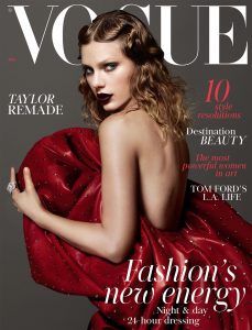
This recent Vogue cover of Taylor Swift is very beautifully photographed. The headline ‘Taylor remade’ is shown by the makeup and outfit that Taylor Swift is wearing. It is very different to the way she used to portray herself specially in the beginning of her music career which was the opposite of the way she is made up for this cover. Another headline ‘The most powerful women in art’ is a perfect fit for this photo. Taylor looks very powerful and mysterious in the red dress. The writing around the magazine cover is all done in red and white also to match Taylors dress and the Vogue title. This is all very appealing to the viewer because of the way she is positioned and the use of 2 colours that make Taylor Swift stand out even more.

I am interested in advertising and magazine designs so this is very inspiring to me in my work.

McDonald, being one of the biggest fast-food restaurants in the world, they create some of the best Christmas adverts. I really like this one because it is an ice cream thats shaped like Santas beard which tells the audience they can celebrate Christmas with McDonalds. This is also knows as guerilla marketing. The McDonalds logo being used as the cup that is meant to represent Santas hat is also very subtle but works well. The minimal text “Happy Holidays” is heart warming.

Reference 

https://www.netflix.com/watch/80093804?trackId=13752289&tctx=0%2C0%2C4dfbdd66-ead8-4d32-b725-a0491c5443c3-14306545

https://blog.printsome.com/coca-cola-marketing/

https://www.universeofsymbolism.com/ladybug-symbolism.html

http://www.vogue.co.uk/gallery/inside-january-2018-vogue


Postmodernism

The term postmodern has been used to describe various forms at different eras. It has mainly been used to describe art, music, architecture, philosophy.

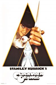
Philip Castle developed a new technique by discovering an abandoned airbrush which immediately got commissioned by The Sunday Times to illustrate its 1967 ‘motor show issue’. Then Castle produced fashion illustration for Vogue, Elle and Jardin des Moes. By then he had been noticed by Stanley Kubrick and created posters and other publicity materials for Clockwork Orange.

I am very interested in advertising and creating posters etc, so Castle’s work is a great deal to me and his unique style inspires me in my work. I like the way he used the main characters hand with the sharp dagger coming through the triangle; it almost looks 3D.

Clockwork orange, poster, Warner bros, 1971

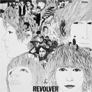
Klaus Voormann being another inspiring illustrator, musician. He created the balck and white Revolver album cover for The Beatles. This was a revolutionary move at the time as everyone was working with a lot of colours. Voormann won Germany’s ‘best alum cover’. Then in 2007 his design appeared on the Royal Mail stamps. Voormann designed over 100 album covers.

Voormann’s black and white illustration influences me to not only use colours. I can have the same affect, if not, a better affect just using black and white. I also relish the collages mixed with the illustrated faces of the Beatles. His success is unimaginable.

Revolver, record sleeve, EMI records, 1965

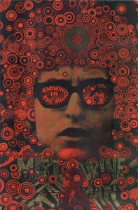
Martin Sharp being a talented illustrator with a dynamic psychedelic style, he created archetypal posters for Bob Dylan, Donovan and Jimi Hendrix. He also designed album covers for Cream and Eric Clapton. Sharp was responsible for giving the Luna Park theme park its extraordinary identity. Sharp is regularly  described as ‘Australia’s foremost pop artist’

Sharp being another illustrator that creates iconic posters, I found his work very interesting and exhilarating. This is what I pursue to do in the future. I like the repeated patterns across the poster. The circular patterns make the poster look very full and busy.

Bob Dylan, Blowin’ in the mind, poster, 1966


Reference 

ZEEGEN, L. AND ROBERTS, C., Fifty years of illustration, In-text: (Zeegen and Roberts, 2014), Your Bibliography: Zeegen, L. and Roberts, C. (2014). Fifty years of illustration. 1st ed. Laurence king.

https://en.wikipedia.org/wiki/Postmodernism

https://www.pinterest.co.uk/pin/496803402620479631/

http://voormann.com/shop/the-beatles-revolver-1966/

https://www.flickr.com/photos/58019348@N08/53300049400

Authenticity

‘Is it possible to be truly authentic?’ Authenticity means something that is not false or copied according to the Oxford Dictionary .
Many artists find inspiration in other artists. Can they ever be genuine? If an artist uses another’s work to create something of their own it means it isn’t truly authentic. There is a new concept during each period of time which reflects on the generation. However is it a constant cycle of todays art being inspired by yesterdays art which makes it much harder for designers to be absolutely original and unique. Although, because of copyrights, no designer/artist can have the same work. They have to have some sort of difference and particularity to their work.
As an illustrator I agree with Margaret Mead ” Always remember that you are absolutely unique,  just like everyone els.” I think that this is genius. The way that she shows her point about authenticity is by telling people what they want to hear (you are absolutely unique) and then contradicts that by saying (just like everyone els) I think that this is a very powerful quote that more illustrators/artists need to go by. She is telling us that we are all different but still the same in so many ways.
How-ever hard we try, we are always inspired by others everyday. Sights, advertisement, shops etc, are all things and places that are designed and created that influence everyone, not just artists. The more we try to be authentic the less we are. It is okay to be inspired, it os not okay to copy.

Reference

http://www.dictionary.com/browse/authentic?s=t

https://www.brainyquote.com/authors/margaret_mead


“Technology is the mortal enemy of art.”

“Technology is the mortal enemy of art.” I disagree with this statement. I think that technology has helped art improve in many ways. Technology had helped Magazines, Posters, album covers and advertising t etc to develop.

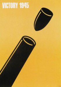
Artists such as Shigeo Fukuda created world famous graphic posters that was inducted into the New York Art Directors Club Hall of Fame. He creates very simple, minimalistic graphic posters with nominal writing. The poster Fukuda is most famous for is Victory 1945.

Fukuda’s work was hard-hitting but it still retained an unmistakably playful side, which is what is so unique in his work and inspires many artist to do in their own work and be more simple yet creative.

Victory 1945, Poster, offset print, 1975

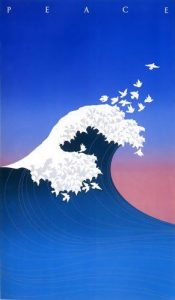
McRay Magleby being another amazing artist that uses technology to create what Is thought to be the greatest poster ever ‘Wave Of Peace’. This poster was designed to commemorate the 40th anniversary of the Hiroshima bombing.

Magleby’s poster and Fukuda’s are both very minimal but have so much meaning within them. I think that Magleby created a very beautiful piece using graphics with an enormous amount of meaning. The doves that represent peace flying out of the crashing wave is appealing.

Wave Of Piece, 1985

However I do strongly believe that without technology art will be just as great and will continue to develop further without technology. But technology also does give art that push to do more and open more doors and concepts for artists.

Reference

McAlhone, B., 2015. A smile in the mind. 5th ed. New York: Phaidon press.

Shigeo Fukuda

McRay Magleby

Counterculture

I decided to look into ‘Fifty Years Of Illustration’ in search for variance, originality and counterculture in the 20th century. Counterculture: The culture and lifestyle of those people, especially among the young,who reject or oppose the dominant values and behavior of society. (Oxford Dictionary)

The counterculture movement started during the 1960’s to 1970’s.

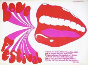
Michael English was one artist that I looked at. He contributed to the international times and created posters for Jimi Hendrix and Pink Floyed. But the poster that caught my eye was ‘Love Festival’ which he created using screen print and bright colours and it screams 1960/hippies.

What I also like about this poster is that the title (Love Festival) stand out. It looks very fun and unique with the way he made it look like the words and being shouted out of the smiling mouth. I also like the final outcome of screen prints which is why English is an artist that caught my eye.

Love Festival, Osiris Visions Ltd, 1967

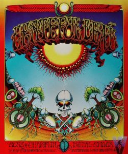
Rick Griffin, being another artist in the 60’s, he created psychedelic illustrated comics, posters and albums. He started to make iconic posters for Chet Helms’s family events at the Avalon Ballroom. Griffin then had a long-standing relationship with the band Grateful Dead which then he started to also designing LP covers and posters for.

I like the symmetry of his work and again the bright colours used like English’s work. However Griffins illustration isn’t really my style of work. I do appreciate his work but it isn’t something that I would be interested in creating.

Aoxomoxoa, album, Grateful Dead/Warner Bros, 1969

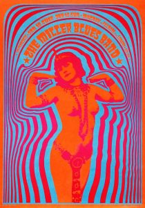
Another illustrator that created some of the most amazing, colourful posters is Victor Moscoso. He created psychedelic and bright coloured posters, ad campaigns and album artwork for musicians such as Jerry Garcia and Herbie Hancock. He also created underground comix in San Francisco during the 1960’s and 1970’s.

I like Moscoso’s work because I am interested in illustration and creating posters. I appreciate the typography that he uses with the repetitive patters.

.

Neon Rose, the Matrix 1967

Reference:

ZEEGEN, L. AND ROBERTS, C., Fifty years of illustration, In-text: (Zeegen and Roberts, 2014), Your Bibliography: Zeegen, L. and Roberts, C. (2014). Fifty years of illustration. 1st ed. Laurence king.

Love Festival

Grateful Dead

Neon Rose

http://www.dictionary.com/browse/counterculture?s=t

https://en.wikipedia.org/wiki/Counterculture

Comparing


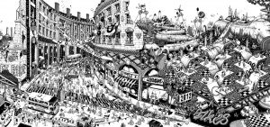
As an aspiring illustrator, one of my favourite artists of all time, Ugo Gattoni created a piece called ‘Bicycle’ for the Olympics in 2012. He creates the most complicated yet detailed illustrations. No matter how many times I look at ‘Bicycle’, I find something new that I hadn’t noticed before because there’s always so much going on with illusions and surreal depictions.

Ugo Gattoni-Bicycle

This is a part of ‘Bicycle’. He is showing the cyclists racing through a city with many illusions and random things going on around the race. I always try to create detailed and complex illustration which is why, personally Gattoni inspires me a lot. Gattoni has also produced a piece called ‘Highways’ which is very similar to ‘Bicycle’, complex and meticulous. He mainly used black and white but in his recent work he has been using more colours and creating surreal, short animations which are also amazing.

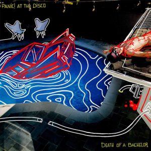
Panic at the disco

Panic At The Discos new album cover(Death Of A Bachelor) is very illustrative. Nicole Guice is the illustrator that created this incredible album. She used and image and with a few simple red and white limes decorated the photo and created this unique final outcome.

Overall I think that these 2 artists are very different and particular. I enjoy both artist. Gattoni uses a lot of detail and illusions in his work and Guice outlines/decorates images with minimal use of colour. Guice created a perfect album for Panic At The Disco with straightforward structure. Gattoni created advertisement for the Olympics with convoluted illustrations.

Reference

http://www.ugogattoni.fr

https://fanlink.to/PATDDeathOfABachelor

Terminal Bar

Terminal Bar is a 22 minuet American documentary directed by Stefan Nadelman that was taken place in Times Square, New York City, released in 2003. the photos were captured in over a decade by Sheldon Nadelman, the images were of the people that visited the bar. The movie was narrated by Tom Clifford all the way through, telling the audience short stories of the people that were at the bar. The black and white photos were animated very well to go with the beat of the music in the background to grab the viewer’s attention with regular pauses from the narration to focus on the images and music at times.

Stefan also wanted to show the homeless and drunk people surrounding the bar laying on the floor with barley anything to wear as the rich and wealthy walked past without even acknowledging the poor.

Sheldon then returned to the bar and said it hadn’t changed at all even though 10 years had gone by, the lifestyle of the people in New York City was also the same.

Overall, I think the photos and the editing with the music, newspaper articles, narrating and graphics worked very well and it defiantly grabbed my attention which is something I am interested in trying out in the future and learn how to edit in such a unique way. There was also the sound of peoples chit chat at the bar playing in the background, I almost felt like I was at the bar in New York City.


Reference

https://en.wikipedia.org/wiki/Terminal_Bar_(film)