
The term postmodern has been used to describe various forms at different eras. It has mainly been used to describe art, music, architecture, philosophy.
Philip Castle developed a new technique by discovering an abandoned airbrush which immediately got commissioned by The Sunday Times to illustrate its 1967 ‘motor show issue’. Then Castle produced fashion illustration for Vogue, Elle and Jardin des Moes. By then he had been noticed by Stanley Kubrick and created posters and other publicity materials for Clockwork Orange.
I am very interested in advertising and creating posters etc, so Castle’s work is a great deal to me and his unique style inspires me in my work. I like the way he used the main characters hand with the sharp dagger coming through the triangle; it almost looks 3D.
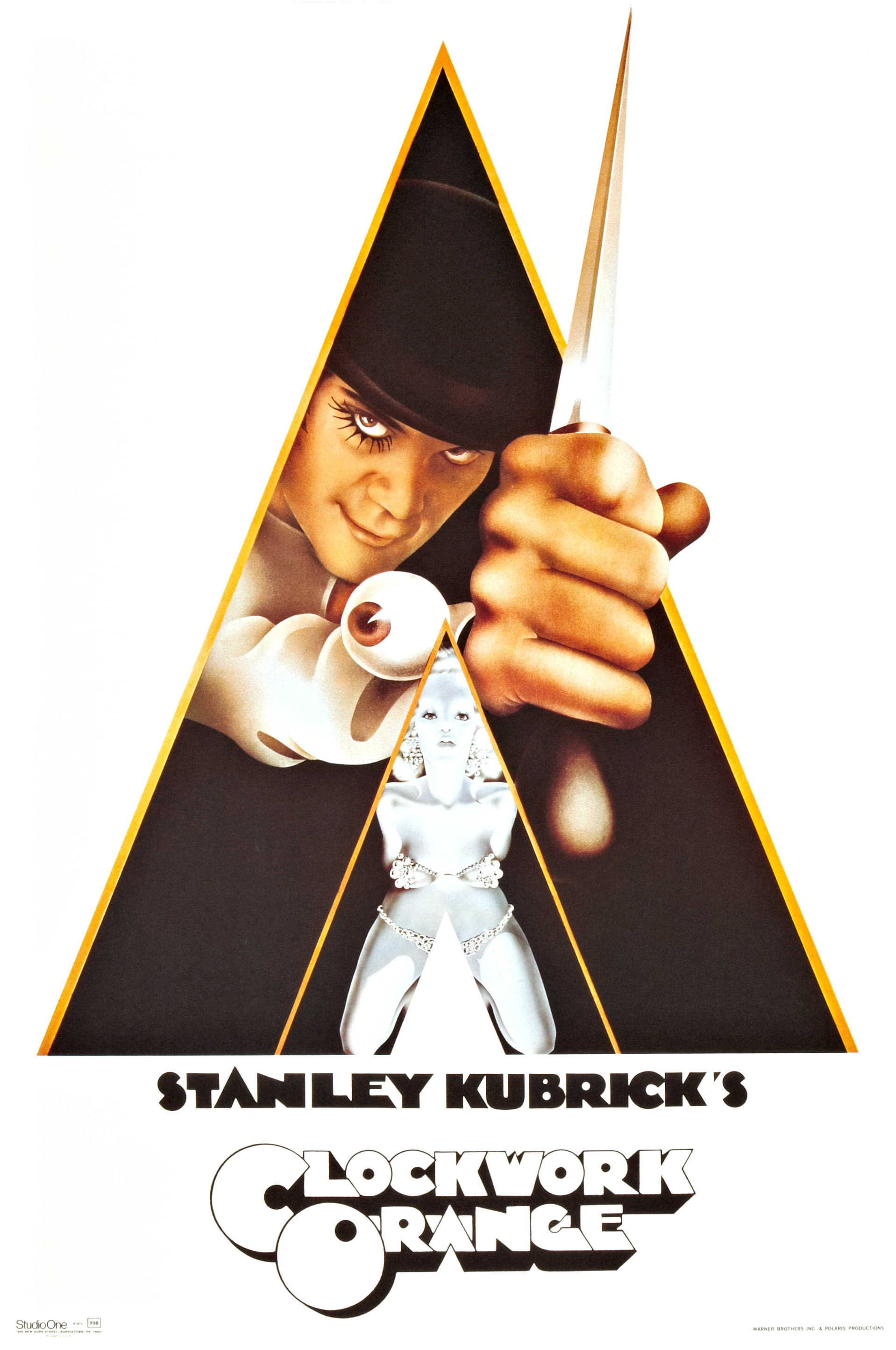
Clockwork orange, poster, Warner bros, 1971
Klaus Voormann being another inspiring illustrator, musician. He created the balck and white Revolver album cover for The Beatles. This was a revolutionary move at the time as everyone was working with a lot of colours. Voormann won Germany’s ‘best alum cover’. Then in 2007 his design appeared on the Royal Mail stamps. Voormann designed over 100 album covers.
Voormann’s black and white illustration influences me to not only use colours. I can have the same affect, if not, a better affect just using black and white. I also relish the collages mixed with the illustrated faces of the Beatles. His success is unimaginable.
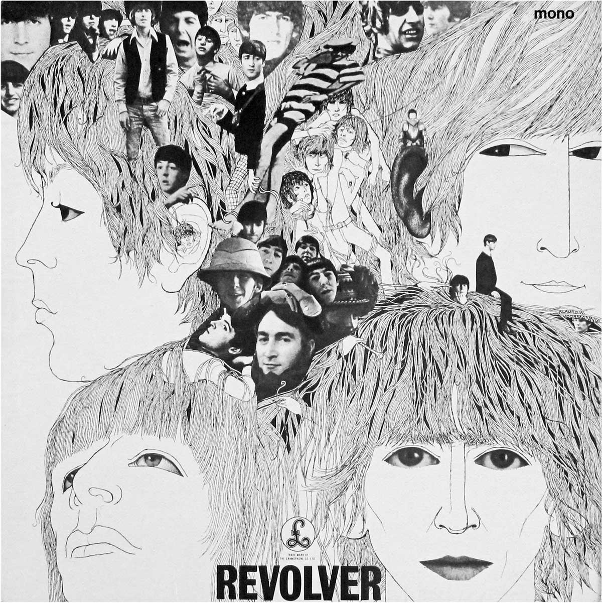
Revolver, record sleeve, EMI records, 1965
Martin Sharp being a talented illustrator with a dynamic psychedelic style, he created archetypal posters for Bob Dylan, Donovan and Jimi Hendrix. He also designed album covers for Cream and Eric Clapton. Sharp was responsible for giving the Luna Park theme park its extraordinary identity. Sharp is regularly described as ‘Australia’s foremost pop artist’
Sharp being another illustrator that creates iconic posters, I found his work very interesting and exhilarating. This is what I pursue to do in the future. I like the repeated patterns across the poster. The circular patterns make the poster look very full and busy.
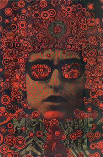
Bob Dylan, Blowin’ in the mind, poster, 1966
Reference
ZEEGEN, L. AND ROBERTS, C., Fifty years of illustration, In-text: (Zeegen and Roberts, 2014), Your Bibliography: Zeegen, L. and Roberts, C. (2014). Fifty years of illustration. 1st ed. Laurence king.
https://en.wikipedia.org/wiki/Postmodernism
https://www.pinterest.co.uk/pin/496803402620479631/