
As an aspiring illustrator, one of my favourite artists of all time, Ugo Gattoni created a piece called ‘Bicycle’ for the Olympics in 2012. He creates the most complicated yet detailed illustrations. No matter how many times I look at ‘Bicycle’, I find something new that I hadn’t noticed before because there’s always so much going on with illusions and surreal depictions.
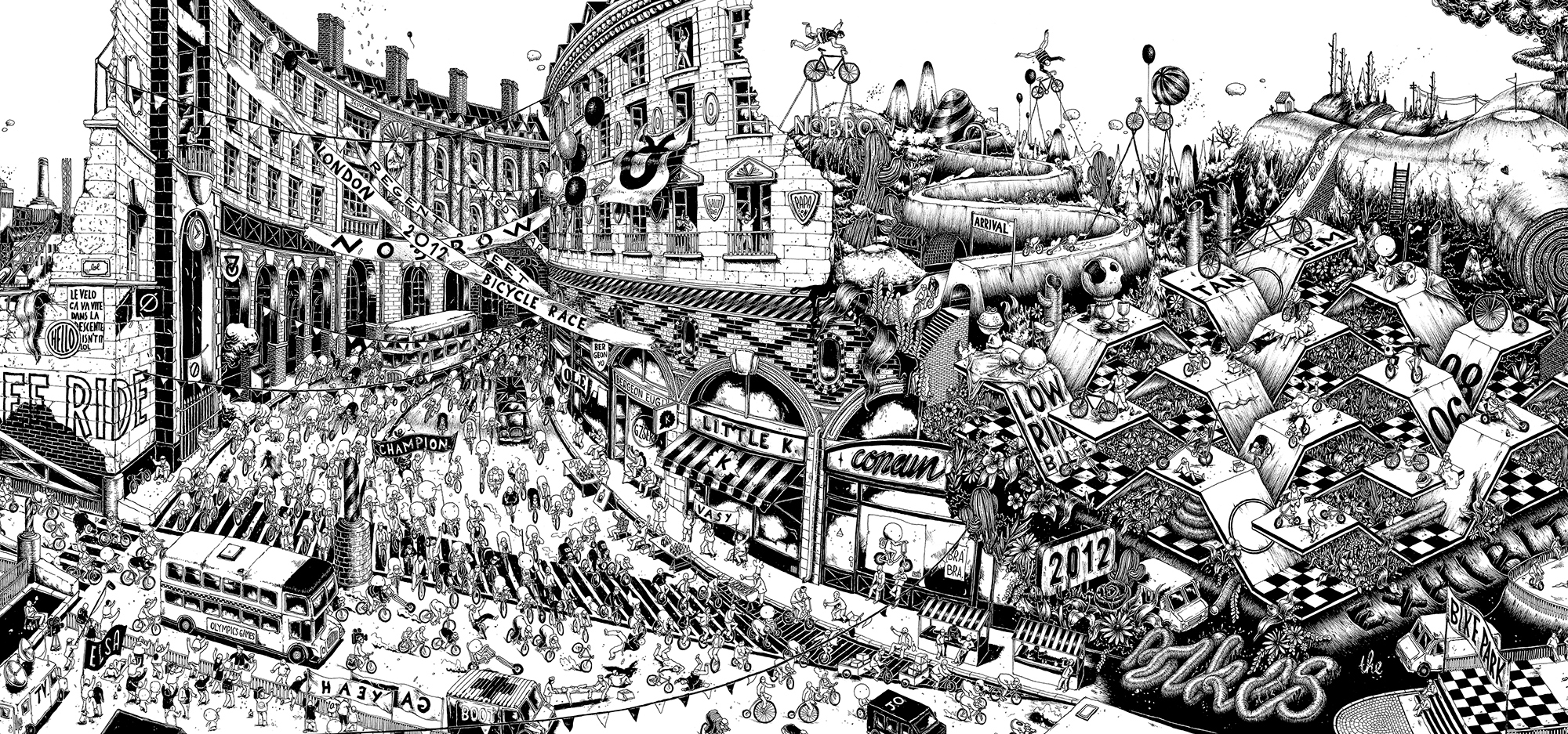
This is a part of ‘Bicycle’. He is showing the cyclists racing through a city with many illusions and random things going on around the race. I always try to create detailed and complex illustration which is why, personally Gattoni inspires me a lot. Gattoni has also produced a piece called ‘Highways’ which is very similar to ‘Bicycle’, complex and meticulous. He mainly used black and white but in his recent work he has been using more colours and creating surreal, short animations which are also amazing.

Panic At The Discos new album cover(Death Of A Bachelor) is very illustrative. Nicole Guice is the illustrator that created this incredible album. She used and image and with a few simple red and white limes decorated the photo and created this unique final outcome.
Overall I think that these 2 artists are very different and particular. I enjoy both artist. Gattoni uses a lot of detail and illusions in his work and Guice outlines/decorates images with minimal use of colour. Guice created a perfect album for Panic At The Disco with straightforward structure. Gattoni created advertisement for the Olympics with convoluted illustrations.