Author Archives: Bia

Task 12 by Bianca Schmittmann

Hello Kitty by Batya Cavens, mixed media on wood, 48 H x 48 W x 2.5 In

https://www.saatchiart.com/art/Painting-Hello-Kitty/314078/2867610/view

This piece is already rather large and loud, however if it were larger in scale, the likely effect is that it would have a bigger impact on the narrative or even heighten it. It would either be a larger portrait which puts a bigger emphasis on the face, it could be turned into a full body piece adding more to the seen figure or even a scene, or it could even be a public mural on a whole wall since it has very graffiti like features. If I myself made it larger, I would add more characters and features, maybe create a scene to expand and build up the narrative that already exists. The piece is very exiting already because of its playful style, so if it were a mural displayed publicly it would draw even more attention.

Adding more to the scale would just bring it much further and make the piece so much more powerful and fantastic. The possibilities of the different kinds of narratives one can add to this piece are endless and would be still very attractive to look at if it were smaller in size.

Task 11 by Bianca Schmittmann

From all the tasks I’ve been set I’ve realised that not only is art making important and reflecting on choices, but the theory of the art world around me is just as important as a growing artist.

My blog consists of my responses to my own works, reflecting on my choices as well as my opinions and responses on different topics. The tasks have opened my mind to different areas of art that I haven’t thought of beforehand such as appropriation. I feel much better being aware of them and I look forward to continuing to expand my knowledge. Some tasks were new to me and therefore were challenging to approach, but it helped me think in areas and bring up new ideas that could help me evolve myself and my practice.

My favourite task so far was the appropriation task because I had so many ideas for it and I really enjoyed the whole process of creating the piece, making it the most valuable to me. The task which I had most difficulties with was task 7, because I found it difficult to understand the given text, therefore I found it difficult to comment on them. I decided to approach it in a direct way and simply comment upon what I found the most important in the given text.

Task 10 by Bianca Schmittmann

“Colourful narratives which look innocent yet thought provoking or dark”

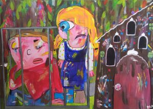
The image and these ten words are what I think represent my practice. The ten words sum up how I see most of my works (literally). And the image that I have chosen links with my ten words. It is colorful, it’s a narrative from a fairytale which is socially seen as something innocent as they are for children. Most fairytales are originally a lot darker therefore I decided to paint a dark scene yet paint it in a way that it looks innocent and positive, making the piece thought provoking to the viewer.

I have chosen this image, because I think it is one of my most powerful pieces. I love mixing and adding dashes of colour, I love painting narratives and specifically fairy tales and manipulating them into my own. A playful looking piece with a dark story behind it is such a brilliant idea to me. Even though I have started branching into different themes, looking into digital art and looking at more contemporary narratives, right now I still feel that fairy tale narratives are the most important to me in my practice.

Behind the Gingerbread House, Acrylic on wood, 130 x 180 cm.

Task 9 by Bianca Schmittmann

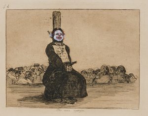
Chapman Brothers – On Account of a Knife, 2003

Jake and Dinos Chapman have created this work by taking an etching done originally by Francisco Goya and basically vandalising/appropriating it. Goya was unable to publicise these etchings at first because they were too controversial for his time. Today these works and works similar in style are still shocking yet they are more widely accepted, because of how our views in art have changed and evolved over the different movements such as modernism in the late 19th century.

The Chapman brother’s works are shocking and are very rebellious in terms of traditional art views and therefore shock even today’s viewers, however this rebellious behaviour in art nowadays, especially contemporary art is no longer such a controversy. If this was done during Goya’s time, it would’ve have been an outrage. Let alone Goya’s collection depicting disasters of war and this piece specifically a priest who was killed as punishment for owning a knife, it is rather dark and shocking. The most shocking factor in my opinion is the choice of replacing the human heads with clown ones and the general concept of vandalising Goya’s work.

http://artobserved.com/2013/06/new-york-jake-and-dinos-chapman-insult-to-injury-at-yoshii-gallery-through-june-29th-2013/1032523_02/

On Account of a knife by Jake and Dinos Chapman, 2003, etching painted on.

Task 8 by Bianca Schmittmann

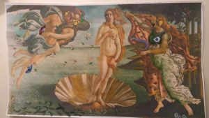
I have always liked “The birth of Venus” by Sandro Botticelli. I decided to appropriate this piece of work by painting features of my own style on top of the existing image. Those features that I painted also resemble the work of George Condo as I work with similar techniques therefore appropriating a second artist in this piece.

This process of painting on top of the printed photograph was inspired by the Chapman brothers and their work on Goya’s etchings. I also wanted purposely shock by vandalising this piece, doing that by painting on top of simple A4 paper. using regular paper also takes away the preciousness of the work. I continued to vandalise the piece by tearing a hole in it. If I could change anything, I would love have done this on a bigger scale.

What makes this new work interesting is that it is a combination of old and contemporary art, realism and cubism. The combination of the two different elements that are obvious makes the work relatively attractive to look at.  This would also trigger the viewer to want to find all the changes/details and carefully observe the whole piece.

The Birth of Venus 2.0, Acrylic on Inkjet printed A4 paper.


Task 7 by Bianca Schmittmann

In the first text of Art in theory, art critic Leo Steinberg talks about Rauschenberg’s approach to having art presented in a horizontal way, shifting from the old masters way focusing on nature into a more cultural way of presenting work.

in 50’s people were still used to always seeing art in front of us (head to foot) and then Rauschenberg had the idea of a flat surface presentation, to look at art horizontally. Steinberg describes that shift as a “radical shift in the subject matter of art” (Steinberg, p.950) which indicates the importance and intensity, following with “a shift from nature to culture” which highlights the big change in ideals and views.

In the second text, due to Richard Serra’s work Tilted Arc being removed from the specific site and destroyed by the government agency, he reveals his perspective of site specific work in a lecture.

Serra referred to his site specific sculptures to “never decorate, but become part of it and restructure the organisation of the site”. (Serra, p.1125) He is very connected with not only the material but the process of creation. The fact that he the site and the sculpture have to be part of each other changes how some people may have viewed sculptures. This links with Steinberg’s words, linking the two in terms of viewing art: stepping away from tradition and into more modern ideas.

bibliography:

Harrison, C., Wood, P., Steinberg, L. and Serra, R. (2002). Art in theory. 2nd ed. Malden, Massachusetts: Wiley-Blackwell, pp.948- 953, 1124-1127.

Task 6 by Bianca Schmittmann

I create all sorts of works that are based off a narrative. My pieces range in scale and some are visually louder than others, which makes a large studio space very useful. In the future, my ideal way of working would be in a studio like a shed or warehouse big enough for all sorts of media. It would also be ideal if the studio had windows so sufficient light can help with how I work but also create an atmosphere when I work during the day. I mainly paint and draw, but sculpture, film and print are also media that I work with and might want to create more works with. I also work very spontaneously, so this large space would give me the freedom of working on whatever I want whenever I want and conveniently.

I’ve been inspired by Paula Rego’s practice and working in a studio filled with sets, props and puppets to physically build a narrative to then draw or paint. I have also occasionally started working in this way, to build and lay out what I will draw from which is why that space is important. As I am currently still developing my practice, this mode of practice is still subject to change.

Task 5 by Bianca Schmittmann

Exhibition at the Museum Kunstpalast: Jean Tinguely, Super Meta Maxi

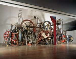
When approaching Tinguely’s works ‘in the flesh’ it becomes a much more magical piece of work. One is not able experience the full extent of the size of the sculpture from a photograph or behind a screen and especially the kinetic aspect of it. Tinguely’s ‘Große MĂ©ta-Maxi-Maxi Utopia’ , finished in 1987 is a huge kinetic sculpture made out of all sorts of items and even stairs and paths for viewers to walk along.

In general with sculptures and large scale works it is very vital to see it in person because of the difference in impact it can have on you. This work creates and even bigger value only when the sculpture is seen in the flesh because you somewhat become part of the piece just by physically walking in/on it. The whole atmosphere and experience is much more exiting in person rather than seeing it still or even from a video, therefore the Value of this piece of work can only be fully expressed when seen in the flesh.

Jean Tinguely, Große MĂ©ta-Maxi-Maxi-Utopia, 1987, 810 x 1683 x 887 cm, Mixed Media.

https://www.artrust.ch/events/jean-tinguely-super-meta-maxi-museum-kunstpalast-dusseldorf/?lang=en

Museum Tinguely, Basel, photo: Christian Baur, © Museum Tinguely, Basel, Donation Niki de Saint Phalle © VG Bild-Kunst, Bonn 2015

Task 4 by Bianca Schmittmann

Exhibition at the Museum Kunstpalast: Jean Tinguely, Super Meta Maxi

In collaboration with the Tinguely Museum and the Stedelijk museum a show of over 100 of Jean Tinguely’s works was presented starting with his first wire sculptures all the way through to his most famous metamechanics. This show was the first major exhibition of the late Swiss painter and sculptor (died 1991) in 15 years.

A lot of Tinguely’s sculptures were created with random found items and machinery constructing a piece of work that comes to life. The works were placed in various areas of 2 halls with the larger works taking up a wall of corner of its own. Some of the sculptures had provided buttons that would trigger movements and some of those movements created certain sounds like the iconic work Ballet des pauvres (1961).

A particular work at the exhibition that always fascinates is Schnudernase (1988) and various other sculptures that all hung from the ceiling. They had many functioning light bulbs of different colours attached on metal bars which would come is many shapes and forms as well as some having metal wheels  which rotated certain parts of the sculpture or other found items, creating a fantastic atmosphere with them moving all together.

Task 3 by Bianca Schmittmann

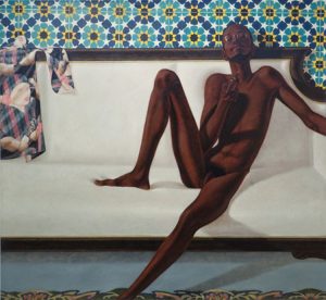
This painting shows a man of colour sitting on a white sofa, naked with only glasses on, holding a pipe (or cigarette). A shirt printed with a woman’s face hangs on the top of the sofa, the carpet is a clear blue colour with a pattern going across and there is very vibrantly patterned wallpaper. At first one might just see the naked man on the sofa, but when one studies the image closely it may have a deeper message it tries to convey.

His facial expression shows that he is aware that the viewer is looking at him or at least he is not ashamed of the viewer’s looking at him even though he is not covering himself up. It may suggest that he is presenting himself in this manner on purpose to maybe provoke the viewer. The position he is sitting in also looks rather relaxed as well as him possibly smoking which conveys that he is not bothered and comfortable. The title stating “no naked niggahs” suggests that the figure was presented this way to suggest that he is breaking a rule and that he probably isn’t concerned about breaking it.

Family Jules: NNN (No naked niggahs) by Barkley L. Hendricks, 1974, Oil on Linen, 72 x 66 inches. http://www.tate.org.uk/research/publications/in-focus/family-jules/the-painting