Week 8 – Publish or Perish!


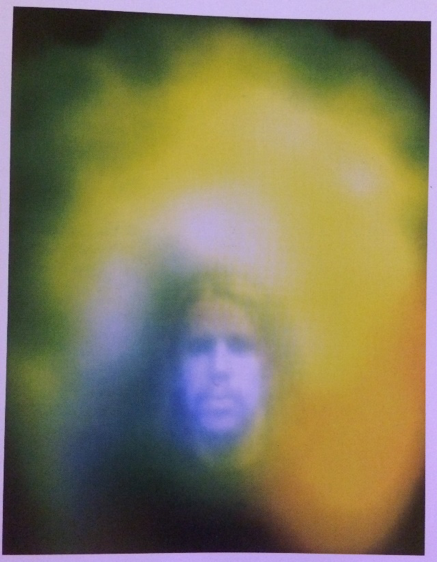
Even though the following quote is spoken about designers who work with digital graphics, the photograph pictured is a key example of how artists communicate feeling as well as provoke feeling within their audiences, “The designer’s mission was simple: to create the simplest, most harmonious, most neutral form, thereby enabling communication to the widest possible audience.” (Helfand,J. 2009). The colours and effects used within this piece allow for multiple feelings of mystery, nostalgia and curiosity to be expressed as well as encouraging the viewer to reflect on what the subject or photographer may be trying to communicate through the feeling captured.

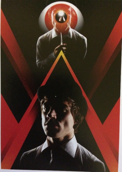
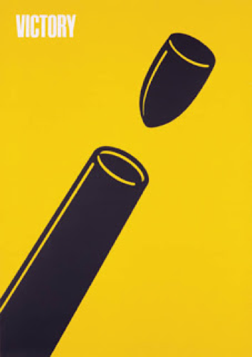
This published image combines strong design and story, the above poster is part of a fashion shoot based off of Stanley Kubrick’s adaptation of the Clockwork Orange, this quote summarises how two sides of design can exist simultaneously without overpowering each other, “Design that strives for neutrality, that seeks to extinguish its relationship to the human condition, risks removing itself from the very nucleus of its purpose, which is, yes, to inform and educate — but also, to enchant.” (Helfand,J. 2009).

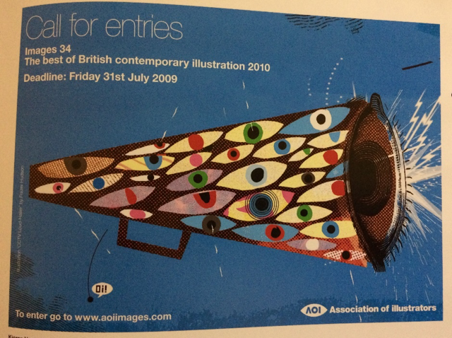
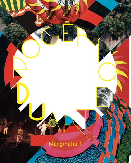
Multiple mediums from design are used to create the ‘Call for entries’ megaphone, the combination of collage, print and digital typography allow for a more dynamic and interesting composition working in a way that is similar to that described in the following quote, “They used a variety of resources and approaches to make sure their graphics translated to their audience.”(Anon, 2013).

I personally think that making sure that the piece is clear to its selected audience is important and a fundamental within Graphic Design as visual art can communicate many things to its audience that other mediums might not be able to communicate to the same standard.


References

Helfand,J. (2009) Can Graphic Design Make You Cry? Available from:  https://designobserver.com/feature/can-graphic-design-make-you-cry/9737 [Accessed 2 December 2017]

Anonymous. (2013) How to tell a story using Graphic Design. Available from: http://www.harrington.edu/student-life/blog/july-2013/graphic-design-how-to-tell-a-story-using-graphics [Accessed 2 December 2017]

Images:

Ingledew,J. (2011) The A-Z of Visual Ideas. London: Laurence King Publishing.

Pages (Fraser Hudson) 59, (David Abrahams) 122, (Thea Swayne) 137.


Is it possible to be truly authentic?

Is it possible to be truly authentic?

In my opinion, not everybody can be authentic these days. But I really do not see this as something that is negative. Everybody has their own style of work, the way they do things, their unique way of working, etc. But most people do become inspired by others work, seeing someone else’s creations and designs could inspire them, making them want to create great things just like it. This can also be called looking up to them. Someone who they want to become like. But not necessarily copy. Even if it is not a conscious decision, I believe that we all do this at some points in our lives.
I constantly see typography work on a daily basis that really draws me in, it always inspires me to go home and create some of my own work. If I see a certain style that attracts me to it, I feel like without really knowing I want to follow that style, to a certain extent of course. Making it my own. I think our styles are moulded everyday by the things that we experience and see, things that we take a liking to. These factors later on ends up creating our own style, special to us.
I am not saying that we all copy other artists work, but I think that we get our inspirations from others. I do not think that anything is wrong with this, if anything we are expressions ourselves.

Human Computer Interaction

Select one game of your interest and explain why does it have a good/bad game UI.


Common belief says that the three factors which make the perfect game are stunning graphics, good gameplay and perfect sound, although this description is missing one important thing: well-designed user interface.

An example of good user interface can be found in the Polish game The Witcher III: Wild Hunt. There are three levels of interface. The most basic one contains the most useful information during the gameplay such as health points, super power charge or level progress. All of them are represented by various bars and symbols so it is impossible to mistake them. In the other parts of the screen there is a clear map with player’s current location, weather forecast, list of active tasks and icons of quick equipment.

Witcher III Wild Hunt

Entering the second level of user interface means that the gameplay will be stopped but it is still convenient to go there during the combat. Player can choose super powers and see all of the active effects.

Witcher III Wild Hunt

The third level of user interface is very vast and consists of several different screens. The inventory panel is very compelling because every single item in game has its own wonderful illustration. There is also a 3D model of our character so it is easy to decide if new clothing suits him from this panel. In the other sections we can find the list of quests, extended version of world map, information about characters, bestiary and much more. The design of interface is black and very simple with only a few ornaments and subtle graphic in the background.

Witcher III Wild Hunt

To sum up, I think that The Witcher III meet almost all requirements of perfect user interface which are visibility, affordance, feedback, simplicity, good structure, consistency, tolerance and accessibility.


Discuss how technology augments human abilities. Reflect upon the implications of the future of HCI.


Humanity becomes more powerful every decade. For example few years ago we were not able to prevent some diseases but we do now. The reason for that is obviously not more skilful people but rapidly developing technology.

Human-computer interaction becomes a significant part of almost every field of life. Starting with very basic abilities such as programming a dishwasher, people are more attached to technology but also able to do more complicated tasks. Furthermore, having a smartphone increases our multi-tasking, and gives us completely new abilities such as continuous connection with other people, GPS navigation in our every step and access to endless source of information which basically set us free from remembering everything.

If we try to look further, we can predict that human-computer interaction will reach even higher levels. Scientists assume that the next big breakthrough after smartphones will be smart tattooes connected to human’s nervous system. All security problems will be resolved with this invention. Another future must-have of every household is the „assistant” which bases on artificial intelligence and organise all life instead of people, take care about their health condition and needs.

Smart tattoo

In the future a lot of our duties will be handled by computer and it means that people will have more free time and possibilities to focus on issues such as art, relationships and personal development. If we take into account the approaching inventions which will help us to develop our interests it is possible that people will become even more creative, skilful and inventive. Both art and science are likely to be considerably expanded in the upcoming decades.

references:

https://www.interaction-design.org/literature/book/the-encyclopedia-of-human-computer-interaction-2nd-ed/visual-aesthetics

https://careerfoundry.com/en/blog/ui-design/the-future-of-human-computer-interaction-whats-next/

Click to access a9cc94292332faee0b9e741bc93419d155a5.pdf

Compare and Contrast

The first poster is a visual pun. It says “piano” but the typography appears to be piano keys. Which of course relates to the word itself. This is a smart visual pun, quite an obvious one. Not every visual pun is as clear as this, some are difficult to figure out or understand. The colours used are minimum, black and white. Simple, plain yet affective. The black is powerful, taking up almost the whole poster. But of course the keys are white, to point out the fact that they are meant to show off piano keys. If any other colour was used, for example pink, it wouldn’t fit the typical image of a piano. 
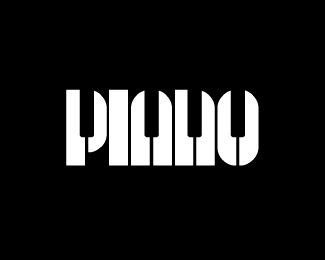
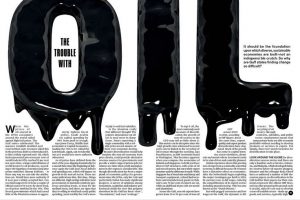
The second one is from a magazine. This is great hierarchy, with exaggerated “OIL” placed on the double spread. The “OIL” really catches the audiences eye, dragging them in. Also they have created this dripping effect, relating to the word oil. The first poster and this relates, as they are both classed as visual puns. It is a smart design, the paragraphs beneath are placed around the dripping of the oil, which makes it look unique and different. The article is all about the trouble with oil, so a very dark and unpleasing colour is used to portray the oil. Just like a very dark colour was used for the “PIANO” poster. Black is a colour that is very powerful. It is dark, gooey, sticky looking. An all round a negative image. This works with putting across their opinions on the troubles with oil.
  • Anonymous (n.d) Amazing use of typography Available at: https://www.pinterest.co.uk/pin/493284965421569625/ (Accessed 20 November 2017)
  • Anonymous (n.d) Piano Typography Available at: https://www.google.co.uk/amp/s/www.pinterest.com/amp/pin/366199013435871480/ (Accessed 20 November 2017)

Week 6 – Post Modernism

Show – Editorial Spread

Focusing on the image labelled ‘3’, I found that this work showed that a magazine spread or in fact any type of organisation of information can; as an individual presentation, be Graphic Design and Graphic Art in its most contemporary form as well as showing how post-modernism is being embraced in modern Graphic Design. This particular piece features the work of multiple designers embracing the abnormal within design and in some pages of the editorial (from which the image is found) the almost illegibility of the typography shows how communicative Graphic Design can be.

Reveal – Wet Magazine Cover

The secondary image combines media, in this instance it provides an almost psychedelic affect to be integrated with the aesthetic of the brand “WET”. This design allows for photography, illustration and graphic design to create a complete scene that reveals something to each viewer; I see the image as a metropolis and as a shrine to a celebrity, this is an effect I particularly enjoy as it encourages a private moment between the image and each viewer in an interaction summarised here “…our connectedness as humans to one another in the globalizing world and with fictional characters as representations of ourselves.”(Gibbons, A. 2017).

Deconstruct – Music Poster

The first image showing a concert poster not only allows for eye catching design through simplistic shapes and colour pairings from deconstruction, but also design that encourages you to think as is emphasised here “The postmodern denial of this viewpoint—which follows from the rejection of an objective natural reality—is sometimes expressed by saying that there is no such thing as Truth. “(Duigan,B. 2014). After dabbling in trying to learn musical instruments and how to read sheet music as most have, I can understand that this piece is a deconstruction of sheet music and instruments. Using the strong shapes and repetitive patterns the designer has been able to not only communicate the purpose of the poster but also entice the target audience of concert attendees to look closer.


References

Duigan,B. (2014) Postmodernism and Modern Philosophy. Available from: https://www.britannica.com/topic/postmodernism-philosophy [Accessed 3 December 2017]

Gibbons,A.(2017) Postmodernism is dead, Now What? Available from: https://www.the-tls.co.uk/articles/public/postmodernism-dead-comes-next/ [Accessed 3 December 2017}


Images:

Anonymous.(2017) Early Swiss Postmodern Design. Available from: http://www.historygraphicdesign.com/the-age-of-information/postmodern-design/765-early-swiss-postmodern-design [Accessed 2 December 2017]

Poynor,R. (2011) Did We Ever Stop Being Postmodern? Available from: https://designobserver.com/feature/did-we-ever-stop-being-postmodern/30798 [Accessed 2 December 2017]

Nariman-qizi,S. (2016) Postmodern Movement in Design. Available from:         https://www.behance.net/gallery/32508169/Postmodern-movement-in-design-Editorial [Accessed 2 December 2017]

Task 6 // Modes of Practice

From one of my drawing workshops, I was able to create a mode of practice using cotton buds, using the tip for mark making, creating an image of dots with acrylic paint. It was inspired by Seurat’s pointillism work, although he used a brush to produce those marks. He was one of the pioneers of pointillism, a technique that developed in 1886. However, I’ve evolved the style of pointillism using cotton buds. It is a very feasible practise to do as the material is a day to day item. I will be working with this method in my contemporary project. Although it was a challenging to do the style pointillism as confuses the mind to blend the colours and place it accurately. To develop this further, I used a hole puncher in some areas to make it look chaotic. I want to keep working with this technique as challenges with me in doing complex techniques.

Week 5 – Counter Culture

This image represents spirit through the smaller details of the image where the artists life is displayed, not only as an embellishment to the focal image which is communicating what the artist feels is the death of his work but also as a timeline for the artists life. The image and overall message wouldn’t have been communicated as well if the style of the 1960’s and 1970’s wasn’t as psychedelic and visually vocal. Artists often wish to affect the ‘now’ within counter culture,“They stress so much happened to them by chance. There were no contracts, no career plans. But the era’s pioneering and radical graphic design influenced everyone who came afterwards – punk was only a few years away with its DIY graphics.“(Hoggard,L 2016).

Within this image, the contrast between the type and the visual art is vivid and noticeable for both symbolic and design reasons. The bullet facing the barrel of the gun suggests the damage done from war is more significant than who claims victory, a very relevant part of counter culturism is how it came to be “The counter cultural movement started on the background of Vietnam War. It was a post-war generation as a result of baby boom. The young people were frustrated due to racism, gender issues, consumerism, and the conservative nature of the society in general.“(Anon 2016). This is supported by the almost illegible white ‘victory’ on the yellow background. The frustration and exhaustion that this image displays is relevant to my world views regarding political topics, however I wouldn’t be as eloquent as this image.

As with counter culture work, this piece shows how distorted some world views become because of the repercussions of war and politics that affect how protest is voiced through art. Marginalia 1 is a collection of text, which was common in counter culture “There were feminine writers such as Gloria Steinem and Slyvia Plath who fought for the equality of women. In the long run, it led to the rise of political activism on the part of women. One such example was the formation of National organization for Women (NOW). “(Anon 2016), Marginalia 1 was influential to the Brazilian counter culture movement (Tropicalism), what I enjoy about this cover for counter culture text is how the visual can voice a message just as clearly.


References:

Anonymous.(2016) The Counterculture Movement and its Effects. Available from: https://brainmass.com/history/cold-war/the-counter-culture-movement-and-its-effects-285642 [Accessed 5 December 2017]

Hoggard,L. (2016) The revolutionary artists of the 60’s colourful counterculture. Available from: https://www.theguardian.com/artanddesign/2016/sep/04/revolutionary-artists-60s-counterculture-v-and-a-you-say-you-want-a-revolution [Accessed 5 December 2017]

Images:

Novin,G. (2016) A History of Graphic Design: Chapter 33. Available from: http://guity-novin.blogspot.co.uk/2010/06/chapter-33-pop-art.html [Accessed 2 December 2017]

Anonymous. (2017) Art and Design. Available from: https://www.manystuff.org/?p=20047#.WiUgmUpl_IU [Accessed 2 December 2017]

Comparing Posters


At the first glance, this movie poster of The Dark Knight Rises looks really captivating. In terms of the colors used in the poster, it has a balanced color contrast and temperature.  The background of the image is dark orange which seems to give a dominant color contrast which matches to the title of the movie perfectly. The entire poster has the incorporation of triadic color scheme and analogous color scheme. The font used in the poster is bold and the font choice seems to be matching with the name of the movie and the way the character is displayed in the poster. In terms of visual mapping, I feel, that this poster does not match the correct visual mapping pattern, as the visual mapping is not starting from upper right corner and ending smoothly at the lower left corner. But, due to a good combination of colors, font choice and character design, it totally seems as if the dark knight is rising.


The poster I am comparing the first poster with is a still from a trailer, the colors used in the poster are bold and dark. The background with an exploding effect totally captures the movement and heat between the characters of the movie. The combination of color contrast, effects and motion used in this totally balance with the scene.

http://imgfave.com/view/1880235

http://collider.com/batman-vs-superman-new-posters/

Task 4 – Ways of Seeing Pt.2

My chosen exhibition is the one our First Year Fine Art class has made for the Manifesto Project. As short as it was, however, it was also a big surprise to me.

The exhibition included different works varying in content and in media including paintings, installations, video installations, texts, prints and other objects. The exhibition was displayed only for a week but it was still very intense. It also provided a good opportunity to get to know a little bit more about the more personal aspect of each other’s work. To my surprise, I was stunned at how aware and how politically sensitive the whole class is to certain socio-political issues while there was still enough room for silliness and self-comedy to make it a more forgiving and less burning experience for the viewers.

As a practitioner, I really enjoyed being part of this exhibition, and the social conversation that followed it which helped to get to more about the work and interests of my peers not just as art students but also as entrant artists who are all very different and having important, full-fledged ideas about the world around them.

The exhibition could be viewed on the ground floor of the Westside Foyer in Winchester School of Art and it could be viewed by anyone but mostly by the students of the University of Southampton.

Is it possible to be truly authentic? Do the principles of Modernism hold value in contemporary practice?

In a world where we have all been programmed to follow the same basic routine tasks, to follow the same lives, how can anything we do now be classed as ‘authentic’? How can anything we create be original? We all wake up, go to work, buy into capitalism and come home again. We seem to repeat this routine day in, day out without question.

Over the past 100 years we have seen a radical change in the way we live our lives and this is dramatically shown by the change in art styles. We have gone from very traditional drawings of portraiture and landscape to very simplified and abstract pieces showing hurt emotion.

The rise of technology greatly aided to the idea of ‘Modernism’; the introduction of machines meant artists had to strategically re-think their practice. Items were now available to be mass-produced, making artwork easier to distribute, though in a very different style. There have been countless revolutions in the past which have called for change through art but now we seem to have hit a brick wall. We have just become robots, following one day to the next without any challenge to the norm. Today, we do see principles of Modernism like ‘form follows function’ (Louis Sullivan, 1896), but we only see products being improved, not reinvented. Just like phones and computers, for example. We have run out of original ideas, we have run out of rules to challenge.

There will always be people out there who want to create something new, who want to become known as an inventor and to be ‘authentic’. But, it would appear that all the good ideas have been used up.

Image one: C.A. Hannaford RBA – Early 20th Century Watercolour, Canal Landscape

Image two: Mark Rothko, Light Red Over Black, 1957, Oil on canvas