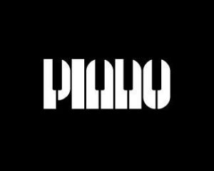
The first poster is a visual pun. It says “piano
” but the typography appears to be piano keys. Which of course relates to the word itself. This is a smart visual pun, quite an obvious one. Not every visual pun is as clear as this, some are difficult to figure out or understand. The colours used are minimum, black and white. Simple, plain yet affective. The black is powerful, taking up almost the whole poster. But of course the keys are white, to point out the fact that they are meant to show off piano keys. If any other colour was used, for example pink, it wouldn’t fit the typical image of a piano. 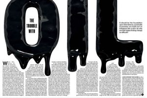
The second one is from a magazine. This is great hierarchy, with exaggerated “OIL” placed on the double spread. The “OIL” really catches the audiences eye, dragging them in. Also they have created this dripping effect, relating to the word oil. The first poster and this relates, as they are both classed as visual puns. It is a smart design, the paragraphs beneath are placed around the dripping of the oil, which makes it look unique and different. The article is all about the trouble with oil, so a very dark and unpleasing colour is used to portray the oil. Just like a very dark colour was used for the “PIANO” poster. Black is a colour that is very powerful. It is dark, gooey, sticky looking. An all round a negative image. This works with putting across their opinions on the troubles with oil.
- Anonymous (n.d) Amazing use of typography Available at: https://www.pinterest.co.uk/pin/493284965421569625/ (Accessed 20 November 2017)
- Anonymous (n.d) Piano Typography Available at: https://www.google.co.uk/amp/s/www.pinterest.com/amp/pin/366199013435871480/ (Accessed 20 November 2017)

 The first poster is a visual pun. It says “piano” but the typography appears to be piano keys. Which of course relates to the word itself. This is a smart visual pun, quite an obvious one. Not every visual pun is as clear as this, some are difficult to figure out or understand. The colours used are minimum, black and white. Simple, plain yet affective. The black is powerful, taking up almost the whole poster. But of course the keys are white, to point out the fact that they are meant to show off piano keys. If any other colour was used, for example pink, it wouldn’t fit the typical image of a piano.