Task 3

Muntean / Rosenblum

Untitled [Everything was as it had been a minute ago…], 2001 [painting]

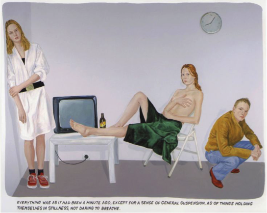
At first glance I get a very stark and bright feel from the painting. The overall ‘look’ of the image is quite flat and the only really dark values are in the green robe in the centre. This draws the eye in to that specific place in the painting, and in turn, the central figure. I find it intriguing how this arrangement of seated and standing positions look rather strange together, each figure looks as though it has been taken from somewhere else. This is reinforced by the fact that if we separate each figure they are in very ordinary positions. It has a certain ‘unnerving’ air surrounding it, a stillness that makes the viewer slightly uncomfortable. This uncomfortable feeling is exaggerated by the glare of the three figures, looking out from the surface and engaging the viewer. From the text we can tell that the artist has tried to encapsulate a feeling of stillness, a snapshot in time that gives no indication of what might happen next. I think that the artist is trying to capture an exact moment that expresses a great feeling of illusion and where very little, in terms of narrative, can be deciphered. The clock on the wall also suggests the theme of time.

I like the general composition and shape of the painting, the slight rounded edges of the image itself and the text being placed below, gives the sensation that we, as viewers, are looking into a screen, exhibit or a cell. The text below could almost be seen as mocking the little plaques that are found in art galleries and zoos, as this text contains no real ‘information’.


Task 7


This book was made by Irma Boom which was commissioned by Chanel. The 300-page book has no ink—each of the crisp white pages is embossed with a drawing or quotation, because this special printed way concentrate on a sense of touch. It’s clean, understated and ephemeral, and somehow still totally engrossing. The book allows us to see the new meaning of the book in the digital times, the active role of the designer in the publication process as well as the need for a new kind of printed book. Irma Boom reinvents the traditional book. It is hard to imagine any other individual following her footsteps, since the digital revolution entirely changed the world we are living in, but it would be interesting to observe where the journey of the printed book will continue next.

In Gunter Rambow potato series poster, each picture is to show the theme of potato, different is the treatment of potatoes. He peeled, twined, cut, colored, and piled up… There are some similarities between the different forms of composition, which is the combination of the potato profile and the color of the block in the composition. Contours and colors are the most expressive elements in a painting

Gunter Rambow said that Poetry, art and literature are what people can feel every day. It’s everywhere. People can find it as long as they look at it.His works fully reflect the fancy imagination of lanburger, and no one will think that potatoes can split up and show the effect of space on the plane.


Ikko Tanaka designed the first advertisement for Muji, a poster printed on a kraft paper, and the branded hue of Muji. The first impression of customers is important to a brand. He used a typical picture in Japanese historical dramas, which emphasized the “right conclusion”. It was illustrated holding a brand sign with emphasis on Muji. He held the idea of simplicity and neat created a new aesthetic form. Moreover, He protruded a specific thing in the advertising picture to introduce the idea and guide people to read more information on the poster.


References

http://milkbottle.today/wp-content/uploads/2016/04/chanel-2013.05.07_Paris_No_5_Culture_Chanel_0674_HI-RES-1.jpg


http://www.gunter-rambow.com/Poster/80er/1988_06_Wiesbaden1.jpg


http://www.muji.com/img/flagship/huaihai755/archive/koike_img02.jpg


Task 7/8 – Reflective Writing

The text I looked at was ‘Fashion as communication, Barnard. M’. The text mentions how we base peoples social class by what they wear, “we make decisions about the social status and role of the people we meet based on what they are wearing” (Barnard, Malcolm, 2002). Furthermore this chapter goes into fashion and anti fashion, the idea of fashion being fixated in high social roles, keeping it traditional to that social class which differs to the other classes. As this fashion is traditional its fixed which makes it anti fashion, its used as a representation of that class.

The text explores how fashion can be seen as trivia, being irrelevant to some people. This explores other peoples views and opinions on fashion. They see it not to be of high importance, however others would argue fashion is majorly important. People wear it daily and its a major factor in the economy, many are hypocritical and even wear it after commonly deeming it irrelevant.

Following on from the first text i found two others which support the first text. The second text I read was ‘The Restless Image A sociology Of Fashion, R. Konig’. I started off by reading the chapter ‘For and Against Fashion’, R. Konig used contrasting views of fashion, how some see it being a bad thing, whilst others see it creating individuality and diversity. The first text says how some people see fashion being trivial, the second text supports this by giving peoples views on fashion not being important. Furthermore, the second text gives arguments of these views, by stating how fashion is a powerful stimulus to the economy.

A point from both texts is asking what would happen if you took fashion away, stating that there would be no identification for people. To continue, its asking what would happen to the economy as fashion affects the majority of people meaning the economy could be affected heavily. The third text I found that also supported the first text is ‘The Culture Of Fashion, Breward. C’. This text supports the first by agreeing to how higher groups of society have strong identities for survival. Jennifer Craik mentions how these social groups offer role models that have a desirable image and behaviour.

After reading all three texts, and seeing how the ideas all support each other, I agree with many of the ideas explored. Firstly I agree with how people make judgments on how others dress, we look at peoples clothing before even engaging in conversation. I also agree with how fashion is a huge part of economy as everyone wears it and we cant escape. I disagree with peoples views on fashion being irrelevant, this is because it affects the many and without our individuality with identities nobody would be different. With the help of the other two texts, my thoughts have become clearer as I got more in depth knowledge.

References:

Barnard, M (2002). Fashion as communication. 2nd ed.

Konig, R (1973). The Restless image : a sociology of fashion. London: Allen & Unwin.

Breward, C (1995). The culture of fashion. Manchester: Manchester University Press.

Task 11 // Summarise your blog

Working on this blog, I feel that I have improved my vocabulary and understanding theories. I was able to broaden my knowledge in the world of art further by attending the given lectures. The work count helped me discuss on the topic rather than going off topic and made me express limited. The word count gives me a structure to work with.

I enjoyed tasks such as 6 and 8 because I was able to use my work and experiment for instance, I learned how to appropriate pieces, something I never knew if can do. This task I really enjoyed doing incorporating my work and into someone else’s which I found so fascinating. I struggled immensely on Task 7, for the art terminology and trying to understand on what the writers were conveying. It took me so long to analyse the two texts and try and link connections. Although, this task helped to break down the text and simplify them.

With the short time we were given to complete these tasks, I realised as the tasks kept being given on how to split time for both modules, studio and research. Overall, I found this blog really helpful in ways expanding my knowledge in the history of art. It has pushed me into wanting to read more artist books from Task 2 and experiment more with appropriation. I am pleased I explored various tasks.

Summary

Over the past 8 weeks, I have learnt a lot about the history of graphic arts, and have developed many skills during the process, mainly researching into past artists work and seeing how they shaped the graphics arts industry, from Avant Guard to postmodernism.

Although when I began this research blog, I had a dislike to the work I was studying, being the type of art that in the past I had disliked in the past I grew to like such as Shepard Fairy’s work that I learnt was more than just branding and a seeming cult type movement, it actually had meaning and was there to try and open our eyes to what’s around us.

What got me most was the counter culturism, I actually liked a lot of the work involved especially from the psychedelic work of Bob Masse and Bill Graham, i loved the art style and the colours they used as well as the way they use their work to express and provoke society in a sense of rebellion and going against the norm. I love the way they work with bold colours that shouldn’t be seen together, such as yellows next to purples yet it adds to the effect, my favourite artist was Bob Masse who used one of my favourite artists as inspiration, Alphonsa Mucha, an art nouvaue artist who’s art is one of my favourite to look at and I happy to see that someone has taken on his work and made something interesting out of it, by keeping the style of Mucha yet using colours to bring it into the counter-culterism movement. making it elegant and fun at the same time.

I prefered the works where I could explore my own interests, such as task 2 where I compared two images that I liked and had similar relations to my own work. I also enjoyed the publish or perish task of choosing my own images that I enjoyed and wanted to describe and look into more detail about how, I got to look into things I liked and share them with other students on the blog. It also makes me look at things more closely such as how a piece of art is put together, the colour schemes used and why they are used. As well as how they the piece works as a whole and if it completes it’s purpose, a lot of the work I have studied has influenced my own work, and has given me new inspirations and ideas that I can work with in the future with my own artistic career and has made me think about what really goes into a piece and what I’m really trying to say with my artwork, as well as it’s purpose, and makes me want to continue this research further as I progress with my study.

One thing I would do better next time is to research more into my artists and give more analysed reviews, as well as being more organised with posting my blogs and understanding the work more.

Week 7: Publish or perish

Image Source: [The Visitor by Shaun Tan – Tales from Outer Suburbia ]

This Illustration is for his award winning of-the-walls story book, and I think this shows exactly why. The unusual combination of familiar elements, ie an astronaut and a suburban environment creates a sense of heightened reality to suggest that this is a metaphor as opposed to literal. He uses almost a childlike and storybook style to tell more mature tales, in which I interpret as a sense of solitude and not belonging. He uses a range of colours in a ashy discoloured way that suggests a passing of time, which resembles a 1950’s futurism poster, or perhaps an old children’s novel with the former child owner now grown up, with their former creative mind tarnished?

Image Source: Gilles Beloeil [Assassin’s Creed II artbook]

This is a concept art for the game franchise Assassin’s Creed, however unlike other concept art, this is painted in a traditional medium: oil, and the composition resembles that of a Romantic Era painting of an occurring scene. The artist create a sense of realism by choosing to go with a realistic style, but at the same time creating a sense of mystery and wonder by using a singular ashy colour scheme and the play with light and dark. The painting style is reflective of the time setting of the actual scene which allows the viewer to be drawn in to the alternate reality. The plotting of character’s location and position creates a narrative and serves it’s purpose of potential story telling.


Image Source: Re-imagination of The Martian movie poster by ChungKong Art

I like this poster design because it is a minimalist depiction of The Martian poster. It doesn’t require much graphics to reveal the main plot of the movie. The use of the bright circle both represent the colour and shape of Mars and the lens of a telescope, also the emotional struggle the protagonist is going through. The abundance of space in the frame and the character’s position suggests a sense of solitude and sadness, which is a perfect depiction of the theme of the movie. I really like how the artist use one aspect of the poster to convey multiple ideas and messages instead of making a complex image. This method also adds focus and to the main subject of the film, at the same time still being aesthetically pleasing; this required intricate planning of the poster’s layout.

publish or perish

Starting off strong with one of my first and favourite ever graphic novels Batman: Hush. It was published Image result for batman hushissue by issue from December 2002 to November 2003. The award winning story was written by Jeph Loeb and brought to life by the amazing pencil work of Jim Lee which was then inked by Scott Williams and finally coloured by Alex Sinclair. Jim Lee alone is one of my favourite comic book artists with his amazing renditions of the characters. Besides the beautiful artwork the story and narrative is gripping throughout the entire novel with intense action sequences and compelling backstories to lesser known characters. Also the way the Williams has introduced so many characters into  the plot with out it seaming like to much each having just the right amount to make them relevant to the continuation of the story. To prove my point further here is one of the first lines in IGN’s review  “there are books that offer significant changes in the status quo, good or bad. In either case, fans are certain to go absolutely f—— nuts. That’s what happened when fan-fave writer Jeph Loeb teamed with Jim Lee for the year-long “Hush” storyline. It didn’t just alter the status quo, it destroyed it.”


Image result for avengers infinity war magazine cover


next on my publication list is the more recent Avengers Infinity war covers to well know magazine Vanity Fair. these covers were published in late November of this year in order to further hype the already massively anticipated 2018 release of the movie. Vanity Fair writes about how marvels decade long story is coming into its final chapters with Infinity war. they interview many of the actors from the MCU one being The Hulk played by Mark Ruffalo who said to Vanity Fair “All good things must come to an end.”


Image result for posters 2017


And finally moving away from the comic theme slightly and into the realm of popular television show we have the second season of the smash hit Netflix original Stranger Things. This latest addition to the Duffer brothers show was another hit and a great addition. Both seasons are jam packed full of pop culture references to the era that its set in. That era being the 80’s. The second season scored an impressive 94% on rotten tomatoes                         ” Stranger Things‘ slow-building sophomore season balances moments of humor and a nostalgic sweetness against a growing horror that’s all the more effective thanks to the show’s full-bodied characters and evocative tone.”


Article title: Batman: Hush Review – IGN
Website title: IGN
URL: http://uk.ign.com/articles/2005/06/16/batman-hush-review
Author Joanna Robinson
Article title: Avengers, Assembled: Feast Your Eyes on All Four of Vanity Fair’s Marvel Covers
Website title: HWD
URL: https://www.vanityfair.com/hollywood/2017/11/all-four-vanity-fair-marvel-covers
Website title: Rottentomatoes.com
URL: https://www.rottentomatoes.com/tv/stranger_things/s02/

postmodernism condition


Postmodernism was a movement that was born as a response to modernism. Modernism was a movement that was born as a response to industrialisation. Modernism let to great achievements but world war one happened as well as the invention of the nuclear bomb and all of this led to realisation that those same institutions we trusted would progress us into the future are lust as likely to destroy us.Postmodernism is direct response to modernism, its does not replace modernism but it does question everything from the concepts of truth, logic, and were adopted the enlightenment era.


Modernism had failed or at least that’s what the postmodernists believed. Modernists had spent much of the 20th century trying to forge a better world inspirited by the science and universal truths. To them less was more. The postmodernists less were a bore. They believed we needed as many references as possible to demine our own individual subjective conclusion. Picasso created one off masterpieces based upon predetermined principals of art. His creation rocked the art world, but postmodernist wasn’t impressed. They believed in more than one method or style. Collage, chance, anarchy, repetition. These were infinitely more interesting. Postmodernists wanted to challenge audiences and force them to ask questions. Postmodern buildings rallied against the blandness that had gone before.

postmodernism had its critics, objecting to unnecessary ornamentation. An obsessive tendency to recycle the past to make something new and often just plain silliness. The rise of mass media really helped postmodernism take off. The world was interconnected like never before. For many postmodernism was liberating giving creative expression a dynamic, often unsettling vice. Postmodernist cinema still confuses, surprise and delights us. Postmodernist performers still bemuse us and we just can’t seem to get enough quirky postmodern art. Politically, philosophically, creatively- the postmodern movement has proven itself a force to be reckoned with. Like a giant social cattle prod compelling society to question why things are the way the are, and why they aren’t.

Reference

https://en.wikipedia.org/wiki/Postmodernism

postmodernism collage


Task 1

Change has been a recent theme in my work, During the summer, I had been working on an ongoing paining project. Starting with a sudden realisation that the process of preparing for one of my paintings has created some sort of metaphor for my current life situation at the time. I made the difficult decision to drop out of Falmouth University back in February. It was hard thinking about the amount of amazing people I had met, how Cornwall is such a lovely place to live and how I didn’t want to disappoint anyone by dropping out, like I had given up. But the course just wasn’t for me, I constantly worries about money and my mental health was declining rapidly.  So, I had to sacrifice a few things for the benefit my future, no matter how scared of debt or reapplying for university I was.
So, I was sat scraping away at one the artworks I made back in my foundation year, worrying about how easily the plaster and paint would come off and whether it was really worth it. Truth is, the paint was slowly falling apart in the corner of my room anyway. Bits of dusty material kept falling on the carpet as a brushed past it daily.
What I’m getting at is if you don’t like what you’re seeing in your life and want to change it, then change it. Even if you’re scared to. Some of the paint took more effort to scrape and some not at all. It’s bits of the past you can’t change, but you work a little harder to create a new surface to paint over.
I then created a few newer paintings using the same sturdy frame and a new layer of canvas, this process of recovering/painting over can now bring up new ideas for me of how my work is produced in terms of exhaustion of material, entropy/history.

Counter Culture


The first counter culture image I chose is the original Broadway poster of the Biltmore theater for The American Tribal Love-Rock Musical- Hair, it is a product of the hippie counterculture and sexual revolution of the late 1960s, several of its songs became anthems of the anti-Vietnam War peace movement. Visually this poster, looks very creative and appealing. The combination of colors totally brings out the spirit of the theme behind the poster which is to promote the musical.


The second poster I chose is the official poster of Star Wars, we can call the posters of Star Wars “a visual history” because there were around eight posters created for the movie in the 1970’s itself, but this is the one which was admired by most of the people. From the placement of the Star Wars logo to the visually appealing background, everything in this poster seems to be perfect. Even in terms of visual mapping, it follows the correct pattern as the visual mapping starts from the upper left corner and ends smoothly to the bottom right. In terms of the colors used in the poster, they totally balance with the theme of the movie and the character placement is also done properly. My field of study being Graphic Design, I am inspired by this design and the fact that this was created in 1970’s as the design approach used in this poster is still used by a lot of designers.


The third image I chose has more of a typographic approach of design, and that is one of my favorite type of design. This poster has different types of fonts and text sizes. The placement of the text is also done in different ways. The main heading that has the text- “The Human Be-In” doesn’t really seem to be placed properly, because visually “the” doesn’t look like a part of the heading. The use of leading in the upper half of the poster seems to be more appealing in terms of designing than the lower half. The background color selection gives the poster a refined look.


https://pin.it/scikxgbn6pr4ic

https://pin.it/5whlu3fprjeach

http://www.vintag.es/2013/01/star-wars-theatrical-posters-around.html

https://en.wikipedia.org/wiki/Hair_(musical)