Task 9/10 – Ethical issues

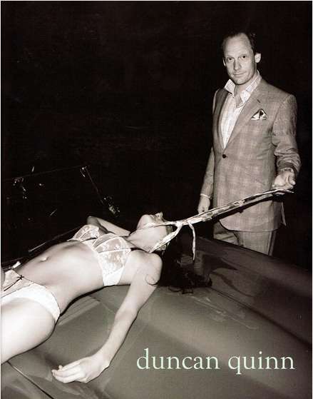
I have chosen this image by Duncan Quinn, to explore ethical issues involved with this image. The first ethical issue which arose with the image was that the female model doesn’t have much modesty and could be seen as sexually exploited as she is only in her underwear. This contrasts with the male model who is wearing tailored clothing, the diversity within the picture shows the difference between models and clearly emphasises the controller from the submissive. The way the female is laying down and the male standing over her, gives the man a dominant character. From a feminist point of view it shows the man is controlling the women, this perceives that the women has less control over herself.

Looking in more depth of the image the female model has a tie around neck which is being pulled by the male model, this can be seen as domestic abuse as he is strangling her. The image can be perceived as violent and could possibly lead the audience to think its okay to exploit women. Furthermore it can the send a message that it alright for men to abuse women whilst looking smart and powerful while doing it.

As you do not see the female face it may seem that she is being strongly objectified as you only need to see her body to make a judgment, unlike the males face of which is looking straight at the camera. This image creates a fifty shades of grey feel about it for how men use women for their sexually gain and pleasure. The female has the characteristics of being a sex slave due to the pose and the submission.

Duncan Quinn is meant to be aimed at males, which sells suits and ties. You can see the products, a suit which the male model is wearing and the tie around the female neck. However the women in the image is the main point but the products aren’t really noticeable. This is a negative way to portray the models as it sends out the idea that women can be objectified. I came across blogs about the practical advert and how much controversy surrounds it. I found a blog by Sandra Winn who express her views on this advert. Sandra’s and my views correspond with each other on how the male model is the dominate and how the female is merely a object. I also found this quote by Paul Suggett, ‘Since the introduction of advertising many centuries ago, women have been objectified, and in some instances, insulted or degraded’, the advert by Duncan Quinn supports what Paul Suggett said by not showing the female with respect.

This image also brings up body image issues, other women may look at themselves in a negative way after seeing this advertisement, by looking at the model and her body. This will make them feel smaller and less respecting of themselves.


References:

Winn, s. (2008). Disturbing Sexists Ads: Duncan Quinn Suit Campaign Depicts Strangled Woman. Available: https://www.trendhunter.com/trends/duncan-quinn-suit-ad-depicting-strangled-woman. Last accessed 5th Dec 2017.

Suggett, P. (2016). The Objectification of Women in Advertising How Advertising Often Treats Women as a Commodity. Available: https://www.thebalance.com/advertising-women-and-objectification-38754. Last accessed 5th Dec 2017.

W8 Reflect

As a student that has come straight from college these essay like blog tasks were honestly rather mundane to write. although i enjoyed the lectures and i do genuinely have an interest in the topics i didn’t feel like any of the questions really stood out as something i was instantly excited to go off and research. i found myself looking at the questions asking myself which ones i could write the quickest and with the least amount of required references. i also initially thought that the 500 word limit might be an issue but i found myself running out of interesting things to say on the questions bar giving an opinion that i’m not sure where  it originated from, and without a ‘credible source’ i felt like i almost wasn’t allowed to say it.

during my process i took notes during the lecture (and proceeded to completely ignore them when actually writing the posts). i also took my time management very (not at all) seriously ensuring i completed all of the tasks in reasonable time (2 hours before the deadline). I made good use (none at all) of the resources available to me in the library and also made use of the recorded sessions to give myself a reminder of the details of the lecture (i actually did this one)

the subjects that i found most interesting were AI and HCI. the lectures re-enforced my existing understanding  of the subjects and gave me a new way to look at them and more resources to learn about them.  something i researched more in my own time was HCI for disabled gamers. i was already familiar with the charity special effect who create custom control systems for disabled gamers and I spent a good amount of time pursuing this interest (admittedly to the detriment of my sleep). 

I found the referencing seriously confusing at times and i’m almost certain i’ve done it wrong however i am happy to blame the fact that we were only told how to go about it a few weeks before the deadline and that gave us very little time to go back and add or adapt it.

I am going to be honest and say i didn’t enjoy this project however i do respect that it is something to get us to show our understanding and it is important for us to know how to go about writing in an essay format. I can’t say i made a great effort on these but i’m fairly sure of my understanding of the topics. if i were to repeat the task i would like to spend more time talking with the lecturers and finding where they got the information for the lectures they provided. i think if i were to do that i would have a considerable amount more to talk about and with that more to research and find interest in.

Indie

Freebird games is a small independent studio consisting of very few members, put together by Kan Gao to tell stories through interactive narrative and music. In 2011 Freebird studios became well known when they released the award winning game To the Moon. To the Moon is an interactive narrative driven game that has the player using very basic controls to solve puzzles so that they can fulfil a dying mans wish. It has a simple pixel art style that gives the game beautiful scenery.

However, the main reason behind my fondness for the game and the studio is how they realise the key importance of music in games. The soundtrack for To the Moon was praised worldwide with its emotional power and how it had such a large impact on the games success. One of the key aspects of Freebird games is that they are heavily focused on how music can impact the game. They charge relatively little for their games due to being an independent studio and they keep people updated on their progression in the form of a blog and news feed. A link to their website can be found below.

http://freebirdgames.com/


Upcoming indie games:

Finding paradise – Finding paradise is the sequel to the game To the Moon, developed by Free bird studios. This game coming late 2017 is probably one of the most anticipated indie titles due to the first games incredible popularity. It’s been 6 years since the last game and the anticipation for this game is incredibly high as the player base expects another masterpiece for the long wait.

Prey for the gods – This upcoming indie title is being developed by ‘No Matter Studios’ scheduled to be released late 2017. It’s considered a harsh survival game inspired by Shadow of the colossus. In the game the player must navigate a dangerous snow covered environment in which they must craft supplies and battle monstrous sized enemies much like the enemies in Shadow of the Colossus which require you to climb them just to damage them. It has an intriguing art style and the survival aspect gives it a refreshing taste and unique feel.

Perception – Deep End Games is a team consisting of former Bioshock and Dead Space developers which have banded together to create a highly anticipated game known as perception. Perception has the player navigate around an abandoned mansion as a blind woman named Cassie Thompson. The player must solve puzzles and traverse the environment by using echolocation to determine their surroundings. This is done by using a walking stick to hit the floor and determine the location of objects. However, the player is not alone in this building and they must choose sometimes on being able to see and letting the monster see them, or traversing blind. The reason this is so highly anticipated is that the mechanics are relatively new to the games as not many games have used or successfully used echolocation as a way of navigation.

Overall it would seem that the most highly anticipated indie games are ones that either have a prequel which set a high standard, or games that take a spin on popular previous titles.

Reference:

image 1:  https://www.giantbomb.com/profile/majormitch/blog/my-journey-to-the-moon/91486/

Task 11 – Summarise your blog and reflect on what you have learned from the process

My blog has become a platform for celebrating diversity through art and liberation from alienation through self-representation and encouraging to break out of the boxes through creativity.

My goals are clear. I believe in art’s power to shape society and I also believe in social engagement. I want to urge a shift in social-paradigms and to replace the material and consumerist value with intellectual cultural and personal value.

I want to create an art space that is free of class, race and gender inequality and that is encouraging people to start to think freely and becoming more sensitive to socio-political problems and to start to shape the world around them so that our society can be a more fair place to live in.

Through my work on this blog, I learned valuable skills from the process. It was a nice experience teaching me how to collect materials around me and where to look for information to represent my ideas. I still have a lot to learn through but I became more confident in my skills in collecting ideas and resources and reflecting on them.

Summary

Research and Communications has shown me a variety of different aspects of all four pathways, whilst incorporating interesting and pivotal aspects of modern design and art history. Not only this, but to delve into the aspects of different art movements, and to see how artists of the time used art to respond to propaganda from war or to express their political views was eye-opening.
Because of the research and knowledge that has accumulated over the last few months, it has allowed me to further stretch my interests of different designers,illustrators and art movements within the design industry world, and how they have also influenced those working in the present day.

I previously already had an interest in illustration, being particularly interested and drawn to designers such as John M Mackay, who I further researched and analysed within week 2. This project was wholly in my comfort zone, because I was faithfully writing about artists who I had previously touched upon during my a levels.
Within week 5, when looking at counter culture, I became very interested in the prints of Hapshash and the Coloured Coat. The colour schemes in which the collaboration used to create psychedelic pieces was intriguing. I found how they used metallic inks within their work to add a sense of depth and beauty to their work an interesting concept. I thought this could be quite interesting within my already 70s themed zine. I felt that the incorporated or even inspiration of Hapshash’s colour schemes and use of repetitive patterns would really emphasise how my illustrations were meant to have a 70s look and feel to them. I thought adding touching of metallic gold to the front cover of the zine could look interesting, as well as using loose movement in shapes to fill my backgrounds, adding a slightly peculiar look to the whole product.

Not only did Hapshash influence my illustration rotation, but I began to edit my photography in a particular way that uses a limited colour scheme and shapes to reconstruct a portrait using two colours and black. I chose carefully what colours I wanted to use because one portrait in particular, a key element to the piece of work was a bleeding nose, which I did not want to be lost within the block black. When looking at how colour and particular shapes can represent and communicate to the viewer a particular emotion or viewpoint within post-modernism, I remembered how Basquiat and Haring used colours and basic shapes to connote to the audience a message. Within Basquiat’s work he used limited primary colours to draw the viewer into the central part of his King Alphonso piece. I did the same by using red to represent the blood.

Overall, research and communications has helped me develop furthermore as a designer because I have been opened up to new movements within the art world, and how they have influenced design in the present day to connote and communicate messages in simplistic ways.

Task 10 – Encapsulation: Statements/Presentations/Exhibitions

#Bills #Debts #Waste #Burial #Alienation #Consume #Collect #Own #Beurocracy #Capitalism

Most of my present practice includes collecting materials that usually has no artistic value but are strongly connected to our identity and often tells a very intimate story of who we are.

In a capitalistic state apparatus what we own is often more important what we know or who we are, so the lack of materialistic possessions, lack of money and being indebted is also a very important factor that can play into our alienation burying and suffocating us.

Collecting these materials and rearranging them into art-works offers a very intimate self-representation while also liberating from alienation.

Publish or Perish!

For Lazy Oaf’s’14 summer and magazine launch party, this image was created for the front cover, as well as to be used as a poster to advertise the event.
The aesthetic created for the magazine was deliberately in the same vain as their clothing which has very strong illustrative look to them; for example the shirt the model wears has the same shapes on it that the brand’s logo which is being used as a masthead. The sleek and muted colour scheme which consists of a strong pink and blue to it runs throughout the photograph, from the background, to the shirt and even the washed-out muted colour of the models’ skin, this appeals to their target audience, meaning if you connected with the ad, you’d want to buy their product.

Absolut vodka ran a series of interesting adverts from 1980 till the early 2000s depicting their drink in different scenes.

The ads were created by the New York City Agency, and used no photoshop through the campaign.
The campaign incorporated the brand’s name into each of the different ads. What I liked about the ‘PERFECTION’ ad,was the lighting was used to create angelic lighting to create a halo which also really ties into the colourscheme, because theres its quite monotone, meaning you’re drawn more into the brand’s name on the bottle and the anchoring text.

Illustrator Peter Strain creates original artworks that- in a sense- advertise films. I found his Pulp Fiction piece interesting because he used one illustration of Uma Thurman in black and white, whilst flooding the background. This helps Strain tell a story “through a single image (which)is important (to me) and mixing in typography allows (him) to do that”

I also found it quite interesting how he’s used the reference to Thurman’s misuse of drugs within the film.


Your eye is drawn to what she is doing,because she’s looking down at the table, and as you follow her hands down you can see she’s cutting out the letters of the film in cocaine- this was a clever way to communicate to the audience the film title.


Lazy Oaf Launch and Magazine Cover,

https://www.lazyoaf.com/blogs/story/lazy-oaf-ss14-magazine-launch

Absolut Advertisement:

https://www.buzzfeed.com/copyranter/the-best-of-the-great-absolut-ads?utm_term=.hv1Qg2rpr#.iyomwgKMK

Peter Strain, Pulp Fiction:

http://www.peterstrain.co.uk/ADMIT-ONE-FILM-POSTER-EXHIBITION

Coles, M (2014), Interview: Peter Strain

QUOTE STRAIN: http://www.peopleofprint.com/general/interview-peter-strain/

Task 9/10-Ethics

Task 9/10-Ethics

Response to Duncan Quinn advertisement

Duncan Quinn’s advertisement image used in 2008 is controversial and found disturbing by many observers. The image raises a number of social issues- particularly from the feminist theory perspective. Some of the choices made by the photographer create cause for concern in terms of morals and what the company perceives as acceptable.

The image shows a fully clothed man dressed in a formal suit standing upright and looking directly into the camera with a smug smirk on his face. In contrast the woman pictured in the left of the photograph is sparsely clothed wearing lace lingerie (which has sexual connotations). She is lying on the bonnet of a car with little of her face visible and is not making eye contact with the camera.

The contrast between the outfit choices for the two models is cause for conversation enough however the most distressing aspects of the image include the use of the tie (one of Duncan Quinn’s best known accessories) being used to strangle the female, held taught by the male. This shows him controlling her while she is animalised and belittled to less than human. Moreover, the unconformable position of the females hand and manner in which her head is leaning back suggests that she is not conscious giving connotations of a rape scene. If not unconscious the woman is certainly subservient to the male while he is on control which is also an unhealthy depiction of any sort of relationship.

The issue with these aspects of the image is that the violence of the man and submissiveness of the woman is not only normalised by being featured in an advertisement but is also glamorized as it is being associated with luxurious and expensive items meaning they may become aspirational.

By associating luxury items with this image the promotion of domestic abuse and rape culture, against women in particular, continues as does inequality of the sexes and oppression. As Duncan Quinn only sells to men the feature of a woman is unnecessary and unrelated to the products meaning that the women is being used simply as a sexual object. But why is she being used as a sexual object if sex and females are not related to the products being sold?

It is commonly believed that ‘sex sells’ and for this reason companies seem to think this justifies their use of imagery that normalizes rape culture violence towards women while allowing oppression and misogyny to continue. However, according to an article by the Business Insider in most cases sex does not actually sell but in most cases instead repels buyers (Business Insider, 2012).

My personal opinion of sexualisation of women in marketing is that it is sexist and damaging for women to be unduly sexualised and objectified when it is not necessary or relevant, particular when men in the same advertisement are not. This is because it reinforced the damaging idea tat women are first and foremost sexual objects. I particularly object to images, such as this by Duncan Quinn, that normalise or glamorize the mistreatment of women. That said I also do not adhere to the idea that women are not sexual at all, like men women can be sexual and enjoy sex but when they decide to be sexualised and feel sexy is their choice and they should feel empowered when doing so, rather than belittled.


Bibliography:

UGA Today (2012). Magazine trends study finds increase in advertising using sex. [online] Available at: http://news.uga.edu/releases/article/magazine-trends-study-finds-increase-in-advertisements-using-sex/ [Accessed 30 Nov. 2017].

Business Insider (2012). Do you think sex sells? Think again. [online] Available at: http://www.businessinsider.com/do-you-think-sex-sells-think-again-2012-4?IR=T [Accessed 30 Nov. 2017].

Duncanquinn.com. (2017). Duncan Quinn. [online] Available at: http://duncanquinn.com/ [Accessed 6 Dec. 2017].

ThoughtCo. (2017). What is Feminist Theory?. [online] Available at: https://www.thoughtco.com/feminist-theory-3026624 [Accessed 7 Dec. 2017].

Copyright

A) what do you see as the positive and negatives around copyright?

Copyright encourages and discourages people from making new work.  It would be impossible not to appreciate others work and be inspired by it, in a world where people can sometimes make the most enjoyable things; like music. The copyright law makes sure that work isn’t stolen or used in ways the creator did not want. Copyright does however have an expiration date of 70 years for music, film and art, or 50 for sound recordings. This is great for original creators as they can own it for most of their lifetime, and also gain whatever profit comes from it. The copyright law also applies to businesses and companies that hire talent or are in the creative business. Workers in these businesses feel safe to produce work as it is under a well-known label that would fight for the ownership of property.

On the other hand, inspiration from other artists should not make people copy an art style, but help them to find their own. This is why copyright is important. Without copyright work can be stole, claimed and profited from. Many frauds have done this to work mainly in music and art, but there are other instances like personal photos and fake profiles which can be very dangerous. Even distorting and changing an image would be classified as illegal under the copyright law.

Unfortunately, as electronics evolve it is harder and harder to depict these copyright laws and even harder to claim rights. Recently, the media on the internet has been reviewed and many think that certain websites should be pay-to-see, as profits are being lost. As this may be good for certain businesses I think it will stop that freedom of what you can view on the internet.

B) is it possible to make anything new?

With all the changing technology it is most definitely possible to make new things. even using old technology or materials there are so many avenues to explore. Buildings, people, architecture , history and so much more. As it is getting harder to create original ideas I feel like people should take extra care regarding the copyright of their creations, or be willing to let them fly around the world wide web.

If character work was influenced by a certain person is it copyright? Is it sharing their personal identity by using their behaviour, looks or personality? Mythical creatures have became one of the best examples of how something can influence a whole world in which other stories, artworks and perspectives are made. Dungeons and dragons, being an imagination based game allowed other games to make up their own characters and landscapes from what was being described,

I think that all work can be used as influence and inspiration as long as no original copy is used, changed or sold under different circumstances. Creators that don’t allow others to expand on their ideas are limiting the creative industry for selfish purposes.


sources:

smallbusniess.chron.com

www.crosswalk.com/blogs

Task 9 – Philosophy and Theory and Politics

Guerilla Girls is an artist-activist group founded in 1985 in New York dedicated to fighting sexism and racism in the art world. The group was made up of anonymous women artists wearing gorilla masks and using pseudo names of deceased women artists namely Kate Hollwitz, Alma Thomas, Rosalba Carriera, Frida Kahlo, Julia de Burgos and Hanna Höch.

The group began in response to the exhibition International Survey of Recent Painting and Sculpture in MoMA. The exhibition claimed to display the era’s top artists from 17 countries but the roster only included 13 women and even fewer people of color and none of them were women. To add salt to the injury Kynaston McShine the show’s curator commented in interviews that “Any artist that wasn’t in the show should rethink ‘his’ career.”

It was started as a protest against the exhibition with little success but they later started to look for other methods for protesting through the use of street art, posters, prints, and actions.The girls naturally gained popularity and gradually became an embraced part of the art world.

The group has a clear feminist agenda and later expanded their focus to include racism as well becoming the self-proclaimed consciousness of the art-world by heavily criticizing its sexism and racism. They started to do projects outside of New York as well enabling them to address sexism and racism internationally too.

Through their work, the girls have witnessed many positive changes and brought attention to the sexism and racism in the art-world on an international scale and influenced a more inclusive approach from the part of curators and art-dealers.

REFERENCES

The Museum of Modern Art. (2017). An International Survey of Recent Painting and
Sculpture | MoMA. [online] Available at: https://www.moma.org/calendar/exhibitions/2220
[Accessed 7 Dec. 2017].

Tate. (2017). Who are Guerrilla Girls? | Tate. [online] Available at:
http://www.tate.org.uk/art/artists/guerrilla-girls- 6858/who-are- guerrilla-girls [Accessed 7
Dec. 2017].

Sparkmovement.org. (2017). SPARK Artists: The Guerrilla Girls and activism as art | Spark
Movement. [online] Available at: http://www.sparkmovement.org/2014/09/09/spark-artists-
the-guerrilla- girls-and- activism-as- art/ [Accessed 7 Dec. 2017].