task 10

Memory, Psychological, Terror, Distortion, Abstract, Experimental, Fractured, Presence, Light, Vibrancy

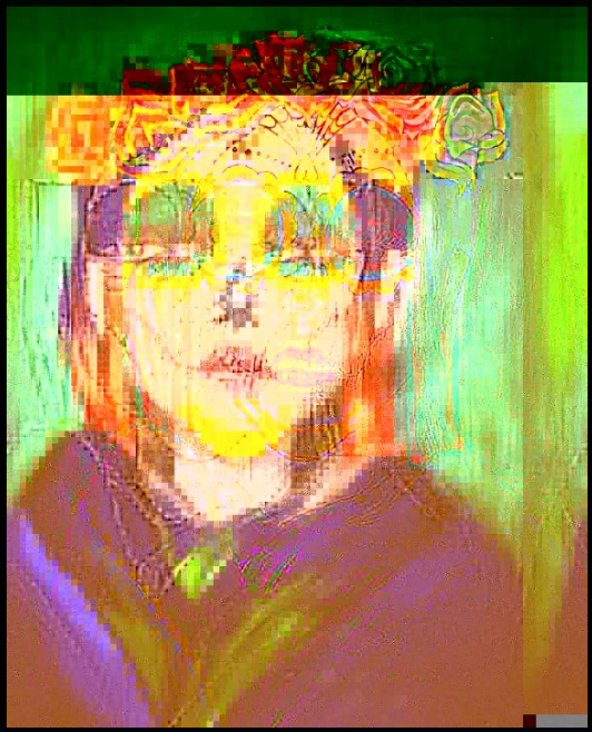
I selected this image to represent my work as it expresses my current practice and illustrates a number of areas I’m presently interested in. The words selected reflect on areas of my study. The observer is initially drawn toward the lightest parts of the image which in this event is the face. Their eye then observes the brighter hues for instance the purple clothing and green background. The yellow and purple contrast alongside each other, creating a fascinating composition. I’m enormously interested in vibrancy drawing the viewer into my work. I have been particularly involved with the awareness of terror and the mark produced in people’s memories from this. This is a glitched photograph of a painting I made of a woman I had a nightmare of.

Task 4

Choose one of the indie designers / developers and outline why there work and approach is of interest to you.

The indie designer I have chosen is Toby Fox for his work on Undertale, he stood out to me because he created the entire game alone along with a full sound track and graphics, although the graphics in the game aren’t the best for a game that came out in 2015, the whole game was made in the game engine “Game maker: Studio” and is available on multiple platforms including PS4, PS Vita and PC. I found it really interesting that he wanted to develop a role playing game that was different to the standard RPG that he said he found boring, he wanted likable and interesting characters and that “utilizes the medium as a storytelling device … instead of having the story and game play abstractions be completely separate”. Another thing that I like about Toby is that he decided to work on his game independently to avoid relying on others, this may have been the reason that the game took 2.7 years to create but I respect him for making the entire game independently. He even said that if he where to have an entire art team the character design would stay the same because he found that “there’s a psychological thread that says audiences become more attached to characters drawn simply rather than in detail” which I found very interesting.

Image result for toby fox Image result for undertale characters

(Toby Fox in top pic)

What do you think could be one of the most exciting indie projects that are in development?

One of the most exciting indie projects in development for me is probably TUNIC which is supposed to be released in 2018, not much about the game is known at the moment but after watching some clips of the game and an interview with the developer Andrew Shouldice, I am excited to play the game when it is released, it is a gorgeous Zelda type adventure game with the main character being a fox, There is only one trailer from E3 last year and the graphics look stunning, the game play smooth and the mechanics of the character seem to be fast and smooth from the trailer, although some games like No mans sky have made up things about there games at E3 and other game events so its best to not get your hopes too high. Essentially the game is about a small fox in a big world who is exploring the wilderness, discovering spooky ruins and fighting creatures from long ago, its soon to be released on most platforms such as PS4 XBOX ONE and PC.

Image result for Tunic game


AI

Whether or not emotive modelling should be part of NPC development is a difficult question to answer currently. And i do believe that it’s not exactly a yes or no question of whether it should have a place in games with NPCs and more of a question of should it be included in certain games. Emotive modelling means that the AI by having their own emotions can decide how they interact with the player and other NPCs. Now this could have serious impact on gameplay depending on the game and could be both positive and negative for the player. Imagine the player needs to talk to an NPC but that particular NPC was killed by another for somehow upsetting the other AI. Usually without this emotive modelling the NPCs wouldn’t be able to interact in this way. A good example is from the article below:

“There was one time I was playing a murder mystery game we had designed – and there was this doctor who came to diagnose how a character was murdered,” he says. “However, the doctor was being very rude to my character and kept making dismissive remarks. Initially I thought it was a bug because I knew the doctor’s personality was mostly pleasant, and I knew I hadn’t been rude to him. I thought, oh man, why is he being such an arsehole to me?
 
“I looked through the code and it turned out that much much earlier in the game I’d been rude to a servant during dinner, and the servant had gone into the kitchen and told the people there what a jerk I’d been – one of those people was the doctor. He remembered that.”

https://www.theguardian.com/technology/2016/oct/12/video-game-characters-emotional-ai-developers

In FFXV AI are present constantly, from start to finish of the game. Some with their own personalities and traits, and others who are simply background characters. From enemy AI to friendly characters the player meets on their journey. When playing the game you’ll notice you are accompanied by 3 AI companions, each with different traits and personalities. They’re aimed at bringing something unique to the team and keeping the player immersed. They’ll follow the player wherever the player goes and they’ll traverse environments and fight in different ways. They appear to be quite intelligent AI on the surface but they do have quite a few issues.

They can notoriously get stuck on objects in the environment which means the only way to free them is to progress a large distance and the game will teleport them to you. The enemy AI in the game is relatively simple as they only have one or two attacks each with the exception of the final boss. The final boss of the game tries to mimic the player by fighting with the same weapons as them and using the same attacks, however they don’t seem to learn at all during the fight.

Reflective Summary

Receiving and completing the tasks that have been set throughout the RCS module has allowed me to learn a lot about myself, my work ethic, and my understanding of different issues and subject matters within the fashion and textiles industry. Throughout the past few weeks I have been provided with a new set of challenges to overcome in order to successfully complete the tasks.

I found this module to be very interesting, the lectures to be engaging and the tasks to be well explained, presented and easily accessible when needed. I found some tasks to be easier than others but all to be pretty substantial and at an even skill level.  Going into this module I feel I already had a lot of experience with referencing because I learnt to Harvard reference and reference a range of different sources during my art and design diploma, despite this it was refreshing to have the importance of referencing explained to me going into this course, I also found the lecture on plagiarism to be a very useful reminder before starting our tasks, encouraging us to become more confident in our work and not to rely purely on the sources we find in relation to our tasks.

All of the tasks forced us to develop a collection of information from various different sources, living in the modern age I find it very difficult to steer away from looking purely at online sources, I am aware of the importance of looking at books, news articles and objects to back up your opinions and facts, however this is something I feel I haven’t achieved well throughout this module, therefore looking at both primary and secondary sources is something I would like to make a conscious effort to improve on next term.

Looking back I feel as though I struggled more with the long written tasks, even though I am fairly confident in my writing skills I feel it is important for me to fully understand what I am focusing my attention on to succeed to an extent I am happy with. I learnt that it was important for me to discuss the tasks and gather second opinions on my ideas before moving forward with a task. The ‘Ethics’ task was one of my favourite tasks because even though it was a longer task I felt as though I understood the brief to the best of my knowledge and was able to see many pathways and opportunities within a limited theme.

This module has been useful in helping me to focus on direction and format within my work, both written and practical, it has allowed me to think more about where I gather initial my sources from in each project or task that will benefit my studies in the near future. I was grateful that there was plenty of explanation and direction given to us to ensure we fully understood the tasks set but still containing plenty of balance which allowed me to be independent and original enough in my work.

TASK 7 & 8

‘Taste, Fashion and The French Fashion magazine’, by Sandra Miller delves into the rise of the first publicity of Fashion during the emergence of the 17th century, by which the age of enlightenment had much influence. The Age of Enlightenment (1685-1815) was marked by the influence of new era of thinking and changed mindsets.’ Ideas of politics, philosophy and art, to name a few, needed to be challenged, and fashion was one of them. The 1700s was the rise for France in fashion and it had become ‘the fashion capitol of the world’, so of the release of Le Mercure Galant was anticipated, however not well received and was ahead of its time.

This was due to the fact fashion during the early 18th century was only for the wealthy and elite. So, the gazette’s ideas of fashion or ‘taste’, were rejected, possibly due to the fact the sector was only limited to a small group of society and not deemed a posing enough category for debate.

However, ‘by the middle of the eighteenth century, fashionable dressing was no longer the exclusive privilege of the elite but something in which men and women of the middle class could indulge.’ Clothing became the mirror of one’s refinement, it was no longer the purposeful labourer clothes, and fashion became an art form. Which started the debate of ‘aesthetic contemplation to its subjective appreciation’. And for the magazine and others alike this took a hold a debate to what would be published and what is ‘tasteful’.

In the writing, it quoted David Hume who stated that ‘the great variety of Taste, as well as of opinion which prevails in the world, is too obvious not to have fallen under every one’s observation’ (Hume 1965:3). I think at this period it had come to agreement that everyone’s view of taste, and even art that ‘Beauty is in the eyes of the beholder’. So, magazines for fashion and lifestyle became more accepted, as tasteful and things considered untasteful, could still be shared, and rather appreciate the art for whatever it is considered. However, Edmund Burke later stated that he believed that the concept of taste is ‘no more than that faculty or those faculties of the mind’ (Burke 1990: 13), this means everyone has their own preferences and their own ideals of what ‘tasteful’ and therefore become biased with their own preferences to which tasteful should be. From this Hume also acknowledged critics to have a ‘delicacy of imagination’ also showing how individuals opinions are bias.

Furthermore, James Shelly states that ‘the eighteenth-century theory of taste held the judgment of beauty to be immediate; against egoism about virtue, it held the pleasure of beauty to be disinterested’ (Shelly 2009). This tells a story that this time, held judgement by other opinions and not by the technique or context of the artwork. Overall, I feel everyone has their own opinions to what is athletically pleasing artwork and to what is not. Everyone will always have their own taste and preferences, because that is what makes everyone individual. On the contrary though, I do understand where the likes of Hume and other opinions ventured from, as they tried to solve an unsolvable predicament to what makes art successful. At the end of the day art is to the value of its beholder and that could be priceless.


Plato.stanford.edu. (2017). The Concept of the Aesthetic (Stanford Encyclopedia of Philosophy). [online] Available at: https://plato.stanford.edu/entries/aesthetic-concept/  [Accessed 22 Nov. 2017].

History.com Staff (2009). Enlightenment. Available at: http://www.history.com/topics/enlightenment  [Accessed 06 December, 2017].

Jones, J.J. (2009) The Fleeting Art: Fashion and Culture in Eighteenth Century France. St.Leo: Julia Jones

Task 12 – Ambition: scale, texture and complexity in practice

The picture shown above is a quick sketch to illustrate my plan of making Hungarian Forints printed over with the face of George Soros taken from the infamous posters made by the Hungarian government to make Soros the boogie man of Hungary.

Continuing my work on the Soros posters made me curious about how further I could develop this project as I could clearly see more potential in this. Keeping the theme of having him present in our every-day life through political propaganda all the time and having him present in any space in Hungary I started to think about where to reuse his “iconic” image. I chose money because it is an object that is similar to advertisements and posters in that it is present in our every-day life. What’s more, we are forced to use money on a daily basis unable to escape it making it similar to the Hungarian government’s aggressive hate campaign in that context.

Having him present on Hungarian currency is especially ironic considering the fact that the government is demonizing him because of his status as an oligarch. By putting his image on Hungarian forints I put him on an imagined pedestal with other Hungarian people such as Count Istvan SzĂ©chenyi who has been presented with the title of The biggest Hungarian of all-time for his generous charities to develop and modernize Hungary in the 19’th century.

Despite all the criticism George Soros is the second biggest benefactor of Hungary till today. Next in line right after Count Széchenyi.

REFERENCES

444. (2017). KözlemĂ©nyt adott ki a Fidesz Soros György vĂ©delmĂ©ben! – 444. [online]
Available at: https://444.hu/2016/05/26/kozlemenyt-adott- ki-a- fidesz-soros- gyorgy-
vedelmeben [Accessed 7 Dec. 2017].

Kovåcs, Z., Woods, J., Kovåcs, Z., Kovåcs, Z., Kovåcs, Z., Györgyi, B., Kovåcs, Z., Lajtai-
SzabĂł, G., ErdƑ-BonyĂĄr, K., Mezei, L., News, D., BĂ©ni, A., Mezei, L., News, D., News, D.,
ErdƑ-Bonyár, K., Kovács, Z., ErdƑ-Bonyár, K. and News, D. (2017). DK: Orbán, Hungary
have lot to thank to Soros – Update – Daily News Hungary. [online] Daily News Hungary.
Available at: https://dailynewshungary.com/dk-orban- hungary-have- lot-to- thank-to- soros/
[Accessed 7 Dec. 2017].

summary of rcs

To be completely honest I can say I didn’t enjoy this at the beginning I found the researching tedious and in some cases irrelevant. I have never been the biggest writer so it was quite difficult to get into as well. Some weeks were definitely easier than others as I found the topics more interesting therefore it was easier to express my views and opinions and I feel this will be evident in my previous posts.

One of my least favourite is most likely evident as the Authenticity post. I did not enjoy this one at all it dragged out and was extremely boring to research. And as admittedly I don’t have the longest attention span this one was hard to complete.

On a more positive note one of my favourite posts would have to be the Publish or Perish. I enjoyed this one I’m not 100% sure I done it right but nether the less it was interesting to me to look at and express my opinions on some very interesting pieces of published media especially when I spoke about the comic ‘Batman: Hush’. I was able to speak about this with fondness as I very much enjoy the book.

Image result for martin luther kingThe Publish or Perish lecture was also one of my favourites for another reason. I found the section on Dr. Martin Luther King and Malcom X extremely interesting as I have looked into this a little myself and it was very insightful into the black history in America. This is a topic I find engaging as a young black man myself this relates to my history also.

Overall I did like the way we explored into each of the pathways throughout the course of the lectures. They are not all going to apply to me but I did get the much needed insight in order to help me make a decision for which I am going to choose. I do feel like the lectures were a bit too long on some days though. I feel as though there wasn’t enough information given to justify two hours of lecture. Especially with the Netflix show ‘Abstract: the art of Design’ don’t get me wrong I enjoyed watching the show but on occasion it wasn’t completely relevant and sections could of easily been skipped.

My personal take aways from the research and communication lectures are the ability to reference. I have never used this form of referencing before so it was a change but I see its importance to see where the information has been sourced from. Also the ability to find these sources that give valid information that I need. I will definitely be using these skills to improve my research in future projects making sure to use correct referencing.

Website title: Upload.wikimedia.org
URL: https://upload.wikimedia.org/wikipedia/commons/8/84/Martin_Luther_King_Jr_NYWTS.jpg

Task 5/6 – Reflective Writing

The first chapter from ‘Taste, Fashion and the French a Magazine’ by Sanda Miller addresses how “taste provides a rational universal basis which postulated an inborn faculty of taste deeming a beautiful object to a not so beautiful object” (Milller). It goes on to discuss philosophical aesthetics and how they have guided us in understanding our personal concepts of taste and the development of fashion magazines originating from the French Revolution.

Firstly Miller introduces how the first fashion magazine was produced in the 17th century by Jean du Vise who published ‘Le Mercure Galant’ consisting of articles, illustrations and addresses of ‘merchandes de mondes’ and therefore was considered to be the first form of publicity in the sector. Although short lived this first publication allowed people to gain an understanding of the emergence of fashion in media and advertisement. During the 18th century fashion magazines gained a higher status of the Enlightenment during the revolution due to their more intellectual profile.

The chapter goes onto discuss philosophical aesthetics and how they sought to understand how our experiences within beauty sets out to provide us with our own personal opinion, suggestively providing us with a reason as to why we acquire our own taste/aesthetic. This emerged as an enquiry into the concept of taste in order to deal with the shift in interest from aesthetic contemplation to subjective appreciation (the art work and our psychological response towards it). The subject of ‘taste’ began with British empiricist philosophers such as Anthony Ashley Cooper who sought to provide an answer as to why we seemingly have an emotional response to particular aesthetic experiences. David Hume investigated ways to come up with a more accurate definition as to why we seek a standard of taste proposing that ‘only a qualified observer is in a position to provide a proper verdict of the true standard of taste and beauty’(Hume) leaving a range of ongoing disagreements.

The concept in this chapter of fashion and taste being linked creates lots of room for discussion behind why we find things visually appealing and how trends are created due to a common denominator in our likes and dislikes. Furthermore the existence of personal opinion leads to the idea of ‘beauty is in the eye of the beholder’ (Kant) suggesting that everything is art, and everything is beautiful depending on who is making the judgement leaving this down the ‘the delicacy of the imagination’. The linking of fashion and taste has been used throughout history to elevate fashion above its current state.

In summary the emergence of taste in the fashion industry has led to wide success and has been greatly accepted in order to maintain a functioning status within the fabrication of the media. The concept of philosophical aesthetics brings a new light into how we engage in criticism and how this is applied in fashion.  I feel that in turn this was very beneficial and will continue to be revolutionary to fashion magazines. I appreciate the depth of the history and the discussions and points made about each statement and feel I have learnt a lot about the importance of taste in order to help the growth of the fashion magazine industry.

UI – HCI

Example of a good UI in a game would be Final Fantasy XV. This games UI does everything it should in a simplistic way for the player to understand. The information is presented and then removed when its not needed so that it doesn’t hinder the players experience and break immersion.

In a game such as FFXV colour is used to help the player keep track of their health. For example, the player will notice that when they are on low health their screen will go red alerting them that they need to heal. This is a subtle warning using colour to indicate the players health. Colour is also used another way in combat. It serves as a guide to which form of attacks the player should use on an enemy.
This is shown where when the player attacks an enemy, it shows a damage number in one of three colours (yellow, white, purple). White damage indicates to the player they are dealing moderate damage to their foe. Yellow damage shows that they are using a weapon that is effective against the enemy resulting in a higher damage number. Purple damage indicates that the form of attack they are using is not very effective as the enemy has a resistance to something you’re using.

Health – In FFXV, The bottom right of the screen displays each character in the parties health and the playable characters MP. As each character in the game is important, displaying every party members health is a crucial aspect in a battle. This feature allows the players to see which member of their team needs help and how much damage the enemies can do. When the player is attacked their health bar goes down and the number next to it (which represents their health) drops.
It also shows the players MP bar to let them know how much Magic they have left to use. This is crucial information for the game to help the player understand the game and strategize their gameplay. The health bar is easy to understand for anyone who’s playing the game as it has a very simple format which is similar to many past games and is also easy to understand even if you’ve never played a game before.

HCI – Human Augmentation.
As technology evolves over time, so does HCI. Virtual Reality (or VR) is one of the many ways that HCI is evolving. Virtual reality has been around for a very long time but recently huge strides have been made in helping to successfully enhance the experience. Just recently it was released to the public for use in games. VR has the ability to trick the mind into believing its somewhere else and change our perceptions. Its ability to do this means that people can experience things that they may never have the chance to. Below is a good article on how it is changing our world around us and some of the people responsible for this change.

http://www.bbc.co.uk/news/technology-36279855

TASK 5 & 6


For this task I decided to look at the work of Timorous Beasties, particularly this colourful print from the Omni Splatt collection.

Omni Splatt Wallpaper – Timorous Beasties WIDTH (MM) : 520 REPEAT (MM) : 1860


Bill Jenson’s abstract paintings are widely known for their profound sense of colour and unconventional compositions. His paintings came into prominence with “the return to painting” in the late 70s and early 80s. For Jenson, a painting is only successful when the artists ‘initial impulse and his material properties harmoniously converge.’ Often inspired by Chinese poetry and Buddhism he creates landscape-like abstractions, where shape, line, and intense colour follow unpredictable yet harmonious paths.

Jenson comments, ‘Change is good for art but hard on the artist,’ there

Locus 39″×32″ oil on linen 2001-2003. Courtesy of the artist and Mary Boone Gallery

fore has never really been interested in developing and maintaining his own signature style. I personally like Jenson’s ‘free’ approach to art, and being able to produce what you feel and not be categorized is an excellent way to create more unique pieces of art; all with their own individuality.  So much so, looking more deeply into this specific painting, you can see that individuality. It has allowed Jenson to explore contrasting colours, and freely play with lines. In this painting, I can see inspiration from India through the vibrant colours; it could almost be symbolising the Indian Holi festival. In India Holi is known as the festival of colours. The festival signifies the victory of good over evil, the arrival of spring, end of winter. Therefore, the painting I feel could be symbolistic of love and hope. The rich colours providing warmth and a sense of rejoicement. However, the enjoyment of Jenson’s piece is that it can signify many things. On a second glance, I see inspiration from urban streets, stimulated by vibrant graffiti. His work looks like layered graffiti motifs, with the bright blue at the top covering the hidden messages of the yellow and red paint. His brush strokes almost mimicking that of the smooth rounded outlet of a spray canister.


Brennan, M.B. (2003) The Brooklyn Rail. Available From: https://brooklynrail.org/2003/06/artseen/jensen [Accessed 2003]

Beasties. T.M. Omni Splatt Wallpaper. Available From: http://www.timorousbeasties.com/shop/wallcoverings/1822/omni-splatt/ [Accessed 2017]