Category Archives: Uncategorized

Do not use, you should categorize each and every post.

postmodernism Liu Xinyi

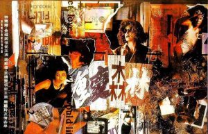
This is the poster of one of my favorite movies, chung king express, which has a really obvious style of postmodernism. The reason why I defined it to a postmodernism movie is mainly three, the first is that the movie has no definite theme, which means the audience can understand its meaning by themselves, in the other word, different audience can have totally different understanding after watching. The second one is that it distorts time. One of the most famous words in the movie is: ‘the closest distance between her and me is only 0.01 centimeters, and after 57 hours, I fell in love with the woman. But she was in love with another man after 6 hours.’ These are all damage to the continuity of time, which made the continuity of time is no more important, instead of it, the collage of each moments became the focus. The third reason is that movie can lead us to imagine a new city which doesn’t exist. The city in the movie isn’t the same one in real life, which is also the result of collage and reengineering. It is consistent with the repetition and no-source from Postmodernism. Everything is for audiences to think alone.

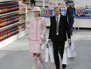
The photograph taken here is from the chanel fashion show 2014 fall/winter, this show is so unique from others, because Chanel decorated the show as a big supermarket, and all the goods in the supermarket were printed with the logo of brand. And all the models who should do catwalk all pretended to shopping in that supermarket. This innovative design connects high fashion and life. It effectively changed our ideas about that fashion is far away from normal life. Because the supermarket was really allowed to visit after the show, which caused that the authors, the audience, the curators, and the environment were all participants in that art work.

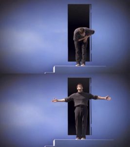
This is the photograph in the movie Truman show, which is about Truman finally decided to leave the ridiculous city he lived, which was a lie, his life was a show to everyone, in the other word, everyone in that town knew who he is instead of himself. Some comments about the film are mainly to criticize the unscrupulous modern media nowadays, and some others think that this movie has a deeper philosophy meaning: “Existence” is a fraud, “self” is a fraud, the world around you is carefully planned, and you are the pet. The environment around is objective existence but is an unsympathetic scam.


Liu Xinyi


http://bbs.tianya.cn/post-filmtv-48278-1.shtml, postmodernism in movie, 2003/3/5

https://baike.baidu.com/item/搎现代䞻äč‰/99666?fr=aladdin, postmodernism

https://www.weibo.com/bagszhuyejunlt?refer_flag=1001030102_&is_all=1&is_search=1&key_word=chanelè¶…ćž‚#_0, chanel fashion show fall/winter 2014, 2014/3/5

https://image.baidu.com/search/index?tn=baiduimage&ipn=r&ct=201326592&cl=2&fm=detail&lm=-1&st=-1&sf=2&fmq=&fm=detail&pv=&ic=0&nc=1&z=&se=&showtab=0&fb=0&width=&height=&face=0&istype=2&ie=utf-8&word=愚闚的䞖界, truman show

https://www.weibo.com/bagszhuyejunlt?refer_flag=1001030102_&is_all=1&is_search=1&key_word=chanelè¶…ćž‚#_0, chanel fashion show fall/winter 2014, 2014/3/5

https://www.weibo.com/u/5245303645?refer_flag=1001030102_&is_search=1&key_word=çŽ‹ćź¶ć«&is_all=1#_0, wang kar wai

Is it Possible to be Truly Authentic?

In my opinion authenticity is subjective. For example, if I were to create an entirely new piece of artwork, different to anything I had seen before, then I could be led to believe that I had created a completely authentic piece of art, but then, the first person I showed it to could tell me ‘oh yeah, that looks a lot like the work of so and so.’ My idea, therefore, isn’t authentic in the art world, but for me it was still an original idea. That is not to say that there is anything wrong with this happening, with the world population at 7.6 billion it is more than likely that a lot of the same ideas are re-used in infinite variations across the world.

‘Necessity is the mother of invention.’ I think this is very true of the artistic community, there is a necessity to find new and creative artworks and trends, as evidenced by the countless art movements. I believe that many of the principles of modernism are relevant to modern practice we should strive to do something new, but with the rich history of art it is hard to create work that is not an imitation of something else. This is becoming increasingly difficult in modern works as we gain inspiration from previous work. To take inspiration from previously existing work is still to create genuine and original artworks, but its authenticity does get dragged into question.

Publish or Perish

Planton, a photographer within the film Abstract quoted, ‘what’s important is the story, the message, the feeling, the connection, how do you make this reach people?’. This is very important to show through photography because it allows the photograph to tell their own story.

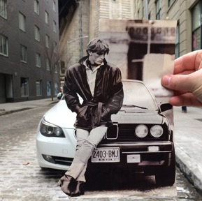
Kalen Hollomon is a photographer based in New York. He travels around with paper cut outs of photographs which fit perfectly into todays New York. His photographs each tell different stories by juxtaposing the past and present day, this creates an immediate connection with the audience and within the photograph as they contrast but also fit together so well.

“I am always concerned with what lies beneath the surface,” says Hollomon. “I hope to create conversation that is rooted in questions related to learned social rules, identity, the subtext of everyday situations and perception. Above all, I try to capture a sense of romance in images that are spontaneous and slightly unnerving.”

Selman Hosgör is a graphic designer and collage artist who mixes photography and illustration in his work. He tends to use ‘spirited colours’ throughout his art work; ‘they are the fruits of individualistic spontaneous inspiration’. This collection of work ‘Midnight in Woddy’s Colour’ is very vibrant and fun which gives the feeling of informality and humor. This sense of relaxation that the viewers gets allows them to connect with the images. The colours peruse happy and friendly vibes which allows the viewers to interact with the artwork.

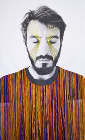
Victoria Villasana weaves colorful graphic patterns on portraits of people using colorful threads. She is influenced by different cultures and the human spirit, her creations focus on “the way people interact with each other in a fragmented and post-digital world.” This image is from one of her exhibitions at the Saatchi Gallery. She uses photographs of models with their eyes shut, ‘holding themselves in the intimate space between outer and inner identity’. The coloured string is to show a hidden strength, from the exposure of the model, but also a feeling of vulnerability shown by the viewers intake of the image itself.

Bibliography

Hollomon, K. (2015). Kalen Hollomon. Retrieved December 02, 2017, from Kalen Hollomon: http://www.kalenhollomon.com/work-1/#/thumb-ass/

Hosgor, S. (n.d.). Midnight in Woody’s Colours. Retrieved December 02, 2017, from Studio Selman Hosgor: http://www.selman-hosgor.com

Villasana, V. (2017, November 06). Altered States Saatchi Gallery Group Show. Retrieved December 02, 2017, from Victoria Villasana: https://victoriavillasana.com/category/work/original-work/

feedback Liu Xinyi

Till now, I have already finished three of my project which are graphic design, photography and motion design. I have to say that I learned a lot knowledge and skills during the past two months.

In graphic design, I’ve tried to do some creative design about English words, make some black-and-white posters by collage, then make them online with InDesign. I learned some information about typography and its history, and how to make a poster。 And hte process of making poster makes me learn how to put my own ideas into the posters, by putting the most important information which you want the audiences see first in the most prominent place. Moreover, I learned some basic skills about Photoshop, illustrator and InDesign. And I finished my first crit about those posters we made, this kind of crits every two week practiced our ability to show and explain our ideas to the audience. Since English is not my mother tongue, this is extremely useful for me to talk in front of people.

My second project is photography, which I’m interested in the most, I always preferred to use film camera to shoot in the past, so this is the first time I used a digital camera to photograph different objects. I also learned how to use lights to produce the light and shadow better and use the background of the scene to shoot a professional photo. What’s more, my impression about photography was that photography is an effective way to record life and reveal our inner thoughts. But after studying, I understand that it is also important to show the deep meaning behind each picture. And after all those objects we had to shoot, I found out I prefer the shooting of human portrait or their daily moment. Till now, photography is still my favorite part of studying, I might choose that as my second year project. In addiction, I did better and more fluently at my second crit than the first time.

My third project is motion graphic which I just finished last week, it is bit different from the other two because I never tried stuffs like that, making a simple animation. We use illustrator to play with two letters we picked in the beginning, stretch them and change the color, I used bright colors to make it more strongly visual. After this step, we set rhythm in another software, and add the sound to them. I have to admit that I was bit confused during that process, but the final work is better than what I expected.

This course has helped me improve the skill I already had, and has taught me new skills and knowledge which will help me in the future. But the ideas I’ve learned about art and design is more important. In general, the first lecture of each project was always about some basic theory, then we had to practice them to make sure we really get them, the fact is that both of them are really helpful and meaningful. I’ve enjoyed what I learned of graphic arts so far.


Liu Xinyi

Is Technology the Mortal Enemy of Art?

“Technology is the mortal enemy of art.”

I don’t entirely agree with this statement, I feel that technology is a tool of art such as a brush or a canvas. We live in an age where computer generated art and graphic effects can be used so readily to make new and different artworks that it would be foolish to boycott technology. One of the points made in the manifesto was that once someone has an idea it is easily mass produced and reused across the artistic community. However, plagiarism excluded, I think this is more of an argument for technology; it allows for more artists to experiment and push each ‘breakthrough’.

One argument for this notion would be made by John Berger in ‘Ways of Seeing’ that reproductions, whilst they free up art to a bigger audience, reduce the importance of the original. Also, that with reproductions it takes the image away from its intended setting. I can see that from a constructivist standpoint this would remove from the social element of art that they strived for. But, as we can see with the popularity of galleries there is still an interest in going to see art together and seeing the original version of a piece – the Mona Lisa in the Louvre for example is always a packed attraction, yet the view of it is probably better through a computer screen. Furthermore, with reproductions of art the audience can put together their own gallery of their chosen artworks in their own space, so whilst it removes from the artists intent it adds to the audiences viewing pleasure.

Research and Communication Review

I found Research and Communication very useful this semester and it has taught me many new skills which will be very helpful to me in the future.

The first task, Online resources I really enjoyed as I was able to research in to a subject area I found very interesting. It also made me realise what a useful webpage and online resources are and how important it is to find reliable information to use within my work. I found the session gave me good idea of what to look for when researching and how to figure out whether it’s a reliable source or not. I found it similar with the Harvard referencing as it made me look for information within webpages and articles I did not look for before.

I found I struggled with the visual research, as I could not find the exact sources that my chosen designer used. However, this then made me look further into the artists work and analysis it further and try and figure out what they were inspired by. This then made me aware of how the development process worked and how I could reflect this upon my portfolio projects.

When completing the reflective writing task, I struggled as I found it hard to write and give such a personal response. I believed I would find it hard to find other texts that related to my own argument and Barnard’s in Fashion as a Communication.  Although, I did struggle to understand the academic writing, which made less confident that my argument made sense, which is why I think that is why I found it hard to use other texts at first. However, after finding text which related to my points, I enjoyed completing the task and found it more interesting and is an area I would like to complete more research in the future.

I also found the ethics task very interesting as I disagreed strongly with Duncan Quinn’s advertisement, because of this I found the task easier than others, which could also be due to the broad range of similar arguments I found online. It also made me more aware of how there is ethical decisions to be made in all areas of work, which will be very beneficial to me in the future.

Throughout the module I did struggle as in some areas such as the reflective writing I found it hard to form my own points and physically explain them in written work. However, throughout the semester this has become easier for me and I know with further practice throughout the course I will improve.

In conclusion, I believe that this Research and Communication module has been very beneficial to me as it has taught me about how to analysis both visual and written work, which before I did struggle with. It has also given me more time management skills and made me more organised as I had work out how to fit in the work around the portfolio modules. Overall, I have really enjoyed this semester and look forward to continuing this further in semester two.


Task 2-

PRINCENTHAL, N. (2015)Agnes Martin Her Life and Art, London: Thames & Hudson.


This is a biography on Agnes Martins life as an artist, touching on abstractism and the history of female artists all over America. Nancy Princenthal is a critic based in New York, she writes regularly for ‘Art in America’ in which she is a former Senior Editor for. The book includes images throughout, of different pieces and images of her. The book is written chronologically, talking about Martins life from birth and throughout her career with all of the ups and downs.


From the book you can really get an understanding of Martins personality, her way of thinking and beliefs come across quite strongly from the outset, which I find is one of the most important things about the book because it makes it a lot more personal to the reader. Her take on abstractism was something that really intrigued me, when explaining her method of working she wrote ‘I paint from an image that comes into my mind because I want it’ which is something I was able to relate to, such a simple and to the point sentence was a lot more to me as a lot of my work is abstract and sometimes I find it difficult to put an explanation to it. The way Martin explains it shows that it is a case of more iimagination rather than subject, choosing to create something based of an image in your mind that you think would suit and be effective.


https://www.amazon.com/Agnes-Martin-Her-Life-Art/dp/0500093903

Task 5+6


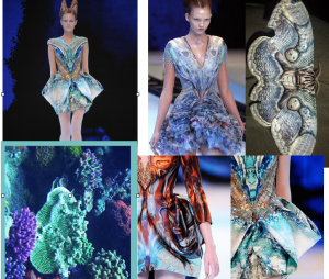
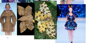
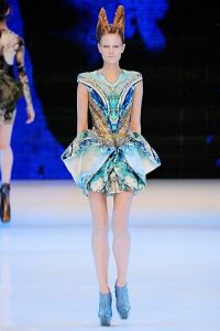
Alexander Mcqueen was renowned for creating innovative, unique and incredible designs influenced and inspired by multiple themes. In this collection, Platio Atlantis, was based on themes of natural life and Darwins theory of Evolution. Moths, Snake skins and marine life such as Corals with colours including blues, golds, greens and browns. In this particular image I am going to analyse the context behind this image and the garment being worn by the model. In this show the lighting and colours for background were dark to contrast against the light metallics in the garments and bright lights to show off the shoes. The show was set in an indoor arena in Paris to a select number of people. it was labelled as one of his most influential shows yet, but it is to be his last. The collection based on nature merged with Darwins 19th century theories on evolution, ‘Plato’s Atlantis – a reference to the legendary island described by the Greek philosopher, which sank into the sea – prophesied a future world in which ice caps would melt, seas would rise, and humanity would need to evolve in order to survive.’ (http://www.vam.ac.uk/museumofsavagebeauty/rel/encyclopedia-of-collections-platos-atlantis/) This dress in particular, has the model looking ‘alien’ and un-human like with pale skin and hair styled upwards. The shoes which are platform, lengthen the leg and runs seamlessly into the floor giving an unnatural look to the body. The dress works with pattern illusion to juxtaposition the body to make the dress flattering but working with complicated and computer printed designs of animal skin and natural textures. From this image and design tells the sort of man Mcqueen was and how he had a love for nature, possibly to fill this void that depression has left, as this was his last collection it had a significant effect on designers and started to talk about mental health in the industry.

bibliography :

http://www.vam.ac.uk/museumofsavagebeauty/rel/encyclopedia-of-collections-platos-atlantis/

Ethics

Duncan Quinn Advertisement 

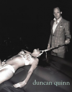
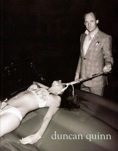
The image that I selected is the Duncan Quinn Advertisement for suits which involves a man standing over a body of women in her underwear, with a necktie around her neck which he is holding. This advertisement is unethical as the man is intended to appear superior and stronger than the women, it appears that Duncan Quinn wanted to use the advertisement to appeal to man wanting to appear and feel more masculine, however, by doing this he has created a sexist advert that implies the only way for man to be masculine and strong is to weaken a female.

It glamorizes domestic and sexual abuse, as the the women maybe considered a sex slave, this has is unethical and should not be a message promoted in a positive light within the media. Another message which could be put across is that it is encouraging men to value and want control over the sexuality of a women, as in the picture he has full control and there is a lack of consent seen from the women due to her body laid out on the car and her unconscious state.

This is irresponsible to have in an advertisement campaign as many consumers are highly influenced by advertisements they see in the media, so having this platform Duncan Quinn should have more consideration for what he published to the public. As media can have a great impact in the behaviour of consumers. And due to the high volume of subtle similar graphic messages within the fashion media it has become more acceptable to involve these ethical issues within advertisement campaigns. Therefore, affecting the view men have of women and this view has been considered by the Dr. Shari Miles- Cohen from the American Psychological Association (APA) who ‘explained that the inappropriate portrayal of women and girls in the media is not only negatively affecting women, but is also contributing to the misperception many men have about the female gender’. (Womenleadingchange ,2014) Overall, these messages are working against the steps towards full equality between sexes, and therefore should not be portrayed in a positive light.

The promotion could also affect the Dunn Quinn’s brand as from the public’s reaction to the campaign was not liked by many and having an offence message related to their name could reduce their customer base, as consumer will not buy from them due to what they perceive the company stands for because of their advertisement campaigns.

In conclusion, I believe that the aim of Dunn Quinn’s advertisement was make the man appear strong and masculine, by emphasising his power over the women within the photograph. However due to the strong influence advertisement can have it was irresponsible and unethical to promote a message. Overall, big brands such as Dunn Quinn who have the large platform that reaches so many consumers need to be more considerate when producing campaigns such as this as it can send negative messages and ideas into society.

Womenleadingchange (2014), The Sexualisation of Women and Girls. Available from: https://womenleadingchange.wordpress.com/2014/03/13/the-sexualization-of-women-and-girls/

Accessed-  01/12/2017

American Psychological Association, Dr. Shari Miles-Cohen. Available from:

http://www.apa.org/pi/women/programs/leadership/shari-miles-cohen.aspx

Accessed – 01/12/2017


Research & Communication Skills Task 9&10

This advertisement from Duncan Quinn presents us with the violent image of a woman wearing provocative lingerie and being strangled by a smug looking man using a necktie, across the bonnet of a car. The image, surprisingly is an advert for a 2008 suit collection and, judging by the image, it is trying to portray a brand of male dominance, but has taken this beyond what is considered ethical. The violent characteristics suggested of the man are not only inappropriate but extremely sexist and suggestive of female inferiority; advertising suits to men with desires of power both sexually and commercially. Any person reading the ‘about’ section of Duncan Quinn’s website would likely say that the description of Quinn is not far from the man in the advert: ‘He’s also been known to throw the occasional party, indulge in the odd cheeky lunch, drive too fast and enjoy life just a little too much in the company of his friends.’ This sounds like the stereotypical ‘womanizer’ characteristics and confirms the concepts suggested in the advert.

The advertising techniques used here, play on the male subconscious desires of power and brainwash men into believing that this violence they see is ‘acceptable’. This is damaging to viewers and has societal consequences surrounding sexism and the ways in which woman are victimised. Furthermore, the demoralizing effect of this advert makes women feel objectified, as if it is normal to be seen only for their body and be a faceless ‘object’, violated by men. It is troubling for this gesture to be made and this has the potential to cause major issues within the development of society; not only by making women feel disgusted and degraded but also damaging progress made in modern society around gender equality. I think it is also important to remember the effects this has on men who could feel offended by the campaign expressing the idea that men are violent and sexist. A respectful and moral man would not want to be associated with such a campaign doing the opposite of promoting the brand.

The advert also suggests to young, impressionable viewers that violence and victimising women is a way to gain power; this consequently has a damaging effect on younger generations whose morals are effected by influences they are exposed to. Also, with legality in mind, advertisement rules from the ASA read that ‘Marketing communications must not contain anything that is likely to cause serious or widespread offence. Particular care must be taken to avoid causing offence on the grounds of race, religion, gender, sexual orientation, disability or age.’. This advertisement is offensive to both religion and gender. Inappropriate themes in this advert are not needed to sell a product, there are endless possibilities of ways in which this advert could be much more appropriate, successful and classy without depicting such disrespectful and damaging imagery.


References:

Duncan Quin (2014) About. Available from:  http://duncanquinn.com/about/ [Accessed 30 November 2017]

ASA and CAP (2017) CAP Code 04 Harm and Offence. Available from: https://www.asa.org.uk/type/non_broadcast/code_section/04.html [Accessed 30 November 2017]