Category Archives: Uncategorized

Do not use, you should categorize each and every post.

task 9/10

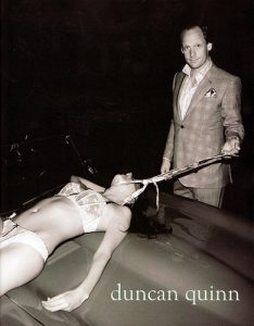
I decided to look at the image by Duncan Quinn as it was more distasteful to me. To me the image is worse than the other because of the dynamic between the guy and the girl in the photo. As a men’s suit company, I first would like to point out that there is no reason to have a woman in underwear in the photo at all. This is one of the first things that makes the picture seem that the man has grotesque hold over the woman in the image. This is unnecessary because the man is fully clothed why isn’t she.

The second is the way the woman is modelling is like she isn’t modelling at all her, the lifeless look to her body almost seems like she is died or as in I think the advert is trying to represent she has no control over her body. I particularly find this disturbing because I have had friends and heard stories of woman getting drugged in clubs and bars and thus having no control over the situation their in. this is one of the first indicators that this ad is showing sexual assault or rape. A totally immoral way to advertise a suit.

As I looked up this ad I found that it was advertised in fashion magazines. This worries me even more because these companies have effectively viewed this and given it the okay which means many leaders of business think there is nothing wrong with this image and the backlash came only after it was published. In an age where children and teenagers can practically access anything or see anything they want to use laptops or even reading a magazine in a dental practice. This means that this image would have been viewed by ages which have not thoroughly been taught about these issues and think parents would find this very worrying.

Also, the way her neck is held by the tie makes it look like the woman is in pain bringing in an element of torture to the picture. Draped across a sports car I wouldn’t be sure this is what company would want to associate with there image. It is effectively saying if you wear this suit you’ll be able to do this to a woman which would never be true. I look at this book called advertising and societies it said ‘They found that females are more likely to be places in submissive positions; females are more often sexually displayed; and females are often the subjects of violent imagery.’ basically saying that this image is not alone in its depiction of woman. Which makes it even worse that more and more brands have found it okay to depict woman in this way and in effect promote rape and sexual assault culture.

In conclusion the use of the woman draped naked on the car is totally unnecessary and sends the wrong message to the public. It tries to make rape and sexual assault culture look cool and thus making men feel like they can do it especially if it is shown in popular fashion magazines which is totally outrages.

Frith, K. and Mueller, B. (2010). Advertising and societies. New York [etc.]: Peter Lang, p.97.

comparing – task 2

T

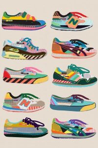
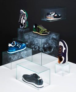
These two images are used for advertisement but they have both been created using different materials. Photography and illustration are a great way of advertising a product as they attract different target audience groups. The illustration has focused on using colour, shape and pattern whereas the photograph has kept it quite simple using smoke to highlight the shoe.

The photographer has tried to think of a way of making the trainers the focal point so they have used a black background and focused lighting. The illustrator has used a faded white background to bring out the colours of the trainers. If they wanted to focus on one shoe and brand they could repeat the shape but change the pattern and colours.

I have chosen these images as I am into illustrating over photographs and photography.I believe a mixture of both of these techniques within advertisement is very popular and successful within industries at this moment.

From my own love of trainers I am able to recognise the shoe brands in the illustration, however in the photograph it is harder to tell. i think this is important within advertisement, especially if there is no information or text added to the poster.

Bibliography

https://www.pinterest.co.uk/pin/155163149645020354/

https://www.pinterest.co.uk/pin/456130268499766360/

task 4 – is it possible to be truly authentic?

Over the past century art has developed, changed and become extensively popular within society. In this generation appearance is a major factor within our lives. Meaning our own appearance, the things we do, where we live and where we go are judged. We feel the pressure to fit in and copy others to earn a higher status. This means we are finding it hard to be authentic. We use a mixture of different materials to create a so called perfect appearance but lack to create our own.

Within the art world we are discovering new things every day. However, we struggle to make them popular so we refer to original ideas and techniques that have been successful in the past. As most people are thriving to be better and different there is such a struggle to be spotted amongst the crowd, so much so we end up losing our authenticity because we are too focused on being the best.

It is incredible how much art and fashion has changed over the years. We can see how different elements have reappeared within the modern day but adapted to fit in with today’s society. I believe we will struggle to be authentic within the next few years as we have discovered so much already. However, machines and technology are evolving and becoming more powerful then ever that we may discover new and much more modern styles that us humans haven’t been able to create or discover yet.

Counter Cultural Design – spirit, sensibility and meaning

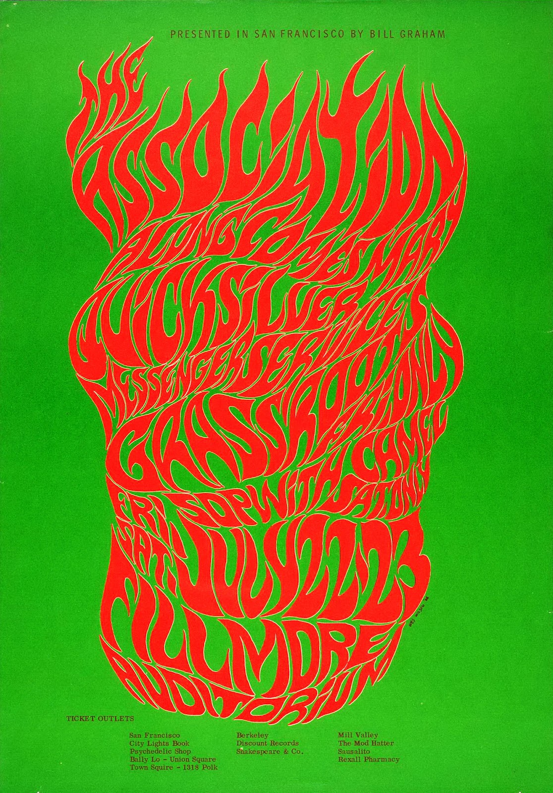
Wilson, W. (1966). BG-18. [screen printed poster] San Francisco

While I could have chosen any number of Wes Wilson concert event posters to make a point of how spirit and sensibility are key to effective graphic design, this one from 1966 perfectly compliments my favourite quote from legend Paula Scher: “Typography is painting with words”. This image embodies what made the psychedelic posters of the 60s and 70s so radical and that is their emphasis on feeling over rational design. As is the case with many of the posters Wilson made for concert promoter Bill Graham as well as with work from his counter-culture contemporaries Victor Moscoso and Rick Griffin, the typography is incredibly expressive, more so than legible. The fiery and free-form lettering evokes a wild sensation and does enough to illustrate the spirit of the advertised concert without any accompanying imagery and that is more important than abiding by traditional design conventions.


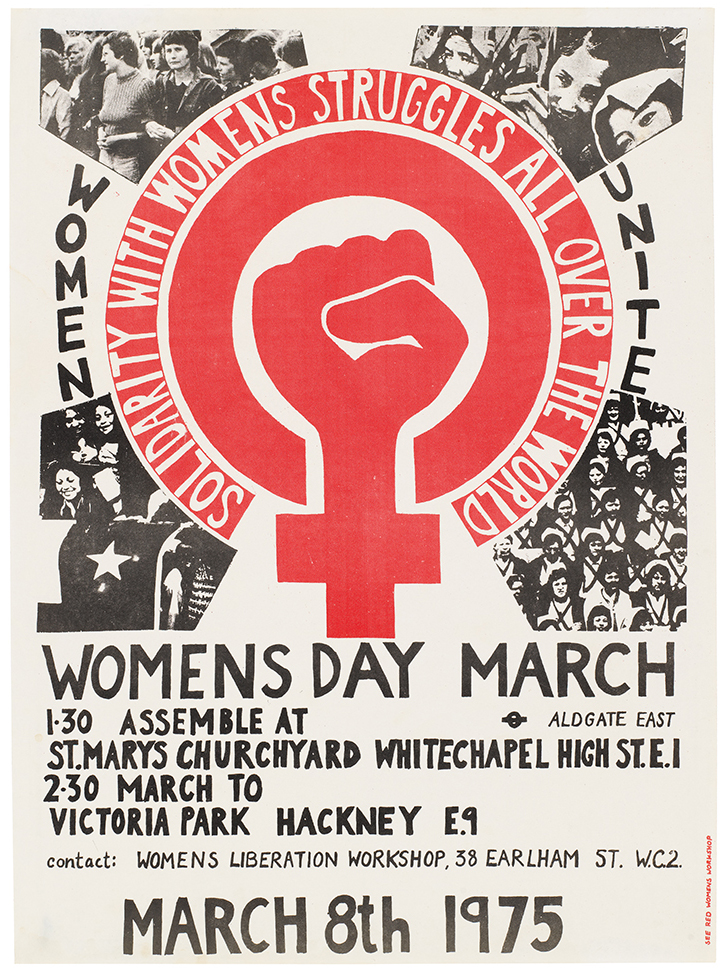
International Women’s Day Poster 1975. (1975). [Litho print poster] London.

This was the first design commissioned by the See Red Women’s Workshop and it boldly champions the grass-roots, populist spirit of the counter-culture movement that was occurring in 1970’s London. It’s imperfect hand-crafted aesthetic is key to it’s benevolent intentions and general sensibility. I believe that if someone sees an image that they believe could have been made by someone that shares their social class or situation then they will feel a natural appreciation towards the work. Though the production values of this poster may not have been a much of a choice at the time, they are what make this poster relevant to me in 2017. The meaning behind the sharp illustration is also a powerful aspect.


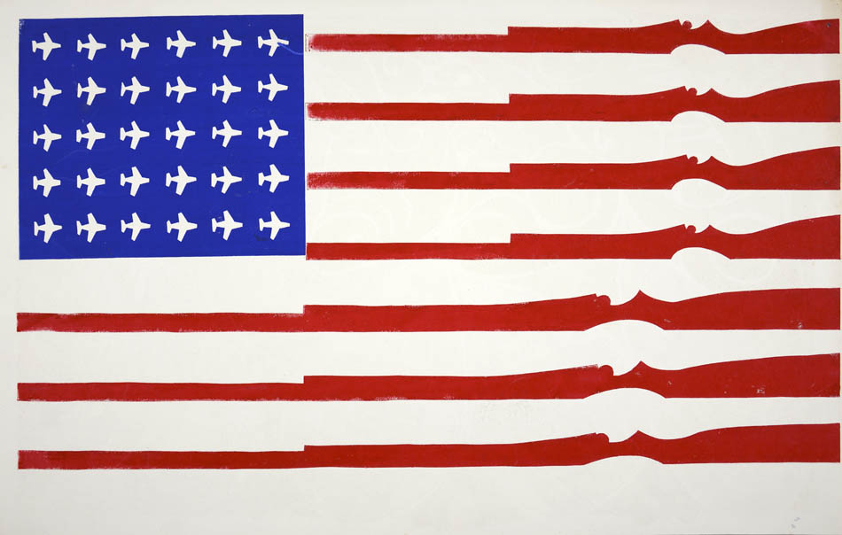
American Flag (untitled). (1970). [Screenprint on recycled calendar] Berkely, CA.

This is a potent image that conveys meaning through little detail and no words. Screen-printed by a student at California’s Berkeley university it conveys their feelings they had towards their country. The artist has vandalised the US flag with American tools of destruction, USAF MiG fighter planes being used in the escalating Vietnam war and national guard rifles, a common sight for many student protesters – “…We would go down to People’s Park and stick flowers in the national guard’s rifles.”


Abstract: The Art of Design, S01E08 – Paula Scher: Graphic Design. (2017). Directed by R. Press. Netflix.

Wes Wilson. (2017). Bill Graham Presents. [online] Available at: http://www.wes-wilson.com/bill-graham-presents.html

Bromwich, K. (2016). Poster power: 1970s anti-Vietnam war art by California students. [online] The Guardian. Available at: https://www.theguardian.com/artanddesign/2016/jan/30/poster-power-anti-vietnam-war-art-berkeley-california-students-exhibition-shapero-modern

Publish or Perish!

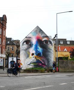
I love this piece by David Walker, whilst it has no specified meaning  I find it to be a celebration of the human face, adding colour and flair to an infinitely recognised image. ‘The truth claim of a resemblance to the person portrayed simultaneously coexists with a claim to the repression of interiority or spirituality.’  (Soussloff, 2006) The scale of his work is also very impressive, I am a fan of working on a large scale, and these images decorate an area, rather than being stuck on one wall in one gallery. It opens his art up to a much wider audience. He makes his pieces in spray paint, which is a fun medium to use, that I want to use more in my own work, and in doing so he is deconstructing the idea that spray paint is a “vandal’s medium”.
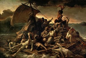


The ‘Raft of The Medusa’ by Theodore Gericault is one of my favourite paintings. Being a Romantic painting with has such bold colours and such a striking image. But Gericault went to extreme lengths to make his painting as true to the story as possible. Again, I really like the scale of the piece, the difference here being that Gericault painted in a lot more information, so you see more by looking about the image rather than being impressed by the sheer size of it, but the level of detail across such a large area add to its effect. I did my own version of this piece based on the Paris terror attacks, and I think it came out macabre, I think an artwork is a nice way of creating a memoriam, as well as to capture their story.

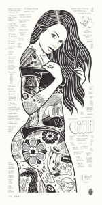
I enjoy the work of Mike Giant who makes little black and white graphic pieces.Being a tattoo and graffiti artist aswell he has quite a ‘tattoo’ aesthetic, but rather than just draw the tattoo design itself he is able to put them in place, as if he got to to tattoo them on an actual body. This also allows him to group together different tattoos and things to create an aesthetic for the piece. I think this is a nice touch and find it funny that these designs could easily become tattoos themselves.


Soussloff, C. (2006). The subject in art. Durham: Duke University Press.

Task 2

Brian O’Doherty (Also known as Patrick Ireland), is an Irish, art critic and writer born in 1928. His book Inside the White Cube: The Ideology of the Gallery Space is a collection of essays that appeared in Artforum Magazine in 1976, with those three issues being almost impossible to obtain, this book is highly commended in the art world. This expanded edition features ‘The Gallery as a Gesture’, a critically acclaimed piece written 10 years after the rest. Curators and other art writers considered his Inside the White Cube ‘one of the most influential and oft-quoted statements of it’s time’ (N. Fox, 2010). His poetic criticism and in-depth analysis  of 20th century art is still very much relevant today. With dry wit and educated curiosity, O’Doherty explores the crisis of Post-war and he relationship between the social, economical and aesthetic factors that held an importance over modern art in a gallery setting. In my honest opinion, I bit off a lot more than I could chew with this book as I struggled to understand the authors expansive vocabulary, this subsequently led me to looks up certain terminologies mentioned. Thus, learning a great deal of terminology, useful for writing about art and its theories, especially in a gallery context.

O’Doherty B. (2010) Inside the White Cube. Berkeley: University of California Press, p 12.

task 5/6

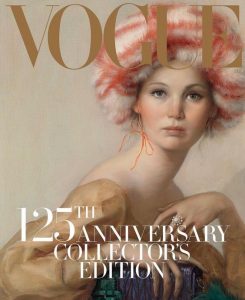
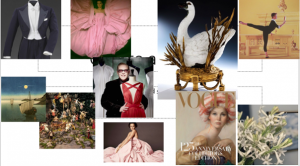
This image was made for the 125th issue of vogue I choose this image because of its uniqueness within the fashion industry and within magazines themselves. Vogue choose three people to create covers aside from some ordinary options such as the one by Annie Leibovitz, vogue choose painter John Currin for the job. In my head this reminds me of the original fashion magazines harking back to the late 17th and early 18th century which because of the lack of photography in the world would have been all drawn and painted. I love how at a time of celebrated such forward-thinking magazine such as vogue they glimpse back to there roots as a company. When looking up the artist influence I came across that he is often inspired by the renaissance era which I think you can see the links too in this picture because that era saw the progression in art to make things more realistic and often is thought to be a big turning point in art. I particularly like the mood of the painting Jennifer Lawrence the actress who is portrayed this painting seems to look innocent the colors used such as the pale pinks and the softness of her skin. But as well as this there is a strongness which I truly believe was provided from the accessories in which she is wearing and holding. The Miu Miu hat and bag portraying a sense of strength with the fur hat often associated with strong Russian characters and the bag with bold purples and green showing that she is not afraid make a statement and have colour in what she wears. In conclusion I think this is a very intelligent and interesting image by john currrin and a fantastic decision for vogue to have made and I can see how the many influence in this painting could influence a designer.

Wk 3 Avant Garde- technology is the mortal enemy of art

Traditional artist may come to the conclusion that technology is the enemy of art, because they feel that true art is organic and has come solely from the artist’s hand. But then you have to ask how far you can take that statement, the definition of technology is ‘The application of scientific knowledge’ Oxford English Dictionary, but then you wouldn’t be able to use paints because of the chemistry used to make them, you wouldn’t be able to use most materials. It seems that the traditional artist who still want to live in the renascence where only charcoal and oils were used. They have a bias against new ways of making art.
The Avant Garde movement was fighting against the people who don’t want art to move on, they did it by making art which had never been seen before, and showing the world that art is everywhere like Marcel Duchamp’s Fountain, it was a urinal, and it pushed the boundaries of what was to be considered art having something which was just a piece of technology be on display as art.
So in our modern age when programmes are made purely to make art with, is it the enemy of art? Artist don’t have to spend as much time in photo developing studios to get their images or take time making sure all of their work is straight, to me it is helping art.


Oxford English Dictionary, technology 2017

Fountain (Duchamp)(2017), Wikipedia, Available at: https://en.wikipedia.org/wiki/Fountain_(Duchamp)

Copyright and Originality

Copyright is one of these things that in concept should be quite easy to enforce, in reality however this is often not the case. In a world where everything is copyrighted it is often difficult to be original or create something that is truly original. We all become inspired by other’s work and that is never a bad thing the issue arises when we begin copying other’s work and claiming it is ours. This is why copyright laws where brought into place.

The Positives and Negatives of Copyright

Positive

Negative

Automatic Copyright Protection:

As a creator anything you create is automatically copyrighted. This is why it’s good practise to document and evidence your process.

Ambiguity: The Copyright laws at the moment can be vague and ambiguous allowing for some wiggle room on the definitions and terms. What defines fair use can often change. Cases such as “Ice Ice Baby” vs “Under Pressure” (Rolling Stone. 2017) constantly probe the definition of this term and bring it to the public eye.

Protects the Creator: Copyright is good because it protects works and makes sure the creator benefits from the use of their works. It protects their ownership of the item.

Limiting: Because everything is copyrighted it is becoming increasingly difficult to use others works in your own. This is often prevalent in the music industry when a similar beat or jingle is used.

Control: Copyright allows the original owner to have control over their work. If they object to the use of their work for any reason they have the right to stop their work being used. This is good because it means for things like music and Art the creator has a say in where and how these pieces are displayed.

Accidental Infringement: It sometimes occurs that an artist or musician will create a piece that accidently infringes copyright of someone else’s work. Now that copyright is an automatic thing it means that it is quite difficult to produce original work. It is why research is extremely important. Blurred lines is an exceptional example of this in action. (The Guardian, 2017)

So as we can see there are clear advantages and benefits from copyright law. There are, however, some very big problems with copyright. The major one being originality and ownership issues. Copyright stops people combining pre-generated artefacts to create something new. Everything now is automatically copyrighted, whether or not it has been shown or displayed. This is an issue as it means that being original is extremely difficult and even if you’re sure you made something original it could steal be infringing copyright laws accidently.

I think that in an age of immediate information and social media it is unlikely that anything is original anymore. We learn by copying and watching others, so by that logic everything we create is going to be heavily inspired by something else that we have seen or heard. I think the knack to making something seem original is do your research and try to abstract from the original source of information as much as possible.

C.S. Lewis writes, “Even in literature and art, no man who bothers about originality will ever be original: whereas if you simply try to tell the truth (without caring two-pence how often it has been told before) you will, nine times out of ten, become original without ever having noticed it.”(Lewis, C.S. 1973)


Sources

Pros & Cons of Copyright Laws | Your Business. 2017. Pros & Cons of Copyright Laws | Your Business. [ONLINE] Available at: https://yourbusiness.azcentral.com/pros-cons-copyright-laws-5170.html. [Accessed 06 December 2017].

Pros & Cons of Copyright Laws | Your Business. 2017. Pros & Cons of Copyright Laws | Your Business. [ONLINE] Available at: https://yourbusiness.azcentral.com/pros-cons-copyright-laws-5170.html. [Accessed 06 December 2017].

Business Insider. 2017. Nothing We Do Is Original Anymore, So Find Things Worth Imitating – Business Insider. [ONLINE] Available at: http://www.businessinsider.com/nothing-we-do-is-original-anymore-so-find-things-worth-imitating-2012-8?IR=T. [Accessed 06 December 2017].

Rolling Stone. 2017. Vanilla Ice vs. Queen and David Bowie (1990) | Songs on Trial: 10 Landmark Music Copyright Cases | Rolling Stone. [ONLINE] Available at: http://www.rollingstone.com/music/lists/songs-on-trial-10-landmark-music-copyright-cases-20160608/vanilla-ice-vs-queen-and-david-bowie-1990-20160608. [Accessed 06 December 2017].

Copyright, Designs and Patents Act 1988. 2017. Copyright, Designs and Patents Act 1988. [ONLINE] Available at: http://www.legislation.gov.uk/ukpga/1988/48/contents. [Accessed 06 December 2017].

The Guardian. 2017. Pharrell Williams and Robin Thicke to pay $7.4m to Marvin Gaye’s family over Blurred Lines | Music | The Guardian. [ONLINE] Available at: https://www.theguardian.com/music/2015/mar/10/blurred-lines-pharrell-robin-thicke-copied-marvin-gaye. [Accessed 06 December 2017].

Mere Christianity:

Ann, K., 1973. C. S. Lewis. Regal Books.


task 7 – publish or perish

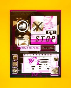
Barnbrook creates amazing graphic pieces full of colour, typography and his opinions. He uses a mixture of photography, 3D layouts and animation. Everyone one of his designs are different but his style remains the same. in this piece ‘Stop American Cultural Imperialism’, Jonathan expresses his negative opinion on Americas and their culture. He sets an image of Americans being greedy by using photographs of greasy fattening food and money. Using large typography he creates a strong message to the viewers that we must change the stereotypical view Americans. i believe this view on Americans is very dated and this opinion is beginning to fade as time goes on but this may be why Johnathan has used a dated style for this poster. During an interview with Sean O’Toole/Design Indaba Johnathan mentions “fonts are one of things that unconsciously show ‘the spirit of the age'”, which i strongly agree with.

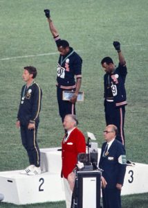
This photograph captured during the 1968 Mexican Olympic games of Tommie Smith and John Carlos is full of emotion and significance. The two American sprinters bow their heads and raise a black gloved fist to protest against racial discrimination. I am a strong believer in standing up for what you believe in and this is a perfect moment in history when this was performed. This was a very important moment for the sprinters as they planned and successfully carried out their peaceful protest during a time it would be seen by thousands of people. They had a dream and seized their moment and this beautiful image captures that.

Peter Kennard has created a series of photo-montages seeking to reflect his involvement in the anti-Vietnam war movement. This is an impressive and powerful piece of lithography. Using an image of the world draws in everyone and everything to the seriousness of the piece. I have an interest for war history and believe art like this is a great way of attracting the worlds attention to destressing issues like this.

Bibliography

‘Stop American Cultural Imperialism’, (1999), available at: http://www.barnbrook.net/work/virus-japan-poster/

The Design Virus, (6/12/17), available at: http://www.designindaba.com/articles/interviews/design-virus

Black power salute (1968) available at: https://en.wikipedia.org/wiki/1968_Olympics_Black_Power_salute

Peter Jennard, 2003, available at: https://www.pinterest.co.uk/pin/138626494755144527/