Category Archives: Uncategorized

Do not use, you should categorize each and every post.

Postmodernism

‘In art, postmodernism was specifically a reaction against modernism, which had dominated art theory and practice since the beginning of the twentieth century. The term postmodernism is also widely used to describe challenges and changes to the established structures and belief systems that took place in Western society and culture from the 1960s onwards.’ (Tate) Within the ‘classic’ style of post modernism design I think of the multiplicity that combines various styles into an ordered chaos including styles of ed fella, April Greiman and frank gehry.

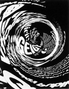
Designers deconstructed the norm and a paradigm shift began from straightforward answers in modernism to questioning what was in front of you in post modernism. German designer Wolfgang Weingart is a pioneer of graphic posters that used these ideologies into his practice. Getting rid of the grid system and ordered typography, shifting towards a fragmented design. Emphasizing on design for the designer rather than for the user. The focus of the work was

‘The semantic value of design, rather than its utilitarian qualities. In other words, it is the meaning of a product, rather than the uses to which it is put, that is the primary criterion in its conception and use.’(J.Heskett 2002)

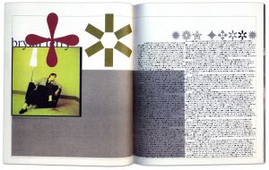
Another very good example of this is David Carsons spread on musician bryan ferry in ray gun magazine. Upon reading the article, Carson found it tiresome and so as a solution, he converted the text into Zapf Dingbats typeface, which is made up of symbols rather than letters. This was going against all the rules, leaving the article illegible and following the characteristics of post modernism. Nonetheless, the text was presented in an understandable font at the back of the issue with the asterisk motif.

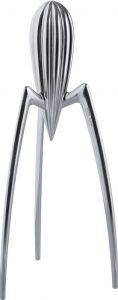
The Postmodern movement influenced the western world on a huge scale, from art, design and philosophy. Within product design, taking on the movement created open doors for designers to be free from their normal boundaries. Objects took on arbitrary forms, which favored form over function but justified by their meaning. Italian company Alessi along with a plethora of household utensils, presented the ‘Juicy Salif’ designed by Philippe Starck. Alessi describe the product as ‘A truly iconic object and symbol not only of Philippe Starck but of Alessi itself, this citrus squeezer – as revolutionary as it is surprisingly functional’ (Alessi) However the product is exceptionally lacking in its practical use and has become more of a fashion statement.

Alessi.com. (2017). Juicy Salif – ALESSI. [online] Available at: https://www.alessi.com/gb_en/juicy-salif.html [Accessed 6 Dec. 2017].

Carson, D. (n.d.). David Carson Ray Gun. [image] Available at: https://processandskills.com/2013/04/21/david-carson-and-his-notorious-use-of-dingbats/ [Accessed 6 Dec. 2017].

Csun.edu. (2017). David Carson. [online] Available at: http://www.csun.edu/~pjd77408/DrD/Art461/LecturesAll/Lectures/PublicationDesign/DigitalTimes/David-Carson.html [Accessed 6 Dec. 2017].

Heskett, J. (2002). Design: a very short introduction. New York: Oxford university press inc.,New York, p.38.

Juicy Salif. (n.d.). [image] Available at: http://store.alessi.com/aus/en-gb/catalog/detail/juicy-salif-citrus-squeezer/psjs [Accessed 6 Dec. 2017].

Tate. (2017). Postmodernism – Art Term | Tate. [online] Available at: http://www.tate.org.uk/art/art-terms/p/postmodernism [Accessed 5 Dec. 2017].

Weingart, W. (n.d.). [image] Available at: http://www.historygraphicdesign.com/the-age-of-information/postmodern-design/538-wolfgang-weingart [Accessed 6 Dec. 2017].

Task 9-

Banksy is a British street artist, working with spray paint his works are scattered across the world, but mostly in London and Bristol. Along with spray painting, he has also been involved in filmmaking and sculpture. With his work touching on political and social issues, he also does add a kind of humor, which leaves his work with an almost wit to it. This image for example shows how we have a huge amount of social issues at this moment it time, worrying more about how people online perceive us rather than the connections we are able to make in person. Which to me is actually a huge part of my growing up, with technology advancing people are more bothered about how they come across on social platforms and spend more time on their phones than actually speaking to each other. Banksy goes straight to the point with his work, not beating around the push or making it seem anything other than what it is. His brutality makes people intrigued as it is exactly how it is, along with this piece he has also done works that are controversial, such as one of a young boy who looks like he would be throwing something like a bottle during a protest of some sort, yet in his hand is flowers. Which is on the humorous side of his work, showing what things could change and how we would all be better off if that was the case, the lightheartedness contrasted with straight to the point means everyone can take something from his work.

http://designtaxi.com/news/393849/Banksy-s-Real-Identity-May-Finally-Have-Been-Revealed/


http://hubwav.com/banksy-posts-walled-off-hotel-official-instagram/

TASK 9

I’ve decided to look at the rise of pop art during the 50’s and most notably the 60’s. It started to gain traction during the 60’s throughout Britain and the United states. Artists that were active in this particular movement were drawing inspiration from there surroundings, our consumerist culture, so by taking imagery from mass culture they appropriated logos and imagery into there own work.

By focusing on mass produced works, Andy Warhol’s work would directly reflect the current state of mass communication in today’s society.

Young artists felt that what they were taught at art school and what they saw in museums did not have anything to do with their lives or the things they saw around them every day. Instead they turned to sources such as Hollywood movies, advertising, product packaging, pop music and comic books for their imagery.

It is therefore evident that Pop Art rose to power through the innovative technologies of that time, those that allowed us to reproduce on a wider scale. It should be noted that a major key player that gave rise to such a movement was Dada. Dada wasn’t exactly an artistic style, it was a nihilistic movement that rejected the current state of affairs, those young artists that were involved were anti-war due to the concerns with rising political tensions across seas at that time. Dada was breaching on surrealism, they rejected logic, capitalist society and in direct reaction to WW1, they pushed with irrationality which quite obviously contrasts capitalistic agendas.

Interestingly, we can see a positive correlation between the views of dadaist’s and those within Marxisms. The idea that capitalism is nothing but a greedy machine that pushes and pulls us to whatever ends, shows how they both would much rather accept a new state of economic conditions. It is clear in Marxism that the rich really do get richer by having private ownership

In Karl Marx’s view, the capitalists would eventually accumulate more and more capital impoverishing the working class, creating the social conditions for a revolution that would overthrow the institutions of capitalism.


Encyclopedia Britannica. 2017. Pop art | Characteristics, Facts, & Artists | Britannica.com. [ONLINE] Available at: https://www.britannica.com/art/Pop-art. [Accessed 06 December 2017].

Tate. 2017. Pop art – Art Term | Tate. [ONLINE] Available at: http://www.tate.org.uk/art/art-terms/p/pop-art. [Accessed 06 December 2017].

Anti-capitalism – Wikipedia. 2017. Anti-capitalism – Wikipedia. [ONLINE] Available at: https://en.wikipedia.org/wiki/Anti-capitalism. [Accessed 06 December 2017].

Task 12-

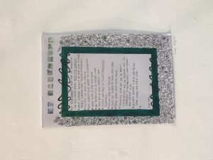
For my Manifesto project  I chose to do mine inspired by William Morris. I worked on A3 and created a boarder which was full of ivy and flowers, I knew the space for the project was going to be large, so I wasn’t sure about creating something too small as I thought it would have been drowned by the surrounding Manifestos. After placing my work up, I realised from where I had done it larger the boarder wasn’t as tight as I would have liked it to be, as I had more space to fill the ivy was loose and you could see gaps of the paper underneath, which isn’t how I wanted it too look.  If I were to change it I would defiantly make it smaller, as that means the illustrations around the edges would not have been so spread out and then it wouldn’t look as disorganised. With the colours as well, the one thing I can always notice is how it’s uneven, which if on a smaller scale I think I would have found it easier to create something that looked a bit more neater. 

Task 11-

Looking back on my blog I have seen my improvement within each task that I have done, with my vocabulary and the way I have gone about the layout of my work. From doing these tasks I have learnt a lot about what I am interested in and drawn too and the range of that is a lot wider than I originally thought, which has also helped within my other other projects to expand my practice. My blog will come in handy in the future with other things, I think it’ll be a really useful thing to have because of the research and information that I have made available for myself.


I have found artists that I wouldn’t have probably not come across, which takes me to different aspects of art within my own practice, as it has given me inspiration to try out new mediums that I wouldn’t have thought of if I hadn’t have come across it. In the future if I was to create my own blog, it wouldn’t be a daunting as I have now had the experience of what it is like to manage my work and make it flow together in a way that I feel comfortable and proud of. If I were to change anything about my blog, I would add more photos of my own work, whether it is large pieces or just small illustrations, I think it would have made it more personal, rather than just a few images and mostly writing.

Task 10-


Gentle

Striking

Different elements

Deep

Fluffy

Personal

Pure

Honest

Layered

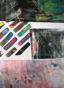
Within my work I focus a lot on colour and shape, I would call it abstract above anything else, when first starting uni I was focusing mostly using watercolours and I had never really used any other materials continuously beforehand other than that. Now most over my favourite work that I have done are either mixed media or acrylic paint, which before was something I never felt comfortable doing.

I explore tones and textures of colour, experimenting and seeing what different outcomes I can create also with looking at light and dark within the paintings I create. Acrylic paint is something I have grown to work with purely for the fact you can layer it to create a texture, I think having work that that has a literal feel as well as an emotional one is really important.

For the future I want to start working on a larger scale, exploring if my work has a different feel to it when done on a different scale, I want to challenge myself further to see what mediums work for me and what doesn’t. Katherina Grosse is one of the only artists who does her work on a very large scale and I still feel an emotion towards it, the colours may have a big part of that but I also think it’d due to the fact she uses whole rooms to create her work, not just a painting covering half a space.

Task 2 // Consume a Book

CLAYTON,E. (2017), Painting India, Italy, Lump Humphries

The book ‘Painting India’ consists a catalogue of Howard Hodgkin’s paintings, interviews, reminiscences and essays written by Eleanor Clayton and Shanay Jhaveri.  Hodgkin’s main source of inspiration is India ever since he visited it in 1964, he has a longstanding engagement with the country. He visited it for over 50 years travelling continuously making lifelong annual trips and produced more one hundred paintings.

Clayton discusses about how the ‘Somewhere else’ is India for Hodgkin. On how he felt highly productive in the environment. He believes that everyone has a somewhere else. I truly believe in that too, being in environment you feel comfortable in helps your think clearly and India was Hodgkin’s. She explains how Hodgkin grew passion and interest for India. How he falls for the usual clichĂ©s of India. I feel there is more than vivid colours about India such as the society, traditional values, religions and more. Hodgkin quotes “Many aspects of the subjects which I paint pictures about would lose their meaning if they were too specifically presented, and that’s why I’m forced into metaphor 
.a metaphor for emotion”(2017,p.15). I can understand on what he is trying to communicate, his paintings are abstract landscapes with gestural brush strokes. The layers within them evoke atmospheric conditions.

Jhaveri’s essay is on Hodgkin’s Indian Exchanges, meeting various Indian artists called Anish Kapoor, Dhruva Mistry, Mrinalini Mukherjee and much more. It also mentions about his and Khakhar’s friendship. It discovers why Hodgkin wanted more knowledge from Indian artists and explores on curating for the Six Indian Painters, hosted by the Tate Gallery, where he selected the artists along with Kapur.

Task 5-

Untitled (One Hundred Spaces) is currently apart of Rachel Whitereads exhibition at the tate, created using coloured resin she has moulded the underneath of a chair, which forms into a square objects with all of the different grooves within them due to the different chairs that she has used, you can see from the markings that some of the chairs were worn and old from the maybe not so perfect moulds. With each being different colours you can see a range of pastel tones, making the blocks seem almost transparent and very fragile, they reminded me almost of honey, from where you can see through them but it is hazy and very unclear.


The thing that drew me the most to these was that as a collective from afar you can see how similar they all are, harmonious together, then the close you get you can see each individual groove in the blocks, which makes them all suddenly separate from each other in one way or another. They way they were placed out showed each one for itself, with their spaces between being marked out evenly the show itself was satisfying before even seriously focusing on the main subject itself. After leaving the exhibition this piece always stuck in my mind, it inspired me with my own colours, making me think a lot more about how I wanted my work to compliment with other pieces that I would produce.

Final Summery

Through this course I have been able develop my knowledge of how to research different subjects, being given starting points meant I then had to learn how to use resources to get a deeper understanding of the topics. I learnt how to use the library by being able to look up books that are relevant to my work using the library sites online. I also had to learn how best to use the internet to get the most reliable information, the going right to the source (the artist page) although not always the easiest came with the best information. I have also learnt how to reference artists work and other information in the Harvard style.

I enjoyed learning about all of the different artistic movements, and how world events has moved artists to create new art that all has the feelings of the time. Learning the meaning behind the art made the art mean so much more than it did at face value. How so many different artists felt the same thing at the same time and felt the need to make art all with the same themes. Some of the art was directly made for these movements like the posters made by the students for the 1968 Paris protests. Then other art which was influenced by current events, DADA movement, people started making art which was so different to what was made before it was collages sound poetry sculptures photography, it was created as a reaction to the end of World War One, the art was without sense or logic it just expressed the artists deep sadness with war and violence.

I felt a lot of connection to art which has been created based on events which were happening at the time as that is what I have done in my previous work, I always prefer my work to have a political meaning to it no matter how serious. The art I felt most of a connection though was photographers like Nick Knight when he documented what it was like to be a skin head, him showing the skin heads as more than their violent reputation allows them to be was important to help get the public to be more comfortable around them. I feel connection to this piece of work specifically because I would like to be able to go into a group of people who are seen as outcasts and humanise them again though photography.

Overall I found this course beneficial to me and my writing skills, practicing how reseach different artists I wouldn’t normal of had looked into has been helpful so I feel more ready for when I have to write about artists I am using to influence my work in the future.

Skinhead (1982), Knight. N

summary post

Over the course of the research and communication skills sessions, I have made significant progress in both my analytical skills and technical writing. I have learned about the importance of research and artistic reference. Finally, I have learned about the correct method of referencing sources and crediting artists and researchers.

My analytical skills have been greatly improved by the tasks set. I have learned to engage in a piece of artwork, writing or media at a higher level and appreciate the choices of the creators more. For instance, in the first task, when reviewing the short film, ‘Terminal Bar’ by Stefan Nadelman, I had to analyse the film and its social and historical context before forming an opinion about the subject matter.

Another area that I have learned a lot about is communication through writing. I feel that a number of the writing tasks have required a development of my ability to communicate my own ideas and thoughts on certain subject matter as well as think critically and contextually about other work. An example of when I have had to use my communication skills is during the ‘story, message and feeling’ writing task when I had to analyse three published illustrative images and discuss their relevance to my own personal practice. In this task I had to understand both the artist’s given style and techniques, as well as the personal context for their work and then express my own opinion of the work. In this task I focussed on artists who have an illustrative focus around their work including Robert Crumb and Dan Hillier. In order to communicate the rational and ideas of the artists effectively, I first had to do extensive research into their own practices before referencing my own.

Research is one of the topics that I feel I have improved in the most over the course of these tasks. What I found difficult about effective research before was choosing appropriate sources that could be valid for use in a discussion. Also, finding enough relevant information to have a discussion about subject matter was also challenging. However, I think that the research tasks have dramatically improved my ability as a researcher, in that I now look for a mixture of sources including texts, books and websites. Also, I think that I have improved the quality and validity of the sources that I now use, looking for writers and authors who have specialist knowledge or qualifications in the given field of discussion.

Finally, I have learned how to use the Harvard referencing system when citing my personal research. This is a hugely important skill for critical writing tasks because it validated the sources I have used and strengthens any conclusions I have made that I have based on the information drawn from my sources. I have learned the importance of crediting the correct writers and including the dates the source was used in order to be able to compare them to other sources.

In conclusion, the writing tasks have lead to significant improvements in my analytical and critical thinking as well as my abilities as a writer. It has also strengthened my ability to cite research and credit sources.