Category Archives: Graphic Arts

This Category should be selected if you are a Graphics Arts student.

Terminal Bar

Terminal Bar is an award-winning American documentary short film directed by Stefan Nadelman. It is about a bar located in the Times Square in United States of America.

The entire documentary revolves around the owner of the bar and various customers of that bar. One of the thing that makes the documentary interesting is how the bartender, shot over 1,500 black and white portraits during his ten-year stint there from 1972-1982, and how those portraits are used in creating a film. The entire content of the movie is basically made of stills, black and white portraits, short scenes/interviews, audio, newspaper information and write ups, this is the reason that it is very interesting to see how a short film can be created using just these things. All the information presented in the movie is clearly understandable because of the way all the elements are presented and the way the information is zoomed in/out which makes it easier for the viewers to understand the visuals. One of the other interesting thing about the creation of this documentary is how the entire audio used in the film is connected to the content from starting till the ending, also the audio totally represents the hustle bustle life of New York City.

This documentary is a perfect example of how a short film can be created by using a proper combination of audio and visuals. For my projects, I could use a similar process of creating a layout that is particularly based on stills and text.

Final Summary

Throughout the research and communication I feel that I’ve developed my talents for analyzing an artist’s work. I believe that I look at artwork in a different way that before, such as previously I would see a piece and think about the way it was done, how they would have created it and what kind how art movement the artist would have followed, But now I have a deeper understanding of what this art represents and who did/ does effect and possibly inspire. For example the counter culture essay made me realize that the art wasn’t just about style or a fashionable trend to follow, but a symbol that fought against the way the system was running, anti war and a better way for the public to express how the people of there era felt, free, experimental and passivism.

I also revisited the artist Ai Weiwei that I’ve done work on before and seen a few exhibitions that he had done, one in the RA in London and another exhibition in Greece. I love seeing his work mainly on the basis that the final result isn’t what’s spectacular, although sometimes it is, but its what each piece resembles and his thought processes behind them is what really inspires me. I wrote about his dropping of the Han dynasty pot that I actually based a project on in my art foundation where I made a replica pot from clay then, purposefully, dropped it in a crit in front of my assessors to try and relive the scene, but that attitude in his art is what really attracts my attention because he had a one million pound pot that’s two thousand years old and he smashes it for a cause that he was passionate about and a cause that needed a shocking piece of art work to show the public that it was a big issue. Although after researching him this time I realized that there is a totally other side to his art that people really dislike, and its his arrogance. I noticed that people looked at that dropping of the pot as not helping the cause he wanted to expose, but endorsing it and having no shame in destroying a historical artifact, also having a very violent approach towards it.

I feel that in conclusion the Research and development tasks have helped me creatively write and take time in researching every aspect of a topic and seeing every side to an art piece. It’s given me a better understanding on how to be a better designer in many ways but to look at thing from different perspectives. After watching ‘the happy film’ by Stefan Sagmeister in one of our early lectures I understood that to be a better that great graphic designer you have to open your mind to different experiences to really understand something and put yourself in situations that affect your standard thought processes in a way that challenges it, and personally writing isn’t my strongest asset at all in comparison to doing physical work but doing the research and development tasks has defiantly improved my ability to assess and write about artist work.

Publish or Perish

I decided to choose David Carson for my first designer, and I chose him because, like me, he follows the culture in surfing and creates a lot of branding for surfing based company’s/ magazines. The work I in particularly liked was the designs on the surfboards themselves, because as a consumer of the products and also an admirer of the art that goes onto them, I felt that this had a very eye catching design and also minimal. You can see on the board that it follows Carsons style because he’s known for a controlled/ scattered approach to his work, for example a lot of his typography based work is revolving around a few key areas then has a lot of different sizing and overlapping. You can see that process in this board where the quality and thickness of line is different and dotted around in what appears to be random but also tastefully placed.

Stefan Sagmeister is a graphic designer that took my eye and the style that he has in his art really grabbed my attention, especially the album cover he made for the rolling stones, Bridges to Babylon. It made me look twice because I saw a similar approach to another piece he did where he cut out shapes on his face then put a background behind it and I thought it worked really well, yet this one I much prefer the design he cut out and the background compliments the key feature of the album cover, the lion. “I had to come up with an idea for that new brief in time for another meeting that same day” (Heraldsun.com.au, 2017) he also showed he had a talent for creating ideas quickly and has a total understanding of his niche which I very much respect.

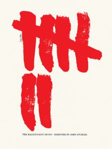
As I am a fan of a minimal approach to advertisement, I Thought Saul Bass’s posters for film were very clean and interesting. I personally liked the poster he made for ‘The Magnificent seven’ because of the striking red paint like strokes showing the number seven really makes you look and is easily distinguishable as that film after you’ve seen it once you’ll always recognize that it’s the film magnificent seven. It also doesn’t clutter your eyes with unneeded information just the key number that’s in the title is the only focal point and that is always easier to remember than a load of random images.

Week 5 – Sensibility, Spirit, and Meaning

Sensibility, spirit, and meaning
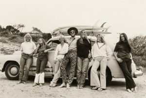
This image from the 1960’s is a photography based image that shows and has captures the spirit from that time. You are able to see the sensibility in this photo from the expressions on their faces. They are showing their emotion through their smiles, showing their sensitive sides. The meaning of the photograph is a group of people having fun, and it has been captured as a memory. This image is not in colour, however it is still able to capture the spirit that was happenings and going on at the time.
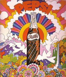
This image is from the 1960’s also and is an illustration culture based image. This image shows the same spirit as the previous image but through different ways. The spirit before was captures through the sensibility on the subjects faces, however it differs in this image. The sensibility comes from the colours in this image. The colours are so bright and vibrant it shows the meanings of the 1960’s, which is happy, bright, and spiritual. This particular illustration is for a Pepsi Cola advert so it needs to be bright to capture the audiences attention, personally I think it for fills its purpose.
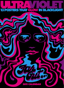
This image is a 1970’s culture poster which is from a series called “Black Light Posters”. This poster has an ultra violet theme to it. Only using pink, black, violet, and black in the poster, it is simple with the four colour use. Even though it is simple you still can understand the meaning, spirit, and sensibility behind the poster. This poster is different to the previous two because it is the most computer generate poster. The previous image was drawn then computer generated, then the first image is a photograph. The slickness of this poster allows the sensibility to be captured in a sense that it is slick, and professional allowing the audience to take the poster more serious.
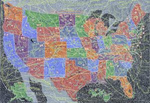
“Paula Scher” is an artist who did work similar to the second image. Her work is very colourful and the features stand out due to the colour. I am looking at the picture of the state map that she illustrated.

References: https://www.bing.com/images/search?view=detailV2&ccid=BEFCFJfO&id=5E473076FF9613134A40F75448609DD1A5BB9626&thid=OIP.BEFCFJfOBwcfqle0rY6wJAEsDI&q=1960+culture+photography&simid=608035365217307975&selectedIndex=5&ajaxhist=0

https://www.bing.com/images/search?view=detailV2&ccid=%2f3TA6qpS&id=DAC1EAC72E1F31A44E152F1D66AC8AFAE7195C47&thid=OIP._3TA6qpSHI08elyXWhjYCAEAEs&q=1960+culture+illustration&simid=608027526894846056&selectedIndex=2&ajaxhist=0

https://www.bing.com/images/search?view=detailV2&ccid=83%2f6KzAG&id=091CD56124874694978A3E2317EA4317C5F8F926&thid=OIP.83_6KzAGtZebkgZ0ht2xyAHaKO&q=70s+Black+Light+Posters&simid=608031353734956270&selectedIndex=4&ajaxhist=0

https://www.bing.com/images/search?view=detailV2&ccid=d7lnUXUE&id=62D66770A567787A5E28584CC5431E4A41F6A635&thid=OIP.d7lnUXUEMvDWTgVNt-i53wEsDO&q=Paula+Scher+state+map&simid=608043512782195110&selectedIndex=0&ajaxhist=0


 

counterculture


The counterculture emerged in early 1960s in USA and in UK, then spilled over into other western countries. The counterculture name suggest this is a culture that is against something but against what? In 1960s the cold war cold reached a climax with the Cuban Missile crisis with the world on verge of nuclear war. The newest generation come of age during this time and began to question the norms and values of their dominate culture. The different groups such as African Americans, woman’s, gays and lesbians began to demand their rights. Civil right and freedom of speech become central to creating a society that was more inclusive revolution and many of the protests began. So in principle the counterculture of the 1960s and early 1970s was thus a mixture of people, ideas, events, circumstances, and technological developments. These developments made exceptionally rapid change.  The new generation become rebellious by welcome sex, drugs and pop music.


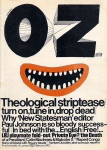
OZ magazine was an underground alternative magazine. OZ pushed the boundaries during a time of cultural and political upheaval. As times were changing and new generation were becoming more to new views.

This magazine is simplistic, relying heavily on typography. The most prominent feature is the cartoonish face in the middle, using the hand-rendered “OZ” as the eyes- thought simplistic in design and colour, this illustration works effectively in showing the tongue in cheek spirit of this underground publication. The rest of the poster is composed of typographic work, using only 2 typefaces decreasing in size. This heavy amount of information, conveyed mainly in Helvetica, contrasting with the illustration portrays the ideals and meaning behind Oz magazine – the combination of the crude culture of underground press and its hardline activist journalism.

Reference 

https://en.wikipedia.org/wiki/Counterculture_of_the_1960s

Menu homepage

https://www.theguardian.com/media/gallery/2017/sep/23/covering-the-counterculture-the-60s-underground-press-in-pictures

https://theconversation.com/oz-magazine-goes-digital-and-the-party-continues-29766

Summary

Throughout the research and communication lectures I have learnt a great deal of information. Each lecture we have learnt about significant movements throughout the years and furthermore, introduced me to new artists. Each week I have been able to see how art has evolved and its connection to current 21st century art. Personally I have a keen interest in Graphic Design however, these lectures have also introduced me to other mediums of art and allowed me to gain a great deal of inspiration from them. In addition It has also help me with my analysis skills and further encourage me to utilise the facilities that I have access to such as the library. Moreover, writing blog posts has also allowed me to progress in my essay writing as well as working on my time management skills.

These lectures have enabled me to progress within other aspects of this course as I have been able to see connections when I’m in lessons. I’m able to refer back to knowledge that I have gained within my research and communication lectures and response to work more clearly. This has been immensely helpful as it has allowed me to see how art is continuously inspired by past movements and artists. Furthermore, It has also shown me how current situations inspire art. To create and design something that is successful an artist needs to ensure that they’re fully aware of the context and purpose of what they’re designing. A clear and comprehensive understanding of theory allows artists to accomplish a successful design practice outcome. This is evident within the  postmodernism movement work, artists are aware of previous work and re appropriate it or create something new in the style of it – pop art for example.

Each lecture has been significant for my progress within this whole graphic arts course however, week 5 lecture regarding the ‘Underground Culture’ was one of the most inspiring. It motivated me to consider how I would design a piece of graphic design work. The work produced and shown during this lecture was all very vibrant and innovative. I could see various elements within the work that inspired me. Primarily the typography, it was playful and decorative which was ideal for the message that was being portrayed. What I gained from this lecture was the importance of ensuring you have a clear understanding of what you’re trying to communicate. Furthermore, it also encourages me to be more inventive with my design work. When I consider graphic design I think about clean, clear, sophisticated work mostly computer based. However, I now deliberate on whether I could create my own typeface. If it doesn’t confuse the message that I am trying to convey then I don’t necessarily have to with default use a font found on computer design software. Moreover, the lecture also inspired me to think about layout and composition. The alignment of elements of the artwork can help the final outcome as it can make or break how successful the work is. For example if a piece of design is primarily text then you can play around with that and manipulate the text to mimic shape.

Overall, the lectures have given me important knowledge and allowed me to work on my research and writing skills. I’m able to take what I’ve learnt into my other lessons to expand on my practice work.

final summary

From doing these blogs over the past few weeks I have learnt how to constructively create my own opinions on subjects and correctly respond to the questions given I have done this by not only including my own opinions into the blogs, but also researching the subject of the task. I have also learnt from these lectures how to evaluate the work of artists and create an informed written argument of the work they have produced by commenting on the way the work has been made and how it may be relevant to my work as a practitioner.

I have seen the connections between the lectures and how they all link as I’ve noticed we are almost being taken through the time line of art starting from the early 20th century, starting with abstract art all the way through to post modernism. Also, I have noticed with the ideas and my developing practice is that by going through the timeline of art it is extending my knowledge into the history of art and how it’s developed over the years. When doing these blogs, I have been constantly referring back to different notes from other lectures which is almost linking them all together so they flow nicely and make sense.

Theory is the before bit where you plan and research before doing the practical part, this is the connection between the two because it is very difficult to do one of those without the other as you can’t really make a piece without the evidence of planning as people want to know and understand the reasons behind your work otherwise they wouldn’t understand why you have done what you have done. In some cases, it is possible to just do the theory side of things, but again people will want to understand why you may have not completed the work and by showing them that you end up creating a piece to support that evidence.

A key part from the lectures that I have taken and how it has helped my studio based practice is the Netflix series “Abstract: The art of design” that we have watched in some of our lectures because I feel like this has really helped me as a practitioner to see inside the minds of different artists and how they work. In the series, they don’t just focus on what form of art, but many and so far, I have watched the illustrator, stage designer, graphic designer and photographer. I have found this to be helpful as in my studio based practice I look into these practitioners and research them for my theory side of my work to support my evidence in my sketchbooks. Not only that, but I also visually enjoy their work and how they explain the reasons for the work they created.

500 word summary

These past 9 weeks have really been educational teaching me the importance of research in my work and how it can shape me as a contemporary practitioner in the future. The research lectures have taught me the history of art and design engaging me in the different art movements through the years and the relevance it had in society. Having this new found knowledge of different art movements it has defiantly given me a new perspective in design and has widen my understanding of what good design looks like. As well as the different movements we had sets of new artists, photographers, illustrators and graphic designers that I found greatly inspirational seeing all the different piece of art gave me a whole catalog of work I could reference and use in my own personal work to develop my style. 

Having had this research and communication skills course it has prepared me for the second semester developing my skills in researching knowing where to look for information in the library, being able to use the facilities effectively and also going online and finding resources and being able to properly reference them using the Harvard referencing. Taking on board everything I have learnt hopefully I can use my skills to to refine my work using research to get a better understanding questioning my work and using the resource I have found to help refer and develop my idea hopefully allowing me to create more in-depth and visually interesting work.

In our publish or perish lecture I was most interested when we watched a video about Platon a photograph on the Netflix series Abstract. In the video Platon says “Taking a picture is technical but 99.9% is spent on the connection” this reminded me that all the software and techniques we learn about is only a small fraction of are working and we have to develop are way of thinking and working to utilise these tools effectively. Story, message, feeling and connection where important roles in Platon’s work shaping the way it looks. By having all this home work of information behind each photo creates a something that speaks to the viewer using only a single frame.

The importance of connection and feeling was reinforced when I had to write up about the publish and perish blog. When I was looking for published work I found two pice that really spoke to me the Bloomberg business week cover titled no apologies and the International Society for Human Rights poster about children victim from the war. For both these piece I read a lot of articles and news stories about each event and really got engaged and interested with the research I was doing. By doing this blog write up it has shown me the importance of message and content behind my own practice.

I think overall the research lecture skills have widen my knowledge in art, expanded my catalogue of artist I’m inspired by and improved my way of researching and approaching my practice.


Authenticity

What does authenticity mean? The dictionary describes it as “of undisputed origin and not a copy; genuine”. Meaning being real and true.

To be authentic in todays creative industry is is harder then before; the development of social media has influence more artist to create amazing art/ design. Now day finding and sharing an art work has become earlier. The positive side is more people are being inspired through social media, and it has influences people to create they own creative medium. Internet has allowed us to share our creative skill meaning most of your work is inspired by someone or something. Therefore, in my opinion to be truly authentic in today’s world can be challenging but not impossible.

During the early development of the Modernism movement Paul Strand was one of the greatest and most influential photographers of the the 20th century whose images have captures abstract viewpoints also defined the way fine art and documentary photography is understood and practised today. Edward Hopper was influenced by this style and produced paintings with a similar effect.

This is relevant today because modernism as a principle strips away old convention to the bare bones of simple style in pursuit of making new, this still holds value in modern practice, we see these principles in our everyday lives with the use of abstraction and sans serif design.

The argument to Hoppers authenticity could be the differences in subject matter and media. He was influenced by an artists work but interpreted with his own style and ideas to create an original concept.

I think it is impossible to be truly authentic; we learn from history with even new ideas and styles can be related to another even subconsciously in some way.

reference 

http://www.jobdig.com/articles/1778/What_Does_it_Mean_to_be_Authentic%3F.html

task 7

My interests as a practitioner mainly consist of photography and illustrative pieces, especially portraits.


I chose a piece made by Chuck Close “self-portrait” I chose this as portraits are relevant to my interests as it is something I really enjoy; Chuck Close is also an artist whom I have admired for many years. I enjoy his work because I find his piece always tell a story within them as he only ever draws friends and family, or himself so he’s always got that connection with his pieces as they are close to his heart and knows them more on a personal level which he may not have had with strangers.

Close, C. (2004). self-portrait. [oil on canvas].


Another artists whose work I really enjoy is Cristina Troufas. I really enjoy her unfinished paintings that she paints onto a coloured background that contrast her work. I like this because it’s different to other work as by giving it the unfinished look especially when it’s the clothes she doesn’t finish it gets you to focus more on the people in the piece allowing a connection between the viewer and artwork.  “The painter uses simple lines and negative space to punctuate her compositions, choosing to highlight the flesh which makes her figures essentially human.” Lesley Frenz, 2012, artsyforager.com.


Troufa, C, (date unknown) pedestal. [Acrylic on canvas]


Platon, (2007) Vladimir Putin, president of Russia. [photography]


Breaking away from the illustrative side I looked into ‘Platon’, a famous photographer. In a previous lecture, we watched a documentary on him and his work and I found him really interesting in the way he works with his models. Platon likes to make sure he has that connection with his model when working with them and by doing this he asks them questions about their life whilst he takes the pictures to show this emotional side otherwise people when looking at his work won’t feel this connection with his pieces, I feel as this quote from his documentary supports my opinion best “taking a picture is very technical, but 99.9% is spent on this connection that allows me to reach someone. And through that connection, there’s just a chance you’re going to feel something too.”  Platon, 2017  , abstract: the art of design.