Category Archives: Fine Art

This Category should be selected if you are a Fine Art student.

Kerry Mercer – Research and communication skills / Task 8

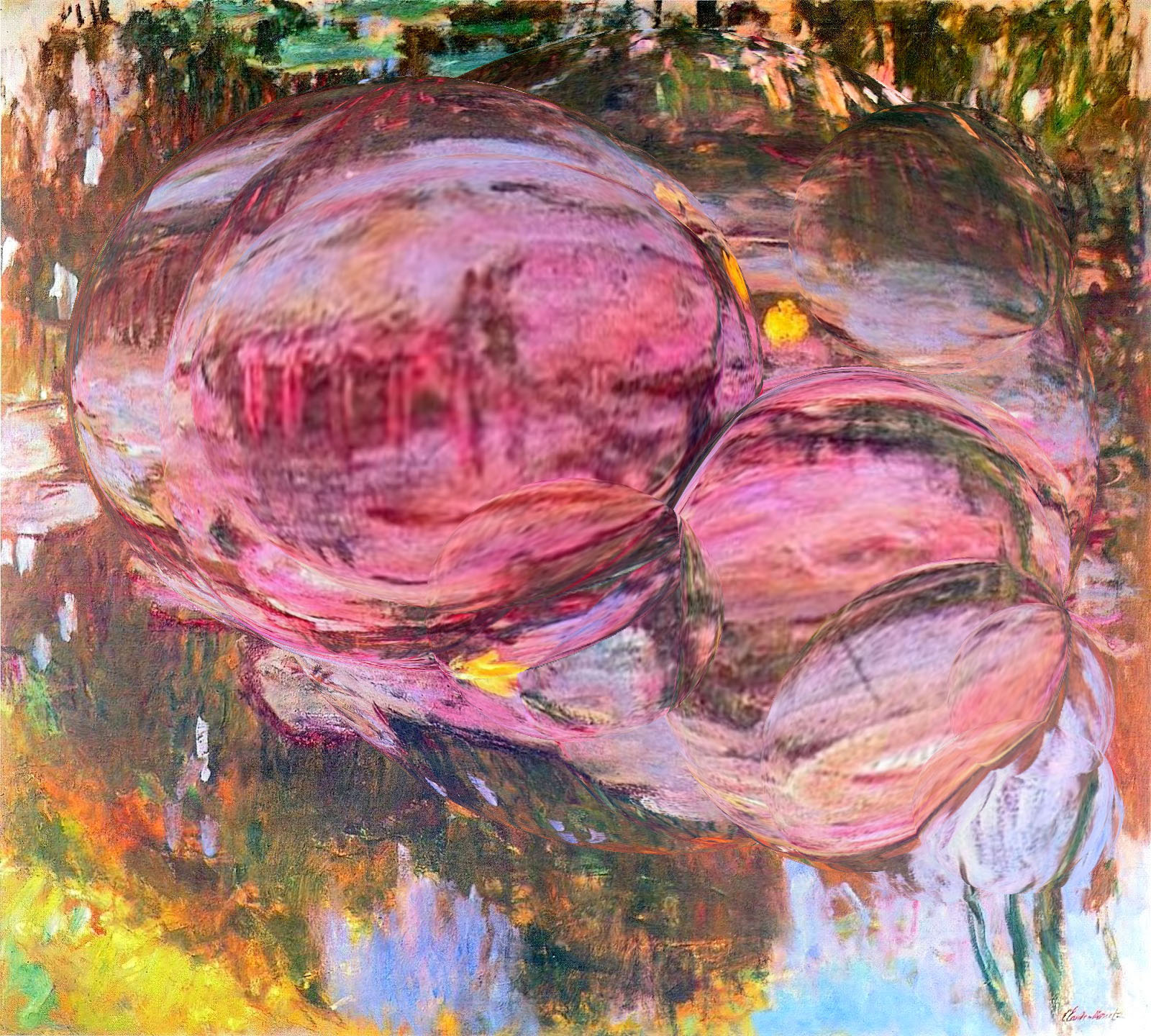
As previously talked about within my blog, I’m very much interested in making people question what they see. Currently within my work I’m looking to use a double convex glass and using that to view a scene. This has been inspired from the 17th century notion of the ‘Claude glass’ which originates from Claude Lorrain’s curved style of work (1). Often just referred to as a black mirror, it was used for sketching and examining landscapes. This gives a slightly distorted image when looking through it, which is something I wanted to replicate here.

The image I’ve appropriated is one of Monet’s Water Lillie series. I used this painting as it already gives an unrealistic impression when depicting water lilies, using warm vibrant hues instead of the traditional subtle blue ones. To replicate something like the Claude glass effect, I used photoshop to ‘spherize’ multiple sections of the image. I layered this to create an over-emphasised representation and to show the obvious distortion. This only became more apparent with Monet’s signature expressive brush strokes being blown out of proportion. For me, this shows how modern pre-industrial art can be altered and disfigured by 21st century technology. It also questions whether you can still call this one of Monet’s paintings now it’s been digitally altered.


Bibliography

(1) https://en.wikipedia.org/wiki/Claude_glass – reference to the ‘Claude glass’ origin

Task 9 – Philosophy, Theory and Politics

Hollywood Africans, 1983

In his painting, ‘Hollywood Africans’, New York-based artist Jean-Michel Basquiat depicts himself, alongside fellow experimental artist-musician Rammellzee and graffiti artist Toxic, both emerging figures in the underground music scene. Music was a powerful source of inspiration for Basquiat and the trio collaborated to produce the single ‘Beat Bop’ (1983). This was in the midst of the rise of hip-hop as a new movement and an increasingly powerful force in the 1980s.

The work is a powerful, unapologetic and striking depiction of the trio, the intensity of colour and high contrast of the electric blue on yellow, as well as the expressionist, trademark, gestural use of paint gives it what critic Skye Sherwin describes as a ‘raw energy’. Text dominates the canvas in the artist’s distinctive writing and particularly pertinent and shocking are the words ‘paw paw’ branded across the artist’s hand. As Sherwin notes, this references the ‘obscene view’ of black people as animals. ‘

Basquiat uses his work to critique the stereotyping and marginalisation of black artists across the arts industries. Many of the artists and musicians he admired and referenced in his work had suffered ‘extreme racial prejudice’ during their lifetimes; the title of this painting references the ‘inescapable racism’ in the film industry. Phrases such as ‘gangsterism’, ‘sugar cane’, and ‘tobacco’ allude to the lack of roles and opportunities for black actors.

Nathan Pine – Task 9


The work I have chosen to talk about is Duncan Grant ‘Bathing’ 1911. It depicts a scene of seven naked men diving into the sea, however it has been suggested it is a representation of a continuous movement of a single man diving into the sea.

The focus on male nudity has been argued that it was due to Grants homosexuality and therefore his attraction to males. This art piece was created in the wake of the French post-impressionist movement. The Post-Impressionist movement used a lot of arbitrary and unnatural colours as well as emphasised on geometric forms. You can see that this image was heavily influenced by Post-Impressionism with the unnatural colours and geometric forms of the sea.

Grant was also a member of the Bloomsbury group, which was a group of individuals with mixed fields of work such as: English writers, intellectuals, philosophers and artists. Their works and outlook deeply influenced literature, aesthetics, criticism, and economics as well as current attitudes towards feminism, pacifism, and sexuality. I strongly feel this artwork as well as some of his other works he created around the same time such as ‘Football’ 1911, made a positive impact on societies views on same sex attraction at the time and would have aided the more accepting view of the LGBTQ+ community of today.

Morgan Watson, Fine Art, Task 9

Heather Cassils’ ‘Becoming an Image’ reflective of Queer Theory and the Gender Binary

Cassils, a transgender bodybuilder from Montreal, states that “I resist the idea that you have to live as a man or as a woman;” immediately indicating that he resists the gender binary while referencing the ideologies of queer theory of which “challenges the cultural acceptance of heterosexuality as the only natural and normal sexual identity” (2) and the counteraction of the “expectation that two sexes exist” (2). This is especially evident in Cassils’ performance piece ‘Becoming an Image’ of which he explores the “senseless acts of violence against trans and queer bodies beyond the historical lens” (1) through the violent manipulation of a tonne clay block through the artist’s anatomically female body.

“It is with sweat, blood and sinew that I construct a visual critique and discourse around physical and gender ideologies and histories” (3) says Cassils of his piece. What the audience is allowed to see of his performance is almost a “series of “live” photographs” (1) due to the surroundings of the performance being totally dark; illuminated by “intermittent flashes of camera” (1). It could be interpreted that this visual stimulation could overwhelm the senses of the audience, imposing upon them the harsh realities of the LGBTQ+ community and the refusal to conform to the gender binary.


Bibliography:

Task 6 by Bianca Schmittmann

I create all sorts of works that are based off a narrative. My pieces range in scale and some are visually louder than others, which makes a large studio space very useful. In the future, my ideal way of working would be in a studio like a shed or warehouse big enough for all sorts of media. It would also be ideal if the studio had windows so sufficient light can help with how I work but also create an atmosphere when I work during the day. I mainly paint and draw, but sculpture, film and print are also media that I work with and might want to create more works with. I also work very spontaneously, so this large space would give me the freedom of working on whatever I want whenever I want and conveniently.

I’ve been inspired by Paula Rego’s practice and working in a studio filled with sets, props and puppets to physically build a narrative to then draw or paint. I have also occasionally started working in this way, to build and lay out what I will draw from which is why that space is important. As I am currently still developing my practice, this mode of practice is still subject to change.

Megan Fragopulu- Fine Art // Task 9

For this task I decided to use Cindy Shermans recent project of her instagram selfies. She uses different filters and effects to distort female faces.

I think that this project is really powerful and relates to the medias perception of women and how they have to constantly be put together and wear make up and have everything together all the time. By Cindy over editing the faces it adds a comical feel and look to the images which I really like. Also I think having the images uploaded to instagram rather than printed off or displayed in a gallery is really effective because she is challenging the media’s perception of woman in a direct way.

Task 8, Appropriation

Appropriation means the deliberate rework of pre-existing objects or images, with little transformation applied.

I chose to use Irving Penn’s photography of Lisa Fonassgrives, ‘From the Bygone’. His Images show a sense of simple and serious. He isolates the models and raises them to photographic perfection. His work is neat, smooth and elegant. Penn shows beauty within women with flawless skin with a strong and fierce look.

My idea was to take his photo and layer colourful collage over the top. Taking away the serious feel and replace it with a new meaning of beauty. Fun and excitement, showing no perfection, yet there is still beauty seen between the different shapes and colours. This helps to take away the idea of beauty being found only within the flawless.

By taking someone like Lisa Fonassgrives, I was able to almost abuse the iconic. Cutting out and drawing cartoon cigarettes and smoke, strong eyebrow designs and big lips, out of bold purples, yellows and oranges. I chose to use bold colours to one, make the drawings stand out strong and distort the images, to help ‘appropriate it’ in my perspective. The second reason was to take away the black and white that makes Penn’s images look so formal. The idea was to take away he edge and bring back the fun, while still showing natural beauty and style that the model has.

 https://fromthebygone.files.wordpress.com/2016/01/1953lisabypenn.jpg

https://www.google.co.uk/search?q=definition+appropriation+art&spell=1&sa=X&ved=0ahUKEwi0u_a8kLTXAhWpBcAKHT9xCMEQBQgmKAA&biw=930&bih=753

Task 7, Histories of art

Leo Steinberg, ‘From Other Criteria’, Published in 1972 relates to modernist work to changed continuum. The text explores and underlines the changes in viewing art in a typical indoor art gallery environment. The picture plan, referring to the physical surface of a painting, is seen as horizontal, rather than placing the work in an upright positing (vertical situation), this linking the work closer to the ‘human posture’. Although the text contains artist references throughout, which, as described, have influenced this particular movement in art, Steinberg’s text main focus lies upon the quotes of Jasper John, and the work of Robert Rauschenberg. Rauschenberg’s work is described as,

“Pictorial surface that would let the world in again”, “Abstract Expressionism” and referenced as, “The man who in his century has invented the most since Picasso”.

Richard Serra, ‘From the Yale Lecture’, written in 1990 focuses strongly upon the use, definitive and differences of site-specific and site-orientated. It also includes his opinions about modernist sculpture, and how the work is made to be site-orientated, which are built upon environmental components. His describes the work as,

“Giving the illusion of being autonomous from their surroundings”.

Serra talks about his interest in site-specific sculpture, and his idea that site-specific sculpture is a concept that can be verified within each case. The sculpture itself is its own evidence/backup. He describes it as “nothing to do with opinion or belief”.He suggests that there is something unique about the different type of sculptures made within the outside environment compared to sculptures made within the studio. With this he firmly states that a piece made within a studio cannot be made to be adjusted to a certain site.Serra then finishes the text by outlining his opinion on how corporate-funded sculptures make the artists “puppet creators”.

After looking back and summarizing the two texts it clear that both explore some major changes within art movement. They both cover the use of the way both artist and the public perceive the work within a gallery and the way in which we view public sculptures. Serra explores the use of out outdoor sculpture to move away from the ‘norm’, meaning a flatbed picture frame, spoken about by Steinberg. Similarly they both look into expanding artwork, bringing creations closer to life by making them in the third-dimension. However still linking them towards the way a viewer to perceive a painting. An example from Steinberg’s text is Rauschenberg’s submission of a canvas of square grass that is hung, vertically, from a wall. The square suggests a frame and the grass representing nature. This piece shows movement because it’s displayed in an unpopular way.


Click to access Harrison_Charles_Wood_Paul_eds_Art_in_Theory_1900-1990_An_Anthology_of_Changing_Ideas.pdf

Task 6, Mode of Practice

Mode of practice. It offers a way of considering the relations that occur within the process of making and developing a piece of work. Materials and tools are not just objectives to be used ‘instrumentally’; they are used to become one of/ with an artist’s creative intelligence. Their creative intelligence can be shown through the form of design, digital media, performance, music, painting, drawings and more.

My research for an idea of new concepts and methods starts with Jenny Saville. Her subject matter of her work deals with figure. She created work in which created a niche for overweigh and obese women [viii]. Alongside her artwork she reveals the models traumas, and how the rest of world preserves them.

Saville’s approach to painting is achieved with a traditional sense. She uses paintbrushes as her main tool. Her primary media is oil paint, applied onto canvas in a way which the viewer can see the brushstrokes and each colour. This helps to see her attention towards the detail of curves, jagged edges and lines painted of the human figure. I found an organic quality to Saville’s work, which made through the detail.

Saville inspired me to look into a practice that allowed me to depict the human figure of abnormality. Through abnormal brushstrokes, blank spaces and mixed media, including oil paints.

I started the development of practice with a simple outline of a female face, completed in charcoal. This give me a chance to see where I wanted the shading and heavy lines to be placed. It also allows the artist to express the facial features in fine, yet power detail. Giving the image an expressive appeal.

I then began to explore the range of dark tones. Applying dark reds, purples, pinks and browns on top of the darker shaded areas. Each brushstroke I made sure was clear and large, following the shape of the face. Then, while staying in the style/ practice of Saville, I added lighter shades of yellow, brown pinks and reds to help lift the figure off of the canvas.

The final touch to develop the practice further was adding another layer of charcoal. This increased the depth of shade between the figures hand and face, and also helped to outline to hair and define the facial features stronger.

Task 5, From the exhibition

In Particular this piece of artwork stood out for me, not just as an individual, but it did come (as it looked) in a pair. This piece was created by an artist called Pietro Calvi and titled, A Black Queen. 1881. Bronze, bust with white marble sculpture.

When looking at sculpture through an image,you can’t depict the sculpture’s texture or detail truly. In person, the sculpture seems to stand proud, yet sad when looking into the eyes. There is strong detail lining of the hair, crown and cape; as well as fine placement of rule jewels placed around the females neck. The black figure is prominently shown by the white of her clothes. Her ethnicity is pushed towards the foreground, which reminded me strongly of Kerry James Marshall’s work.

The sculpture Calvi studied at the Milan Academy was taught by Seleceroni Hid first creations were sculptures of Ophelia, and then moved on to specialize in coloured sculpture. This means the use of bronze and coloured marble. The bust is an example of this technique of marble and bronze. The work also stood out to me because in relation to the rest of the exhibition on Merton’s collection, Calvi’s piece rebelled against just looking into white power, and classic landscape scenes. His work wasn’t just a white bust, or a full nude female figure. It showed power and strength through contrast and detail.


https://it.wikipedia.org/wiki/Pietro_Fortunato_Calvi