
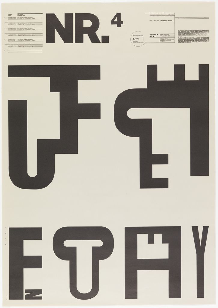
This poster was designed by Wolfgang Weingart who is an internationally known graphic designer and typographer. In addition, he is a postmodernism artist. This poster use different method to reorganize letters which is newfangled and attractive. The most important element of his projects is deconstructing. He is good at break the limits of media and technology and the conventional. His creative methods and media beyond the manual and mechanical to make typesetting, multiple film collage, photocopiers, letterpress and offset lithography. What’s more, He even attempted to use digital design tools. He broke the rules of typesetting including the dogma of the right angle, spacing out letters and words and creating stark typographic contrasts with the use of multiple type sizes at once. His flexible use of type and inventive choice of materials resulted in a distinctive visual quality in his (typo-)graphic composition. From his projects, I can see his understanding of freedom and the attitude of postmodernism artist
The designer of this image is April Greiman who is the student of Wolfgang Weingart. This image is that Greiman to design a page about the Walker Art Center for “Design Quarterly” magazine in 1986. She broken the traditional magazine form and created a 2×6 inch hinge. On the hinge, the designer’s nakedness is combined with multiple layers of text and images. In today’s view, Greiman’s use of the computer to create the work is not very noticeable, but then the computer only 1MB of memory, even black and white display is only 9 inch size. Greiman finished the hinge on the computer and printed it on the dot-matrix printer, and then instructed the print magazine workers to combine the pages and photos into a complete composition. She use different words to describe her work: “mixed images” “cross-media” “visual communication”, but she never calls it “graphic design”. The reason is that she thinks the most important thing of design is not pages but the space.

“Graphic design will be increasingly influenced by other media from outside of print, which will bring the most experimental and creative work, as the printing experience has previously”. Through this poster we can see that he is good at use chaotic typography and pattern to express the meaning and emotion, seemingly meaningless at the surface but holding a larger picture. Carson’s design has been assigned to the new life of words and he use his creative method to deconstruct the words, sentences, paragraphs and chapters. From his projects I learn about how to use type to stop the view of public.
http://www.famousgraphicdesigners.org/wolfgang-weingart
http://www.epubit.com.cn/article/947
https://www.ted.com/talks/david_carson_on_design