
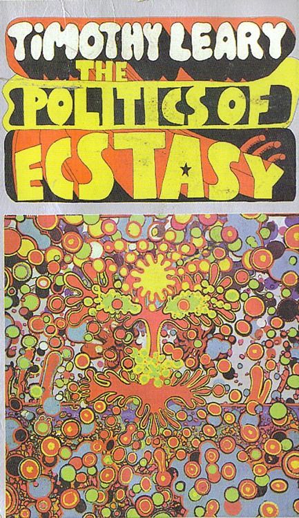
This image shows an illustrated idea of the effect of taking ecstasy, this isn’t the right message to be putting out as it makes it look fun and crazy to be taking drugs, the whole image doesn’t have any sensibility about it and is quite playful, especially as it uses different typefaces alongside many, many colours. The spirit of this piece shows that drug taking was a culture of the time making it common practice and not against any laws to create posters and advertisements like this to promote drug use. The meaning of this poster/book cover is to illustrate the ins and outs of taking ecstasy by the author Timothy Leary. The design of this is very true to the time using lots of bright colours and shapes, the layout also doesn’t have a uniform to it, this could relate to the use of the drugs in question.
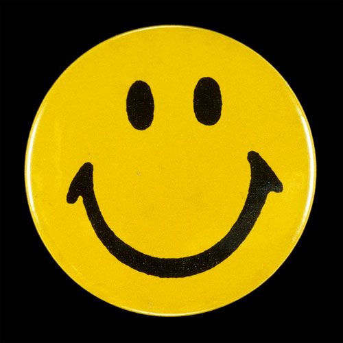
I quite like this piece as it is very simple and effective, using only three different colours, this was a logo that could be recreated very easily. On the other hand, this was the logo for the Acid drug taking group/culture which could be seen as a bad image. The circle in the middle of the square is very uniform and sensibly placed. This image shows a happy spirit which could be conveyed as the same as being happy when taking the drugs.
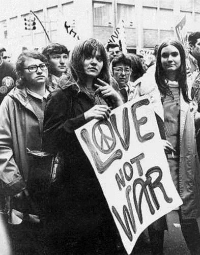
This photo above from the 1960’s shows a group of teenagers in protest of war in the very popular hippie movement. There Is sensibility in the photo as it seems to be a very peaceful protest, even including the peace symbol in the word Love on their poster. The people in the photo look very spiritual with the hippie movement and are quite content with the peaceful protesting to forward their opinion. In particular, the whole image taken in black and white, is aimed to focus on the poster in big black letters with the background mostly grey in colour to distract the viewer focus onto the centre and read the only type in the image.
references: