
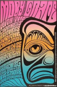
 The first counter-culture image which piqued my interest was a piece by artist Wes Wilson (1967). This poster appealed to me due to its highly illustrative style, evident in the bold psychedelic typography which fills the page with design – this is a style that I personally prefer, and shows clear sensibility to the aesthetics of the era. The contrast of the black outline against the warm gradient of colours works especially well, while variations in the thickness and direction of line show clear influence of the 60’s aesthetic.The tiki illustration paired with the hand-rendered lettering sets this piece apart from a simplistic piece of design, really encapsulating the spirit of the 1960’s-1970’s counter culture.
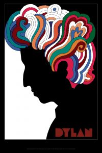
My second image was a piece by Milton Glaser (1967) – again, another image-focused poster, which is the type of design which appeals to me most. What’s most eye-catching about this work is the juxtaposition of the basic silhouette and the burst of colour and design of Dylan’s hair – I personally love the use of bold, flat colour in this design, the simplicity of the piece enhanced by the contrast of bright hues against the monotone silhouette, the meaning of which connects to Dylan’s “Man of Peace’ persona. The piece captures the spirit of Dylan’s vibrant music, while showing sensibility to the aesthetic of his time. The simplistic typography fits the composition of the piece well, and Glaser’s choice to choose a font without counters enhances the bold and unusual design.
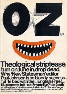
The final image I chose was the front cover of the first issue of OZ magazine (1967), the “icon- and the enfant terrible – of the underground press” (Ramaswamy, 2016). This magazine is more simplistic, relying heavily on typography. The most prominent feature is the cartoonish face in the middle, using the hand-rendered “OZ” as the eyes – though simplistic in design and colour, this illustration works effectively in showing the tongue in cheek spirit of this underground publication. The rest of the poster is composed of typographic work, using only 2 typefaces decreasing in size. This heavy amount of information, conveyed mainly in Helvetica, contrasting with the illustration portrays the ideals and meaning behind Oz magazine – the combination of the crude culture of underground press and its harsh social commentary.
Bibliography:
- Wilson, W. (1967) BG-56. [image]. Available at: http://www.wes-wilson.com/bill-graham-presents.html [Accessed 08/11/17]
- Glaser, M. (1967) Bob Dylan’s Greatest Hits. [image]. Available at: https://www.miltonglaser.com/the-work/444/columbia-records-poster-for-bob-dylans-greatest-hits-1967/ [Accessed 08/11/17]
- OZ Magazine (1967). Theological Striptease. OZ Magazine issue 01, February 1967, Front Cover. [image]. Available at: http://www.wussu.com/zines/ozimages/oz01cov.jpg [Accessed 08/11/17]
- Ramaswamy, C. (2016) Return to Oz: the most controversial magazine of the 60s goes online. Available at: https://www.theguardian.com/media/shortcuts/2016/mar/06/return-oz-most-controversial-magazine-60s-goes-online [Accessed 08/11/17]