
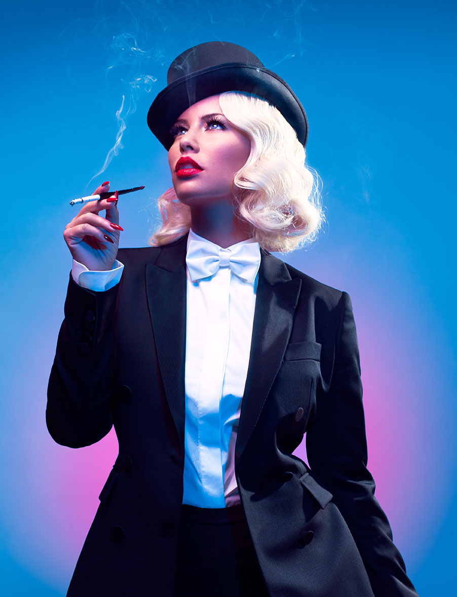
 The first published image which appealed to me was this photograph by Charlotte Rutherford published in Paper Magazine (2015). Here the model is dressed as feminist figure Marlene Dietrich – I think that portrait work is really interesting, especially if it conveys a story like this image. I feel Rutherford connects to the feminist message of the shoot through her photography; the positioning of the model centre frame, almost angling the camera up at her, creates a bold and powerful presence, capturing the feeling of the photoshoot. Rutherford’s use of bold juxtaposing colour is striking, contrasting the model – particularly against her highly exposed platinum hair. As well as being a brilliant aesthetic choice, the connotations of the pink and blue gradient relate to the themes of feminism and gender expectations evoked in the photo.
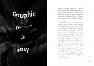
My second published image is this work by Graphic designer Craig Ward in his book “Popular Lies about Graphic Design” (2012). I really like the work of Ward, his tongue-in-cheek typography series uses physical elements to create thought provoking pieces of design which I find inspiring. Of the book, my favourite piece is this image claiming “Graphic Design is Easy” – here, Ward has simply crumpled up this statement, but in doing so has created a piece of typographic design that conveys the message of the piece effortlessly, a crumpled design to represent the struggles of the artistic process seen as “easy”. The bold contrast of the white text against the background is another simple, but effective stylistic touch by Ward.
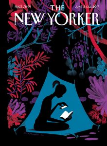
I also really love the illustrative work of artist Christopher Niemann (2017). This piece, which appeared as the cover of the New Yorker Magazine, represents how “reading takes you to another world” (Niemann, 2017). I think this piece is so beautifully illustrated; the vibrant cool toned colours against the dark background almost making the foliage appear illuminated – I also personally enjoy adding texture to my illustrations like Niemann has done here. The contrast of the bright white book and screen create a connection between new and old mediums of storytelling, while the fantastical surroundings create the feeling of wonder a good book can evoke.
Bibliography:
- Rutherford, C. (2015) Amber Rose as Marlene Dietrich. [image] Available at: http://www.papermag.com/amber-rose-feminist-heroes-1-1488371818.html?slide=PDJAIV [Accessed 29/11/17]
- Ward, C. (2012) Popular Lies about Graphic Design. Barcelona: Actar Publishers, page 58. [image]
- Niemann, C. (2017). Christopher Niemann’s “Enchanted Forest”. Interviewed by Francoise Mouly for The New Yorker, 29 May. Available at: https://www.newyorker.com/culture/cover-story/christoph-niemanns-enchanted-forest [Accessed 29/11/17]
- Niemann, C. (2017) Enchanted Forest. The New Yorker, June 2017, Front Cover. [image]