Author Archives: Nadia Sarwar

Task 12: Ambition in practise

As a part of my film project, I designed a video of London’s Christmas lights and fireworks in order to create a festive film, with the idea that perhaps it could be used as a background or as part of a festive advertisement.

In order to make my film bigger and more elaborate, I would consider how I am presenting my film. Currently I have only presented my film on a single projector, but so that the audience could become more emerged in the video I would like the video to be projected on all the walls of a dark boxed room, ensuring that the lights and fireworks are vibrant and bold creating a bright cheerful atmosphere. I would use surround sound, to submerge the audience in the energetic surroundings, to create the ‘magical’ idea of Christmas.

Also,  I examined the original footage that I was using, which was recorded unprofessionally by my iPhone camera, and realised that it was unfocused and restricted me from filming professional clips. If I was to complete this task again then I would ensure that I use a DSLR camera, and explore more using Adobe softwares such as “After effects” to blur out the images further, making the lights look sparklier, and creating a variation of speeds so the video connects more with the beats of the Christmas song playing in the background.

Task 11: Summary of my blog

At first, I found the blog challenging, because I struggle why I have created a piece of art, I have always preferred being practical rather than focusing on the theory aspect of art.

However, I have used the blog as an opportunity to study and enhance my knowledge on art theories (as I have never based or connected my artwork to art theories before this degree course). I have mainly focused on the the “female in art (feminists)” theory, however I have briefly looked into religious theories including “supernatural power”. I have found this experience extremely intriguing as I have thoroughly enjoyed connecting further with the art works due to gaining knowledge on the struggles feminists have had involving themselves within the art world and the range of medias they have used, especially performance art, to draw attention to themselves.

Also, the blog has encouraged me to visit a range of exhibitions within London and explore a variety of art from Jack Whittens’ abstract paint surfaces to Lorenzo Quinn’s symbolic sculptural work about “human love”. This has encouraged me to expand my techniques further by creating sculptural work and exploring print further.


Task 10: My work and 10 words

Experimentation, outlines, overlapping, textures, bold, abstract, vibrant, dynamic, creative, unique

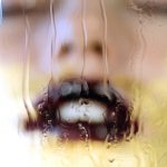
I have used the past semester to study “females within art” and to create the idea of women being oppressed and their true identities being faded away, this is specifically portrayed through Yann Houri’s “the complexity of mankind”. I have decided to use this photograph to represent my practice, as a key part of my work is experimenting with various medias, as I am unsure as to what pathway to choose.

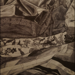
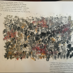
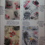
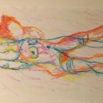
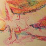
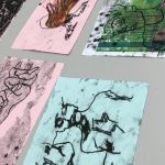
Therefore, whilst attending a number of life drawing classes I have experimented using charcoal, print, collage and water crayons to create abstract drawings of the female body. I was especially intrigued by the outcome of the print life drawings, as the applied pressure on the page, resulted in the ink transferring onto different sections of the face, creating the idea of how bleak the oppression is. I decided that the outcome was successful and printed the same image over the top of the first one and reflected, creating a the idea of these, figures all being trapped and merging together.

Task 9: Contemporary art and theory

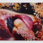
For my contemporary art work, I have decided to discuss Marilyn Minters’ “Orange crush” 2009, which consists of a faceless woman who appears to be ‘sexually’ licking glass, however Minter has created this image to deform the woman’s’ sexual features by pressing her wet lips and nose up against the surface.


The feminist movement within art has been around since the late 1960’s when many women began to fight for their rights for freedom and control over their bodies. Minter designed her “Orange Crush” work as part of “A year of yes” which was an exhibition based in the Brooklyn museum, which was an opportunity for feminist artists to “push the often denigrated 1960s styles of Photo Realism to new extremes”.

Feminist artists including Minter, believed that women “were invisible to the public eye”. Women believed that the art industry was mainly male dominated and that they were “denied exhibition and gallery representation based on the sole fact of their gender” therefore, feminist artists wanted to find alternative venues where they could promote their art work and they steered away from the traditional male techniques such as painting and sculpture and used different medias including textiles and performance to create wider artistic perspectives.

https://www.nytimes.com/2016/11/11/arts/design/a-nasty-woman-of-contemporary-art-fearlessly-renders-the-body.html

http://www.theartstory.org/movement-feminist-art.htm

Task 8: Appropriate an image

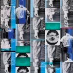
For this task, I have decided look into the artist Ciara Philips work “Things put together” (2003), which consists of numerous greyscale screen-prints of her own photographs, combined with bold ‘dyed fabrics printed with repetitive patterns and geometrical elements’. I was fascinated by this piece of work because it really reminded me of the pop art movement and specifically Andy Warhol’s’ Marilyn Monroe paintings. I loved the way both artists use these repetitive images to explore political issues and the celebrity culture, in a way they use their art as a method of advertising and persuasion to express their artistic views.

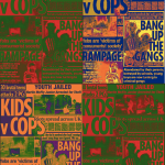
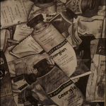
Therefore, as part of my manifesto project, I decided to use this idea a repeated bold design to portray my views on the major social issues of “British youth vs cops”. I began by using adobe Photoshop to crop and overlap negative newspaper articles about the youth of today and their relation to crime, and ensured it was monochrome. I then went on to alter the brightness, contrast and colour balance and repeated these four times, so that each poster had a range of colours and tones, making it unique. I then experimented repeating the images in different compositions, sizes and brightness until I was content with the overall outcome. I am going to continue exploring this method of art but through the use of paintings, film and sculpture, to try and create my own style of work.


https://frieze.com/article/ciara-phillips

http://www.tate.org.uk/art/artists/andy-warhol-2121

Task 7: Histories of art

Leo Steinbergs’ essay the “Other criteria” is focused on the modern art from the 19th century to the present and he discuses the “changing continuum” of the world going back to the Renaissance era. Steinberg discusses the “Old masters” and his theory that it is portrayed through Cubism and Abstract expressionism due to the picture representing a world; the top of the picture being the head, whilst the lower is our feet. He particularly praises the likes of Rauschenberg as he believes he is changing the art world with his idea of “art being engineered by the subject matter itself” as the bold colours, proportions and intricate detail against a blank wall, allows the audience to consider the true meaning.

Whereas, Richard Serras’ essay based on ‘The Yale lecture’ is targeted towards his dimensional work and the purpose and process of how the work in created. However, Serras’ work varies to Steinbergs’ because he believes that his sculptural work has to be left in the space that it was initially created, for the audience to properly connect and understand the context. He discusses that an artist needs to consider the current social and political situations aswell as the “scale, size and location” before putting the work in that location.


Task 6: A new mode of practice

At the beginning of my art exploration during GCSE’s I worked in a very precise and tight manner creating tonal and biro drawings as they were the only two mediums that I felt worked successfully as the tones allowed me to create a 3D realistic still life drawings. I looked into traditional artists including Tamara de Lempicka who creating paintings of women in an Art Deco style to express her ideas on “liberated female sexuality”.

Then when I moved onto my A levels and foundation course, I began to target my work towards the abstract movement and artists such as Jackson Pollock and Mark Rothko as I was fascinated by their use of “gestural brush-strokes or mark-making, and the impression of spontaneity”. I was excited by the idea of being expressive through the use of various tools and creating textures and surfaces due to different paint thickness.


However, I am currently intrigued in evolving Fred Hatts’ figurative drawings and his art style of movement and rhythm through his use of crayons on various surfaces including canvas, cartridge paper and black paper. The style I now work in is very fast and expressive, as I believe this spontaneous way of working allows me to express myself fully through my art work, compared to when I tried to control what I was drawing, it looked too manipulated and planned out. I want to continue creating abstract expressionist paintings and evolve it further by painting it onto various surfaces including walls and metal to steer away from the traditional method of painting.

http://www.theartstory.org/artist-de-lempicka-tamara.htm

Fred Hatt, drawing with energy

http://www.tate.org.uk/art/art-terms/a/abstract-expressionism

Task 5: Single exhibit

Exhibition: ‘More dimensions that you know’ by Jack Whitten (1979-1989)

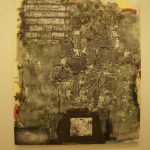
The single exhibit that I am focusing on is “Ode to Andy: For Andy Warhol”.

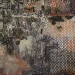
When I first came across Jack Whitten’s work in the flesh I was especially intrigued by his acrylic on canvas, mixed media painting which was designed for Andy Warhol. I was absorbed by the bright bold colours emerging through the dark rough surfaces and textures, that are incorporated with various lines and shapes.

The sheer size of the work is one of the first aspects that captivated me, as the large-scale piece controlled most of the white wall space, meaning when you stand back from a distance you can focus on Whitten’s conceived idea of his painting as ‘skin’ and observe the surfaces and textures that he has created through the use of brushes and scalpels, associating these marks with keloids (scarring after skin is cut).

When I studied this design, I was aware that he was trying to recreate an urban landscape, which captivated me because I loved his techniques of using moulds of man-made everyday objects including man-hole covers and car tires to destroy his recreation of a wall. “The matrix of lines and shapes incorporate, and figuratively recover, lived experiences and histories of the urban environment”.

Also, this piece caught my eye because in comparison to the rest of exhibition Whitten’s work is very symmetrical and he uses monochrome colours as he uses his work to design ‘a nuanced language of painting that hovers between mechanical automation and spiritual expression’, therefore the use of bold colours stood out as a powerful piece of work.

Task 4: Exhibition review

https://www.halcyongallery.com/exhibitions/lorenzo-quinn-actions-not-words

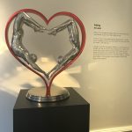
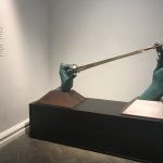
During reading week, I went to visit the “Lorenzo Quinn, Actions Not Words” exhibition which was held at the Halcyon gallery in London. I had never come across Quinn’s work before; however, I was intrigued by his simplistic yet extremely symbolic sculptural pieces. Quinn had created a number of bronze and stainless-steel sculptures, illustrating hands in various positions and holding symbolic items such as a slingshot and the infinity sign, ‘to represent his dream and hope for love, support and protection amongst humanity’. I believe that he has selected these materials in order to create a rich and powerful symbol, allowing him to emphasise his powerful ideology that “It’s what we do in life that defines us not what we say. Love moves worlds and saying I love you is special but acting upon it is everlasting”.

When walking into the gallery, you are greeted by his large-scale sculpture of two hands stretching and aiming a slingshot, and as you walk around the gallery you are led through a maze of smaller dimmed rooms with smaller sculptures of the infinity sign and peoples’ bodies in the shape of love hearts. The fact he selected dimmed rooms with one spot light on his sculpture in an empty room, makes the audience fascinated by the visual simplicity of the gleaming bronze but also makes them question the deeper meaning of what this specific sculpture is representing.

I find Quinn’s work so powerful because next to each of his sculptures he writes a short description of his views of love and humanity’s love towards earth, he only writes a few sentences but they are bold and come across as emotive, allowing the audience to connect to his work in an emotional way as well.

.

Task 3: Image analysis

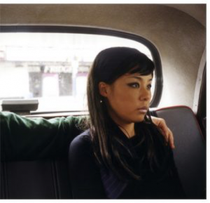
Part (14) 2002 by Nikki S.Lee (Photograph) part of her “Parts” project 2002-2005

Nikki S Lee is a Korean artist and filmmaker, who dresses up and performs various characters for her projects, to demonstrate different everyday lifestyles. This photograph is from Lee’s collection “Parts”; a collection of cropped photographs of Lee performing her everyday social situations with her loved ones.

The photograph illustrates a glamorous Korean lady sat in the back of a car, that we could presume is a taxi, however she is sat staring out of the window looking blank and gloomy. The composition of this photograph allows the audience to ask many questions, as we wonder who the man sat next to her is and why he has his arm over her shoulder, is he a loved one trying to comfort her? Or is the reason she looks emotional due to the fact that they have had an argument and he is reaching out to her, yet she is shutting him out? We also need to consider the fact that maybe her emotional expression is due to the car journey and where they are off to. They may be on a journey to start the next chapter of their life, or end the current chapter that they are in together.

Overall, I find this image extremely intriguing because there can be so many questions and interpretations about the emotions this lady is going through, this makes the image mysterious and makes me feel emotional for Lee as she clearly felt a lot of physical and emotional separation throughout her life.