
Counter Culture was a movement that was created in the 1960’s and 1970’s which promoted rebellion and revolution. The desire for change pushed people to find new ways of spreading the message around. This was a response to the war and the different governments actions around the world. The 1960’s and 1970’s were known as the hippie era’s as this was when the pro-peace and anti-violence protests were in full force. The combination of the want to spread a message and the hippie style produced a new style of art which is known as psychedelia. This era was known for its stereotypical saying ‘sex, drugs and rock n roll’ which led to many artists becoming more free with their styles.
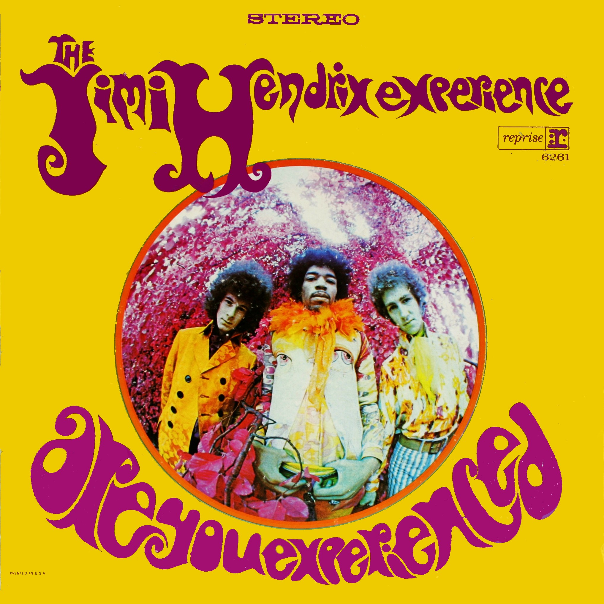
Above is the album cover for the the famously known musician/artists Jimi Hendrix. This was was designed in 1967 and was released on the 1st January by the graphic designer Karl Ferris. ‘Hendrix wanted “something psychedelic”‘(En.wikipedia.org, 2017) which tells us that the psychedelia era was in its prime. This era didn’t just affect the people but the typography. As you can see the bubble/funky style was the way of expressing the mood at the time. This typeface was also completely different to the previous modernist style which was compiled of the clear lines and simplistic type. When looking at the album cover you can see that the photograph of Hendrix, Mitchell, and Redding it is obvious that there has been a style of manipulation which makes the photograph look morphed.
Hendrix’s love for the psychedelic style of albums continued, Karl Ferris continued to work with Hendrix and created the album cover for ‘Axis Bold as Love’.
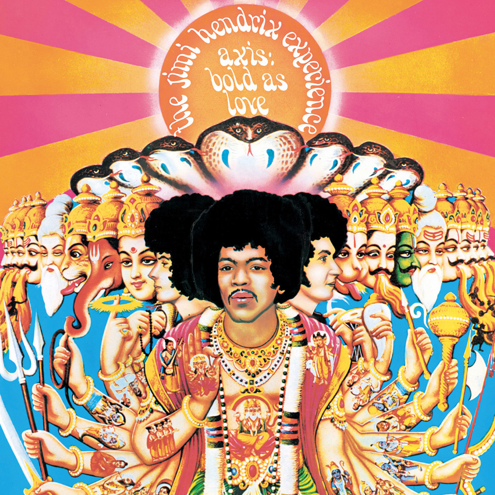
“The record label chose an Indian based painting of the band for the cover because at the time, “All Things Indian” was the fad of the music world” (FeelNumb.com, 2017). This album cover was released in December 1967 showing us that the bright colours seen on the psychedelic posters and albums were still embedded in the art and design world. This cover became very popular very quickly and so was the first ‘Are you experienced’ cover. This was not just because of the music but because of the era they had been created in. This was the popular style at the time and it depicts the exact era due to its colourfulness and boldness.
The psychedelic era was a time when art started to present what was going on in society far more than ever and was able to portray what the people felt.
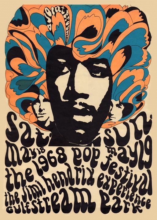
The poster above was created for the Miami Pop Festival in 1968. This was when Hendrix decided to release his recordings to the public which became important. Due to this Hendrix wanted to create a poster that would attract both the public and fellow artists. Hendrix decided to follow his psychedelic style in his albums by injecting the morphed and manipulated typeface which is now linked to the hippie era. The colour palette used on this poster is wild and this stands out. The colours, technically, go well together and this makes it aesthetically pleasing.
Refrences:
En.wikipedia.org. (2017). Are You Experienced. [online] Available at: https://en.wikipedia.org/wiki/Are_You_Experienced#Album_cover [Accessed 30 Nov. 2017].
FeelNumb.com. (2017). The Jimi Hendrix Experience “Bold As Love” Album Cover Artwork. [online] Available at: http://www.feelnumb.com/2013/07/02/jimi-hendrix-bold-as-love-albun-cover-artwor/ [Accessed 30 Nov. 2017].