
Dennis “, a graphic designer and art director uses the typography and photography to produce amazing posters which flow in an abstract way. His ability the make the typeface flow through the poster in a controlled way enables the viewer to see the shape and form of the car through the curves of the type.
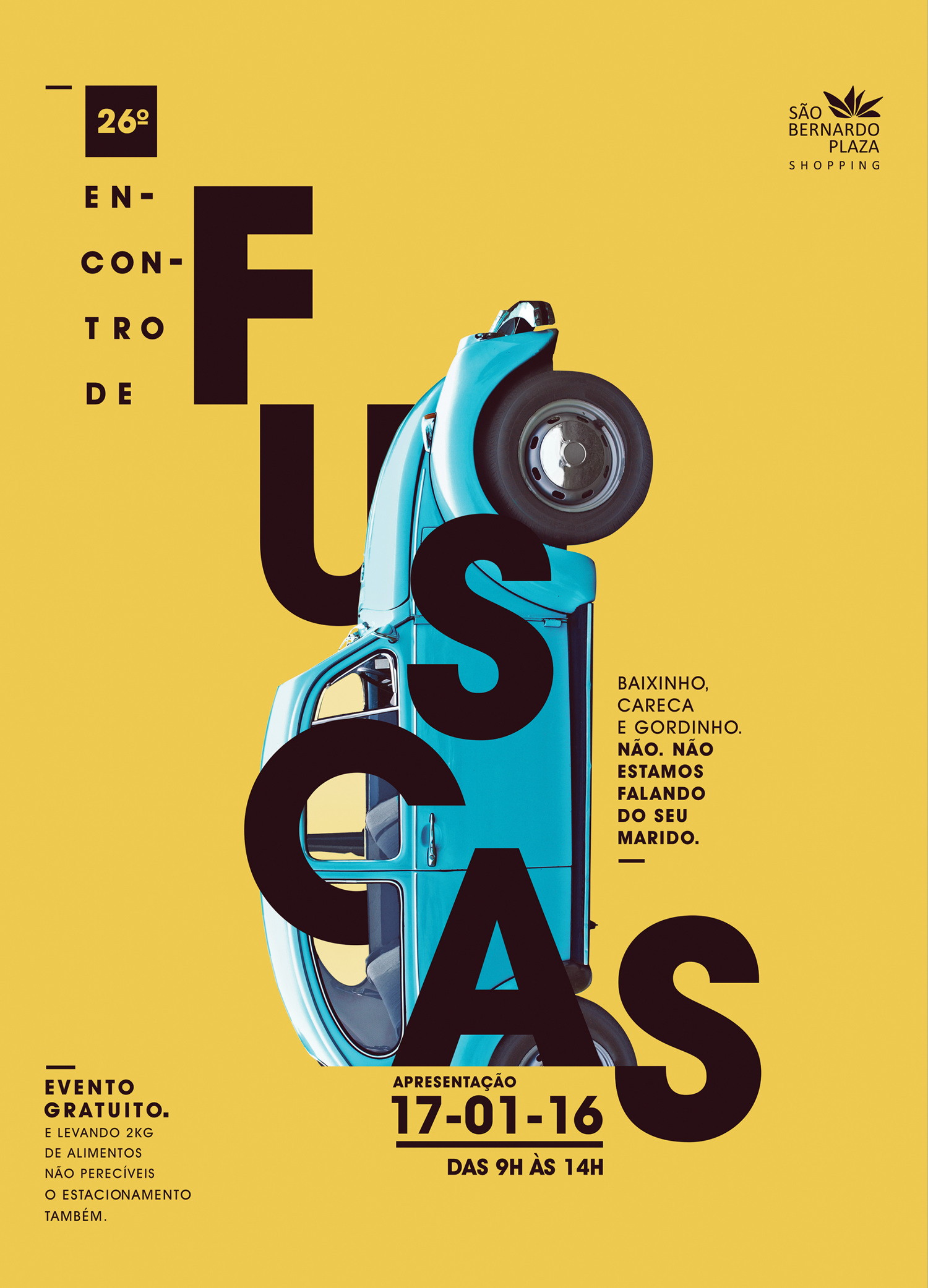
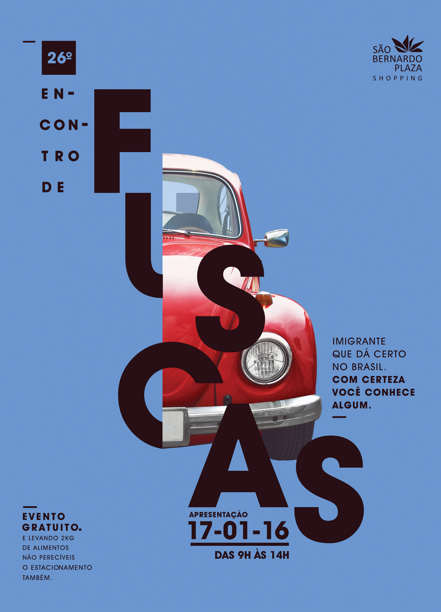
The two posters above (created and designed by Dennis Silveira) advertise the Beetles exhibition in January 2016 called Fuscas. I find a certain attraction towards these posters due to the colour scheme which I believe is an aesthetically pleasing style. The colours attract and stand out which therefore catch the eye of people in society and will transfer the message on the poster. This simplistic style is something that I would like to develop in my own personal work, this simplicity is also combined with Silveira’s use of the grid which he effectively uses on both posters.
Another artist that has influenced me and who still inspires me is FHK Henrion. Hendon was a german graphic designer, who was a celebrated poster and exhibition designer who used typography as his tool to translate messages. He eventually became “founding father of modern European corporate identity”(En.wikipedia.org, 2017) which led to a wide range of clients for all sorts of design.
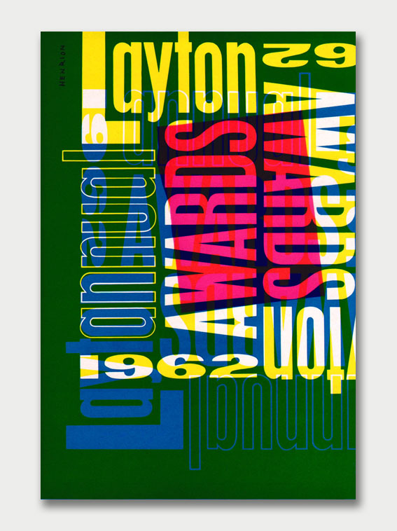
I enjoy typography very much and this piece created by Henrion let’s you appreciate how simple it is to create an attractive piece of art. His use of the same typeface and a variety of his colour palette allows him to create an organised mess which still portrays exactly what he wants. This piece was created in 1962 which was during the time when Henrion was a lecturer at the Royal College of Art. The overlaying of the words and colours makes certain pieces of information more visible than others. This use of hierarchy creates a connection with the posters designed by Dennis Silveira, this enables people to view what is most necessary first. I find that hierarchy is fascinating due to how simplistic it is but can change the whole layout of a design.
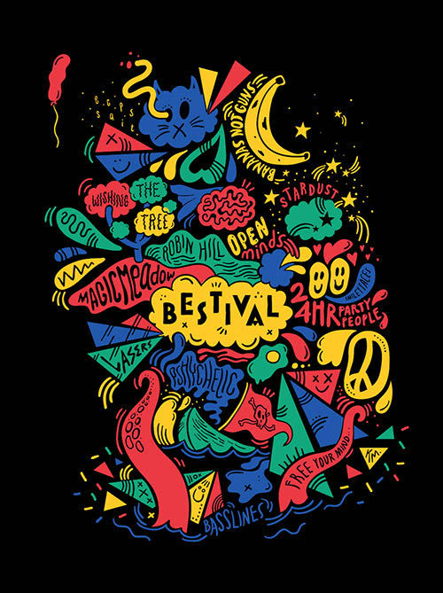 When looking at the grid and hierarchy I discovered an artist called Kate Moross who doesn’t use the grid technique at all but still creates pieces that have an obvious theme. The chaos on the page is controlled by the hierarchy as seen on the image above. The centre piece showing the ‘Bestival’ is viewed immediately and thus the main info surrounds it.
Refrences:
En.wikipedia.org. (2017). Henri Kay Henrion. [online] Available at: https://en.wikipedia.org/wiki/Henri_Kay_Henrion [Accessed 3 Dec. 2017].