
“A “counter culture” refers to a culture in opposition to or disregard of the mainstream culture or central aspects of the mainstream culture. It is exercised through protests against certain elements, contempt for a particular way of doing things, and, in extreme scenarios, the creation of a divergent culture from the culture in place.”(Chepkemoi, 2017)
The counter culture movement of the 1960s and 1970s was about the youth rejecting the social norms of the 1950s. The culture spread throughout the Western world in the 1960s before beginning to fade out in the mid-1970s
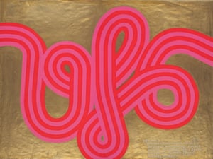
(A poster for UFO Mk II 1967, designed by Hapshash and the Coloured Coat., 1967)
The first image from counterculture that caught my eye is a poster for UFO Mk II 1967, designed by Hapshash and the Coloured Coat. I love the designers bold use of colour and line, colour is something which really draws me to artwork and is what I like to play around with in my own work. The counterculture used lots of bright and vibrant colours to which gives the artworks the spirit of the movement and make it recognisable to the movement.
“In 1970, “the hippies” were awarded the Sikkens prize, a Dutch award for groundbreaking work in the use of colour.”(Hoggard, 2016)

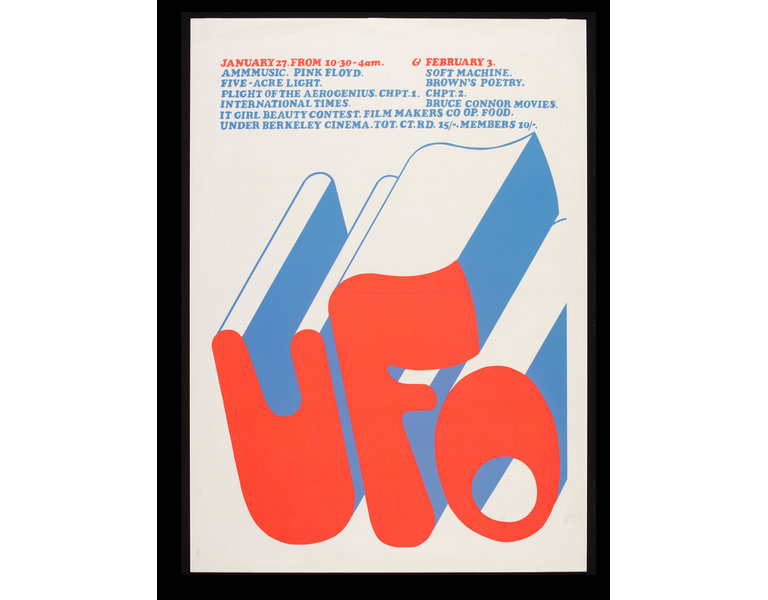
(Pink Floyd & Soft Machine – Original 1967 UFO Club Concert Poster, 1967)
The second image I chose is a Pink Floyd & Soft Machine Original 1967 UFO Club Concert Poster by artist Michael English, I chose to look art this image because again the bold use of vibrant colours stood out to me but I also was drawn to the typeface used. I love soft font and love the use of shadowing especially with the contrasting green against the neon pink.
(Psychedelic poster by Michael English for UFO club, 1967)
The third image I chose to look at is a screenprint psychedelic poster by Michael English for UFO club. I like this posters use of white space to give it a stylish and minimalistic look. I like to use white space in my own works and I am drawn to works and practitioners with a minimalistic style. I also think English’s use of two bright and vibrant contrasting colours is really effective. I like have a contrasting colour in work as it helps to draw a focus to particular areas and elements.
Image 1: A poster for UFO Mk II 1967, designed by Hapshash and the Coloured Coat. (1967). [image] Available at: https://www.theguardian.com/artanddesign/2016/sep/04/revolutionary-artists-60s-counterculture-v-and-a-you-say-you-want-a-revolution [Accessed 25 Nov. 2017].
image 2: Pink Floyd & Soft Machine – Original 1967 UFO Club Concert Poster. (1967). [image] Available at: https://recordmecca.com/item-archives/pink-floyd-soft-machine-original-1967-ufo-club-concert-poster-pre-hapshash/ [Accessed 25 Nov. 2017].
Image 3: Psychedelic poster by Michael English for UFO club. (1967). [image] Available at: http://collections.vam.ac.uk/item/O129172/ufo-poster-english-michael/ [Accessed 25 Nov. 2017].
Sources:
Chepkemoi, J. (2017). What Was The Counterculture Of The 1960s and 1970s?. [online] WorldAtlas. Available at: http://www.worldatlas.com/articles/what-was-the-counterculture-of-the-1960s-and-70s.html [Accessed 25 Nov. 2017].
Hoggard, L. (2016). The revolutionary artists of the 60s’ colourful counterculture. [online] the Guardian. Available at: https://www.theguardian.com/artanddesign/2016/sep/04/revolutionary-artists-60s-counterculture-v-and-a-you-say-you-want-a-revolution [Accessed 25 Nov. 2017].