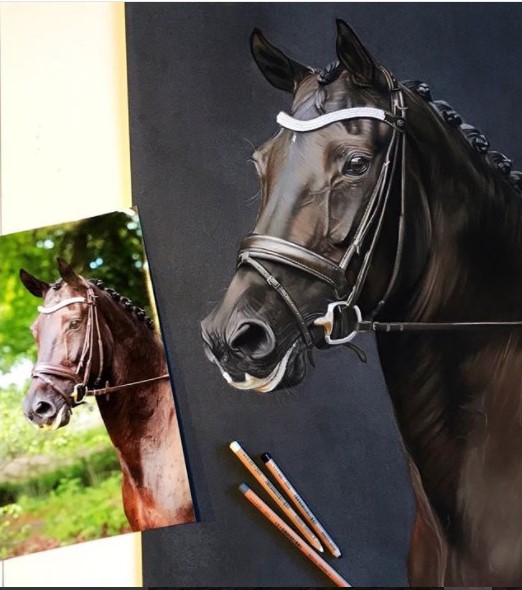
To create the first illustration of the horse, Anne-Baukje used the grid method, placing a grid over the initial reference image and creating a larger grid for her illustration. Many artists use this method in order to capture a better representation of the physical likeness and anatomy of the subject. One famous example being Chuck Close. Due to the grid being hidden or erased in the final outcome, the artist is left with a very natural looking and realistic piece that is highly effective. Although I work more with watercolours as opposed to pastels and pencils as Baukje does, this is very much like my own style of working, it gives me confidence in the initial sketch and encourages me to continue into colouring. I’m also currently working on my own realistic wildlife series, with minimal backgrounds, after working on human portraiture.
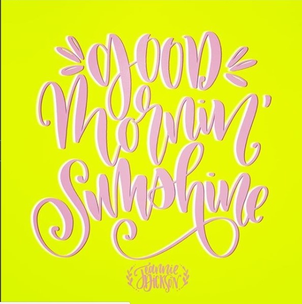
In contrast, to create the typographic piece artist Jeannie Dickson drew her design freehand, actually disregarding the need of the grid; the letters of each word do not sit on a single line or fit into a column and they overlap in places. However, I like the natural atmosphere it conveys as it brings out the bouncy and joyful characteristics of the design, heightened by the appropriate yellow colour choice in the background. The natural elements are also emphasised by the contrast between the thick and thin lines and the curves Dickson has put in place. This effect and style is something that I’m trying to replicate myself in my own modern calligraphy experiments.
Both designs convey strong natural atmospheres but for different reasons. It is this naturalness that attracts me to them both, as it key in my own work.