
The 1960’s was a time of unsettlement in both Europe and America. Men were being forced to participate in the Cold War and people began to distrust their government. This lead to using art within protests and people going against the sociably accepted culture. Due to this, strong meanings came through the images being used which highlight the depth of emotion of the time period. Additionally, due to the high level of drug use, a lot of spiritual elements became included.
As a passionate member of the vegan counter culture, I feel that I can partly relate to this sort of way of living. I do a lot of charity work and take part in petitions fighting for animal rights. I also hope to use my artwork to influence others in the future, perhaps using similar ideas to those circulating in the 1960’s-70’s.
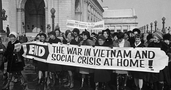 I particularly liked how this event was called a ‘Peace Parade’, contrasting the war and the fighting which they were protesting against. Additionally the rain puddles, coats and boots emphasise the dreary atmosphere, despite the smiling faces, and shows how these women wouldn’t let anything stop their protest. The banner is clear to read, with words such as ‘crisis’ to highlight the disruption the war has been causing. In terms of the photography, I liked how the artist hasn’t taken the shot from above to emphasise the amount of people taking part, nor taking it from below, showing their strength. The fact that the artist has taken the photo at the same level of the participators shows how they are all equal, emphasising their protest for freedom.
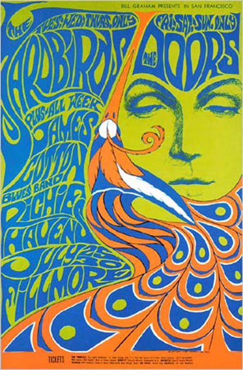 The complementary colours initially stood out to me in this poster, heightened by the use of a green background, which ties the two closer together. Additionally, the face has been kept simplified to not distract away from the text which flows next to the peacock feathers, becoming almost hair-like. I thought the feathers were also a nice way to shape the face and to cut off different parts of information. The use of the woman, and feathers, also represents the audience this piece would have been targeted at, and it becomes more personal. The half-closed eyes could be linked to the high drug use within the counter culture, the feathers being a fashion icon. Although this piece does not directly relate to my own work, I prefer to create hyper-realistic pieces, the idea of incorporating breakages into the design to separate the text, rather than just using blocked lines, would be beneficial in future typographic work.
Victor Moscosco greatly plays with the idea of psychedelics within this poster. Viewers would naturally be drawn to the eyes of the subject but we are denied of the emotion, instead there are circles blend the character with the background. The simple use of the two colours is most striking due to their vividness and their contrasting natures. The typography upon the subject’s jacket is slanted and squashed making it hard to read and demands time for the viewer to
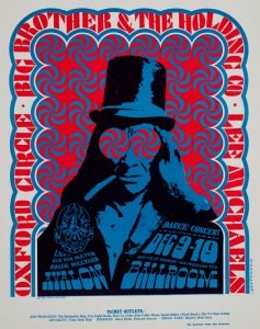 understand the information. This is also apparent in the previous poster and is something that I feel I could look at in the future. I find it interesting how just the shape of the letters can alter how it’s read and how the information becomes translated.
Image one: Gabriella Benavidez, Counterculture of the 1960’s
Image two: Bonnie Maclean Yardbirds, Doors, Fillmore Auditorium, San Francisco 1967
Image three: Victor Moscoso Avalon Ballroom 1966 Big Brother and the Holding Company