Author Archives: Harry Joyce

Fine Art-Task 12-H.Joyce

For my Manifesto project I decided to present it by projecting it onto a wall. This ended up making its scale quite large, the benefit of this being that it was eye catching and could be seen from a distance. However as it was a video it could be scaled down very easily, therefore it could be scaled down to a monitor or even a phone screen. As it was a manifesto this benefits it also as this ease of viewing could allow a lot more people to view it and receive the message.

I believe the positives of reducing the scale on a video is that it really makes the viewer come closer. Ths engagement normally means they’ll be paying more attention to the work, especially on a screen as small as most smartphones. On the other hand the large scale makes work more dramatic, this almost overwhelming nature can really grab the viewer. I believe the best medium for this work would to have a large scale projection in an exhibition space but to have a copy on a website so that it could circulate and be viewed at a smaller scale on a range of devices and therefore circulate.
FINE ART-Task 11-H.Joyce

Completing each blog post has become a continuingly challenging task that has pushed me to research new and interesting artists that I may never of discovered otherwise. Also it has made me really think about previous works and allowed me to reflect on them, often leading me onto new thought and ideas. This is especially true with task 12 as it made me question the scale of my manifesto project and  allowed me to imagine new ways of presenting. I believe this questioning will benefit me on future projects.

I believe task 7 was the most challenging task because of the type of language presented within the essays. I really had decode them to discover their meaning and subsequently develop my own opinions on them. I overcame this by concentrating on the texts, coming back and summarising each paragraph in my head to gain a comprehensive understanding. This again will benefit me in the future as I have methods and the confidence to read challenging texts I didn’t possess before.

Finally this module has benefited me as it has tested my time management skills and the ability to work within a deadline. Although some weeks I fell behind on my tasks I was able to overcome and complete the given tasks.


FINE ART-Task 10-H.Joyce

‘YOU SET OUT. AND I, NOT DEATH.

DROVE THE CAR.’

My chosen image is a frame from my film ‘Dysmorphia’. Some could say over my studies in art I have been “obsessed” by the idea of identity. My practice so far has mainly been influenced by the idea of identity as I believe it’s such a personal topic within my own life which greatly affects my thoughts on a day to day basis. This pushed me to create the film dysmorphia which shows the shifting identity of subject to subject, their likenesses being twisted and contorted until a gradual resemblance is made. My idea is to challenge the idea of identity, to ask the question what makes me, me and you, you? The simple change of a single feature can completely change someone’s appearance showing how fragile our idea of exterior identity.

The use of chalk and charcoal as a medium adds an entirely new element to the work. The fragility almost ethereal quality of the marks, fading into a black background brings up a deeper question of identity, the idea of the soul and what that means to be human. The ghostly imprint of the chalk and the featureless face could suggest this idea, that behind our outer appearance is a deeper, even spiritual, element inside everyone.

The words are an extract from the poem ‘Isis’ by Ted Hughes. It describes his own unhealthy obsession, that eventually ends in tragedy.

Bibliography-

Hughes, T., 1999. Birthday letters. London: Faber and Faber.

FINE ART-Task 9-H.Joyce

Jean-Michel Basquiat’s Defacement (The Death of Michael Stewart) is a tribute piece to the young artist Michael Stewart who was caught by two officers when vandalising a subway station and was subsequently beaten to death. The imagery of this piece is incredibly powerful, the ‘cartoonish cops’ drawn in a child like scribble with batons raised in the air has extremely malevolent connotations. The figure in the middle is a ‘ faceless silhouette’ their passive pose showing their complete helplessness. The lack of features represents the threat that Basquiat saw to all people of his race, he himself saying “It could have been me”. Finally the writing behind the figure  “¿DEFACIMENTO?” really questions the viewer, making them think who is actually defacing. The man drawing on the wall or the man? Depending on the viewer’s personal beliefs their opinion will change.

What I find most interesting about this piece however is that even though this piece was made in 1983, it couldn’t be anymore contemporary. You still read now of the race issues in America, most notably between the police and black Americans. Even ‘31 years’ later ‘Eric Garner’ was killed in ‘an illegal choke hold in NYC by Police, an all to similar story to that of Michael Stewart. This piece is an excellent example of art recording history and politics, hopefully so that us in the future can learn from it.

Bibliography

Liang, O., 2017. Jean Basquiat defacement – Google Search. [online] Google.co.uk. Available at: <https://www.google.co.uk/search?q=Jean+Basquiat+defacement&safe=off&rlz=1C1CHBF_en-GBGB758GB758&source=lnms&tbm=isch&sa=X&ved=0ahUKEwin59DcmfPXAhXDCsAKHbtiCBgQ_AUICigB&biw=1368&bih=807#imgrc=_> [Accessed 6 Dec. 2017].

FINE ART-Task 8-H.Joyce

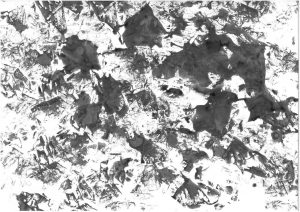
For this task I decided to appropriate the work of Julie Mehretu and William Kentridge to create my own original artworks. The aspects I like most about Mehretu’s and Kentridge’s work are the use of mark making, even though their styles are completely parallel to each other. Mehretu utilisĂ©s a lot of detail in her work, this comes in the form of what looks like architectural blueprints, giving an immense sense of complexity within each piece. However this is juxtaposed by the use of layered marks which are much more abstract and free. This creates a visually interesting image. On the other hand Kentridge uses very rough emotive marks to create a visual tension, this being effective when animating and bringing his drawings to life.

How I appropriated these artist’s works was through the use of mono printing. After scanning and printing images of the artist’s that I like I was able to pick certain lines that grabbed me through a very instinctive process. The final outcome of this process created abstract pieces of work that combined the straight rigid linework of Mehretu and the emotive marks of Kentridge, again creating an interesting juxtaposition. To develop this further I also used collage to combine the two artist’s works. I believe they work well together because of the lack of colour which is a similar aspect of both of their drawing’s.

By using this process I was able to visually analyse both of the artist’s works and compare the similarities and differences between them.

Bibliography-

Kentridge, W. and Christov-Bakargiev, C., 2004. William Kentridge. Milano, Italy: Skira.

Mehretu, J., 2013. Julie Mehretu. New York: Marian Goodman Gallery.

FINE ART-Task 7-H.Joyce

In the essays ‘the Yale Lecture’ and ‘The flatbed Picture Plane’ both Serra and Steinberg discuss the environment in which art is presented but from two different point of views. Serra argues that the ‘site’ a piece of work is presented in had a direct ‘relation’ to the piece of work itself. This relationship therefore creates its own dialogue or language, it’s own language and the language of its surroundings. Because of this it is ‘impossible’ to construct a work in a studio space and then take it out into a different environment and expect it to work, like artists have done for centuries.

On the other hand Steinberg instead of a specific site discusses the ‘The Picture Plane’. Since the ‘Old Masters’ and onwards to movements such as Cubism and Abstract Expressionism work has been vertical, an upright surface. However Steinberg noticed a ‘radically new orientation’ with artists such as ‘Rauschenberg’ and ‘Duchamp’. They shifted this plane from ‘vertical to horizontal’ arguably completely changing the meaning of art from natural to cultural.

The main difference between these two essays is that Serra is more literal in his description of environment. From his use of language and description you can see the physical space that a piece of work is created and subsequently presented. But with Rauschenberg his ideas are more conceptual, with a shift in perspective rather than space.

Bibliography-

Harrison, C. and Wood, P., 2003. Art in theory, 1900-1990. Malden, MA: Blackwell Pub., p.948.

Harrison, C. and Wood, P., 2003. Art in theory, 1900-1990. Malden, MA: Blackwell Pub., p.1124.

FINE ART-Task 6-H.Joyce

The theme of my contemporary project was simplicity. This was reflected in the artists I chose who I believe apitamised the idea that for a work of art to be poignant or beautiful you really don’t need to over complicate things. Bill Viola is a great example of this; his video work often of a single still subject, reminding me of the still life’s of the Great Masters, yet completely coming to life with subtle movements and sublime use of colour.

For my practice I decided to use one item to create artwork with and record the various marks I could make with it, this through the use of drawing, photography and video. I started simply, using the tin as a mark making tool and using the various textures to print onto paper. This created a series of experimental ink drawings, each one with a different kind of imprint left on the surface. After each drawing I photographed the tin. This reminded me of an almost forensic experience, the stark white background contrasting with the slowly changing tin. Each imprint like a series of ever changing fingerprints.

To develop this further I saw what I could do myself to change the kinds of marks made. This including drilling into the tin and melding it with a hammer. I again recorded this process with video and photography.

FINE ART-Task 5-H.Joyce

From the ‘Thick Time’ exhibition the piece that grabbed my attention the most was Kentridge’s piece based on his production ‘Lulu’. After experiencing ‘The Refusal in Time’ I walked up a set of stairs, pushed open the door in front of me and saw a small stage, surrounded by a sea of chairs. Coming from the grand, overwhelming scale of ‘Refusal in Time’ to this piece could almost seem disappointing, however it grabbed me instantly. The stage was illuminated by a projected image, with the artwork shown in typical Kentridge style, rough ink drawings. In front was a machine, with 2 pieces of wood dangling from string. And to my amazement as the video started these pieces began to dance along the stage, the once stagnant images coming to life. These completely inanimate objects had suddenly became characters from the play, able to portray a whole range of emotions.

Seeing this piece ‘in the flesh’ for the first time truly gave me an experience I doubt very much I could get from a picture in a book or a video on my computer. Even though drawn images it truly felt like the play was happening in front of my eyes, with the all the drama of the real thing. As I was surrounded by people all sat together to watch it it further heightened my experience as I could imagine sitting in a theatre, everyone around me experiencing the same feeling of awe that such emotion could be portrayed from two mobile pieces of wood.

Bibliography-

Blazwick, I. and Breitwieser, S., 2016. William Kentridge : Thick time. London: Whitechapel Gallery.

FINE ART-Task 4-H.Joyce

Exhibition- Thick Time by William Kentridge (Whitechapel Gallery)

For a while I had admired the work of Kentridge, seen his video’s on a small computer screen, flicked through his books enamoured by the sheer creativity of his work and the deep conceptual ideas embedded into each frame. However nothing could prepare me for the exhilarating experience of seeing his work first hand. Waiting in the que, excited to enter the exhibition space, I could hear the low thumping on brass instruments in the background. This hypnotic melody got louder and louder as I pushed open the heavy doors, becoming enveloped in sound, the light from the projections transferring me to a new world. I was surrounded by movement, light that danced across my entire body. I had never felt so involved in someone else’s artwork.

Accompanying the throbbing, encompassing music was a wooden machine, the struts and beams seemed to take on a life of their own. As I slowly strolled around the first room, projections hitting me from every wall, I studied it in complete awe, unable to understand the workings of this sculptural piece. That was probably my favourite part of this exhibition, how from room to room I was in a complete state of I was shocked and surprised by the weird and wonderful creations of Kentridge. It could be argued that a lot of the core work he presented was quite similar, however the way each piece was presented continued time and time again to challenge me as a viewer, even on my second and third viewing of the exhibition.

Bibliography-

Blazwick, I. and Breitwieser, S., 2016. William Kentridge : Thick time. London: Whitechapel Gallery.

FINE ART-Task 3-H.Joyce

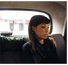
Nikki S. Lee Part (14), 2002

Nikki S.Lee is known for her series of works named ‘projects’ in which she assimilates in a variety of cultures, recording her interactions through photographs. However this work is different as although I believe she is attempting to portray a certain persona I don’t personal see it as explicitly linking to a specific culture.

What’s interesting about this piece is the use of crop. From the left of the frame you can see a male arm which sits across the subjects shoulder. But his identity is hidden, his face left out of the photograph. That makes the viewer question firstly who he is and also why he has been cropped out of the photo. Was it done purposely? To me this looks like half a picture, like it has been intentionally cropped to withdraw the mysterious man on the left. This could possibly link to a break up of a relationship, where she has tried to remove him from every physical aspect of her life, even photographs. This paired with the glazed over stare makes it seem like in this moment she is unhappy, looking out past the frame, out of the car, possibly a metaphor for longing for a better future.

The amateur and candid nature of the photograph further emphasises the intricacy within the moment captured. This effect is created by the lack of professional lighting, as this it is only lit by natural light and the overall lack of detail within the photo.

Bibliography-

 Anon, 2017. Nikki S. Lee. [online] Tonkonow.com. Available at: <http://www.tonkonow.com/lee_parts.html> [Accessed 6 Dec. 2017].