Author Archives: Harriet Mansfield Parker

Task 7 Histories

Leo Steinberg’s talk Other criteria: The Flatbed Picture Plane 1968 explores the alteration of the angle of the picture plane and the shift in art from natural to cultural expression this signified in terms of Rauschenberg’s work.  In Richard Serra’s talk at Yale University in 1990 focuses on his own practice and it’s interactions with process and art history and the dilemmas posed by the conceptuality of site specificity.

Both texts suggest that the discussed artists did not follow the existing precedent of theory. Serra says of his own works ‘The history of welded sculpture in this century has had little influence ‘ while Steinberg  remarks that ‘Even as Abstract Expressionism was celebrating its triumphs… [Rauschenberg] proposed the flatbed or work-surface picture plane as the foundation of an artistic language that would deal with a different order of experience.’ As such, both texts portray the work of these atists as turning points for the art of their practice; new ways of thinking in painting- Rauschenberg , and welding sculpture- Serra. A key difference between the texts could be that while Steinberg is reflecting on Rauschenberg’s works from a third person perspective, Serra is commenting on his own work and it’s position in art history. This could mean that the works of Rauschenberg are being explored in the way that art history needs them to be seen rather than the artist’s intended interpretation. However it could also be that Serra is placing his own work in to art history and therefore his portrayal is not the way it would be understood in the context of art history by a viewer or historian.

While there is a great deal to be discussed in comparing these texts, the question that personally holds the most interest is what causes art to be a turning point in the contemporary? How the artist intends to be seen, or how the viewer consumes their work both immediately and historically? Perhaps they are two sides of the same coin and art theory remains fluid even after the fact.

Task 12 The Matter of Time 1994-2005

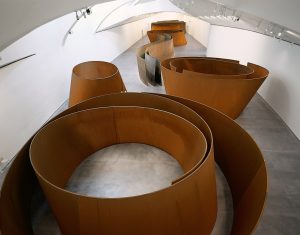
Richard Serra’s 8 sculptures that make up The Matter Of Time 1994- 2005 carry so much impact because of their monumental scale. Unlike Rachel Whiteread’s casts, The Matter Of Time are not on a human scale and so to reduce them down to smaller than human height would remove the epic proportions that make the an experience not just a sight. At 2 feet tall they would be a set of sculptures interesting for their material and design like other small pieces, purely aesthetic interest. At a few feet tall or even a single foot tall, I would choose to increase the number of sculptures in the set (possibly by using multiple of each of the 8) so that the pieces covered a large area of floor. The more elaborate miniature landscape like texture this created would be seen from above. This would reinstate more of an experience to the collection as viewers would be in a sea like arrangement of sculptures and could appreciate the collective shapes form above rather than the construction from within.

Photogapher unnamed (date unspecified) Guggenheim. Available from: https://www.guggenheim.org/artwork/21794 [accessed 6/12/17]

Task 11 Blog Reflection

The blog has allowed me to practice key analytical skills from analysing and reflecting upon my own work to comparing past and contemporary works and analysing features of art history and the impact of social change in the art world. Similarly I have learned more about views of art history and political effect on art of which I was unaware before. Although politics still does not inspire my own practice particularly, some ideas of Raschenberg  which I had not heard before are an interesting start point in to more research. I am excited to continue exploring the library resources. As the blog has reminded me how to analyse images and how to review exhibitions, I have gone over again how, and what, I think about my own practice and the art world at large. My own practice shifts slightly with everything I learn but I become more certain of the key parts with each task. For example, after using the blog I am still sure that hand written notes are more useful for me in terms of reflection because the physical process of writing becomes part of the reflection and allows me to more freely and accurately map out my thoughts.

Task 10 Practice

bty

Observational, exploratory, scientific, biological, psychological, organic, minimal, negative space, rethink.

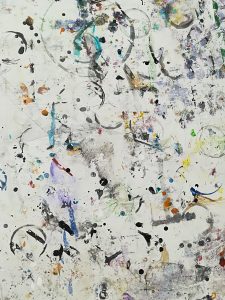
My work often reflects my biological background and my personal interest in psychological conditions and the public understanding of them both. I find I conduct my artistic practice in a somewhat scientific method of observation, hypothesis, experiment.  It is important to me to explore the potential of art to rethink both its own position and the perceived ideas of science through observations, experiments and turning things back to front to look at them differently, in a similar way to why negative space interests me. I tend to work with very minimal outcomes, I think because it allows to ideas in the art to come across clearly and carry more impact in a stark kind of way. The organic interests me in both science and art. Line and form with organic qualities I find fascinating. The photograph of the remnants of art works on the painting studio tables reflects this interest in the organic and also in how we think about art. The debris of these pieces are just as much art as the pieces themselves, possibly more so given the maker was not concentrating on these marks but those of the intended piece.

Task 9 Theory and Politics

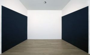
Richard Serra’s Blank 1978 drawing comprises heavy linen covered thickly with black paintstick and tacked directly on to the wall of the gallery. It is one of a number of experiments of Serra’s in to minimalist work focusing on materials rather than subject. Although Serra had been producing minimalist work throughout, this work features toward the end of the height of minimalist movement which became prominent in the 1960s. A retaliation to the abstract expressionism of earlier in the decade, minimalism focused on the art itself, materials and surface, without the frivolous brush strokes and shapes of the post war pieces. Blank 1978 fits directly in to this ideal with no discernible shapes, strokes or subjects, just the solid black surface of the canvas. Minimalism continues through Serra’s works including in to his weathered metal sculptures in which the typical minimalist preoccupation with material persists.

Author Unnamed (date unspecified) Art Movements, Magic Web Solutions UK. Avaiable from: http://www.artmovements.co.uk/minimalism.htm [accessed 6/12/17]

Author Unnamed (date unspecified) Tate. Avaiable from: http://www.tate.org.uk/art/art-terms/m/minimalism [accessed 6/12/17]

Author Unnamed (date unspecified) Wikipedia. Avaiable from: https://en.wikipedia.org/wiki/Richard_Serra [accessed 6/12/17]

Photographer unnamed Available from: http://www.stedelijk.nl/en/artwork/1554-blank [accessed 6/12/17]

Task 8 Appropriating Serra and Veilhan

dav

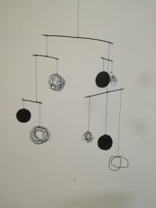
I appropriated the lines of Richard Serra’s drawings such as Black tracks 2002 and form of Forged Drawing 1980/2008 and combined it with a the motion of Xavier Veilhan’s Le Mobile. Serra’s drawings in charcoal, ink and paintstick have a beautifully organic quality that I find fascinating. The rough edges and high contrast between the white and black give them a two dimensional motion in a similar way to Veilhan’s very static imagery of clean spheres having three dimensional motion in their mobiles. I am interested in translating the two dimensional to the three dimensional and so I chose to recreate the organic lines from Serra’s drawings in wire. This was remarkable difficult because as I was attempting to accurately recreate the organic nature of the drawings the outcome was very static because it was such a controlled process. To achieve anything close to the organicity of Serra’s work I had to abandon any attempt to copy his lines but more to use the style of drawing to achieve the same feel. In wire the shapes and lines lose some of the raw edge that adds motion in the large scale of his work. My own recreation is on a small scale and so I was happy with the level of motion added by the number of lines in the area of each drawing. Similarly the plain black appropriated from several of Serra’s works provides contrast to the untidy drawings. Experimenting with Veilhan style mobile structure, I suppose inevitably recreated the smooth motion of his pieces. Learning how to balance the sides of the piece took some attempts but formed an ever changing outcome.

Task 6 Mode of Practice

Being particularly interested in art works being more than just things to be looked at but also things to be touched, experienced like the rest of the world , in a new mode of practice I would like to develop  focus more on the viewer’s interaction with the piece of work or the material. Thinking somewhere between Superflex’ 1, 2, 3, Swing! and Robert Morris’s Continuous project, I would like to not just provide the audience with pieces to handle and experience, as I have done before, but also place a material in a space and document it as interactions with the audience change it’s state. Such as presenting a large plate of polished copper and inviting the audience to touch the metal. The plate could then be photographed at the end of every day and the process repeated over a week. The plate would then be left to tarnish and could be presented as a piece of work in its own right under the title of the dates it was exposed to the public.

Task 5 Rachel Whiteread’s Untitled (Room 101)

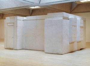
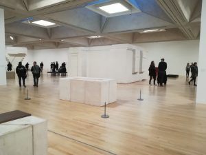
Rachel Whiteread’s cast of the inside of a Victorian room at the British Broadcasting Company’s head quarters is all that remains of the original space. The room, used by George Orwell during the Second World War and thought to have inspired room 101 in his book Nineteen Eighty- four, was dismantled around the plaster and fibreglass used by Whiteread to cast the space. As the exhibition information says, Whiteread’s sculptures are always on a human scale and the true impact of the size of this piece is lost in images. While looking at an image the piece could be mistaken for overlarge or even daunting but standing in front of the sculpture, the scale feels surprisingly comfortable. It has a human feel and is remarkably easy to take in in the few seconds it takes to walk around it. Similarly, while photographs convey the rough shape, straight walls and protruding windows, only by walking around the object can you see the tiny shadows thrown up by dents in the walls, the skirting board gaps and the negatives of the window handles or their rust stains. For a piece in which the human feeling it is designed to have comes from a comprehensible scale and familiar imperfections, a two dimensional image robs Untitled (Room 101) (2003) of its purpose in the viewer’s experience.

Author of Exhibition Information unnamed (2017) Rachel Whiteread Tate, Exhibition Curated by Anne Gallagher and Linsey young.

 Photograph: © Tate

Task 4 Rachel Whitread

dav

Rachel Whiteread at Tate Britain, organised by Tate and National Gallery of Art, Washington, celebrates 30 years of acclaimed artist Rachel Whiteread’s works. Reflecting Whiteread’s career, the show includes inspirational found objects and investigative drawings as well as casts, for which the artist is renowned, in a mix of eminent pieces, such as Untitled (staircase) 2001, and previously unseen works.

While there are photographs of some of Whiteread’s momentous works such as Untitled monument, a resin sculpture of the fourth plinth in Trafalgar square the exhibition pays homage to the artist’s practice as a whole as she “explores the human imprint on our everyday environment”. The exhibition deftly captures key focuses of Whiteread’s works such as negative space, material and scale and leads the viewer through the artist’s journey of transforming the mundane in to the unexpected and beautiful with a steady flow of change in these ideas from piece to piece. Concrete casts of the underside of tables and beds leads on to casts of hot water bottles in resin, plaster and rubber,  then in to a dolls’ house in resin; a plaster and  fibreglass cast of the inside of a room; and insides of toilet paper rolls in multiple colourful media.

The uncluttered space and deceptively familiar shapes of the pieces make the exhibition a relaxing and comfortable place to be. In the space that reflects the artist’s architectural and orderly feel in the cast concrete ceiling and white walls, unfocused, top down lighting of the exhibition creates additional depth with shadows and highlights. Playing to Whiteread’s use of both opaque and translucent media as well as the contrasts between shiny and matte, this brings to life hidden details and imperfections, such as those on the walls of the Victorian room, that change as the pieces are viewed from different angles.

Author unnamed (2017) Tate Available from:http://www.tate.org.uk/whats-on/tate-britain/exhibition/rachel-whiteread

[Accessed 6/12/17]

Task 3 Part 14 Nikki S.Lee


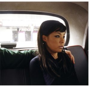
Nikki S. Lee’s Part (14) photograph, 2002, shows a woman in the back seat of a car, dressed well with careful make up, with a male arm around her shoulders. The body of the man is out of the frame of the image, leaving a large gap of bare car seat between the woman and the unseen body of the man. The woman is sitting stiffly, slightly turned away from the man and seemingly looking out of the window of the car with a solemn expression.

The image seems to be about the woman’s resignation to her lack of control in the situation. The seemingly  unwelcome arm across her shoulders shows the owner of the arm has dominance over  her and control of the situation, while her solemn expression and stiff posture shows a resignation to the arrangement. The lack of identity of the male figure could show that it is unimportant as if control of the woman belongs to more than one person: that she is generally owned by someone else. It could also suggest that his control is a defining feature of their interaction as his expression or even appearance in removed.  The image appears very still as if the situation is not going to change.

Lee’s parts project looks at the clichĂ© of photographs of couples . Brittany Capenter explains how Lee  arranges photographs of couples and cuts the printed images removing the significant other to create ambiguity of intentions and emotions in the image. The hidden narratives that emerge through the removal of the identities cause the viewer to engage with image fully to work out what is being shown in the scenarios presented.

Carpenter  B. (2013) Fluid Identities: The “Parts” and “Projects” of Nikki Lee, Broad Strokes,  National Museum Of Women In The Arts, Available from:  https://nmwa.org/blog [Accessed 3/12/17]