
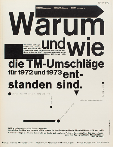
Cover of Typografische Monatsblatter by Wolfgang Weingart, 1973.
Weingart created work that presents his skills of producing experimental graphic design. The manipulation of his materials, created postmodern designs that show how attractive typography on a standard page can be. The variety of scales (not always aligned) and the cutting and pasting of diagonal alignment seems to ‘break the rules’ of modernist typography. This shows to me, that typography doesn’t have to be ‘traditionally beautiful’ in order to communicate and be satisfying as a design. Weingart manages to do this in the simplest of typefaces and monochrome; as he says himself ,‘the simpler the assignment, the more difficult the soloution’ (Smith, S, 2014). This shows the imagination he had as an artist, to create such impact on a blank page with the simplest of tools.
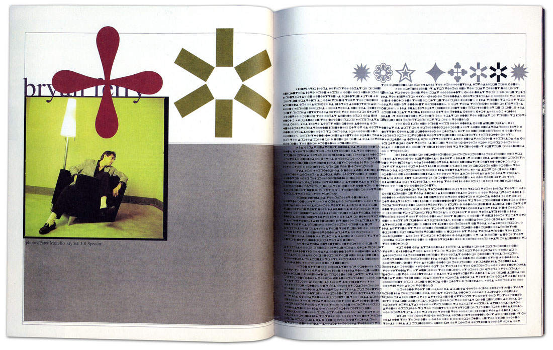
Carson’s ‘do it yourself’ aesthetic was ‘fuelled by raw emotion’ , which shows through the features in his designs, that rebel against the rules of traditional magazine spreads. Shown above, Carson hated his interview and decided to symbolise the text instead. The overwhelming use of symbols and shapes overlaying typography, creates confusion within the design that works. The free-form of Carson’s work, enables him to expose a contemporary and non-conforming attitude of youth, which is later known to be ‘grunge’. This allowed the younger generation to appreciate and relate to his work, creating a statement. ‘The appeal of grunge was based on a basic idea: it had not been seen before’ (Shetty, S, 2012) , especially in a graphical form.

Keith Haring, Untitled, 1982.
Keith Haring ‘committed his life and work to the democratic ideals of social justice and equality’ (Sheff, D, 1989) and to me, this is what made his work so appreciated and cherished. The piece above, presents two males holding a heart together, symbolising homosexuality. The style of his illustrations could be deemed childish, especially with a monochrome or primary colour palette. His work goes against social norms, and displays what is deemed ‘not right’, in a fun and exaggerated style. By exposing what society is against in this style, it begins the deconstruct the opposing attitude, creating a more accepting outlook to issues such as homosexuality and aids awareness; big themes within his work.
Bibliography:
Sheff, D. (1989). Keith Haring: Just Say Know. Available: http://www.rollingstone.com/culture/features/keith-haring-just-say-know-19890810. Last accessed 15/11/2017.
Shetty, S. (2012). The Rise And Fall Of Grunge Typography. Available: https://www.theawl.com/2012/08/the-rise-and-fall-of-grunge-typography/. Last accessed 15/11/2017.
Smith, S. (2014). Wolfgang Weingart. Available: https://www.creativereview.co.uk/wolfgang-weingart/. Last accessed 15/11/2017.