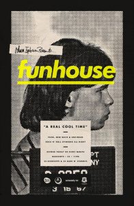
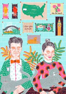
Left: Funhouse by Michael George Haddad, 2013. Right: Kayleigh and Steve by Camilla Perkins, 2015.
‘Funhouse’ by Michael George Haddad uses famous mugshots, in a graphic form, to advertise the ‘Funhouse’ DJ night in a venue called Mugshot. This piece of graphic design really appealed to me due to the black and white halftone screen print. It creates a gritty and underground aesthetic, to relate to the image and the event style which promotes ‘punk, new wave’ music. The yellow typography is also striking, complimenting the half tone to create a modern ‘pop art’ effect – like Andy Warhol’s use of halftone and block colour in his portrait work.
Similarly, Camilla Perkins illustration of ‘Kayleigh and Steve’ is also created through screen print and the layering of colours. However, unlike Haddad’s work, the screen print brightens the colourful imagery, making the illustration more positive and vibrant, relating to the people in her illustration, those she admires in her life; her friends.
The use of squares in both the Funhouse design and the illustration of Kayleigh and Steve, help display more information in the designs. For instance, the layering of typography in square shapes within Haddads work, helps the audiences eyes follow straight from the bright yellow ‘Funhouse’ , to the other pieces of information in a hierarchy order; from most important information such as dates and times to less important like sponsorship’s. The use of squares as posters in the background of Camilla Perkins illustration, helps unravel more personality to the characters, like the date they got married and their love towards their pets and travelling.


