Author Archives: Danielle Larkby

Final Summary

In this module I have furthered my research skills, broadened my understanding of art history and pushed myself to analyse more closely the work of others.

Through the research tasks set in this module I have discovered how valuable researching art movements and not just individual artists is. This has allowed me to discover new artists with ease, reading about artists and then about artists involved in similar work at that time. Researching art movements has also allowed me to discover artists across a variety of mediums that all work to the same ideals and themes. This means that I have been broadening my field of research across different time periods, medium and values, giving me a wider variety of references to call upon in my practical work.

In the task regarding authenticity I began to further understand the value of using quotes to support my work. By using quotes from Picasso and Austin Kleon I was able to convey a broader understanding of the topic at hand and they helped me to summarise certain points I was trying to make. This applies to using quotes throughout this module and I feel I have begun to learn the importance of quoting reputable sources on a particular topic.

Through comparing different pieces of work I have pushed my ability to analyse the work of others, looking further into the social and political events of the time, as well as reading into some of the more subtle and suggestive themes in different artist’s work. In the second task of this module I compared Stanley Kubrick’s A Clockwork Orange to the Vertigo comic book series “Transmetropolitan”. This was a challenging task as the two are very different mediums but I had very strong feelings for the two and really took the time to make strong points in my comparison.

Something I have enjoyed in my research for these tasks has been researching the influences of the artists I’ve been influenced by. For instance, in another task I referred to the work of Kate Moross, one of my biggest contemporary influences. I linked the work of Moross to that of Bridget Riley, one of my favourite artists from the Op Art movement. In doing so I have shown that I am looking further into my influences and aiming to discover their roots in order to better understand their creative process and to thinking as designers.

These aspects of my research will benefit me in my practical work as it will expand the way I think about my influences, analysing further the work of artists I admire and reading up on the social and political context surround pieces of work. Working in this way allows me to move forward and create new work with the ability to draw upon a much broader and varied range of sources.

Publish or Perish

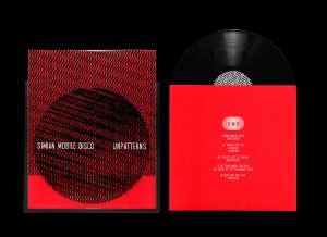
British graphic designer and art director Kate Moross with her team in Studio Moross work mostly on design for music projects. She is well known for her hand rendered typography and free flowing shapes with inspiration taken from Wes Wilson and Milton Glaser. In her design work for Simian Mobile Disco you see influence from Bridget Riley, utilising a simple line pattern on the sleeve that when removed from the cover interacts with more lines to create a moire effect. This is a great example of how design can be connected to and interact with a product in a physical way, and this is something I look to take into consideration when designing work for a physical product.

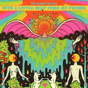
Oliver Hibert is an American illustrator based in Arizona known for his 60’s psychedelic stylisation and black light style colour schemes. Currently the main body of his work is personal work, for example he recently created a complete deck of illustrated tarot cards and his own ouija board. A piece of his work that recently caught my eye is his album cover for The Flaming Lip’s album “With A Little Help From My Fwends”. Using his signature fluorescent colours and block painting, Hibert creates a clear and fully realised aesthetic making effective reference to psychedelic style in a contemporary way –  something Iaim to create within my work.

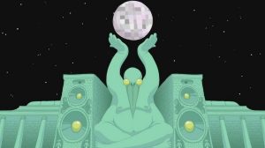
Felix Colgrave is an Australian animator that has been animating professionally since 2009 aged just 16. Colgrave creates animated work his own personal pieces as well as animating commercially. My favourite piece of his is Fever the Ghost’s “SOURCE” music video, with a variety of eccentric characters and locations the video is a brilliant demonstration of Colgrave’s signature style. Colgrave captures the essence of each personality he creates through clear characterisation and consistency in style, something I aim to achieve in my work. A particular element within Colgraves music video work that I admire is the way he animates to the very rhythm and pulse of the music, making for an altogether more flowing, connected piece. I took this on in my own work when I made animated parts of a music video.


https://www.studiomoross.com/casestudy/simian-mobile-disco/

https://www.oliverhibert.com/album-covers?lightbox=dataItem-ir9gvorv\

https://www.youtube.com/watch?v=9RHFFeQ2tu4

Postmodernism

Postmodernism is a broad term describing work made in opposition to the ideas and features of modernism. Here I have chosen three examples of postmodern work that has had an impact on my work.

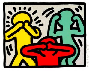
In 1990 Keith Haring tragically died of AIDS related complications at only age 31. Haring’s iconic style was a made of simplified and heavily stylised figures using bold lines and colours. He conveyed such energy through his medium, and he used this energy to tackle difficult issues and show they can become public conversation. An example of this is his 1989 piece Rebel With Many Causes in which we see three figures taking the “hear no evil, see no evil, speak to evil” pose, a criticism of those avoiding such social issues as the AIDS crisis. I admire Haring’s methods of tackling social and political issues through illustration and have a love for his simplistic but energetic style of drawing.

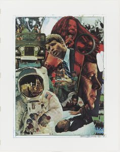
60’s pop artist Robert Rauschenberg is known for his use of non-traditional materials across sculpture, painting and college, and creating statement pieces that often challenge the very definition of what art is and isn’t. I’ve always found the experimental and playful nature of Rauschenberg’s collage work very engaging. A great example of this would be the 1970 piece “Signs”. A reflection on the love, terror and violence the 60’s brought to American culture, with images that were still raw at that time. We see Rauschenberg using collaged images and leaves some canvas revealed to create his signature look. His desire to experiment overrides a need for order and perfection in his work and this is something I look to develop in my own work.

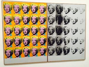
Andy Warhol is widely accepted as the godfather of pop art. With roots in illustration an advertising, Warhol’s work was graphic and clear in content and style. Warhol looked to deconstruct social and cultural norms with interpretive and satyrical meaning behind his work. For instance, his 1962 piece Marylin Diptych isn’t a tribute to the late actress who died just months before the piece was made. Its repetitive nature is reference to mass production, its use of the diptych format highlights the worship of celebrities in American culture and the contrast of colour against monochrome is representative of life and death. I look to Warhol’s work for examples of how simple imagery utilised in the right way can convey satyr and humour whilst making social commentary.


http://www.haring.com/!/art-work/834#.WiblxlKcaHo

https://www.moma.org/collection/works/67925

http://www.tate.org.uk/art/artworks/warhol-marilyn-diptych-t03093

Counter Culture

The work produced in the 60’s and 70’s has had a great deal of influence on my work as a designer. Below I have included three examples from artists in this period that have played a part in shaping my work.

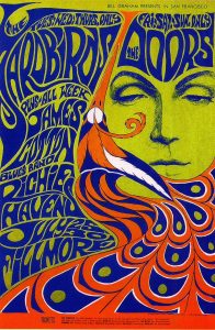
American artist Wes Wilson is one the biggest psychedelic poster designers from the 60’s and 70’s, known for his use of simple, vibrant colour schemes and popularising the iconic typography that is now synonymous with the peace movement. His 1967 Bill Graham poster is a great example of this, with simple contrasting colours and type that melts on the page. With type being distorted and reshaped for creative effect, the lettering isn’t always immediately clear, but this isn’t to say the meaning is lost. Viewers find themselves decoding the message and in turn looking even further at the type. I look to Wes Wilson’s work for typographic inspiration, reminding me that hand rendered type can be highly effective.

Bill Graham Presesnts poster design, 1967, Wes Wilson (Accessed 20/11/12)

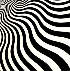
Bridget Riley is one of the best known op artists to date, with black and white geometric paintings catching the public eye in the early 60’s for those who had sensibility enough to appreciate the subtlety in her work. I think Bridget Riley’s work was the first to draw me to simplicity in design. Her 1964 painting “Intake” is an example of her clean, geometric designs where small changes in line and pattern create incredible effects that play with the eye to create illusions of movement and perspective. Riley’s work is a testament to what you can do with geometry and pattern as well as a reminder thatsometimes less really is more.

Intake, Bridget Riley, 1964, Acrylic on Canvas 178.5 x 178.5 cm (Accessed 20/11/17)

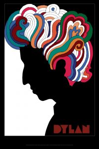
Milton Glaser is a graphic designer, best known for his I Heart New York logo and his editorial illustrations. The piece that first grabbed turned my attention to his work was his 1966 poster for Bob Dylan’s “Greatest Hits” LP, immediately recognising its influence on contemporary designers I look to today. This piece demonstrates his key characteristics; hand drawn elements of block colour and line alongside his signature typeface used together to effectively capture the spirit of the music he is promoting – techniques that resonate with me personally as an illustrator longing to design for music.

Bob Dylan’ Greatest Hits LP poster design, Milton Glaser, 1966 (Accessed 20/11/17)


http://www.wes-wilson.com/bill-graham-presents.html

https://www.miltonglaser.com/store/c:posters/824/dylan-reproduction-2008

http://www.op-art.co.uk/op-art-gallery/bridget-riley/intake

Is it possible to be truly authentic?

I believe authenticity is a relative term and is all too often used in the place of originality. As artists and designers, we constantly strive to create work that is original. After all, if it has been created before why create it again, right?

However, Picasso once said that “Art is theft.” (Kleon, A. 2012) By this he means not the literal theft of the work of others, but that we all take ideas from others. We find what we like in the work of others and then allow that to help us make informed decisions about the work we create. This is by no means to say that we should copy the work of others. Aptly put, Lionel Trilling said: “Immature artists imitate, mature artists steal.” Not only is imitation depriving the rightful creators of praise for their work, but it stops you from learning and from making progress on your journey as a creator.

In this instance to steal is to learn. It is imperative that we read into the work of others and assess what we like, what we dislike and then move forward to make decisions about our work, as to “steal” from others. It is only once we gather a wide range of source and points of reference can we make informed decisions in our work, and I believe to learn from others and then put this into practice within our own work is what makes each of us authentic as designers.

Kleon, A. (2012) Steal Like An Artist. New York: Workman Publishing Company.

1962 September, Esquire, “The Student Prince: Or How to Seize Power Though an Undergraduate” by Robert Benton and Gloria Steinem, Quote Page 85, Esquire, Inc., Chicago, Illinois.

Technology and art.

In the Constructivist’s manifesto, Rodchenko uses the phrase: “Technology is the mortal enemy of art.” (1922 pg. 220) I think what Rodchenko is referring to here is the use of technology in replacement for the human quality of creating. Whilst I agree that the human element in design is essential, I disagree with the above statement for a number of reasons.

Technology has been used to further our ability to create in all areas of art and design and I think that a key reason it has allowed us to do so is that certain processes can be sped up allowing for more time to be spent on other processes in order to push ourselves further as designers. Instead of spending hours on the physical production of a piece, more time can now be spent considering the clarity of communication and the concepts of the piece. Furthermore the use of technology has enabled us to edit and change elements of our work like never before, with work now able to be taken apart, rearranged and put back together again with ease. What this means for a designer is that weaker points in a design can be improved and worked upon much easier, enabling them to push themselves to create a higher quality of work.

I think part of Rodchenko’s attitude towards to technology may have been to do with artists and designers using technology as a replacement for effort and hard work, and to that I say a lazy artist will be lazy in their work regardless of media and material choices. Technology should be used to enable our skills, not to replace them.

A Clockwork Orange // Transmetropolitan

Stanley Kubrick’s “A Clockwork Orange” (1971) shocked British viewers taking its displays of sexual violence and crime simply for face value. Reading further into the film we find a range of social and political commentaries through the narrative of our leading character, Alex DeLarge. Themes and ideas that are also at the core of the Vertigo comic book series “Transmetropolitan” written by Warren Ellis, illustrated by Darick Robertson, where we too follow our leading role, Spider Jerusalem, into a futurist world of crime, chaos, and disorder.

Disorder is a key theme in both A Clockwork Orange and Transmetropolitan, and ways of displaying this must well thought out in order to communicate effectively. One way this has been done in both A Clockwork orange and in Transmet is through effective use of composition and framing. Kubrick is well known for his precision in shooting and this helps communicate effectively in his work. Here we see how a shot from early on in the film shows very quickly who is at the top of the hierarchy with the boys stood at the tip of the pyramid created within the frame, and who is left lying in the dark with their victim barely visible below the shadows of the gang.

http://geometricshots.com/post/154121168660/a-clockwork-orange

We are also shown early on how Spider Jerusalem’s world in Transmet is fuelled by chaos and disorder, with composition being utilised on the first comic’s cover. When using the rules of thirds we see key information by looking down the middle column and across the central row. The words “sex”, “cancer” and “pregnancy” directly above Spider’s head, dirty, broken pipes, and heaps of empty drinks containers and cigarette butts show us a dirty world in a state of disorder and social disrepair.

Terminal Bar

In Stefan Nadelman’s 2002 “Terminal Bar” we are taken on a behind the scenes, raw, honest tour of a New York bar of the same name. Through 10 years worth of photography from the film maker’s father, who worked at the bar himself, we get a raw insight into what the bar looks, sounds and even smells like on a day to day basis. The photography is personal and close up and raw. We meet many of the regulars through the years at the Terminal Bar, and we also hear many stories about these people from Nadelman’s father who can be heard narrating the way through the story over the top of the images and the any news articles about the bar that appear on screen. These show how the bar changed across the years, at one stage adapting to become a gay bar when their customers grew into a mainly gay male community.

Nadelman here is making a record and a documentation of what the bar was like before it was gone and when Nadelman and his father visit the site where the bar once stood and we hear him say “Nothing’s changed; it’s New York Shitty”. The techniques used help tell the story of this bar and it’s customers really well, layering multiple pieces of corresponding information across each other really helped give us a real feel as to what it was like to be at that bar. I think if I were trying to document something myself I’d look again to this film for the way it utilises many forms of media and storytelling.