
The work produced in the 60’s and 70’s has had a great deal of influence on my work as a designer. Below I have included three examples from artists in this period that have played a part in shaping my work.
American artist Wes Wilson is one the biggest psychedelic poster designers from the 60’s and 70’s, known for his use of simple, vibrant colour schemes and popularising the iconic typography that is now synonymous with the peace movement. His 1967 Bill Graham poster is a great example of this, with simple contrasting colours and type that melts on the page. With type being distorted and reshaped for creative effect, the lettering isn’t always immediately clear, but this isn’t to say the meaning is lost. Viewers find themselves decoding the message and in turn looking even further at the type. I look to Wes Wilson’s work for typographic inspiration, reminding me that hand rendered type can be highly effective.
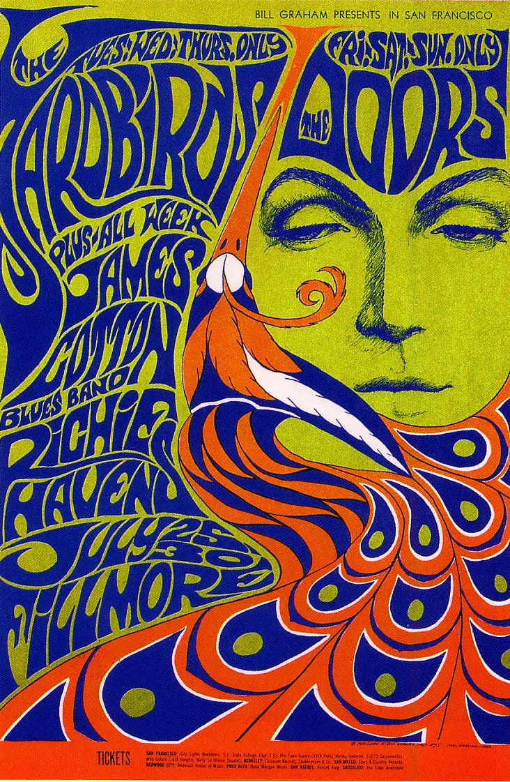
Bill Graham Presesnts poster design, 1967, Wes Wilson (Accessed 20/11/12)
Bridget Riley is one of the best known op artists to date, with black and white geometric paintings catching the public eye in the early 60’s for those who had sensibility enough to appreciate the subtlety in her work. I think Bridget Riley’s work was the first to draw me to simplicity in design. Her 1964 painting “Intake” is an example of her clean, geometric designs where small changes in line and pattern create incredible effects that play with the eye to create illusions of movement and perspective. Riley’s work is a testament to what you can do with geometry and pattern as well as a reminder thatsometimes less really is more.
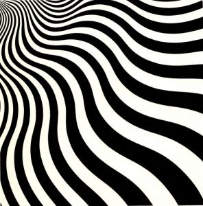
Intake, Bridget Riley, 1964, Acrylic on Canvas 178.5 x 178.5 cm (Accessed 20/11/17)
Milton Glaser is a graphic designer, best known for his I Heart New York logo and his editorial illustrations. The piece that first grabbed turned my attention to his work was his 1966 poster for Bob Dylan’s “Greatest Hits” LP, immediately recognising its influence on contemporary designers I look to today. This piece demonstrates his key characteristics; hand drawn elements of block colour and line alongside his signature typeface used together to effectively capture the spirit of the music he is promoting – techniques that resonate with me personally as an illustrator longing to design for music.
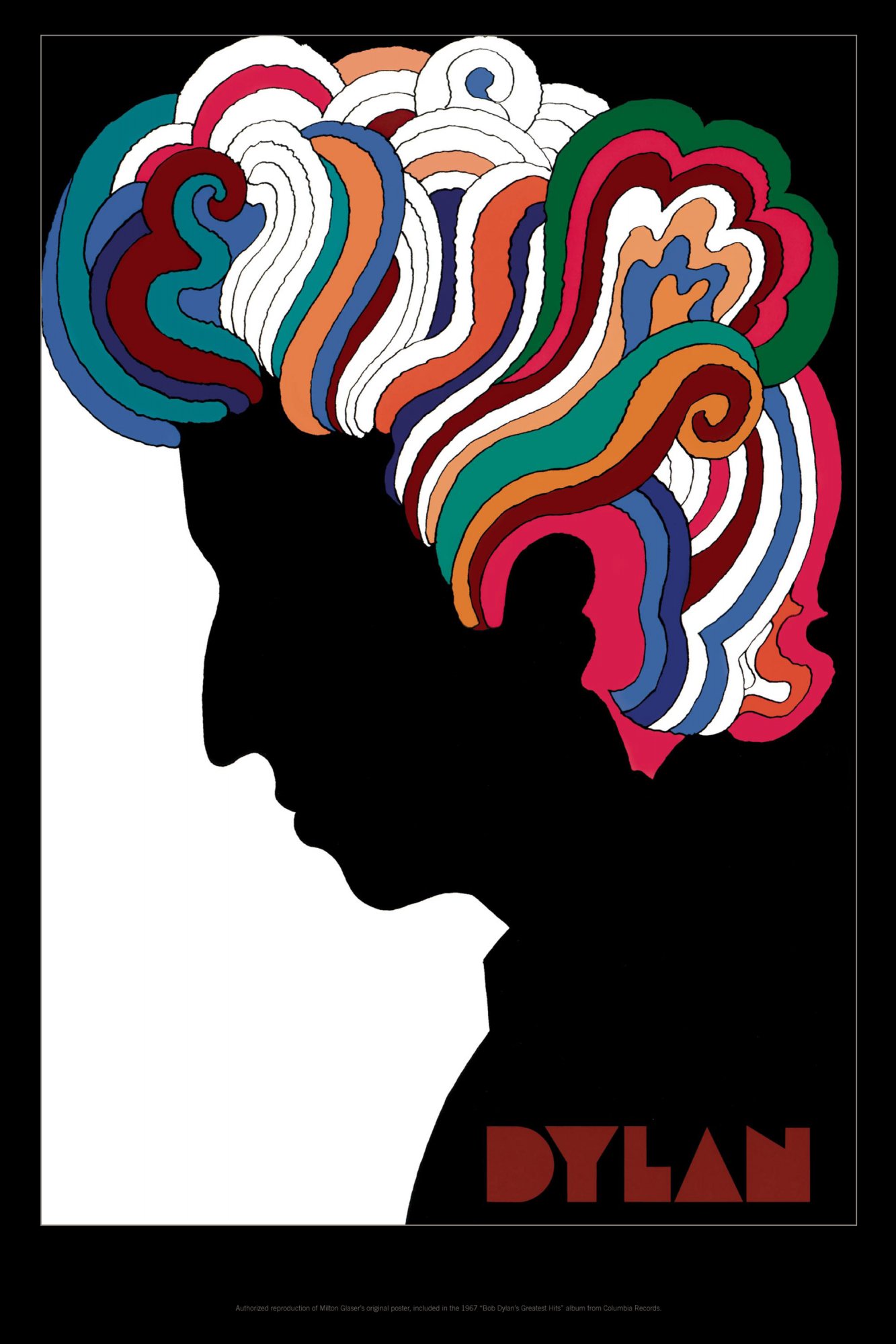
Bob Dylan’ Greatest Hits LP poster design, Milton Glaser, 1966 (Accessed 20/11/17)
http://www.wes-wilson.com/bill-graham-presents.html
https://www.miltonglaser.com/store/c:posters/824/dylan-reproduction-2008
http://www.op-art.co.uk/op-art-gallery/bridget-riley/intake