
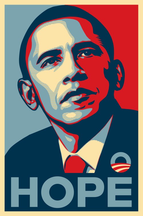
Shepard Fairey – Obama – Hope
Shepard Fairey is a contemporary artist who specialises in graphic design, street art, is an activist and an illustrator, that creates hard hitting art. Fairey became well known for his Barack Obama “HOPE” poster during the 2008 election. Fairey states “I’m not going to be intimidated by identity politics”, as he is an activist and strives for change it’s not a surprise that his work is influenced by politics. Fairey uses screen printing with a variety of layers to achieve clean, pristine lines and gives a posterised affect. This allows the tone to be split from continuous gradation to several regions with fewer tones which is what creates the bold images we see on billboards. Fairey uses Gotham typeface in his poster that reads “HOPE” in uppercase and is a geometric sans – serif typeface which is also simple but bold and gets the message across therefore was chosen well as it fits in with the poster.
April Greiman – 1970s
April Greiman is a contemporary Graphic Designer. Greiman was one of the very few designers who embraced the technological change and digitisation in the art world. Greiman pushes the boundaries of typeface and combined with image they reinforce and compliment each other. Greiman is constantly thinking about space within her designs and this can be admired in her posters where she uses type to give her posters dimensionality. Greiman ‘exploited pixelation and other digitisation “errors” as integral parts of digital art,.’ meant that she was able to be a futuristic within her design work and from a design point of you, her work would still be considered contemporary and modern in todays world.
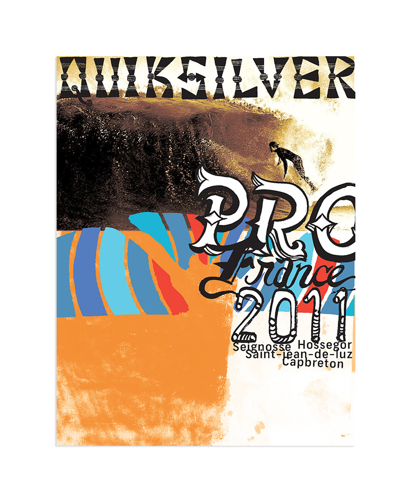
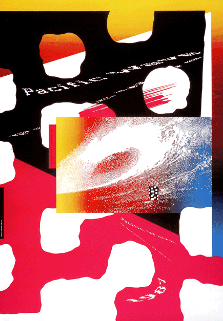
David Carson – Quicksilver – 2011
Carson broke every traditional boundary created within typography and design and rebelled against these ideas to create artwork that is very pleasing to look at as a designer although in theory it should not work. Carsons fascination with the surf world and type resulted in these incredible posters where there is a staggering use of symbols and type overlaying whilst working free of form suites this style of design. Carsons design appeals to all ages as it has a playful feel although still looking professional.
Bibliography:
Butler, A (2014). Interview with graphic designer David Carson. https://www.designboom.com/design/interview-with-graphic-designer-david-carson-09-22-2013/
Delaney, B. (2017). Shepard Fairey: artist behind Obama ‘HOPE’ poster unveils largest work to date in Sydney.https://www.theguardian.com/culture/2017/jun/17/shepard-fairey-artist-behind-obama-hope-poster-unveils-largest-work-to-date-in-sydney
Williams, L. (2016). April Greiman – New Wave design.graphicdesignwomen.com/april-greiman-new-wave-design
Zara, J. (2017). Shepard Fairey: ‘I’m not going to be intimidated by identity politics’. https://www.theguardian.com/artanddesign/2017/nov/14/shepard-fairey-new-exhibition-la-damaged