
The Legend of Zelda poster created by Van Orton Design caught my attention as I found that the bright neon colours within the poster were striking and drew me to it most. Although Van Orton Design made the title of the game small which is not following the norm, as typography 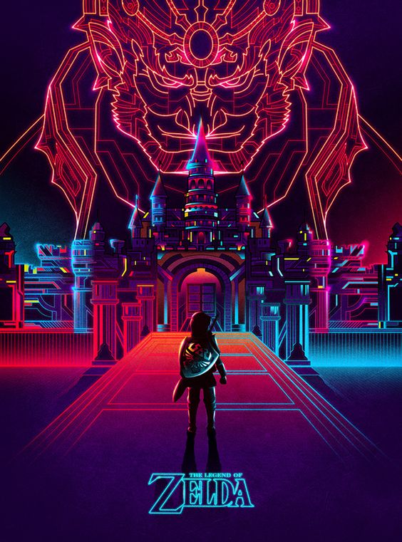 usually plays a large part to this type of advertising and is usually where the eye is drawn too, rather they emphasise the actual design of the poster itself which I admire.
The minimal colour scheme helps the eye focus on the poster as a whole but also helps show that the main design element of the city and Ganon towards the top of the poster is the main focus and this is where the eye should go naturally, however by placing the title underneath the main character, keeping both centered, means that nothing would be lost.

Whilst with Brandon Woelfel’s photography I found just as intriguing in how he photographs his subjects by using light as his main source of inspiration. He is attracted to neon lights and exploring how they can change a person’s face. Although this photograph is much more minimalistic compared to the Zelda poster, it has a similar effect in that both use the neon lighting as their predominant medium. The red lighting in his picture contradicts what he is trying to communicate; it gives the photo a sinister feel rather than warm and friendly, whilst playing on the idea of innocence at the same time.
Bibliography:
http://www.brandonwoelfel.com/photography-1/4r1ya2i7957ittb7xfpaqa8kt39skn
http://vanortondesign.com/WORK
https://www.behance.net/gallery/21814109/The-Legend-of-Zelda