Author Archives: Amy Murphy

Conclusion

When I first received the research and communication briefing I was very nervous as English is not my strongest subject and I have not had to write an essay before. Although I found writing my first few posts confusing as I was unsure on what I had to write, I feel like my writing has improved throughout this module. The more confident I became in my writing the more I enjoyed my tasks and lectures. I found the lectures fun and interesting therefore I was more engaged when having to write my essay. Although I found some of the tasks challenging, I felt like they were the most beneficial to me. It allowed me to challenge myself and really think about what it is thats is expected of me for the certain essays.

As the first 2 tasks were research tasks I felt like I was repeating myself in my essays. I really struggled to write 500 words for my first task as I found the task quite straight forward. I did however find Harvard referencing really difficult to get my head around at first and it is something I still struggle with now. I have not used this method of referencing before and struggle to remember the format for each research method. I really enjoyed the lecture of our second task about plagiarism as I found it really interesting how famous designers have copied family heirlooms, independent designers and national costume. Discussing whether plagiarism is important and what plagiarism is was really fun and engaging. When given our task for this lecture I was really disappointed that we did not get the opportunity to talk about our opinions of plagiarism. I felt that the second task was the same as the first and could have been more interesting by being able to give our opinions on the lecture we previously saw.

The task which I found most engaging was the Ethics task (9/10). It gave me the opportunity to write about a subject I feel passionate about and analyse an image that was very controversial. I struggle to find quotes to back up my opinions because I am not sure where to look or how I should look. It would be great to improve on this next semester. I find writing my opinion about a subject much easier than explaining my research process. Not only do I find it more interesting but I also have much more to write about. I would love to be able to do more of these tasks as I feel that it improves my writing hugely.

Overall, although I was not looking forward to this module, I have found it interesting and it has hugely improved my writing skills. I manage to write the essays much quicker and find it easier as I have had more practice. Although some tasks were daunting at first I was really happy once they were complete and found that they were not as hard as I originally thought.

Task 9/10- Ethics


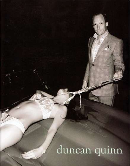
The advertisement which I have chosen to analyse is the suit campaign advert for Duncan Quinn. I have chosen to look further into this advert as I find it the most disturbing and degrading out of the two images.

Unlike in the American Apparel advert, where the lady had control of herself and her actions, in this Duncan Quinn advert the female looks inferior and submissive under the control of a man. The advert shows a well dressed and smug looking man, pulling a lady in sexy lingerie across the bonnet of his car by the head. The way he is controlling her reminds me of a way you would control your dog when it is on a lead. He is very much in control as she is in a vulnerable state. The way the ladies hand looks limp and the shadowing around her head could suggest that the lady has been killed by the man in the image. His smug look on his face shows his enjoyment and pleasure of the power he is holding over lady. A stylish expensive suit, a posh American style vintage car and the pride on his face all indicate that he is a wealthy and important man. Her submissive pose and lack of clothing shows that she is unimportant. As this is an advert for a male suit campaign it makes it worse for me. Duncan Quinn is portraying to his audience that you can be this man if you wear one of my suits. As if he is proud to say that is ok to control women if you are wealthy and powerful enough to own a Duncan Quinn suit.

The woman being in her underwear gives the impression of a sex slave. Someone who is raped and forced to be submissive to the superior male. The way in which the photograph has been shot also gives a more sinister feeling to the whole image. The whole focus is on the lady, the car and the male. Around them is incredibly dark and mysterious. You don’t know where they are or who else is there. It gives off the impression they could be in a garage or parked outside in a more rural area at night. Adding the black and white filter to the image takes away all happiness and life from the photo. Instead it is dark, cruel and uninviting.

‘Research has shown that violence against women is a serious public health and human rights concern (World Health Organization 2000) and that the simultaneous presentation of women as sex objects and victims in various forms of media increases acceptance of violence against women (Malamuth et al. 2000)’  This quote from the article  ‘Women as Sex Objects and Victims in Print Advertisements’ has made me think about the impact which media has on the world. After seeing this advert men may feel that is has become more acceptable to treat women in this way. The power of this man could be tempting to the male audience due to his wealth and appearance. I believe that this advert should have been banned as there are so many different ways which it could be interpreted badly. There are many other adverts which have been banned from certain countries which I feel are far less graphic and discriminating. For example the Marc Jacobs ‘Lola’ perfume advert was banned from the US for complaints about ‘sexualising children’ after using actress Dakota Fanning in a girly/ childlike dress.

Task 7/8- Fashion as Communication

Fashion as communication is the book I have chosen to reflect upon for this task. In the chapter ‘Etymologies and Definitions of Fashion and Clothing’ Malcom Bernard looks in depth at the meaning of fashion and the way fashion has been used in society. In the opening Bernard explains that fashion was once something which someone done, unlike now, where fashion is something that someone wears. Throughout the chapter he expands on this thought as well as how fashion changes social status and peoples opinions towards fashion as a craft.

The passage of the chapter which I found most interesting, Bernard talks about how Fashion design ‘enjoys a lower status than any of the so-called fine arts’ (1996, Bernard, p.23) he backs up this quote with one similar from Willson ‘fashion is the degraded or unacceptable face of art’ (1990, p.209). After reading this chapter I was faced with the question ‘what is my perception of fashion?’. My initial thought was fashion is a form of wearable art. I noticed that this thought disagrees with Bernard’s and Willson’s feeling towards fashion. The oxford dictionaries definition of art states that art is ‘The expression or application of human creative skill and imagination, typically in a visual form such as painting or sculpture, producing works to be appreciated primarily for their beauty or emotional power’. Art is appreciated for their beauty or power in the same way fashion can make people feel beautiful or powerful. Fashion gives people different feelings as they wear it. The same way that art gives people different feelings as they study it. Dance, literature and music are also considered one of the arts. This is because they convey emotions. You either like or dislike certain genres of the arts the very same way that people like or dislike styles of fashion.

A debate by the Tate questions ‘is art changing the face of fashion?’ stating ‘the Piet Mondrian paintings that inspired Yves Saint Laurent’s Mondrian Collection of now iconic cocktail dresses in 1965’ (Tate, Holtham, 2013). The way art has such a big impact on fashion shows the close relation between art and fashion. Artists and designers are both very creative people therefor designers grasp the deeper meaning of art and translate it into their own. I came across a quote by Hugo Pratt ‘The fact is that even art is subject to fashion’. This made me think about how fashion is also changing the face of art. The styles of artist have changed throughout history to fit in with the fashion of today’s society. Even in the form of tattoos, the artwork that people choose to put on their bodies, change with the fashion of today’s world.

I feel that this chapter has opened my eyes to what fashion is and made me think about how it is perceived in today’s society. Although I disagree with some of the points in the writing, I found it incredibly interesting to see how others see fashion.


http://www.tate.org.uk/context-comment/blogs/tate-debate-art-changing-face-fashion, Susan Holtham, Feb 2013

Task 5/6- Alessandro Michele Gucci AW17

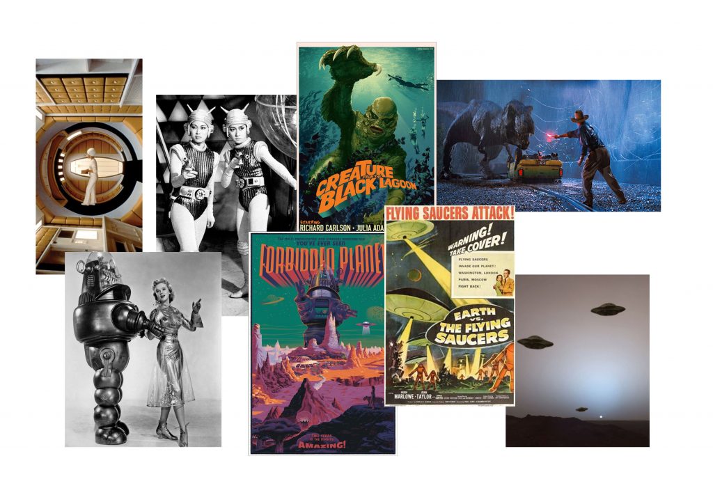
Moodboard featuring 60's Sci Fi inspiration

Moodboard featuring 60’s Sci Fi inspiration

4be13c4368a2497b44dd59efecd1990d

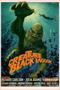
Image of the 2008 Stan and Vince poster

AAHTUAAAJUA7IAIAAAAAATIB6QA7777774AAAAAASAAVQAQA

Stan and Vince Jurassic Park

Creature_from_the_Black_Lagoon_poster-1

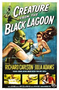
Original Poster not 3D

1 sheet a

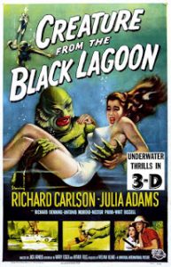
Original Poster with 3D.

Creature from the Black Lagoon

The image from my moodboard that I have chosen to review is the poster from the film ‘Creature of the Black Lagoon’. As well as inspiration to Gucci, it is also a huge inspiration for my knitwear portfolio project. After researching further into this image I discovered that this poster is not an original from the 1950’s. This poster was made in 2008 to advertise the release of the original movie with new 3D technology. The artist of the poster Stan & Vince, has also recreated posters for Jurassic Park (another film which inspired Alessandro Michele) in a very similar style. The digital style of the poster is different to the hand drawn original, however you can still see the connection of them both. Keeping the original style of 1950’s artwork made it hard to notice that the peter was a remake. I am glad that i researched further into this image as I would have had the incorrect information about the poster.

I began to look closer into the original poster and found that the original film was released in 35mm Polarised 3D strips. They also created a range of 3D posters however they were never issued. Attached are images of the original posters from before and after the 3D snip. This original 3D poster is one of the most sort after poster from the 1950’s due to its limited number of issues. In 2015 one copy sold for $20,315. The images of the original poster, Albert Kallis, has done a number of sic fi posters for other films. The brain Eaters, Invasion of the Saucer-men and Not of this Earth are a few of his posters which show his clear style. It was great to see the connection to the poster, film and the Gucci collection, it shows how research can be translated into fashion.

Task 3/4

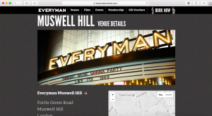
Everyman Cinema, Everyman Venue Details, https://www.everymancinema.com/muswell-hill#venueDetails, Accessed 22nd October 2017.

Everyman Cinema, Everyman Venue Details, https://www.everymancinema.com/muswell-hill#venueDetails, Accessed 22nd October 2017.

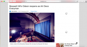
Bridget Galton, 2016, Munswell Hill’s Odeon Reopens as Art Deco Everyman, Ham&High, 15 November 2016.

Bridget Galton, 2016, Munswell Hill’s Odeon Reopens as Art Deco Everyman, Ham&High, 15 November 2016.

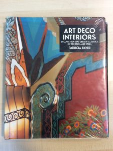
Bayer, P. (1994) Art Deco Interiors, Singapore: Thames and Hudson.

Bayer, P. (1994) Art Deco Interiors, Singapore: Thames and Hudson.

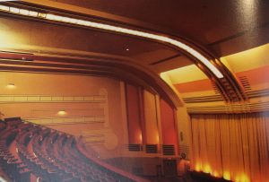
Munswell Hill Odeon, date unknown, Patricia Bayer.

Munswell Hill Odeon, date unknown, Patricia Bayer.

For this task I chose to carry on the theme of Art Deco architecture as it is my main inspiration for my print project. Throughout my project I have focused on the exterior of art deco architecture and I thought now would be a great time to research further into interiors. Interior design is something I wish to go into in my future so I found the book ‘Art Deco Interiors’ by Patricia Bayer incredibly interesting. On every page there were a range of photographs in both black and white and colour, along side information about the brief history of the building and the architect. One of my favourite images from the book was of the original Munswell Hill Odeon cinema. I chose to use this image to research into further.

Finding a website for the Munswell Hill Odeon was difficult as it is still a running cinema so I looked into the cinemas venue details page. This gave me more information about the cinema’s location, opening times and transport options. My newspaper article however, was much more interesting as it gave me more of an insight into the history of the cinema. In this article I discovered that the Munswell Hill Odeon has recently under gone a £3m restoration to restore the building to its previous art deco style. I feel that my previous task on expanding my research skills hugely helped me with this project. I found finding the information a lot easier that I did previously.

Task 1/2

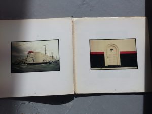
Photograph of Colo-cola Bottling plant, Robert V. Derrah 1937, Photographer Ave Pildas. Art Deco, Los Angeles.

Photograph of Colo-cola Bottling plant, Robert V. Derrah 1937, Photographer Ave Pildas.
Art Deco, Los Angeles.

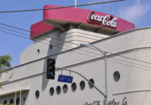
Coco- Cola Bottling plant, April 29th, 2008. Photographer unknown. http://bigorangelandmarks.blogspot.co.uk/2008/04/no-138-coca-cola-building.html

Coco- Cola Bottling plant, April 29th, 2008. Photographer unknown.
http://bigorangelandmarks.blogspot.co.uk/2008/04/no-138-coca-cola-building.html

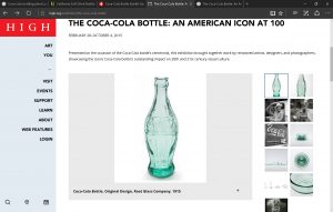
High museum of art, The Coco-cola bottle: An American Icon at 100 https://www.high.org/exhibition/the-coca-cola-bottle/

High museum of art, The Coco-cola bottle: An American Icon at 100
https://www.high.org/exhibition/the-coca-cola-bottle/

This task has helped me gain a clearer understanding of how to research. I have done a lot of research during my time in education however researching the same thing in different areas is not something I often do. It has opened my eyes up to how different areas of information give you different research.

To ensure that my research studies related to my portfolio work, I chose to look into Art Deco architecture. Using WebCat I searched art deco books in the library. I discovered a book of Art Deco architecture in Los Angeles, I thought that this book would have some great imagery relating to my project. My favourite image from the book was of an old coco-cola factory photographed by Ave Pildas. From that image I looked online at the same factory which gave me lots more information and images.

As my research was architecture based I found looking for an exhibition that relates very hard. After searching for art deco exhibitions and Los Angeles architecture photography exhibitions I then searched into Coco-Cola exhibitions and discovered the High museum of Art Coco-Cola 100 years exhibition. Although this exhibition does not completely relate to my original research of art deco architecture, it has shown me how much your research can expand and change simply through looking in different areas of information.

If I were to now expand on my research I would look at the shapes and styles of the cola bottles and compare them to the styles of art deco architecture. This may help me to come up with links to the shapes which are found in that era. Referencing my images in Harvard style is something very new to me. I understand how Harvard referencing helps you to identify your images and lets you find the book again in the future. I have not done this before however therefor I struggle to get the format correct. I am hoping that this is something which I shall learn over time.

Overall I think that this task has been incredibly helpful for my future research. It has opened my mind up to new research methods and taught me how to reference correctly. One thing I would love to improve on is my knowledge of getting the most out of the library. I struggle to find the books I am looking for even when I use the online library service. Finding information in books that relate to my research is also another thing I would love to improve. I hope that throughout this module I will learn more about research from the library.