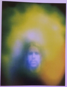
Even though the following quote is spoken about designers who work with digital graphics, the photograph pictured is a key example of how artists communicate feeling as well as provoke feeling within their audiences, “The designer’s mission was simple: to create the simplest, most harmonious, most neutral form, thereby enabling communication to the widest possible audience.” (Helfand,J. 2009). The colours and effects used within this piece allow for multiple feelings of mystery, nostalgia and curiosity to be expressed as well as encouraging the viewer to reflect on what the subject or photographer may be trying to communicate through the feeling captured.
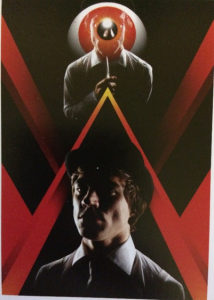
This published image combines strong design and story, the above poster is part of a fashion shoot based off of Stanley Kubrick’s adaptation of the Clockwork Orange, this quote summarises how two sides of design can exist simultaneously without overpowering each other, “Design that strives for neutrality, that seeks to extinguish its relationship to the human condition, risks removing itself from the very nucleus of its purpose, which is, yes, to inform and educate — but also, to enchant.” (Helfand,J. 2009).
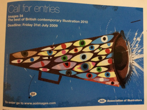
Multiple mediums from design are used to create the ‘Call for entries’ megaphone, the combination of collage, print and digital typography allow for a more dynamic and interesting composition working in a way that is similar to that described in the following quote, “They used a variety of resources and approaches to make sure their graphics translated to their audience.”(Anon, 2013).
I personally think that making sure that the piece is clear to its selected audience is important and a fundamental within Graphic Design as visual art can communicate many things to its audience that other mediums might not be able to communicate to the same standard.
References
Helfand,J. (2009) Can Graphic Design Make You Cry? Available from: https://designobserver.com/feature/can-graphic-design-make-you-cry/9737 [Accessed 2 December 2017]
Anonymous. (2013) How to tell a story using Graphic Design. Available from: http://www.harrington.edu/student-life/blog/july-2013/graphic-design-how-to-tell-a-story-using-graphics [Accessed 2 December 2017]
Images:
Ingledew,J. (2011) The A-Z of Visual Ideas. London: Laurence King Publishing.
Pages (Fraser Hudson) 59, (David Abrahams) 122, (Thea Swayne) 137.


