
Gerhard Richter Photography
https://www.gerhard-richter.com/en/art/overpainted-photographs/rural-landscapes-75/7389-sils-maria-18257/?&artworkid=6&info=1&p=2&sp=32
Accessed on: 20/10/17
The mos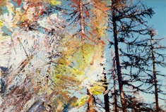 t striking element of this piece is the paint – you are automatically drawn towards it because it is so unusual to see paint on a photograph – in any other situation this photograph would be deemed ‘ruined’ and thrown away. This makes us stop and question why is it so deliberately there. The different colours and textures used, allow your eyes to focus on what’s behind the paint. In this piece the colour draws you in deeper but something makes you stop as you cannot see the real image it shows he covers parts of the image up with paint allowing us to make up our own minds of what the image means. The paint reveals and conceals at the same time. “The smudging makes the paintings a bit more complete. When they’re not blurred, so many details seem wrong, and the whole thing is wrong too. Then smudging can help make the painting invincible, surreal, more enigmatic – that’s how easy it is.”
David Carson Graphic Design
http://www.designishistory.com/1980/ray-gun/
Accessed on: 20/10/17
The first thing that attracts me to this piece is the mirror image and the use of colour, it is a lot like the phot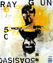 ograph I chose however in this case the paint isn’t trying to cover the image. There is a strong rule of thirds in this poster as there is something interesting in each section such as the type, numbers and images. Even though the words are separated they are still readable it makes your eyes flow around the poster taking in all the information. In the photograph, there is a lot of layering as the paint is spread across the image, in this poster that it also the case the darker colour of yellow attracts you straight away, making these images very similar.