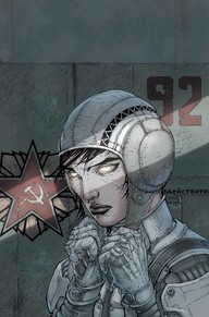
“The wild storm” is a american graphic novel series produced by world-wide known American company DC comics. Volume 1 cover of the series is made in quite a extraordinary way. The main thing that is really noticeable is lack of text. For decades comics books were bombarded with flashing, eye-catching fonts, screaming lines and loads of other information sources, but now those days seems to be over. Wild storm cover is screaming with silence and emptiness, which takes all viewer focus to one target – woman in a costume and an deadly resolute expression on her face. Line of a sun light, 2 red symbols in the background, woman outfit, gives little hints to what story and time period this cover leads to, leaving reader guessing and excited for a new journey in a past world.
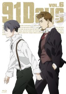
“91 days” manga (manga – Japanese comics) volume 6 cover is shining with freedom and action. It is not that hard to separate 3 classic layers of the picture : the characters, title and a background. Two main characters of the series are fully exposed in large scale, walking right in front of a cover, even blocking up some of the the title, which is lately quite a frequent occurrence in magazines and book covers design. Characters are displayed without any highlights or embellishment, in solid white background enriched with sand-colored font, makes manga cover look clean and simple. Design composition strongly resemble minimalism ideas, charmingly invites reader to dive into new adventure.
Although these two pictures are created for culturally different audiences, I find them surprisingly similar regardless of some minor differences and drawing style. Both covers has most basic compositions with some smoother graphic element ( light line, smoke). “The wild storm” is far more detailed, has less typography elements and is more spacious, while “91 days” cover is focused more on simplicity, less intense art style and uses almost all empty space. Overall both covers graphic designers did a fine job at representing their ideas, comics content in modern and artistic way.


