
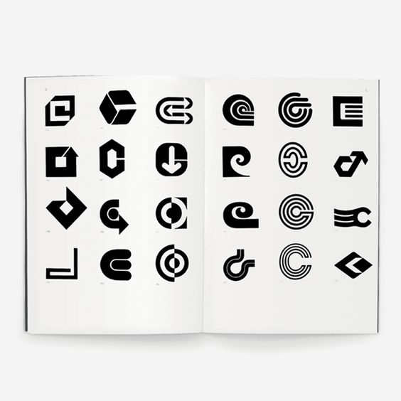
Trademarks and symbols by Yasaburo Kuwayama (published in 1973) is relevant to me and my interests I have for logo design. The book looks at more than 1500 trademarks from all over the world arranged in a alphabetical order. In any one of these page a sense of clarity and simplicity is shown. All these logo have already been done but yet it context of 2017 anyone of these logo are still fresh and new and can still work today. This is why a really love old logo designs that work it doesn’t age unlike logo from today where you can’t bring that design back to the start of corporate design. It gives you a great appreciation of designer during that period using pen and paper.

My second piece I chose was by Jordiros a digital illustrator and freelancer. His work use influence from Japan using religion, history and culture to add flavour to his work. The common ground found between the piece of work is that Jordiros use a lot of logos and typography like adidas, Plastation Station, coke and mixture of other name in his work. Using these well known logos gives a sense of period of time and a street art look to his work. Compared to the logos on the negative white space in Kuwayama book having the logos on these character with vibrant colours and detailed illustration your attention is immediately moved towards the logo making it the centre of the subject working in harmouny with the drawing.
Trademarks and symbols –
Trademarks and symbols by Yasaburo Kuwayama (published in 1973) [Accessed October 19 2017].
Jordiros –
2017. Ha (@_jordiros_) • Instagram photos and videos . [ONLINE] Available at: https://www.instagram.com/_jordiros_/. [Accessed October 19 2017].