Post_M0dernism


Lichtenstein, R. (1964). Sandwich and Soda. [screenprint on polystyrene] Liverpool: Tate

It’s Roy Lichtenstein’s lesser known works that still appeal to me on a deeper level these days. It’s his simpler illustrations that tackle mundanity and everyday irony more tactfully in my opinion. Pieces like ‘Sandwich and Soda’ are relevant to me and others existing in an era of increasing levels of playfulness and sarcasm being accepted in the art world. What’s also inspiring is what was occurring outside of the single image. By choosing to screen-print this image he could manufacture hundreds of copies thus reaching a wider audience, blazing a trail for artists to come.


Warhol, A. (1962). Marilyn Diptych. [acrylic on   canvas] London: Tate Modern.

The meaning Andy Warhol’s most famous works, in my opinion are still as pertinent as ever in my opinion. Among those works is the Marilyn Diptych. It was a bold response to the 60s zeitgeist of celebrity culture, a public spirit that never really went away. By deconstructing the image through repetition in two different ways he reveals the meaning it has in the world. “The color contrasted against the monochrome that fades out to the right is suggestive of life and death, while the repetition of images echoes her ubiquitous presence in the media”. His firm grasp on the world around him is something that any designer should aim to replicate in way that’s appropriate for them.


Kruger, B. (1990). I shop therefore I am. [photolithograph on paper shopping bag] New York City: MoMA.

As a work of art from the 90’s I feel that it ‘I shop therefore I am’ by barbara inherently retains more relevance to me as a designer in the 2010’s. Her punchy type and simple graphics combined with found imagery is something that I feel a strong connection with. Because of where she chose to show the design it reveals more about the design itself and what she meant.


Abstract: The Art of Design, S01E03 – Es Devlin: Stage Design. (2017).

Directed by B. Oakes. England: Netflix.

Tate. (2017). ‘Sandwich and Soda’, Roy Lichtenstein, 1964 | Tate. [online] Available at: http://www.tate.org.uk/art/artworks/lichtenstein-sandwich-and-soda-p77811

The Art Story. (2017). Postmodern Art – Modern Art Terms and Concepts. [online] Available at: http://www.theartstory.org/definition-postmodernism-artworks.htm#pnt_1

The Museum of Modern Art. (2017). Barbara Kruger. I shop therefore I am. 1990 | MoMA. [online] Available at: https://www.moma.org/collection/works/64897

Summary

This module was both incredibly challenging and utterly inspirational. While my time management and research skills definitely have room for improvement, I enjoyed pushing myself to deliberate on subjects I hadn’t thought much about previously. It was the first time I felt the transition between college level and univeristy level of fashion. Things I once just created are now considered, challenged and deliberated upon. This creates a new plane of inspiration which I’m sure will have a massive impact on my designs, with deeper meanings comes more original work.

I think the most beneficial part of this module was beginning to humour my curiosity. i have always been majorly fascinated by art and design, yet seemed never to follow the trail. I would admire peoples work and move on, my contextual studies simply taught me to think and care. Learning the importance of primary visual research for inspiration showed the importance of the library; it’s far too easy to rely solely on the internet. Although useful for deeper more thorough research, books provide ideas you had never previously thought of. We then were shown how to take full advantage of online resources and how to pursue the origin of a source. There is nothing more satisfying than discovering the thought behind artwork you love, such as Yves Klein’s Zone de SensibilitĂ© Picturale ImmatĂ©rielle where he sold invisible pieces of art. I discovered his immaterial pictorial zones accidentally, as I was researching the stem of his Anthropometry of the Blue Period. Something I would have never known without my newfound curiosity for history and meaning.

During the projects I’ve been completing throughout the term I’ve noticed how different my approach to research is. My ideas become more intricate and interesting because I now prefer to think of them as initial research that I then further explore, which results in more complex, deeper topic. The thing I struggled with most is finding specific references for allocated topics, while browsing for research is straight forward and stimulating, actually searching for a particular quote is a lot more challenging. Time allocation also played a large part in this module; while one task a week isn’t much to ask, fitting research and writing around studio time and extracurricular activities is something I definitely need to work on.

This module has been a massive milestone in my development as a designer, I approach problems and topics in an entirely different matter. Listening to a tutor who spoke about subjects with such passion was infectious and so enjoyable, a personal favourite being the visual research talk.

Task 11 and 12

The RCS module for me has been beneficial and taught me a lot however, I have not enjoyed all the tasks and have struggled through some.

For our first task we had to collect three images one from different research sources, understanding the difference between primary and secondary sources. I used a book on Steve Tobin, the V and A archives and an image of Philip Tracey’s work from Pinterest. I enjoyed this task as I was able to utilise the library and look through and learn some really amazing things and it wasn’t a daunting first task either. I also used some of the research from this in my studio work too. This task taught me the basic difference between primary and secondary sources which I previously had not even thought about.

Task 3/4 Academic integrity and plagiarism, we needed to choose a topic and use Harvard Referencing looking at a newspaper article, website and book. I looked at the controversial ‘Heroin Chic’ era in the 90’s. I really enjoyed this task because I was already familiar with Harvard referencing and it was good to put to practice using different research methods.

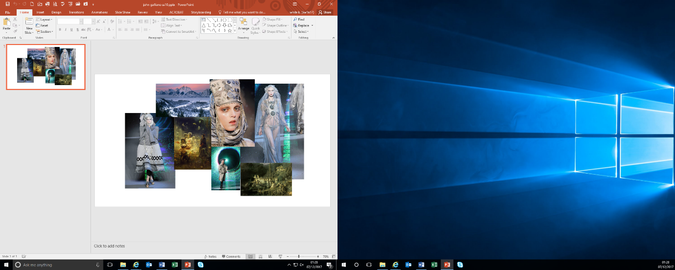
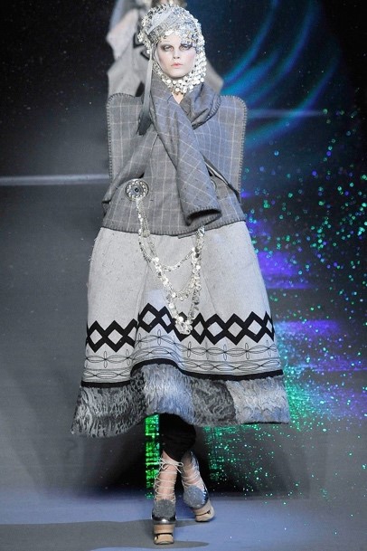
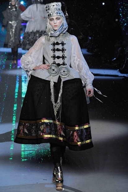
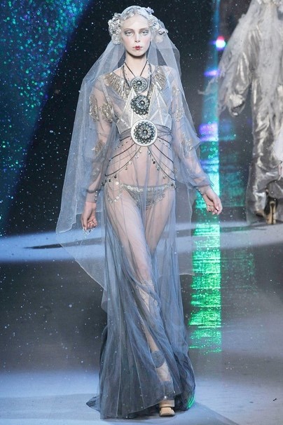
For task 5/6: Visual Research, we needed to choose a designer whose work inspired us and find references that inspired them. With our findings we had to create a moodboard and then write 300 words about one particular image. I chose to look at John Galliano’s fall collection 2009, which was inspired by Russian Folklore. I really enjoyed researching the designer and creating the mood board but found the 300 words difficult as it’s the most writing I have had to do since being at WSA. I had to really use the helping points on the presentation, which were very helpful. This taught me that I need to write down all the elements I could look at in bullet points and then build them up from there.

For task 7/8: Reflective Writing, we were given two essays from books and had to read one and reflect in 500 words. This task was the worst for me, the reading took me a long time and it was hard to understand at points. However once I started writing and the flow took over it was actually really interesting text and really challenged me to push my writing and reflective thinking forward.

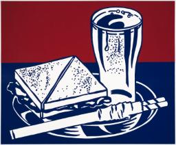
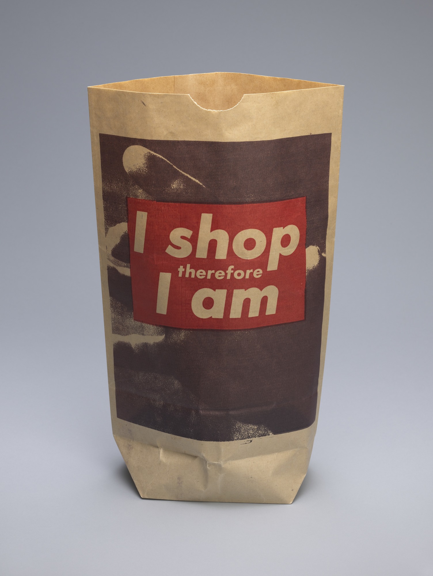
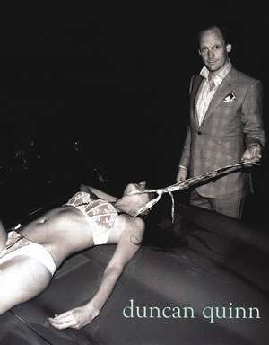
For task 9/10: Ethical Issues in fashion/ Textile Advertisement, we had two images to look at and chose one, both were very controversial advertisements, and then write 500 words explaining and arguing the issues which arise from them. This was such an interesting task and even though the 500 words were unnerving, writing about issues that are very close to my heart was liberating. It was great for understanding analysis an image and how society and the media work together.

In conclusion, this module has been difficult in places but rewarding in others, I have learnt more about the way I work and what’s better for me to do but also skills which will help me for the next two years of my degree.


WEEK 1 : Terminal Bar (2002) —- review and analysis

This twenty minutes short film was mostly constructed with black and white portrait, which taken by Stefan Nadelman, the boss manager and bartender in the bar for ten years. Because of this amateur, the original history of one part of New York street in that decade has been well conserve.

Throughout the whole video, the portraits flow with the rhythmical background music, which can attract audiences to keep their attention on it. In the same time, the producer also added the interview of Stefan between the stories and used his voice to narrate to photos, his could give it a more realistic sense from the video.

For me, there is a part of Stefan interview which shocked me a lot—- the people will just step on the bodies that lied on the street. He said” you gonna see these bullies people disappear from the street, the street eats them alive.” This can clearly show how the place with people of all kinds and people just live for themselves. I think personification is an influential way to show a message because it is a much easy way the explain the situation compare with the complicated sentences. It also kind of reflect my inspiration of my work because I always believe that simple things can have big influence.

To sum up, I didn’t watch this kind of film a lot but it change my expectation of it at some point since the music and the story match very well, which gave me the motivation to find out more about the history.

Task 9 and 10

Duncan Quinn is a bespoke tailoring company formed in 2003 in New York city. This photo was the brands first advertisement poster, presented to the world in 2008 and the New York magazine awarded it ‘the most disturbing ad found in 2008 fashion magazines’.

The photo shows a smug and smirking man in a well-tailored suit holding a tie loosely positioned around a seemingly dead woman. The woman looks like she has blood coming from her head and is in her underwear on top of a car in the open. At first glance this picture is disturbing, at second glance its sinister.

This shows the gross, inappropriate, sexual objectification of women in the fashion and advertisement industry; it is utterly sexist and not appropriate for anyone to see. The male is seen to be in complete control and dominating the woman in every way. The woman being in lingerie suggests that this was also a sexual act of dominating. He’s standing, looming over her, like she is an object at his disposal. He’s completely dressed and covered whilst she is near naked in the open for anyone to see, as if she’s not just for his amusement but for others as well, like a show pony. Him using his tie as some sort of leash suggests how little he cares for this other human, treating her as if she were a submissive dog. Even more the woman’s face is not shown, de-humanising her. It’s disgusting. What makes the photo that more alarming is that the woman is shown to be lifeless, suggesting this is an ad condoning rape or necrophilia. There’s some sort of disturbing sexual fantasy being displayed here that involves death and pain.

This advert shows that although the world has improved in the last 80 or so years on the treatment of women, sexism is still present and still objectifying woman in many industries. It is suggesting that if you buy our suits you will also achieve total dominance over women. ‘Women are put on display like pieces of commodities or merchandise
The more nudity or sexual reference depicted, the greater the sales generated in an exploitative and profit-driven media industry’ (Le Mauricien: 2013) this quote explains the derogative depiction of women in the media and what is still being taught to younger generations: that women are objects to be used at a man’s disposal in any way they want. What’s worse is the women who are used in this way are made to ‘feel guilty, inferior, or somehow less than’ (Cortese 75) abused and used.

In conclusion, this ad is promoting that wearing good suits will enable you to dominate and have control over women. For this day and age this is unacceptable, uncomfortable and incredibly alarming.


Task 7 and 8

I decided to use Sandra Miller’s ‘Taste, Fashion and the French Fashion Magazine’, where she discusses the introduction to fashion as we know today and the concept of tate towards the arts. She talks about how fashion integrated into the world of art and was changed by the French Revolution.

Miller explains that the first alleged fashion magazine by Jean Donneav de Vise in 1672, Le Mercure Galant, was the starting point for introducing fashion into the world of the arts, functioning as ‘the most up-to-date social, cultural and artistic developments’ (Miller). Although this was short lived it sparked a revolution of fashion magazines being the ‘truthful mirrors of their time’ (Miller). Once the new Mercure de France was reinforced it ‘acquired the wider intellectual profile’ (miller) which lead to the products of ‘the Enlightenment’, also known as ‘the Age of Reason’ during the French Revolution. Miller talks and questions the idea of taste a lot; philosophers were interested in how we form an opinion and what is considered ‘good’ taste ‘philosophical aesthetics sought to understand how our experience of beauty transcended personal opinion’ (miller). Are we guided by our own emotional response or is there a set level of taste that one needs to have to judge? Miller states that ‘instead of being a matter of personal preference, becomes intersubjectively valid aesthetic judgement’ (Miller) Later in the essay she discusses how fashion became something for the ‘higher’ classes to indulge in, with the fashion plates representing ‘the latest outfits worn at the French Court and in aristocratic circles’ (Miller). The richest people could get the best clothes, but is does high class automatically mean you have good taste? David Hume states ‘the world, is too obvious not to have fallen under everyone’s observations’ therefore it is ‘natural to seek a standard of taste’ (hume). I believe that taste is subjective, however when one has more knowledge of an area than others they might be considered to have better taste, in today’s society I believe this has nothing to do with status because fashion is so available to people, like Mark Turngate stated ‘You can dress head to toe in Gucci- that proves you’re rich, but it doesn’t prove you have taste’.

I found what Miller discussed about fashion and art being equal was very interesting. Le Brun Tossa, who wrote in the, Le Magazine des Modes nouvelles francaises et anglaises, discussed that if fashion and taste were connected then fashion could be regarded as an art form. This was unheard of before, whereas fashion was considered something an artist could admire but ‘does not equate fashion with art’. I believe that fashion is art; artists express themselves though their desired medium just as designers do through clothes. Even then the occupants of the garments are expressing themselves though the way they dress.

In conclusion, the introduction of fashion magazines set off a revolution of its own and now today fashion is one of the largest, richest and most influential industries on the planet.


  • Barlett, Cole & Rocamora (e.d). (2013), ‘Fashion Media: Past and Present’, London: Bloomsbury
  • Hume, D. (1965), Of the Standard of Taste and Other Essays, New York: Bobbs-Merrill
  • Turngate, M. (2005), ‘Fashion Brands’, London and USA: Kogan Page Limited


Task 5 and 6

John Galliano

https://www.vogue.com/fashion-shows/fall-2009-ready-to-wear/john-galliano

I have chosen to look at John Galliano’s Fall 2009 collection, where he was inspired by Russian Balkan folklore and the frozen lands of Russia. The models are styled to look almost fairy tale like and the runway show created a fantasy world using glitter snow and light effects. The garments are beautifully embroidered and he uses traditional shapes and patterns from Russia, you can see this in his knitwear and choice of sheer materials ranging in colours. The image I have been particularly drawn to is the furthest one to the right, and the final garment shown in the runway. The model wears what seems to be an organza dress which flows gracefully over her legs cascading the floor. The heavy embroidery on sleeves and bodice of the dress create a sense of grandeur which is only enhanced by the silver, gold and blue coins draping over her front and waist. The sheer head piece pulls together the mystery ice princess look, creating an almost innocent demur whilst still having an air of sexuality. I also love how the photographer captured beautiful sections of green iridescent light created by the light effects and the reflection of the glitter snow. Much like McQueen, Galliano always make sure his runway shows are also a spectacle and he shows through the collection that he can adopt traditional expertise’s but still keep his flare. The detail of every models accessories’ makes you believe that you are watching another world with the dramatic makeup, faces nearly white, lips frosted and eyes popping completing each and every look. Only Galliano would conjurer up a collection inspired by folklore and turn it into a parade of glittering theatre.

Final Summary

In this module I have furthered my research skills, broadened my understanding of art history and pushed myself to analyse more closely the work of others.

Through the research tasks set in this module I have discovered how valuable researching art movements and not just individual artists is. This has allowed me to discover new artists with ease, reading about artists and then about artists involved in similar work at that time. Researching art movements has also allowed me to discover artists across a variety of mediums that all work to the same ideals and themes. This means that I have been broadening my field of research across different time periods, medium and values, giving me a wider variety of references to call upon in my practical work.

In the task regarding authenticity I began to further understand the value of using quotes to support my work. By using quotes from Picasso and Austin Kleon I was able to convey a broader understanding of the topic at hand and they helped me to summarise certain points I was trying to make. This applies to using quotes throughout this module and I feel I have begun to learn the importance of quoting reputable sources on a particular topic.

Through comparing different pieces of work I have pushed my ability to analyse the work of others, looking further into the social and political events of the time, as well as reading into some of the more subtle and suggestive themes in different artist’s work. In the second task of this module I compared Stanley Kubrick’s A Clockwork Orange to the Vertigo comic book series “Transmetropolitan”. This was a challenging task as the two are very different mediums but I had very strong feelings for the two and really took the time to make strong points in my comparison.

Something I have enjoyed in my research for these tasks has been researching the influences of the artists I’ve been influenced by. For instance, in another task I referred to the work of Kate Moross, one of my biggest contemporary influences. I linked the work of Moross to that of Bridget Riley, one of my favourite artists from the Op Art movement. In doing so I have shown that I am looking further into my influences and aiming to discover their roots in order to better understand their creative process and to thinking as designers.

These aspects of my research will benefit me in my practical work as it will expand the way I think about my influences, analysing further the work of artists I admire and reading up on the social and political context surround pieces of work. Working in this way allows me to move forward and create new work with the ability to draw upon a much broader and varied range of sources.

Task 3 and 4

 Harvard Referencing:

Website-

Dazed Digital (2015), Revisiting the 90’s moral panic over heroin chic, Available from www.dazeddigtal.com/fashion/article/28630/1/revisting-the-90’s-moral-panic-over-heroin-chic, (accessed 14 November 2017)

Newspaper-

Akbar A. 2006, Photograph that inspired ‘heroin chic’ is selected for ultimate fashion show. The Independent, 9th November, 1.

Book-

Wilcox, C. (2015) Alexander McQueen. London: V and A Publishing.

My theme for this week’s task is looking at the ‘Heroin Chic’ period of the 1990’s, focusing on the controversy around it and also that it was such a movement in the fashion world. I chose my website article because it talks about the negatives of the time including glamorising drug abuse and eating disorders, looking at famous people who had fallen due to heroin overdoses such as Kurt Cobain and Davide Sorrenti. It also talks about how the models were representing an unhealthy body image for women, talking about anorexia and bulimia. My newspaper article because it talks more about the art and aesthetic of ‘heroin chic’, reminding us that it was a trend and movement within the fashion world starting with Kate Moss. I chose my Alexander McQueen book because I think he really represented the change in fashion and pushing the limits for example his early work like the collection ‘Highland Rape’ 1995 and the ‘bumpsters’ trousers. He also used models Kate Moss and Jodi Kidd who were under scrutiny for being too skinny and Kate being the model who started the whole trend.

Task 1 and 2

Primary source from book:

Steve Tobin’s Natural History: Blown glass and neon, 1993, exhibition Retretti Art Centre, Punkaharju, Finland, by Steve Tobin.


Secondary source:

Philip Tracey: London fashion week 2012, Spring/Summer Ready to Wear 2013

https://www.theguardian.com/fashion/gallery/2012/sep/17/philip-treacy-london-fashion-week#img-20


V an A fashion archive:

Hats and pins

  • Date: 1950s
  • Place: London
  • Artist/maker: Thaarup, Aage

Reflection:

For the primary source photo I went to the library and just pulled a random book from the 21st century artists section and ended up with a great book about Steve Tobin’s work. I chose the image I have because I was draw to the contrast between the natural cave setting against neon glass lights. My secondary source I wanted to stick with the neon trend and to start with searched on Pinterest for some images, I came across Philip Tracey and looked more into his work and the guardian did a great spread of his London fashion week collection. I chose the one I did because like the bright colour and like Steve Tobin’s work its almost futuristic like. I knew I wanted to look through the V an A fashion archives because they have one of the best collections. I started with just searching hats and came across the 1950’s classic hat by Aage Thaarup. The colour is bright like the previous sources but I like the contrast between this hat and Tracey’s as it shows how far fashion has come over the last 60 years.