Emma Davies: Task 7

Richard Serra’s “The Yale Lecture” addresses site-specific artworks. He discusses the ways in which art is contextualised within its environment, and the importance of connectivity between the piece and its surroundings. Teaming together a sculptural methodology with context, he suggests that it should not simply be about the artistic quality of the sculpture, but also its co-operation with its external placement. Thus, the scale, size, and positioning should be determined after regarding, confronting, and considering its enclosure, as opposed to working with it when the art is complete.

Leo Steinberg’s “Excerpt from Other Criteria” is similar in its discussion of the importance of artistic placement and how it can alter the viewer’s perception of what they are observing. He considers artists such as Rauschenberg and how he experimented with the traditionally vertical, eye-level curation (such as from the Renaissance period) in order to change “the relationship between the artist and image, image and viewer”. For example, he explored taking objects lacking artistic quality and presented them in a conventional gallery space to re-invent their visual purposes.

Therefore, both texts examine the correlation between the artwork itself and its physical placement. Artistic traditions should not define what can become a canvas and/or medium, but the location and orientation are of equal importance to the aesthetics of the artwork itself.

Emma Davies: Task 6

In my opinion, anything can be a medium of expression. The human body’s limitations are only what can not be achieved by pushing oneself to the eventual limit in our anatomy’s own physicality. The fascinatingly unique and comprehensive undulations of our skin’s texture allow so many possibilities, and by combining ourselves objectively with traditional and contemporary techniques, what is produced will be varied not only methodologically but also aesthetically. Bodies are constantly evolving and developing so subtly: one day we may have a cut upon our knuckle, or a bruise on our forearm, and this can be added and incorporated into our art just like an alteration of oil paint colour or photographic lighting conditions.

Therefore, the new mode of practice I would like to propose is using our own bodies as a physical, spiritual and visual medium of manifestation. The intricacies of our skin and features can be used as an artistically objective medium, canvas for adaptation and/or distinctive visual element which can aid our artistic practice extraordinarily.

Emma Davies: Task 5

In the ‘Everything At Once” exhibition, I found myself most drawn to Laure Prouvost’s ‘A Way To Leak, Lick, Leek’. She explores the idea of unanticipated word associations in language: revealing bizarre, sometimes grotesque, synonymous meanings through the miscommunication of spoken word. I found the discordant, surreal nature of her imagery, along with the jarring quick cuts, and loud, oddly placed music utterly fascinating.

Unlike a lot of traditional artworks, this stylistic new media allows viewers to observe a lot of artworks on their own screen. However, Prouvost’s amalgamation of video, sound and installation emphasise how important being a physical witness in a gallery truly is. Whilst observing this piece, the authentic impact of audio-visuals became more apparent to me. For example, the powerfully loud surround sounds, the darkness of the gallery space encompassing the crystal clear imagery broadcast on the large screen, and the ways the dialogue resonated upon each musical beat. Thus, for me, it became more than simply a video piece, but an idiosyncratically, intensely immersive experience.

Bibliography:

  1. Mousse Magazine (2016) Laure Prouvost “A Way To Leak, Lick, Leek” at Fahrenheit, Los Angeles [online] Available at: http://moussemagazine.it/laure-prouvost-fahrenheit-2016/ [Accessed 6 Nov. 2017]
  2. Jeff, M. (2015) Documentation of Laure Prouvost, “A Way To Leak, Lick, Leek” [online] Vimeo. Available at: https://vimeo.com/154779379 [Accessed 6 Nov. 2017]

Emma Davies: Task 4

It felt like every medium, every concept, and every question was represented in the “Everything At Once” exhibition at the Lisson Gallery in London. From Ryoji Ikeda’s hugely immersive “Test Pattern” binary light display, to Stanley White’s graphic block-coloured canvases, I was confronted by an eclectic range of imagery, audio and visuals. I found myself overwhelmed by the conceptual and contemporary range of artworks inspired by John Cage’s quote, “nowadays everything happens at once and our souls are conveniently electronic” – and a poignant message became apparent. After fifty years since this gallery’s opening, the featured artists over the years have teamed together to confront the idea that society has the ability and capacity to access everything in a cursory, superficial instant. Though there have been criticisms that this exhibition appears to have little direction, as there are no parallels between specified concepts and/or mediums, perhaps this reveals how successful these forty-five artworks are. Perhaps, the idea that there is so much accessible for the viewers reinforces the idea that there is, in fact,  everything at once: “time and space are no longer rational” (Cage, 1966) as “linear concepts and great distances can be traversed with an instantaneous click”.

Bibliography:

  1. Lissongallery.com (2017) EVERYTHING AT ONCE | Exhibitions | Lisson Gallery [online] Available at: https://www.lissongallery.com/exhibitions/everything-at-once [Accessed 4 Nov. 2017]
  2. Everythingatonce.com (2017) Everything at Once [online] Available at: http://everythingatonce.com/ [Accessed 5 Nov. 2017]
  3. Ikeda, R. (2007) ryoji ikeda  |  test pattern [online] Available at: http://www.ryojiikeda.com/project/testpattern/ [Accessed 5 Nov. 2017]

Emma Davies: Task 3

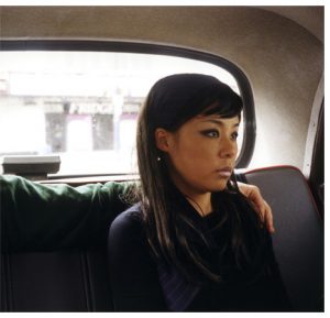
Nikki S. Lee: Part (14), 2002

Nikki S. Lee’s ‘Part (14)’ reveals an incomplete narrative. She sits in the back of a taxi, an anonymous arm around her neck, her face expression inconceivably one of vacancy. Is she listening to the man beside her? Is she looking out the window at something? Lee entertains this idea of narrative in her images, and the ways in which a viewer perceives an image. A subtle implication of a story is revealed through the way her body is placed and presented; she is not resting on the man nor finding comfort in his presence. There is no physical contact but his arm resting upon the back of her neck. This impels the viewer to question further what the image is truly about and Lee’s own mentality, therefore progressively resulting in each observer to interpret the imagery in a different way.

Moreover, as a society we observe people, we people-watch, we are judgemental as a species and it is often in our instinctual nature to understand and have knowledge of what we see. The unknown is unnerving and this disposition is encapsulated successfully in Lee’s photograph. The viewer is likely to create their own narrative to fulfil that unknowing, anonymous identity of the man and the personal interaction between the two.

Furthermore, Lee’s use of cropping reigns hugely notable in this image. A photograph shall be confined to the physical border, but to the subjects themselves a photo is the trigger of a memory. Lee utilises this definitive crop to emphasise how little information a snapshot holds, yet it still has the potential to capture an intensity of passion and emotion for the person in it. Therefore, Lee’s depiction of this standstill captured moment leads the viewer to ask many questions. Such as, perhaps, does absence takes precedence over the visible?

Bibliography:

  1. E-flux (2005) NIKKI S. LEE – Announcements [online] Available at: http://www.e-flux.com/announcements/41689/nikki-s-lee/ [Accessed 3 Nov. 2017]
  2. McLeod, D. (2004) Stretching Identity to Fit : The Many Faces of Nikki S. Lee. Ciel variable [e-book] Available at: https://www.erudit.org/fr/revues/cv/2004-n63-cv1069016/20765ac.pdf [Accessed 3 Nov. 2017]

Emma Davies: Task 2

Pink: The Exposed Colour in Contemporary Art and Culture, written by Barbara Nemitz, discusses the individuality and exposé of the colour Pink in art. Considering aspects from its metaphorical and spiritual significance, to a number of colour-orientated artworks, the entirety of this book addresses Pink as a notably conceptual and visual element. For example, Nemitz (2006) regards the psychological potential of the colour:

“Pink is more closely associated with emotions than any other colour. It appears to be a colour that addresses us with such intensity that it poses a genuine challenge to our emotions
 people seem to know exactly where pink belongs and where it doesn’t.”

Therefore, its effects on a viewer’s emotional interpretation is hugely relevant when connected with human behaviour. Whether associated with the flesh of the human body and its skin, the delicate cherry blossom tree, or an artificial material, the diversity of different shades of pink are both complex and fascinating. Thus, Nemitz transforms Pink from a mere colour to a hugely intriguing and connotational notion in art.

Bibliography:

  1. Nemitz, B. (2006) Pink: The Exposed Colour in Contemporary Art and Culture. Germany: Hatje Cantz Verlag

Emma Davies: Task 1

I find hands fascinating. They reveal a person’s life, disposition and personality far more than most other characteristic human features. Not only does this idea regard practices such as palmistry, or gestures and body language, but also the definitions and environmental damage scattered upon the surface of the hand. And, combined with my ongoing interest in psychopathology, my research led me to explore how people express their mentality and its repercussions through their bodies – in particular their hands. I studied mental illnesses such as bulimia, examining the ways in which people strive to be in control: by dominating their bodies those suffering with this illness often regain control of their emotions. Thus, the mind and body are merged in ways both physical and psychological, and the binge/purge practices associated with bulimia have hand/bodily connotations.

Inspired aesthetically by artists such as Ernesto Neto, I wanted to find something which can represent the metaphorically viscid emotional substance that is the constant need to be in control. I wished to symbolise the ways we as people can manipulate and strive to change situations physically, but their emotional effects are what firmly stick upon us. Using putty (a gummy, yet easily manipulated, stretched and altered material) I decided to present this concept visually.

In the arrangement of a series, the downwards transition embodies the potentially convoluted cycle of this mental illness: the perception of being in control, to its inevitable emotional effects. Control may be obtained in one moment, having a hold of the emotional instability and situation in hand (the putty), but in the next moment it elongates into something impossible to disperse, diminish and handle.

Task two Bloomberg, new contemporaries, 2015

This book is about the exhibition that takes place every year where thirty-eight upcoming artists from all over are asked to partake in an exhibition together, they were given the subject theme of that year was gender. There was a wide variety of materials used and a few interesting ways, not only did the outcome matter but the process in which they took to get there meant a big deal.

I was impressed by the work that I found within the book, from artists like Hannah Ford who creates three minute videos to artists like Pandora Lavender who uses a more 3D form for her work. They had a wide range of styles none of which were the same. I feel like this book represented how art has changed over the years and how there may be some traditional practices used but there are still new ones being created and used all the time.

Task 7

Robert Rauschenberg began a shift in art by changing the way we use a “canvas” by changing the Renaissance way of working “vertical” which was so the art would be eye level to horizontal and other directions. Even the popular artists of the time such as Pablo Picasso employed this traditional technique – however Rauschenberg changed this. He also started to use “culture” instead of nature as his main focus which was something new at the time, using things such as printmaking, screen-printing, found materials and photographs. A motive of Rauschenberg’s was to ruin the illusion of depth by making everything pop out at once. As soon as placing any materials together that would create depth he would eliminate them. All this was a precursor to how we view art stimulus today.

Richard Serra also changed the way the art would be made by very adamantly sticking to what he called “site specific” works. He would employ the use of typical construction materials and techniques from the industrial revolution which was not used at the time in art since these methods were most likely not considered “proper” since they came from working class backgrounds. He believed that location was extremely important for context and that if you made a sculpture elsewhere that it would ruin its context. For example, with his “Tilted Arc” which was a large piece of steel was placed in a very neat and tidy area. This was very controversial and people at the time believed it was antisocial and would encourage things such as graffiti. He wanted to challenge daily norms and art institutions about the idea of modernist works which were autonomous to wherever they were placed. He decided to remove it in the end and it was not placed elsewhere since he believed there was no point since the sculpture was built for that area.

Rauschenberg and Serra are extremely similar since they both challenged the status quo of artists during their time employing new ways of working and new attitudes towards art which helped shaped the way artists create today.


Task 12

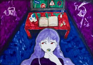
I did this piece on A3 paper with markers and pencil. I feel like it could be interesting if it was filmed. However, there would be many challenges which would come with it.

Props and background:

I would either have to green screen the background which I feel wouldn’t be effective. Or I would have to recreate the room it’s self so I would have to paint the walls, recreate/paint the furniture. As far as the small props go it would be fairly easy to get hold of but the book I would have to maybe spend a lot of money to get something similar. For the window, I would have to get hold of a real window since I don’t know how to construct one and then either paint the sky/signs or paint them onto paper and then stick them onto the window.

The girl:

I would either have to find a suitable model or use myself as the model. I’m fairly confident in my makeup skills to be able to create the look. However, I would have to buy a decent purple wig which would be costly or have a deliberately terrible one which I’m unsure about. I would have to get red contact lenses too.

Film/filters lighting etc.

I’m not entirely sure about lighting – I would have to ask someone to help me with that. In this piece, I did a deliberately odd perspective which might be hard to recreate on camera. I could maybe use a fisheye lens. I would be able to do a lot of enhancing with contrast after I had filmed.

I’ve really wanted to try and recreate my illustration images into film and this task was a good idea to think about that. But I feel I need to get more familiar and confident with film making to do something like this. Also I need more resources and space. If I actually did this project I feel like it would turn out slightly different to the original piece but it would be fine.