Publish or Perish!

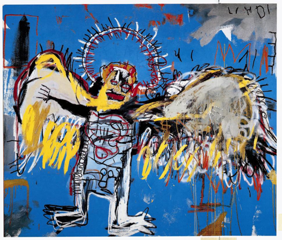
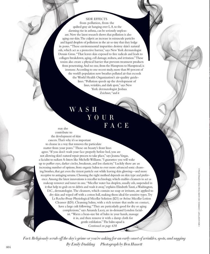
This is my first chosen image. I was drawn to this as soon as I saw it. The hierarchy is amazing. They exaggeration of the S really attracts peoples attention, and you will definitely not miss it. So thats the first positive of this layout, the fact that it draws the audience in at first glance. They have highlighted the S for the “side effects” which is what people would want the most information on. In the centre they have placed the title “wash your face.” The type that they have used it quite bold and the whole imagine looks powerful altogether. The contrast between the black and white has also given this article a less is more vibe. They have no overloaded with colours, this is probably because the article is not such a positive or cheery topic. The black and white colours highlight the seriousness they are trying to put across. The smoke appearing to come from the S also shows something of a toxic nature, something that is causing problems for the S. Again this is to highlight the side effects, the toxic and negative side effects.

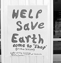
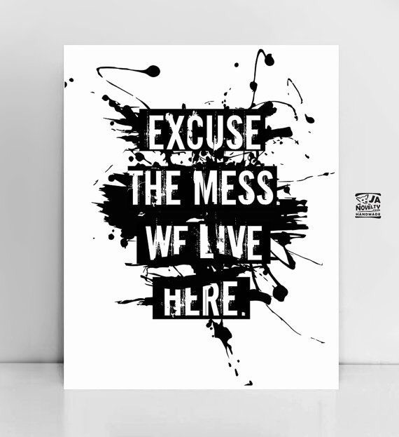
My second publication, a poster.
Although this poster gives off a messy look, you can see that it does in fact include organisation. You can see the layout has been thought through, the typography is placed neatly on the page. But behind the organised typography is the messiness. It includes splatters of ink/paint. The quote reads “excuse the mess” which relates to the messy background. They are trying to put across a messy design to add up with the chosen quote. It seems to be a “controlled” mess, something that is not too over the top.
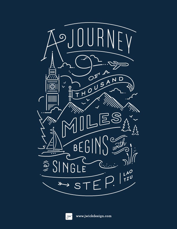
A very simple typography publication. Has a strong hand made feel to it, almost like a simple doodle. Very well put together, along with the white on dark blue. The colour scheme draws attention to the centre where the artist most likely wanted it to be. The illustrations gives off a happy and friendly vibe, which could be the reason some people become drawn towards it.


  •  Jennifer Wick Laos (n.d) Typographic Poster Available at: https://www.google.co.uk/amp/s/www.pinterest.com/amp/pin/510384570248084351/ (Accessed 28 November 2017)
  • Ben Hassell (n.d) Harper’s Bazaar Available at: https://www.pinterest.co.uk/harpersbazaar/ (Accessed 28 November 2017)
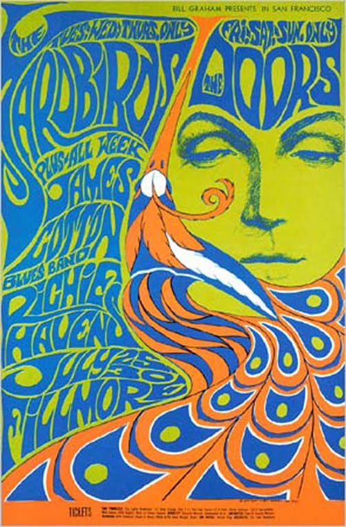
  • Anonymous (n.d) Scandinavian posters Available at: https://www.pinterest.co.uk/ManonGhiurco/scandinavian-posters/ (Accessed 28 November 2017)


Show, Reveal, Deconstruct (Postmodernism)

This poster is a postmodern Graphic design. It’s a mixture of photography, and typography.
Personally, I find this very interesting, with the jumble of words and the imagery. The photograph is in black and white, which makes the black and white typography match the image. I also prefer to use a black and white image if I do add imagery into my typography work. I feel like an image with colour complicates the whole thing, and the more minimal it looks, the better in my opinion. It’s not that harsh on the audience’s eyes, but it does look confusing at first glance. Some words are cut in a way that does not make sense when you first look at it, but this is what makes it different, meaning it would attract more attention. It also says ‘rules are good break them’’ which relates to the whole layout, it’s not your tradition perfect in order typography poster.
Again a very different design. The placement is not in perfect order, type is scattered around and there is again no use of colour. The design is very strong on its own, no colour was needed. The quote works well with the image used, pointing that the person in the cracked mirror is not themselves. I am interested in the cut out look of the typography, looks almost child like.
Because I gave two examples of postmodernism art without colour, I decided to choose one with colour for the final. This one is such an eye catching design, guaranteed to grab the audiences attention. This design definitely cannot be missed. This is the upside of postmodernism work, I think it grabs the attention of many people. Placements look great, the whole cut and paste look is adding more to the busy look of the page.
Looks fuller than the other two, probably because colour is involved. In my opinion the colour scheme that is used here does not work well together, but for this design it certainly has. It gives it that look of postmodernism.


  • Anonymous (n.d) posters. Available at https://www.pinterest.co.uk/pin/432345632962991346/ (Accessed 20 November 2017)
  • Xinying (2011) ‘Postmodernism? What exactly does Postmodernism art look like?’ Post Modernism Graphic Styles 23 August Available at: http://postmodernismgraphicstyles.blogspot.co.uk/2011/08/post-modernism-visuals.html?m=1 (Accessed 20 November 2017)
  • Xinying (2011) ‘Postmodernism? What exactly does Postmodernism art look like?’ Post Modernism Graphic Styles 23 August Available at: http://postmodernismgraphicstyles.blogspot.co.uk/2011/08/post-modernism-visuals.html?m=1 (Accessed 20 November 2017)

Postmodernism – Show, Reveal, Deconstruct

Marking a departure from Modernism, Postmodernism is a philosophical movement that was characterised by scepticism, a general suspicion of reasoning and of maintaining political and economic power. Questions were being asked, ideologies and objects were being deconstructed. We began to truly understand and appreciate objects for what they are.


I liked the amount of emotion Kruger was able to capture within this piece and how the typography brings in elements of graphic design, rather than just photography. Additionally, the ‘not’ is a lot smaller in size and not cut up, meaning that it could be easily missed, bringing double meanings to the piece and highlighting how the subject feels. I thought that the broken text reflected the imagery of the shattered mirror, showing that the subject could be perhaps feeling that her life is falling apart. The addition of the tear drop reinforces this.


I liked the composition of this piece. Although there are lots of random objects that don’t seem to fit together, the piece is balanced. The viewer is automatically drawn to the portrait in the centre, due to the composition, and due to the layered triangles surrounding the image. However, most crucially, we are denied the emotion of the eyes which makes this a very ambiguous piece, allowing the audience to depict it with their own connections. This highly saturated and contrasted portrait appears in some of Greiman’s other work also. Although I find it hard to work in a collage manner, I do like the effect which is created, everything has become deconstructed and disjointed but still remains comfortable. The pyramid shapes at the bottom on the piece also bring a spiritual element which seems to question our existence.


The fundamental element that stands out in this painting is the ring around the subject’s head, along with the wings. These additions give the painting connotations of Jesus Christ and his crown of thorns, raising spiritual questions towards the meaning of life. The hidden phallic symbol could also be included in these questions whilst the child-like imagery and lack of definitive lines bring innocence to the image, hiding some of its deep meaning. The ring could also be linked to Basquiat’s crown icon. The intensity and the speed of the painting could also be influenced by his intoxicating drug use and gives a feeling of struggle and suffocation.


Image one: Brenda Kruger, 1981, ‘You Are Not Yourself’

Image two: Cover for WET magazine, designed by April Greiman, 1979

Image three: Jean-Michel Basquiat, Untitled (Fallen Angel), 1981

Sensibility, Spirit and Meaning (Counter Culture)

In this photograph, you can see the handmade typography on their poster. It looks like a psychedelic typeface which relates to the environmental organisation they created. Psychedelia reminds me of nature, natural, flowy and altogether a positive image. So, I think that by choosing to create their poster with this specific type really worked for them.  It gives people a feel of their organisation. Typography is so powerful that people do receive vibes from certain types. Also, the small illustration makes the whole thing more playful.


This second poster is again using psychedelic type. Although it is not as extreme as the first poster. It relates to the whole Earth theme once again, adding to the natural look. This one is not as neat and tidy, or as put in order. It appears to be more scattered. Although this could be to add more to the natural feel that the makers are going for. It also adds a more playful and fun feel to the posters proposal. It seems to be not a very serious poster, I am basing this just off of the type that was used. This shows again how powerful type can be.


This is a gay youth march in the 1970’s. The typography used here is very simple, not much to it. Just a plain title, and year. Does not give a whole load of information but we all know what it is. Sometimes less is more, although not much is put onto this, it gives a big message. The type that is used, is quite bold and out there. It definitely attracts attention in my opinion. It’s so neat and a strong typeface, it is powerful in itself.
This is the reason that I find typography so important. It changes the whole feel of what you want to achieve, your outcomes can turn out anyway you want it to. For example, if you want to attract attention, use bold and big out their type. If you want something fun then use a playful type, etc. there is so much to experiment and work with.
  • Anonymous (2009) The First Earth Day–Bell–Bottoms And Gas Masks Available at: https://news.nationalgeographic.com/news/2009/04/photogalleries/first-earth-day-1970-pictures/photo7.html (Accessed 28 November 2017)
  • Anonymous (2009) The Specter of Environmentalism Available at: http://archive.oah.org/special-issues/teaching/2009_06/ex3.html (Accessed 28 November 2017)
  • Anonymous (2012) 1ST ANNUAL GAY PRIDE MARCH, 1970 Available at: https://www.charentonmacerations.com/1st-annual-gay-pride-march-1970-2/ (Accessed 28 November 2017)


Technology is the mortal enemy of art

In my opinion I agree yet disagree on this quote. I understand why some people may feel strongly about this. Some people love the fact that hand touched pieces are best, as there is a real connection with the artist and their work. The real life paint brush, pencil, or any other type of medium. “Artists today, on the other hand, operate with clicks of the mouse, video tools and digital colors, which even if they ostensibly mimic old traditional tools” – Mohamed Zaher. So what he is trying to say is digital work will only be mimics of traditional work.
Manar Abdel Maboud
On the other hand I understand why people also disagree. Why should it be the enemy? Why is it not a positive? Technology has helped art come a very long way. We are not only limited, we now have amazing digital help to create even better designs. Very precise things we can create digitally, try out many different versions of the same design in the click of a button, erase a mistake very quickly rather than restarting the whole thing. That is an advantage for artists, everyone wants things to be created quickly, and digital way is the best way for quick outcomes. Also you can still add hand made elements in to your digital work. Create some illustrations by hand, scan them in, work with those etc. It does not all solely need to be digital if you do not want it to be.
  • Zaher, M. (n.d) The Impact Of Digital Technology On Art And Artists Available at: http://www.midanmasr.com/en/article.aspx?articleID=200#
  • Aleksandr Rodchenko (n.d) Who We Are Available at: https://www.behance.net/gallery/12919695/Constructivism-Manifesto-Booklet (Accessed on 20 November 2017)

Technology is the mortal enemy of Graphic Design

Technology plays a major role in the field of Graphic Design. The impact of technology in the field of Graphic Design is both positive and negative.

In earlier times, when technology was not evolved, the approach towards meeting the clients, getting to know about their ideas and getting the designs approved was more personal and communication based, but now since the evolution of technology the approach towards this has become more digital based though the use of text/email which has both positive and negative impacts.  The positive impact would be that the process of communicating has become much simpler, for example- if a client needs to get some designing work done by a graphic designer they can simply email/text them and they can get their work and discuss about ideas easily. It has also become easier to display your work on various websites but again if we do so the chances of plagiarism are very high. On the other hand, the negative impact would be that even though due to the easy process of communicating through the help of technology is useful but it increases the chances of mistakes, because an idea explained by the client through email/text could easily be misunderstood by the designer and vice versa. As quoted by Frank Chimero, “Good design is all about making other designers feel like idiots because that idea wasn’t theirs.” So, because of technology, there are a lot of websites which display various designs and allow us to purchase that design, these services are impacting the graphic designers because even if someone doesn’t purchase the design file, they can easily duplicate the idea of the designer by creating the exact same type of design by their own.

In a nutshell, even though there are many advantages that come with the evolution of Technology, but at the end Technology is definitely the mortal enemy of Graphic Design and various other fields.

https://pin.it/gnk3i3x5xzdhwu

Task 5 – Ways of Seeing Pt.3

My chosen art-work is from the same exhibition made for the Manifesto project the AMP for Anti-manifesto party made by Poppy Ash, Maryam Kazimi, and Lauren Culloty.

The work itself was a yellow box stuck on the wall with many small books, manifestos, and anti-manifestos in it. The box has a nice home-made, punkish aesthetics and its color contrast is reminiscent of the posters made by the Guerilla Girls. The books itself are coming in 20 different designs and an inverse color combination as well and has 10 copies each. Simplistic in design the girls were clearly approaching the whole theme through humor and with the intention of having fun.

The books including pictures taken out of context, appropriating random things and drawings from the studio and from newspapers. The work itself becomes an anti-manifesto through the rejection of the rhetorics of a classical manifesto and becomes a representation of the whole class through the appropriation of drawings and ideas from other students. It also provides a nice interactivity with the books being readable and takeable.

When asking the girls why their decision fell on a group project they said everyone brings individuality and new ideas in. By doing a group project the work becomes a celebration of diversity and individuality.

Task 11/12 Summary

Research and communication module is a subject that I’m quite familiar with as I’ve done this before in college although the level of difficulties are different I find that some of the task are challenging and also interesting sometimes I felt uninterested and don’t really enjoy doing so i struggled with most of them but after i got into it I’ve realised that this is a very useful skills to have in term of research as part of the course.

Different tasks requires research from different resources and influenced me to use that in my in this module and project works. I’ve found that ive been relied on the internet research most of the time like Pinterest or wiki pedia after the introduction to the Online Reseorces teach me how the research process could be done in many different ways like primary, secondary and incourages me to use the WSA library because there’re a range of many interesting books in there that you can’t find it on the internet. I’ve also learnt from the task Acadamic integrity which I think very important how to references the sources that I|’ve used because referencing the books and online article is different which I always forget about this very important part most of the time so referencing is not as difficult as I imagine it’s more about getting in the routine of doing it every time I’m doing any researches or used other people’s works.

I don’t feel very motivated when it comes to written the task my thought of doing it’s make me felt dreadful I just don’t know what to write for analysing the images or how will I make it sounds interesting so I’ve found that choosing the images or topic that I’m interested in have a lot of impact on keeping me writing about, easier for me to come up with what to write without realising how much I already wrote. The task that most difficult for me to write about is “Reflective Writing” because I found that I have to read the article over and over again to really get into what it trying to say and understand it completely which is difficult because of the language and lots of the vocaburay in the article that i don’t understand like “iconographical” so I have to translate and google the definition of it which sometimes when i sum up the whole sentences it doesn’t makes sense so I’m not sure of my interpretation of it is 100% correct or not so I have to keep doing the same thing throughout the article which take me quite a long time to finished reading because I have to stop reading in order to note down and translate the word. So I have been stuck on this task for quite a bit because i don’t know what to write about it so I have a read of other people blog who did the same task and this had diffinitely help guide me and give me some ideas on how to write about it.

In conclusion reflecting on all the task that I’ve done I’ve learnt a lot from this module in term of using different sources for research gave me variety and wider range for inspirations I have found that it have massive impact on my own work (projects) also what interesting is to see how each student responses diffently in the same task.

500 Word Summary

Within both my practise based and essay based research I have found that the work of Christoph Niemann has helped me considerably for multiple reasons. A large amount of inspiration comes from how he develops an idea from simple graphic drawings into interesting and charismatic designs, his approach to observing and drawing inspiration from the murmur and constant shuffle of people watching and taking elements and designs that come forward from this process have helped me to simplify my ideas as well as relax my approach so that character can find its way into a brief to provide a more colourful vantage point than before.

So far, I have found this to be my most enjoyable learning experience due to the approach of the tutors and the briefs, my experience of each pathway within Graphic Arts has been enlightening and exciting as to the new possibilities alongside the ability to combine each discipline to create future projects. I find that even within workshops and small adventures into private research that the short documentary episode on Christoph Niemann comes to mind, whether it as to how I can approach a new topic, brief or attitude within Graphic Arts or if it is in regard to new practise based skills that be transferred from each discipline and reapplied to create new designs and more progressive responses.

My approach to research is unlike my approach to practise based challenges, within research I try to absorb as much information on a topic whether it is relevant to the current task presented to me. . Out of the topics that have been taught to us I found that the strongest influence on my work came from looking into the counter culture movement and looking at post modernism as it is still very relevant and visible in design today.

Being able to look into images and work that are relevant to my interests is especially new as it enables me to discover different artists and how they work independently alongside how they work within their correlating movements or time periods, being encouraged to look into areas and movements of art that I may not have interacted with is particularly useful as it enables me to discover styles and issues that are discussed as well as celebrated that can potentially aid my work and encourage my practise based research to be broader and more eclectic.

When combining my approach to practise and essay based work alongside my inspiration from the works of Christoph Niemann I have discovered new movements and styles to incorporate into my work in a way that collaborates multiple styles so that I can completely understand my own individual style. Theory and practise can sometimes provide conflicting ideas that affect how a project moves forward, having the background research completed for a brief can better your approach to a final outcome, practise can consistently and continuously be improved whereas an approach to research stays more or less the same if the person completing research doesn’t see the benefit in their final outcome.

Counter Culture – Sensibility, Meaning, Spirit

The 1960’s was a time of unsettlement in both Europe and America. Men were being forced to participate in the Cold War and people began to distrust their government. This lead to using art within protests and people going against the sociably accepted culture. Due to this, strong meanings came through the images being used which highlight the depth of emotion of the time period. Additionally, due to the high level of drug use, a lot of spiritual elements became included.

As a passionate member of the vegan counter culture, I feel that I can partly relate to this sort of way of living. I do a lot of charity work and take part in petitions fighting for animal rights. I also hope to use my artwork to influence others in the future, perhaps using similar ideas to those circulating in the 1960’s-70’s.

I particularly liked how this event was called a ‘Peace Parade’, contrasting the war and the fighting which they were protesting against. Additionally the rain puddles, coats and boots emphasise the dreary atmosphere, despite the smiling faces, and shows how these women wouldn’t let anything stop their protest. The banner is clear to read, with words such as ‘crisis’ to highlight the disruption the war has been causing. In terms of the photography, I liked how the artist hasn’t taken the shot from above to emphasise the amount of people taking part, nor taking it from below, showing their strength. The fact that the artist has taken the photo at the same level of the participators shows how they are all equal, emphasising their protest for freedom.

The complementary colours initially stood out to me in this poster, heightened by the use of a green background, which ties the two closer together. Additionally, the face has been kept simplified to not distract away from the text which flows next to the peacock feathers, becoming almost hair-like. I thought the feathers were also a nice way to shape the face and to cut off different parts of information. The use of the woman, and feathers, also represents the audience this piece would have been targeted at, and it becomes more personal. The half-closed eyes could be linked to the high drug use within the counter culture, the feathers being a fashion icon. Although this piece does not directly relate to my own work, I prefer to create hyper-realistic pieces, the idea of incorporating breakages into the design to separate the text, rather than just using blocked lines, would be beneficial in future typographic work.

Victor Moscosco greatly plays with the idea of psychedelics within this poster. Viewers would naturally be drawn to the eyes of the subject but we are denied of the emotion, instead there are circles blend the character with the background. The simple use of the two colours is most striking due to their vividness and their contrasting natures. The typography upon the subject’s jacket is slanted and squashed making it hard to read and demands time for the viewer to

 understand the information. This is also apparent in the previous poster and is something that I feel I could look at in the future. I find it interesting how just the shape of the letters can alter how it’s read and how the information becomes translated.

Image one: Gabriella Benavidez, Counterculture of the 1960’s

Image two: Bonnie Maclean Yardbirds, Doors, Fillmore Auditorium, San Francisco 1967

Image three: Victor Moscoso Avalon Ballroom 1966 Big Brother and the Holding Company