Task 7

The Yale Lecture was developed by Richard Serra from notes after an abandoned sculpture project back in the mid-1980s, Slight Point. This lecture was given in the wake of a similar issue involving his work Tilted Arc. It was removed from the Federal Plaza in New York by a government agency and destroyed after it was deemed to be lacking in ‘aesthetic appeal’. It was debated widely after speculation of it being an ‘act of censorship’ and ‘suppression of speech’. Serra discusses his practice, inspired by the steel mines he worked in at the age of 17 to fund his studies. His site-specific work and its materiality/physicality speaks for itself, it is also heavily dependent on the social and political context in which the work will be/is placed. He believes that the works scale, size and location of the sculpture should be determined by the topography of the site. Compared to that of modernist sculpture, transportable and lacking context. Calling them ‘follies’, he humorously finds similarity in an iron deer on a front lawn, explaining that modernist sculpture is too commonly autonomous with its surroundings. Merely functioning ‘critically in relation to the language of its own medium’.

In an excerpt from Leo Steinberg’s Other Criteria, published in 1972, he discusses the subject of what he calls ‘The Flatbed Picture Plane’. The 70s is the decade that signified a huge shift within the art world. There was a strong sense of rebellion, and need for change. Contemporary Art is said to have started around this time. It was the decade of body art (Gutai), installation art, the conceptual, minimalism, performance art and the rise of feminist art after Linda Nochlin’s article Why have there been no Great Women Artists?, published in Art News in 1971. In one of the best essays on Robert Rauschenberg, Steinberg refers to the artist’s ‘Flat-bed picture plane’, borrowing the term from the flatbed printing press. He describes how Rauschenberg tacks pictures and material on a flat surface as one would with a bulletin board, and how people tack maps or horseshoes on the wall. He describes the flat bed picture plane as a ‘receptor surface’ in which objects are scattered. Steinberg also discusses how the picture plane is an upright, vertical surface that over a huge amount of time has survived even the biggest changes of art style (Willem DeKooning, Rothko etc.), still confronting the human posture, head at the top, foot at the bottom.

In terms of comparison of these two pieces, both explore the idea of change within their field. For instance, from what was said in Serra’s lecture, it is clear that his work embodies the change in which contemporary sculpture had created. It became much more conceptual, well within the context of the sculpture’s location whilst still celebrating its materiality. Steinberg also mentions Duchamp and his paintings in which flat, vertical picture plane becomes horizontal, a whole new viewing experience after the tradition of upright vertical surface lasted so long.
Harrison, C. and Wood, P. (2001) Art in theory, 1900-1990. Oxford, UK: Blackwell, pp. 948-953, 1124-1127
Task 11

I have always been interested in the History of Art as a subject, and studied it for A-Level. During this time I fell in love with writing long essays debating different theories, how art has changed according to politics of the time and so on. To be honest, I expected the same sort of thing from this module, instead I was pleasantly surprised to find a much more ‘contemporary’ course. Although I still thoroughly enjoy writing long essays I have found the ‘blog’ technique very freeing in comparison, in the sense that I don’t not feel confined to certain ways of writing. I have similarly learned to think more broadly when critiquing an artwork, instead of looking for a standardized set of features within a work, such as tonal values, scale etc, which I utilize throughout the course, I have learned to look at each work with a fresh outlook. That does not mean however that these ‘standardized’ features are irrelevant, instead they are just a platform from which this course has now taken me further. By this I mean that the blog has given me another opportunity to study and assess art and thus has taught me a new refreshing way of evaluating art.

W2 design and games 101

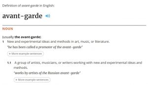
  1. What does the term avant garde mean?

Literally the term means ‘advanced guard’ or ‘Vanguard’.  These terms were used to define the group or individual leading a movement. This could mean any movement for example you could be a vanguard of fashion as equally as you could be a vanguard of medical research. ‘Avant garde’ however has generally been used when referring to the artistic movement of the mid to late 1800s mainly to describe something innovative and unique within the art form. In the broadest sense possible I would say Avant garde means to be at the forefront of something regardless of what that something may be.


Fig 1 (n.d.), English oxford living dictionary


Fig 2 (n.d.), Collins French-English dictionary


Reference

Procter A. (2017) Design_101

Fig 1: (n.d.), English oxford living dictionary, Oxford university press, available at: https://en.oxforddictionaries.com/definition/avant-garde

Fig 2: (n.d.), Collins French-English dictionary, HarperCollins Publishers, Available at: https://www.collinsdictionary.com/dictionary/french-english/avant-garde

2.Is it still possible to be truly ‘avant garde’? And if so provide game examples.

I think it is very possible to be truly ‘avant garde’ following the definition of it being “New and experimental ideas and methods in art, music, or literature.” (n.d.), English oxford living dictionary. In the games industry there are always developers experimenting with new and more powerful technology. An example of this is Middle-earth: Shadow of Mordor and Middle-earth: shadow of war both by Monolith Productions. Both games use a system developed by Monolith known as the ‘Nemesis system’.  Simply put it creates unique characters based on a random selection from various lists. The system fits perfectly into the definition of being “new and experimental” and therefore I would consider it to be ‘avant garde’


Reference

(n.d.), English oxford living dictionary, Oxford university press, available at: https://en.oxforddictionaries.com/definition/avant-garde

(2017), Nemesis system, IGN, available at:

http://uk.ign.com/wikis/shadow-of-war/Nemesis_System


Task 7 Histories

Leo Steinberg’s talk Other criteria: The Flatbed Picture Plane 1968 explores the alteration of the angle of the picture plane and the shift in art from natural to cultural expression this signified in terms of Rauschenberg’s work.  In Richard Serra’s talk at Yale University in 1990 focuses on his own practice and it’s interactions with process and art history and the dilemmas posed by the conceptuality of site specificity.

Both texts suggest that the discussed artists did not follow the existing precedent of theory. Serra says of his own works ‘The history of welded sculpture in this century has had little influence ‘ while Steinberg  remarks that ‘Even as Abstract Expressionism was celebrating its triumphs… [Rauschenberg] proposed the flatbed or work-surface picture plane as the foundation of an artistic language that would deal with a different order of experience.’ As such, both texts portray the work of these atists as turning points for the art of their practice; new ways of thinking in painting- Rauschenberg , and welding sculpture- Serra. A key difference between the texts could be that while Steinberg is reflecting on Rauschenberg’s works from a third person perspective, Serra is commenting on his own work and it’s position in art history. This could mean that the works of Rauschenberg are being explored in the way that art history needs them to be seen rather than the artist’s intended interpretation. However it could also be that Serra is placing his own work in to art history and therefore his portrayal is not the way it would be understood in the context of art history by a viewer or historian.

While there is a great deal to be discussed in comparing these texts, the question that personally holds the most interest is what causes art to be a turning point in the contemporary? How the artist intends to be seen, or how the viewer consumes their work both immediately and historically? Perhaps they are two sides of the same coin and art theory remains fluid even after the fact.

Task 10

Simple, bold imagery embellished with meaningful but somewhat unclear text.

 Recently my work has become increasingly text based, although I still find a strong importance with images. As well as text playing quite a large role in my work, I have been using simple bold, and often high contrast, imagery; I really enjoy creating a relationship between text and image, specifically complimenting simple images with short statements. I have found that using text gives the viewer an extra nudge towards the ‘theme’ of the piece, or equally does the complete opposite and draws the viewer away from the subject by undermining logic. I have been investigating this relationship a lot, and have been using group crits and reactions from peers to determine what, where and when certain aspects of this relationship are either significant or irrelevant.

Task 9

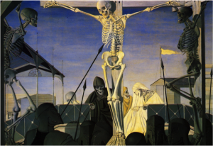
Paul Delvaux, ‘Crucifixion’ – oil on wood- 1952

In the 1950s Delvaux painted a series that revised an old subject that was prolific during the Medieval and Renaissance eras, the Passion of Christ. He did, however, not want to recite the same imagery as paintings from earlier periods. He decided to paint all the figures as skeletons, in nearly all of the paintings. He uses the skeletons to represent the fragility of life, and employs them as a tool to shock the viewer into being reminded of life and its fleeting absence. In this way we could easily look at the painting as a Vanitas. This specific painting from the series shows three crucified figures above a number of fully armoured centurions. The middle figure is illuminated, strongly suggesting that this is Christ, could this represent significance is still present after death? Or is it simply for aesthetic reasons? This painting raises many questions, and takes time to properly understand. Usually depictions of the crucifixion of Christ are in a countryside landscape, as Christ was crucified on top of a hill, whereas here we see a strong contrast to this as it is set in a built up area. The strange architectural shapes create strong hard lines throughout the image, and give the painting a more ‘modern’ film. This could be Delvaux trying to transport the theme of the ‘Passion of Christ’ into a more contemporary era, carrying the message to the viewer that these old Vanitas values still apply.


Week 3 – Skill, Stamina and Luck

A) Select one example to outline the key concepts of the interactive narrative genre?

Combining traditional narrative with visual arts and interactivity (Pause & Effect), interactive narrative’s purpose is to place the person reading/playing/learning in the digital environment, so that they believe their choices are central to the unfolding of the story (Interactive Narrative: An Intelligent Systems Approach).

Episode is the mobile storytelling component of the inevitable interactive entertainment wave. It’s a app where you can read and interact with the characters, where your choices decide the path of your story (About Episode). By definition, interactive narrative implies that the actions of the player guide the outcome of the story. Being able to make changes and influence outcomes in the actual story makes the experience engaging: you can change your look – dye your hair, change your clothes, act as you may not normally do in real life. Good immersion gets the player to feel like they are participating in a realistic experience.

As Christopher Pappas explains, stories contain relatable characters, settings and struggles, which form an emotional connection to the player, making the experience even more unique, things that couldn’t be achieved in traditional books, because the characters have already had their destiny written. I think Episode successfully manages to illustrate the interactive narrative genre because the stories also let the player step outside of “the real world” and into a world that challenges them, that presents an opportunity to be more than who they are. I believe this creates excitement for the player as they explore new ways of acting without serious consequences.

Episode, 2015

B) Does the interactive narrative still have a role to play in video games today? Give exemplary examples?

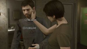
I think that even today, interactive narrative has an import role to play in video games. In Beyond: Two Souls, which was only released in 2013, you can experience the most striking moments of Jodie’s life as your actions and decisions determine her fate. As she traverses the globe, Jodie will face incredible challenges against a backdrop of emotionally-charged events never seen before in a video game (IGN).

In Heavy Rain, for example, as Lark Anderson says, the goal of every story is to form some degree of connection with its observer. Most often, this link is fleeting at best, but every now and then, a much deeper bond is formed. This bond is one in which the observer is less of a passive participant and more of an emotionally engaged accomplice.

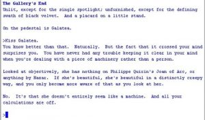
Furthermore, Galatea is an expressive, forward-thinking work of interactive fiction (IF) by Emily Short. You’re an art critic, standing in a room, observing a statue. The whole experience takes place in a fixed position, as you interrogate this magical, talking piece of sculpted rock for your report.

I believe that all these games manage to offer a unique experience since they genuinely let the player have his say. They let him involve in the game, making him more than just an outsider and allowing him to influence the character’s fate. Therefore, I think that the interactive narrative plays a very important role in video games today, providing a distinctive experience to the player.


References:

  1. Stephen, M., 2017. Pause & Effect. New Riders.
  2. Mark Riedl and Vadim Bulitko’s article on interactive narrative and computational systems: “(Interactive Narrative: An Intelligent Systems Approach”, available at: https://www.cc.gatech.edu/~riedl/pubs/aimag.pdf?utm_campaign=elearningindustry.com&utm_source=%2Finteractive-narrative-learning-effective-elearning-strategy-6-reasons&utm_medium=link
  3. Pappas C.: 9 Creative Ways to Reinforce Key Concepts in Online Training, available at: https://elearningindustry.com/creative-ways-reinforce-key-concepts-online-training


External Links:

https://home.episodeinteractive.com/about

https://elearningindustry.com/interactive-narrative-learning-effective-elearning-strategy-6-reasons

http://uk.ign.com/games/beyond-two-souls

https://www.gamespot.com/reviews/heavy-rain-review/1900-6251617/

Summary

During this semester the Research and Communication Skills course has broadened my view on graphic arts immensely. Improving on my contextual knowledge of how and why art movements and various other styles came through has been extremely empowering. I feel that knowledge and understanding is where all good design comes from so for me it’s paramount for my own practice and my career as a whole.

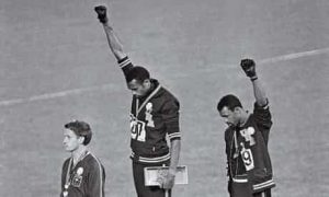
I have found the use of graphic design has played such a huge part in our society, good and bad. The bad use of design from the confusion at Palm Beach county polls where Al Gore supporters mistakingly voted for Pat Buchanan due to the poorly executed layout by Theresa LePore. As well as accelerating the civil rights movement by information being spread to the people on the masses. Emory Douglas, a graphic artist for the Black Panthers, was able to spread the words of their manifesto and spread propaganda aimed at the police, shifting the movement in huge ways. Motifs like the black power salute are still being used to this day and have been adapted for various uses.

The swiss designers from the modernism movement really made me think about what good graphic design is. Dieter Rams ten principles for good design made a lot of sense to me therefore I have began to implement the ideas into my own practice.

  1. Good design is innovative
  2. Good design makes a product useful
  3. Good design is aesthetic
  4. Good design makes a product understandable
  5. Good design is unobtrusive
  6. Good design is honest
  7. Good design is long-lasting
  8. Good design is thorough down to the last detail
  9. Good design is environmentally friendly
  10. Good design is as little design as possible

I found it quite amazing that I have not been the only one inspired by Dieter Rams work, as has the designers at apple. Consequently very closely replicating some of Rams work in the early editions of apple products. Researching this in week 4, I found both a compliment and an insult of his work, going against his own principle of good design is honest. Learning and seeing the shift between Modernism to Postmodernism has been very interesting. Although Postmodernism cannot be directly defined, I can now strongly say I understand the basis in which it was built.

The weekly tasks I have completed have allowed myself to think about what kind of design I want to be and how I want to impact people. In recent tasks I have been drawn to simple designs with complex messages. The WWF global warming poster I analysed is extremely effective and does the job it’s supposed to, connect to the audience and raise awareness of the impacts of climate change. Through this journey I have been able to conclude for myself what pathway I want to follow for the rest of my degree, Graphic Design. However I welcome the use of other practice as I want to continue my love for Photography and learn more about Motion Graphics.

Rams, D. (2013). Ten principles for good design | Design Principles FTW. [online] Designprinciplesftw.com. Available at: http://www.designprinciplesftw.com/collections/ten-principles-for-good-design [Accessed 7 Dec. 2017].

The Guardian (2012). Mexico City Olympics. [image] Available at: https://www.theguardian.com/world/2012/mar/30/black-power-salute-1968-olympics [Accessed 7 Dec. 2017].

Task 8

I have always been a great admirer of David Shrigley’s drawings. To me, they represent a fast flowing style that comes straight from the mind, an image that isn’t thought through meticulously for days or even weeks on end. Although I find this important with some aspects of practice, I feel that artwork like Shrigley’s is needed within the art world to keep it ‘sane’. A large proportion of his drawings clearly have a deeper meaning, but they are depicted in a lighthearted manner. I have always enjoyed creating drawings similar to Shrigley’s, I find that fast mark making, combined with a small caption of text, therapeutic, more importantly for me, it is a very quick and easy way to visualize my thoughts and ideas. Shrigley’s text is often somewhat confusing, in the sense that it doesn’t explain the image accompanying it, give specific opinions or give any real narrative. Even though I find this manner of text intriguing, I wanted to do something different. I decided to start regurgitating sayings and clichĂ©s from my childhood. Many people would have heard similar things during their upbringing; they ranged from strict do and don’ts from adults or teachers, to certain equations and formulas that are forever stuck in my mind. In honesty, I started using this text as I couldn’t think of what else to write, but I soon realised that it accompanied the fast scribbly drawing style very well.

Reflect

Reflect

The Research and Communication Skills part of the course was very challenging and enriched me with a bunch of new skills which can be useful in the future.

I find topics in general quite vast. There was no simple answers to the problems we discussed and I could not construct a satisfying answer to any of them without a thorough research. Each of them required a complex solution and sometimes finding sources of information was the most difficult part.

Very good thing about the essays were question pairs making me have a look at different problems concentrated on the same topic and see which one is the most appealing to me so I can expand it. I really enjoyed few of them but to be honest if I was supposed to answer all the question pairs I am not sure if I would manage with it. I found them really diversified in terms of difficulty level.

Answering for the topics I was not very familiar with such as Human Computer Interaction or Copyright was definitely not my favourite part of the course. Both of them needed a lot of research and thinking every decision through a couple of times. Nevertheless, this kind of topics was probably the most useful in my development.

The more pleasant part of essays was focused on describing the particular features of games I have already played because I was free to use any example I wanted. The work about User Interface in the game I really like was definitely the one which improved my skill of analysing. I would be happy to see more topics like this in the future because they make me look at games I knew before from completely new perspective and find some details I have not noticed before.

I have to mention the essay about indie game developers because it definitely changed the way I used to look at games. Before the course I was only admiring the graphics but this time I was forced to pay attention to creative process and see how much experiments with various styles does it cost to create not only good-looking video game, but also to adjust the style to game’s atmosphere.

As an international student I find another advantage of the module in improvement of my English language skills. It is very easy to pick up some slang words around here but there is no much opportunities to learn specialized vocabulary. Doing research of games related topics gave me a bunch of new words useful to describe my ideas and thoughts.

To sum up, I think that Research and Communication Skills module made me more engaged and experienced in different topics associated with games design. The other useful skills I learnt are analysing, researching, selecting essential points and academic writing.