Category Archives: Uncategorized

Do not use, you should categorize each and every post.

Task 1&2 – Online Resources

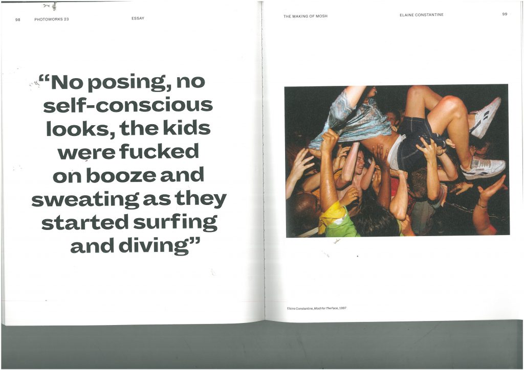
Figure 1: Photograph of a group of teenagers in 1997, taken as part of a fashion editorial called ‘Mosh’ by Elaine Constantine for ‘The Face’ magazine. Pages 92-99. Various contributors, (2016), Photoworks Annual – Issue 23: Self Styled

I first came across this image while reading an issue of Photoworks. I was drawn to the raw nature of the photography and assumed the piece must be about 1990’s teen culture, music or drinking. I was right to an extent, as this is exactly what the photograph is depicting, however I did not expect to find out that the set of images were actually a fashion shoot for The Face magazine. The photographer, Elaine Constantine, explained how in the summer of 1997 she and stylist Greg Faye gathered over 70 teenagers in London, provided designer clothes, alcohol and music and just started photographing. The authenticity of the photos was unlike anything I had ever seen before in a fashion context. Normal teenagers, no styling and even less direction; a complete contrast to the hand-picked models, staged poses and expertly styled outfits we usually see, even when I have seen other photographers adopt a ‘documentary’ style.
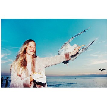
Figure 2: ‘Sarf Coastin’ 1997, original photograph, fashion photography for The Face magazine, Elaine Constantine. Found on V&A collections website.

It was this that lead me to looking further into Constantine and her style of fashion photography, when I came across Constantine’s most famous image. ‘Sarf Coasting’ was another fashion editorial Constantine shot for The Face and it featured a group of girls simply having a fun day out in Brighton. The iconic image of the seagull diving for the girl’s chips, came from Constantine’s own experiences of weekends at the pier, feeding the seagulls with her boyfriend. To Constantine, she was just giving something different a go, when in reality, it was this shoot that kicked off her career, landing her regular jobs with magazines such as US Vogue, Italian Vogue and campaigns with Jigsaw and Hunter.

It is clear that Constantine was tired of seeing the grunge fashion and ‘heroin-chic’ trends that were everywhere in fashion photography in the 1990s, and so wanted to introduce something new, something different. Her vibrant, energetic images were a shock to the industry, a shock that it very well needed.

‘Heroin-chic’ was a trend of the 90s that adopted imagery of heroin addicts and their environments into fashion photography – characterised by underweight figures, dark circles around the eyes and pale skin. It was originally due to the rise in popularity of the drug with the middle-class and wealthy, as well as a reaction to the ‘healthy’ look of models such as Cindy Crawford at the time, however it turned into so much more. It glamorised the drug, depicting it as ‘cool’ and desirable in fashion ad campaigns. It was eventually condemned and fell out of style by the end of the 1990s, showing that capturing real people in real scenarios was clearly what the public and the consumer wanted, and we can see this by Constantine’s continued success. Her work has now been exhibited around the world, and held in collections in the National Portrait Gallery and the V&A.

Sustainable fashion.

Book

“The total amount of clothing and textile waste arising per year in the UK is approximately 2.35 million tonnes.”

Fletcher, K. (2008) Sustainable Fashion & Textiles, Design Journeys. United Kingdom and United States of America: Earthscan.

Knowing facts like this makes you aware of the problem and consider how I might do something differently when I have my own business.

Website

“Christopher Réburn is a British fashion designer with a unique and innovative approach to creating menswear, womenswear, and accessories collections. A graduate of London’s prestigious Royal College of Art, Christopher became known for his re-appropriation of military fabrics and in particular for iconic outerwear created from de-commissioned parachutes.”

Londonfashionweek.co.uk. (2017). London Fashion Week – Christopher RÆBURN. [online] Available at: http://www.londonfashionweek.co.uk/designers_profile.aspx?DesignerID=1136 [Accessed 25 Oct. 2017].

I have been inspired by Réburn’s work for a long time and find his work incredibly interesting. I have been lucky enough to go to his studio and talk to him about the process of his work. In the future I hope to work with materials that have already served one purpose.

Newspaper

“Birdsong is a British brand whose clothing is made by women’s organisations, including knitwear made at a day centre for older women, and garments produced by highly-skilled migrant seamstresses at a factory in London. Their clothes are traceable – the name of the woman who made the garment is on the label.”

Emine Saner, (2017) Sustainable style: will Gen Z help the fashion industry clean up its act. The Guardian, 25 April 2017.

Many designers are looking at how to produce clothes in a more ethical way – especially after the Rana Plaza disaster, where 1,135 garment workers were killed and thousands were injured.

Task 1: Module introduction and developing ideas.

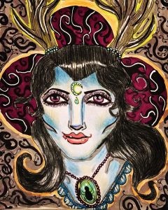
Stag lady – Georgia Weaver

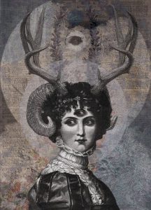
DAN HILLIER -LUNA


The above piece of artwork is something that I began while researching for the contemporary art project.

As part of my research, I began looking at different contemporary artists and identifying themes that they each have that I find interesting. For instance, Dan Hillier’s artwork really appeals to me as it combines mythological ideas along with Victorian imagery. Expanding on this idea, I decided to draw a woman with antlers coming out of her head to show the idea of a half human/half animal.

I gave her skin an unrealistic blue tone to it, and I also gave her purple eyes. The reason I did this was because I wanted her to look like a human but have characteristics that were impossible for a human to have, thus making it seem almost mythological.

The colours that I chose in this drawing are based on colours that I feel celebrate femininity and are present in the majority of my artworks. These colours are: purples, pinks, light blues and greens. I feel that these colours alongside her antlers and glowing complexion gives the woman a mysterious powerful presence. The jewels that she has give the audience an idea of wealth or superiority. I put a spider in the necklace to elude to a darkness or creepiness.

In terms of mediums, I decided to create this drawing with pencils and pens to try and make them contemporary. Artists such as Grayson Perry use marker pens in their work to make their artwork colourful and child like, so I decided to do the same to portray the woman as a mythological and mysterious creature.

In order to develop this piece further, I would like to experiment with different colours, maybe through print making or through digital collage in Photoshop.

Task 9: Philosophy and theory and politics

The artwork of Paul Fryer focuses heavily on aspects of death, religion and the morbid, all themes that are focused on within the symbolist theory.

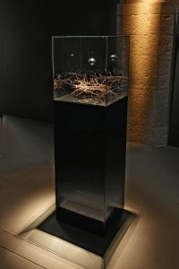
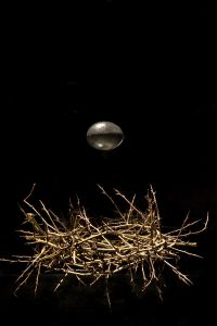
Although a lot of Fryer’s work could apply to the symbolist theory, it is ‘Ecce Homo’ (2006). This is a sculptural installation that features a crown of thorns, with a golden egg seemingly floating above it. One of the main points of symbolism, as expressed by the 5 main points of Albert Aurier, is that the artwork must be ideative, meaning that it has to express an idea. In this case, the artwork expresses an idea of the impossible, by heaving the golden egg floating. It all appears to be in the photography making the audience wonder how it is possible. However, in another photograph you can see reflections in the glass, thus shattering the illusion for the audience.

Other theorists believed that artists had the ability to offer salvation through their artwork, particularly a group called the Nabis. By Fryer focusing on creating sculptures that appear to show impossible miracles and religious iconography, Ryder might be leading his audience to salvation.

Theorists seem to mostly agree that symbolism should keep the audience in mystery; by using photography to his advantage, Fryer is able to make it look as though the egg is actually floating, as well as keeping the crown of thorns also looking relatively simple. This stops the shattering of illusion for the audience. However, in some of Fryer’s photographs you are able to see the reflection in the glass of the egg and crown. This could possibly be an indication about how religious acts seem genuine, but when they are closely inspected the illusion disappears.

Ecce Homo 2006 – Paul Fryer

Ecce Homo 2006 – Paul Fryer

Task 5: Ways of seeing. Write about an exhibition you’ve seen ‘in the flesh.’

‘Door 2’ by Fred Hampton which was exhibited at the Soul of a Nation exhibition really struck a chord with me and is something that will stay with me forever.


the contrasting red and green door, riddled with bullets almost drew me to tears. Without saying anything it said everything. The colours were so bold to this day and draw the audience in, and the bullet holes really brought to life the reality of life for African Americans and the fear that they must have felt at the time.


At the top of the door ‘US approved’ had been written in paint with 3 stars. The colours used were red, white and blue which mimicked the US flag. This was almost a sarcastic comment from the artist, saying that America is not only accepting the death of innocent African Americans but that they also won’t change or do anything about it. Innocent people are being murdered by gangs and police and because of the colour of their skin nothing is done about it.


The thing that really made me emotional is that the door still has the same meaning today and nothing has changed. To this day innocent African Americans are being murdered by gangs and the police, yet the government isn’t doing anything. The fact that this is still happening is awful. ‘Door 2’ by Fred Hampton should’ve memorialised a time in history that was so barbaric we couldn’t imagine it happening today, but instead it stands as a reminder that this is still happening every day and nothing has changed at all really.

Published images Liu Xinyi

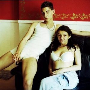
this photograph is one in a photograph set called <Mother Michael Goes to Heaven> by photographer Lilla Szasz. It’s about the story of a 3-persons home who are prostitute pimp and fetish separately. But in February 24, 2010, Michael killed himself and this family in slum of Budapest was broken ahead of time, leaving each other. But their lives were all recorded by her, Lilla Szasz. She is a kind of documentary photographer, who is always focusing on immigration, identity, gender issues and the living situation of the people lived at the bottom of the society. She always likes shooting people in misery, but still try to show the hope of life at the same time.

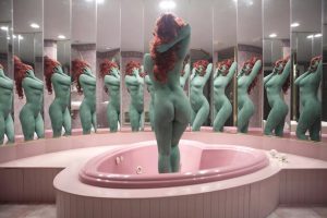
The photograph is from <The Honeymoon> taken by a young photographer called Juno Calypso. This image was taken when juno went to her own honeymoon, a honeymoon hotel in Pennsylvania. She described this picture as ‘This picture is why we look ugly. We look at the mirror, but we see the gargoyle. We saw a monster. We spend a lot of time in the bathroom to wash away dirt and shave hair, just to clean up this fear.’ And I think most of the work in this photo album is to show audiences an ugly side – the mainstream aesthetic view held by the world. Too many people take selfie to show their fake life just like an actor. But juno tried to take this series of photographs to remind us.

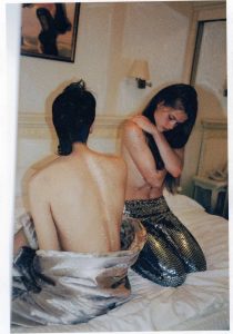
This is one of the photographs about the love between couples taken by Lara Gasparotto. She served as a photographer for some magazines in Brussels, capital of Belgium. She also likes recording her life in the way of taking pictures of her friends. But the image I chose is a photograph about the moment when the lovers are surrounded by love. Her photos would not be too clear and textured, and she wanted to make the picture have a feeling of untouched. Only the story in that photograph was the main purpose of her work.

These three are all my recent favorite photographers with some elements of documentary photography.


1, Live in the world of the senses and grow unscrupulouslyMp.weixin.qq.comhttps://mp.weixin.qq.com/s?__biz=MzA3MDc5NTk0Nw==&mid=2247496674&idx=1&sn=bc04fca7a968ccd804ff1079781a7e7a&chksm=9f35e426a8426d3080f7aee7c525e8dd7f1e04adad0a3fdeca05bcf72b76b94492bfef466d18&scene=38#wechat_redirect

2, Lilla Szåsz: Mother Michael Goes to Heaven, YouTube, https://www.youtube.com/watch?v=_46PpUfLGTk

3, Nell Frizzell, ‘I sounded like I was having the best sex’: Juno Calypso’s one-woman world tour of honeymoon hotels, the Guardian, https://www.theguardian.com/artanddesign/2015/jul/02/juno-calypso-tour-honeymoon-hotels


Liu Xinyi

Task 10, Encapulastion

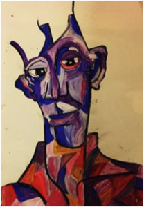
‘Alien, Unknown, Experiment, Rectangle, Abnormal, Loss, Abstract, Bold, Lively, Uncomfortable.’

For my practice in art I have decided to challenge the idea of what is the social norm, what people believe the human figure should look like.

I chose the 10 words above because they help to give an overall perspective upon the physical nature given within my work.

My practice questions and manipulates the human figure in different ways. Taking away the idea of having an aesthetically pleasing image of the human figure. The use of having bold shapes and abstract colours to form what is known to be a face can be used to help question “why do we fall for symmetry?” and “why does skin tone matter?” The use of different shapes and colours dismantles the original image, changing the first impression of an individual. It creates a perspective; the viewer focuses more upon the emotion hidden within the image, rather than just the way that they look. It also makes the viewer feel uncomfortable, the feeling of seeing an alien instead of a person. Almost as though they are making a new form from their imagination.

As my practicing is growing and maturing I have found myself exploring new ways in which I can question the idea of “normal”.The image above is inspired by Martina Shapiro’s work. I chose to base this piece of her work because it allows me to expand my use of colour and media to help challenge, and create abnormal looking figures.

Task 11/12 – Summary

This task is the summery of the previous tasks that have been completed, which were useful in developing writing, researching and evaluative skills which are paraphrased here for this the sixth and final task.

For task 1 I used my favourite image from my books titled ALEXANDER MCQUEEN edited by Claire Wilcox and used the internet to find the original inspiration for this piece. This task was beneficial as I learned how to use the internet wisely, which is something I can continue with future projects, as I found a blog with quotes from Sarah Burton that provided vital information to complete this task. However, my research was not very focused, as I researched too many websites that did not aid my work. Although, this trial and error was useful to learn from.

Task 1 link – (http://blog.soton.ac.uk/rcs/2017/10/19/task-12-research-and-communication-with-lyanne/)

For task 2 I had to learn how to reference three sources; A book, website/webpage and newspaper/article. It was difficult to link each reference together with a common theme however, I decided to complete this task backwards because the newspaper gave me artists which allowed me to find a book that uses a common theme. This process will benefit my studies as using references that linked focused my searches. Also learning how to reference properly has been useful and I can now reference quickly.

Task 2 link – (http://blog.soton.ac.uk/rcs/2017/12/03/task-12-online-resources-3/)

For task 3 I interpreted the inspiration for Ziad Nakad’s 2017/18 collection. I found it difficult to interpret the inspiration as many blogs I visited used the same text. My researched became over-complicate which prevented me from finishing. However, I spoke to my lecturer and I was able to finish that day. This was a beneficial task to complete because I didn’t realise how many sources could be used, as I previously studied many different images of the same inspiration rather than looking else wear. I also learned how contrasting sources can complement each other.

Task 3 link (http://blog.soton.ac.uk/rcs/2017/12/03/task-34-academic-integrity-2/)

For task 4 I wrote a reflective summery regarding the original and changing definition of fashion. This task was difficult because of the reading involved, also sourcing a book with appropriate quotes was difficult because of my dyslexia. To help I looked at examples on the WSA blog to source useful books. However, though this task was difficult it was interesting to learn the etymology of fashion as I agree fashion is the process of making and not just wearing.

Task 4 link – (http://blog.soton.ac.uk/rcs/2017/12/04/task-56-visual-research-7/)

For task 5 I wrote an analysis of an ad campaign. The reason I chose the specific image I researched was because it involved a man and women, which I felt I could more easily look at the man’s point of view. This was useful because it makes me think about if the product is being featured well, as with this ad I felt it was being forgotten amongst the controversy.

Task 5 link – (http://blog.soton.ac.uk/rcs/2017/12/04/task-78-reflective-writing-4/)

In conclusion, paraphrasing these tasks has made me understand the knowledge I have gained. It’s been difficult however, I have enjoyed this module and it has provided me with skills which I can use for future projects.

Task 9/10 – Ethics

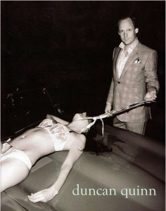
Duncan Quinn: 2008 ad campaign.

I decided to explore the Duncan Quinn 2008 ad campaign because it evoked a lot of opinions. I feel I can give a less bias view point because I am male and I can understand the desire to feel strong. However, I feel this image has taken that desire far beyond acceptable limits.

Duncan Quinn is a suit brand for men which attempts to appeal to their target audience by including signifiers to create signified ideas that appeal to men, such as women signifying sex and cars signifying fun. However, after reading a blog from freelance writer Sandra Winn, my consensus is that using these signifiers in a disturbing way does little to achieve the desired effect of appealing to a target audience. furthermore, it evokes strong, negative emotions and various interpretations which all criticise this image. this includes a post on Buzz Feed titled “The Five Most Sexist/Misogynistic Print Ads from The Last Five Years”, which shares my opinion that this image is misogynistic and ethically incorrect.

The ethical issues raised by this image include repressing the idea of the modern woman. For example, this image contradicts modern ideas about the ascribed roles of women in today’s society as women are told to be strong and to not rely on men to provide for them. However, this image portrays outdated ideas about patriarchy, dominants and sex as the man in the image is well dressed and smirking whilst the women lays there with the man towering over her half naked bloody body, which suggest his dominance and authority because the women is vulnerable to the mans will.

However, this ad raises not only ethical issues regarding violence against women but also the ethical issues surrounding the representation of male fashion and patriarchal ideology, as men don’t often fit this ideology. I whilst reading the book Fashion as Communication by Malcom Barnard I found shor paragraph that helps to explain my point. “Fashion and clothing are instrumental in the process of socialisation into sexual and gender roles; they help shape people’s ideas of how men and women should look. It is not the case that fashion and clothing simply reflect an already existing sex and gender identity, but they are part of the process by which attitudes to and images of both men and women are both created and reproduced”(Barnard: 1996). meaning it’s the clothes that make the man and we choose how to represent ourselves. So why does a man wearing men’s clothing need to assert his dominance by degrading someone else? The more I read into this image I feel it oddly showcases weakness in the man because he has to degrade someone weaker than himself in order to feel strong. To me a “real” man may portray a masculine image with his fashion choices, but does not feel the need to assert dominance with violence. Overall the image has outdated values and has no place in the industry as in my opinion it does not represent a “real” man.

Bibliography

Winn .S (2008) Duncan Quinn Suit Campaign Depicts Strangled Women. Available from: https://www.trendhunter.com/trends/duncan-quinn-suit-ad-depicting-strangled-woman [Accessed 25/11/2017]

BuzzFeed Staff (2012) The Five Most Sexist/Misogynistic Print Ads The Last Five Years. Available from: https://www.buzzfeed.com/copyranter/the-five-most-sexistmisogynistic-print-ads-from-t?utm_term=.amJ6LR5Vv#.edZpER0o2 [Accessed 25/11/2017]

Turner .S (2012) When did it become ok to degrade women in the name of fashion. Available from:http://www.turnerink.co.uk/marketing/degrade-women-fashion/ [Accessed 25/11/2017]

Task 7/8 – Reflective Writing

I decided to explore Malcolm Bernard’s Fashion as Communication Because I was interested in etymology and I was surprised at how much I learned from this text. The section I am interested in is a description of etymology and what it means in terms of the word ‘fashion’. It states that “the original senses of fashion, then, referred to activities” (Barnard: 1996), as the word fashion originally derived from the Latin ‘factio’ meaning to do or to create. However, Bernard also explores the changing definition of this word, as he states “fashion was something one did, unlike now, perhaps, when fashion is something that one wears. The original sense of fashion also refers to the idea of a fetish”(Barnard: 1996) meaning an inanimate object that is ‘worshipped’ rather than a physical task. Personally, reading this section has given me a better understanding of fashion as I understand now the definition means the process of creating while garments (what we refer to as fashion) are the outcome.

This section also delves into the meaning of fashion as clothing and its symbolic purposes as Barnard states “every day we make decisions about the social status and role of the people we meet based on what they are wearing” (Barnard: 1996).

This suggests that garments can be called fashion because they still do something as their purpose is communicating one’s personality or position. For example, wearing a work uniform communicates your position at work or the specific job you do, whilst wearing your everyday clothes communicates your tastes, or even wearing the same shirt for a couple of days communicates that you’re busy and don’t have the time to actively think about specific clothing choices. Even when the clothing people wear doesn’t communicate personality or taste it communicates something about the wearer.

However, during the 80s women born in the ‘baby boom’ period after the war were career driven and excelled in the work place as women were now excepted in the workplace as they had previously proved themselves in the war when they filled the positions men were unable to fill. “As bank vice presidents, members of corporate boards, and partners at law firms, professional women became secure enough to ignore the foolish runway frippery that bore no connection to their lives” (Agins: 1999).

However, Barnard’s views arguably disagree with Agins’s statement as the quote I previous used contradict Agins’s, as Barnard stated that “every day we make decisions about the social status and role of the people we meet based on what they are wearing” (Barnard: 1996). Arguably women in the workplace are consciously making the decision to dress more like men to detach themselves from femininity, in order to be taken seriously, and so it could be argued that they understand the definitions of fashion as they are actively creating a look for themselves that communicates their professionalism and desire to work for themselves without discrimination.

Bibliography

Barnard. M (1996) Fashion as Communication. 11 new fetter lane EC4P 4EE, Routledge.

Agins. T (1999) The End of Fashion. 195 Broardway, New York, NY 10007. HarperCollinsPublishers.