Category Archives: The Tasks

Publish or Perish!

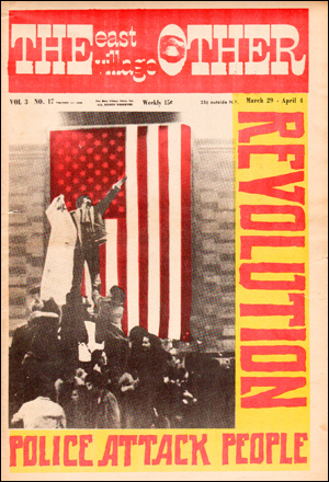
In May 1968, in a response to “..the increasing levels of unemployment and poverty..” (Sinclair, M. 2008). 1 students and staff came together to create the the Atelier Populaire, an association which “..went on to produce hundreds of silkscreen posters..” (Sinclair, M. 2008). 2 The poster I have chosen is a simple image of “Popular Power”3. This simple imagery is very powerful in its communication as it clearly suggests a revolution, or a demand for change depicted by rolling as a ball towards the political parties in a head on collision. The use of one bold colour further communicates this demand as it makes the viewer read only that message and see only that image. Although printed in 1968 this still resonates within the current political climate of our country.

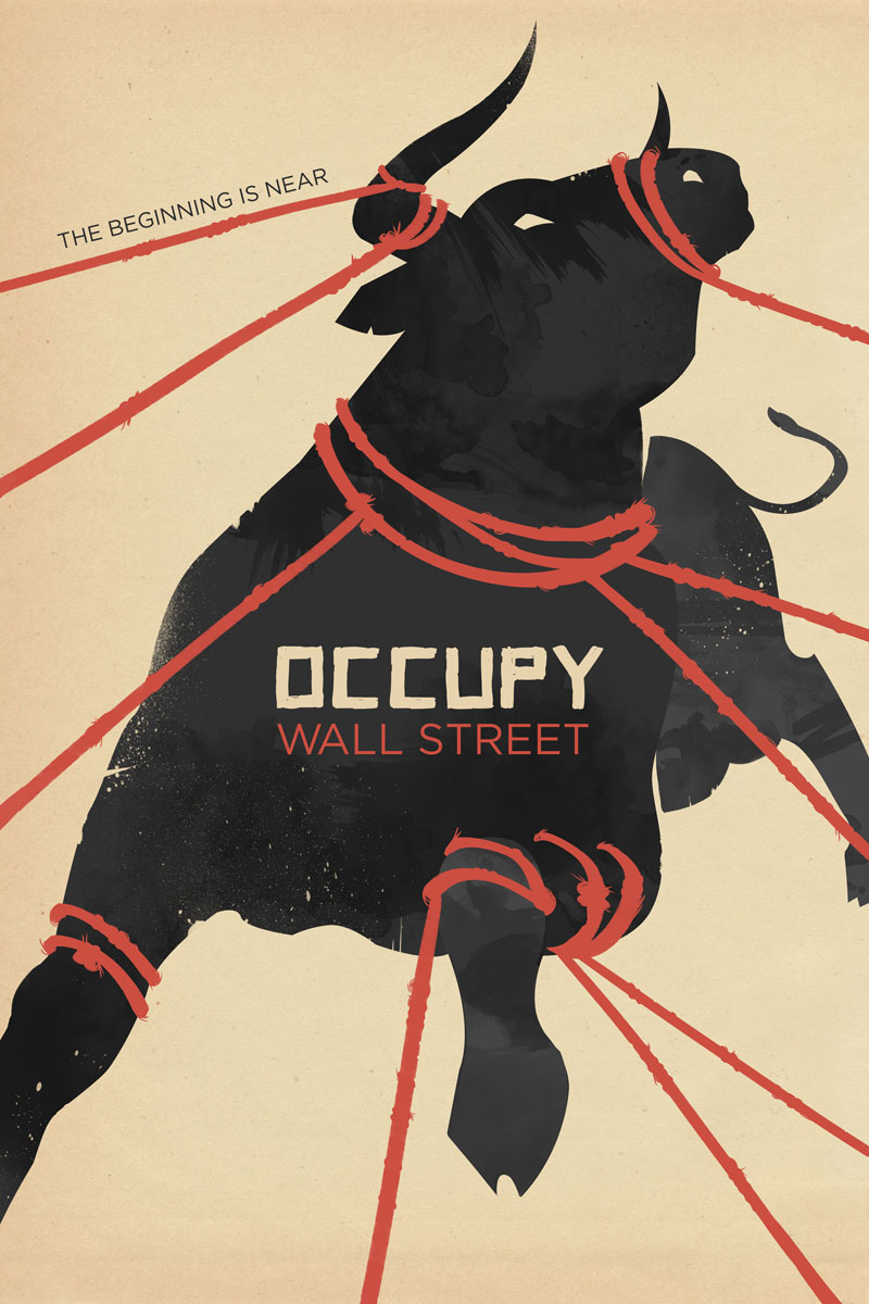
My next image is a poster from the Occupy Wall Street Movement by Alexandra Clotfelter, titled ‘The Beginning is Near’4. It depicts a dynamic image, packing “a visual punch” (Watercutter, A. 2011) 5 of a struggling bull, representing Wall Street and its greed and excess, being held back by tied rope around its body and horns. The movement highlighted economic inequality worldwide and the rope pulling the bull back represents the retribution from the people that the bankers are receiving for their greed. The fact that the bull is pulling away suggests an unwillingness from Wall Street to do anything and the ropes represent the force and power of the demands from the movement for change.

Finally, I have chosen the cover to Adbusters 100th publication, ‘Are We Happy Yet?’6. It portrays a massive, classic American burger but stacked high with 10 meat patties. Links can easily be drawn to consumerist culture, greed, wealth and the idea that what we have is not enough, not being happy with what we have and always wanting more. The composition of the cover consists of solely the burger and this one image, along with the tag line, is effective in communicating everything the reader needs to know but also for the reader to draw their own conclusions, but still based on what the magazine wants to communicate.


AB100: Are We Happy Yet?

2ibid.

Task 6 by Bianca Schmittmann

I create all sorts of works that are based off a narrative. My pieces range in scale and some are visually louder than others, which makes a large studio space very useful. In the future, my ideal way of working would be in a studio like a shed or warehouse big enough for all sorts of media. It would also be ideal if the studio had windows so sufficient light can help with how I work but also create an atmosphere when I work during the day. I mainly paint and draw, but sculpture, film and print are also media that I work with and might want to create more works with. I also work very spontaneously, so this large space would give me the freedom of working on whatever I want whenever I want and conveniently.

I’ve been inspired by Paula Rego’s practice and working in a studio filled with sets, props and puppets to physically build a narrative to then draw or paint. I have also occasionally started working in this way, to build and lay out what I will draw from which is why that space is important. As I am currently still developing my practice, this mode of practice is still subject to change.

Post Modernism

The Memphis Group is an Italian design and architecture group “known for wild colors, crazy patterns, and exaggerated shapes” (Zara, J. 2015). Memphis was about trying to break away from the minimalist designs of the 1970s and so in contrast designed bright, colourful pieces, drawing from Art Deco and Pop Art movements. One of their most iconic creations is the “Carlton” Room Divider designed by Ettore Sottsass. I find it to be a fun and playful spin on your everyday furniture design because of the illogical yet simple idea of slanted shelves. I enjoy how there doesn’t seem to be enough space on the shelves, or the spaces seem too small because they are interacting with something else. This deconstructs the idea of a shelf, to simply hold books and other objects.

My second image is ‘Retrospect’ by Keith Haring, a series of 24 cartoons made with the screen-printing technique. I enjoy the easy viewing of the images and how with such simple detail an environment is created with characters that have movement and energy, exclamation or surprise. Each image is placed one after the other and feels like a series of television screens showing different lives, different stories where you can only catch a glimpse because there is so much happening. In their simplicity, the images require no context because they are so easy to understand. Their straightforward design helps this too. Blocks of colour outlined by black come together to form clear shapes and create a series of signs that communicate the human body.

My final image is a poster created by designer Jayme Odgers, in collaboration with April Greiman. I enjoy seeing how all the different perspectives interact with each other and how the elements of the poster come together, for example the type on the bottom right hand corner and the nearby shapes. I also enjoy the way the composition is put together. The overlapping images focus the energy of the composition into the centre of the poster. Since I am not a natural graphic designer the composition of images does not come easy for me, so it is helpful to discover ways of creating images with deconstructed elements that communicate just as well as a clean, minimalist style.


Carlton Room Divider

In the shape of a trapezoid, poster announces gallery exhibition of artist Douglas W. Schmidt in New York City. Poster depicts compilation of objects including a photograph of a man, colorful discs, an abstracted face of a woman, photographs of buildings, a woman’s manicured hand, geometric shapes in bright neon colors, some paint splatters. Below on white jagged ground, text in black: DOUGLAS W SCHMIDT / 1501 Broadway / Room 1606 / New York, New York / 10036Retrospect


  1.  Zara, J. (2015). Neo-Memphis Design: It Came From the ‘80s. [online] WSJ. Available at: https://www.wsj.com/articles/neo-memphis-design-it-came-from-the-80s-1426885689 [Accessed 21 Nov. 2017].
  2. Sottsass, E. (1981). “Carlton” Room Divider. [Wood, plastic laminate] New York: The Metropolitan Museum of Art.
  3. Haring, K. (1989). Retrospect. [Silkscreen].
  4. Odgers, J. and Greiman, A. (1980). untitled. [offset lithograph on paper].


Task 5 by Bianca Schmittmann

Exhibition at the Museum Kunstpalast: Jean Tinguely, Super Meta Maxi

When approaching Tinguely’s works ‘in the flesh’ it becomes a much more magical piece of work. One is not able experience the full extent of the size of the sculpture from a photograph or behind a screen and especially the kinetic aspect of it. Tinguely’s ‘Große MĂ©ta-Maxi-Maxi Utopia’ , finished in 1987 is a huge kinetic sculpture made out of all sorts of items and even stairs and paths for viewers to walk along.

In general with sculptures and large scale works it is very vital to see it in person because of the difference in impact it can have on you. This work creates and even bigger value only when the sculpture is seen in the flesh because you somewhat become part of the piece just by physically walking in/on it. The whole atmosphere and experience is much more exiting in person rather than seeing it still or even from a video, therefore the Value of this piece of work can only be fully expressed when seen in the flesh.

Jean Tinguely, Große MĂ©ta-Maxi-Maxi-Utopia, 1987, 810 x 1683 x 887 cm, Mixed Media.

https://www.artrust.ch/events/jean-tinguely-super-meta-maxi-museum-kunstpalast-dusseldorf/?lang=en

Museum Tinguely, Basel, photo: Christian Baur, © Museum Tinguely, Basel, Donation Niki de Saint Phalle © VG Bild-Kunst, Bonn 2015

Task 4 by Bianca Schmittmann

Exhibition at the Museum Kunstpalast: Jean Tinguely, Super Meta Maxi

In collaboration with the Tinguely Museum and the Stedelijk museum a show of over 100 of Jean Tinguely’s works was presented starting with his first wire sculptures all the way through to his most famous metamechanics. This show was the first major exhibition of the late Swiss painter and sculptor (died 1991) in 15 years.

A lot of Tinguely’s sculptures were created with random found items and machinery constructing a piece of work that comes to life. The works were placed in various areas of 2 halls with the larger works taking up a wall of corner of its own. Some of the sculptures had provided buttons that would trigger movements and some of those movements created certain sounds like the iconic work Ballet des pauvres (1961).

A particular work at the exhibition that always fascinates is Schnudernase (1988) and various other sculptures that all hung from the ceiling. They had many functioning light bulbs of different colours attached on metal bars which would come is many shapes and forms as well as some having metal wheels  which rotated certain parts of the sculpture or other found items, creating a fantastic atmosphere with them moving all together.

Task 3 by Bianca Schmittmann

This painting shows a man of colour sitting on a white sofa, naked with only glasses on, holding a pipe (or cigarette). A shirt printed with a woman’s face hangs on the top of the sofa, the carpet is a clear blue colour with a pattern going across and there is very vibrantly patterned wallpaper. At first one might just see the naked man on the sofa, but when one studies the image closely it may have a deeper message it tries to convey.

His facial expression shows that he is aware that the viewer is looking at him or at least he is not ashamed of the viewer’s looking at him even though he is not covering himself up. It may suggest that he is presenting himself in this manner on purpose to maybe provoke the viewer. The position he is sitting in also looks rather relaxed as well as him possibly smoking which conveys that he is not bothered and comfortable. The title stating “no naked niggahs” suggests that the figure was presented this way to suggest that he is breaking a rule and that he probably isn’t concerned about breaking it.

Family Jules: NNN (No naked niggahs) by Barkley L. Hendricks, 1974, Oil on Linen, 72 x 66 inches. http://www.tate.org.uk/research/publications/in-focus/family-jules/the-painting

Task 2 by Bianca Schmittmann

George Condo Metal states looks at Condo’s art career from 1982 onward. It was published relating to the exhibition: George Condo: Mental states. Condo’s relationship to art history, pop culture and contemporary society are also elaborated in the monograph. George Condo is an American Contemporary visual artist and his works are known for their psychological cubism.

The tone of this book conveys is quite positive. “Condo proves through his production that he can do anything – has done almost anything.” (L.Hoptman, 2011) is a key quotation from this book because it acknowledges that Condo has explored so many different modes of art practice. Condo has studied so many of the famous predating artist’s practices and he is able to imitate and channel them to some extent for audiences to recognise without Condo copying individual motifs.

The purpose of this book is share the range of artworks created by George Condo, to describe his practice and the context of his subject matter to the contemporary audience. It also acknowledges the background of how he works, the effects of his works on the viewers and the meanings they imply.

[Bibliography]

Self, W., Rugoff, R., Hoptman, L. and Means, D. (2011). George Condo: Mental States. London: Hayward Publishing.

Task 1 by Bianca Schmittmann

For a recent art examination I have painted a portrait of myself using the techniques I have developed in the last year. The task of the exam was to create a painting of choice and I have not painted a self-portrait using the techniques I have developed, therefore I thought that this would be a great opportunity to try something new. During the creation of this work as well as painting what is seen from the photograph, I added random colours and shapes to make the portrait more visually exciting. As much as the figure in the foreground takes the main focus, certain smaller details and features in the background stand out too and make it just as visually stimulating.

To develop this piece further, I would love to expand it. I would add more characters/ shapes and scenery to build the narrative further. I personally think that large pieces have such an impact of the viewer, because they can be filled with so many details. I could also attempt turning it into a triptych, where I’d have three or more portraits of myself creating a step by step story of e.g. my emotions, mental states etc.

self portrait, 01.09.2017, oil on canvas (~ 40 cm x 50 cm)

Underground Culture of the 1960’s

Wes Wilson “is generally acknowledged as the father of the ’60s rock concert poster” (Erlewine, M. n.d.) and as someone who is interested in illustration his work is hugely motivating. He uses Lithography to create his posters and having just finished an illustration brief where I used screen printing, I am now interested in printing and its various forms. His poster ‘The Sound’ is the one image that stands out to me the most. The illustration of the woman is first and foremost, as she is in the centre and is brighter than the surrounding text. I admire his use of clean, simple lines to create her form, which is accentuated by the text.

Another image I came across was a cover for the ‘The East Village Other’. The colour red was the first element that stood out to me as it is associated with revolution and reminiscent of Communism. I also enjoy the collage, cut and paste style, it feels rough and unrefined but so that the message is still communicated clearly, proving that a simple style can go a long way in communication. This newspaper was created using an offset lithography printing technique, which is a technique I’d like to use when creating multiple editions. The main picture is made of two images. The image of the man is small against the backdrop of the flag, but is still powerful as it the white contrasts the red.

My last image is a poster for a Pink Floyd gig by artist Bob Masse. I absolutely adore the use of the classic psychedelic colours such as green, pink and red, which are then used in a style inspired by art nouveau and painter Alphonse Mucha. The illustration of the woman is equally beautiful and inspiring. She is graceful in her pose, about to drink a coffee, surrounded by flowers in her hair and on her dress. I enjoy the way the text of ‘Pink Floyd’ is coming out the cup in the way that steam does. The blue frame reminds of the frames on stained glass windows in a house or in a church, and gives the image a vintage feel, adding to the art nouveau style.

Wes Wilson. (n.d.). A Brief Biography, by Michael Erlewine. [online] Available at: http://www.wes-wilson.com/a-brief-biography-by-michael-erlewine.html [Accessed 8 Nov. 2017].

Wilson, W. (1966). The Sound. [Lithograph] Museum of Modern Art.

East Village Other (1968). p.cover. [offset printed]

Masse, B. (1966). Pink Floyd Marquee Club.

To Be Authentic

To be truly authentic is to be ‘not false or copied; genuine; real’, therefore it can be argued that it is impossible to be authentic, especially in today’s modern culture where the sharing of information is now easier than ever. Throughout my creative practise I always research beforehand, whether it is a practitioner, a theory, a technique or medium. If I come across something that is inspiring and use it to develop my work, am I copying an idea or am I reworking it in my own vision?

David Quay states that “…each period has the type it needs, one which reflects an overall cultural pattern” (Broos, K and Quay, D. 2003). Going by this, it is arguable that every piece of art created during differing art movements aren’t truly authentic, because although they might faithfully represent their respective movements, are they are just reworkings of the same idea over and over again? On the other hand, it can be argued that the creatives are being authentic because they aren’t copying each other’s work, simply the idea.

Furthermore, the definition of authentic does not necessarily have to mean copied. It can mean if a piece of work successfully embodies the idea or inspiration that’s behind it. Take for example the photographs of Paul Strand, authentic because they capture “a subversive alternative to the studio portrait of glamour and power. A new kind of portrait..” (The Met, 2004). By revealing “the strains of living in the city” (Mutti, G. 2016), he captured an authentic, grittier city, the underbelly of New York that was unfamiliar at the time because it had not been documented.

yawning womanyawning woman

1Dictionary.com. (2017). the definition of authentic. [online] Available at: http://www.dictionary.com/browse/authentic [Accessed 1 Nov. 2017].

2 Broos, K. and Quay, D. (2003). Wim Crouwel Alphabets. 1st ed. BIS Publishers.

3 Department of Photographs. “Paul Strand (1890–1976).” In Heilbrunn Timeline of Art History. New York: The Metropolitan Museum of Art, 2000–. http://www.metmuseum.org/toah/hd/pstd/hd_pstd.htm (October 2004)

4 Mutti, G. (2016). How Paul Strand Paved the Way For Photographic Modernism. [online] AnOther. Available at: http://www.anothermag.com/art-photography/8482/how-paul-strand-paved-the-way-for-photographic-modernism [Accessed 1 Nov. 2017].

5 Collections.vam.ac.uk. (2017). Yawning Woman, New York | Strand, Paul | V&A Search the Collections. [online] Available at: http://collections.vam.ac.uk/item/O190912/yawning-woman-new-york-photograph-strand-paul/ [Accessed 1 Nov. 2017].