Category Archives: The Tasks

Task 10


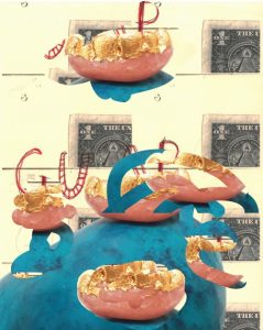
grotesque.erotic.texture.form.ugly.material.yeezus.surreal.colour.consumption.

The words I have chosen relate to what I’ve been focusing on in my research and practical work. I’ve been working on creating grotesque and ugly art that becomes more desirable than something created to be pretty because I find there’s something more aesthetically pleasing about a mess, the unrefined or imperfections of a piece of work.

In creating my 3-dimensional work, the material is important, I want to create something tactile. I sometimes aim to make my objects erotic because I’m heavily inspired by Marcel Duchamp’s erotic objects and the tangibility of the work conforms with the eroticism.

I’ve been using American media for my motif as I’m fascinated with American culture and the oversaturation of media, advertisement, and consumption.

Yeezus is a constant source of inspiration, especially with my current focus on what I am trying to produce, Yeezus is layered with grotesque production, distortion, and garish, insensitive lyrics and subject matter addressing American culture.

I like to use the photocopier in my 2D work because it can create interesting and unexpected results when layering images and words and feeding in different coloured paper can change the mood of the accompanying images. I like to use pink, fleshy colours and saturated colours to create a contrast to the dark subject matter.

Task 9

ai art google magenta project deepdreamArt from Google’s Magenta project

Advancements in technology have always been used by initiative artists from the creation of synthetic blue pigment to Andy Warhols Commodore art and more recently Jeff Koons with augmented reality.

When modern computer technology is used by artists it usually detaches the artist’s direct involvement with the outcomes and can be perceived as either an extension of the artist or to be considered not art at all which is an age-old argument of what is art?

Google has recently launched Magenta which is a project to create art and music using artificial intelligence which ignites many new discussions on what art is. Taking away the humanity, emotion, motivation of creating art, is it still art or would it be considered still part of the original creators of the algorithm, would they need to create an eco-system of algorithms to completely eradicate the human touch and would that lead to the creation of a self replicating artificial intelligence that would eradicate humans all together?

Art has always had big impacts throughout history but can this pursuit of what art is jeopardies human existence? In creating artificial intelligence the question of the conscious arises, how can a conscious being be created when we cannot prove consciousness? Is it even ethical to create artificial intelligence?

Task 12

I would change the Mona Lisa by Da Vinci to the size of a postcard. I don’t get the hype behind it and the stories surrounding it aren’t that interesting. Seeing crowds of people swarming around it with their camera phones mostly because of the status it beholds is irritating, most people visit the Louvre just to see this painting. Da Vinci has much more fascinating things and I prefer Lady With An Ermine because it has an ermine.Image result for mona lisa in louvre

There’s such a detachment with this piece, I don’t like that it’s barred off and in a glass wall, there’s no chance of intimacy with it, any possibility of there being something fascinating about the painting is surely lost through all this.

In making the painting smaller all I’d want to achieve is to waste peoples time more, they wouldn’t just be going to see a boring portrait feet away behind barriers and a glass wall, they’d be struggling even more to see the painting. They’d probably find this disappointingly over-hyped painting more disappointing because when I’ve seen art in real life that has turned out smaller than expected it has disappointed me. I don’t think this painting is worth much more than a faded memory on a cracked phone or part of a three-part series aired on BBC4 at 3 in the morning.

task 3

Kehinde Wiley Ice-T, 2005

In 2005, VH1 commissioned Kehinde Wiley to paint portraits of the honorees for that year’s Hip Hop Honors program. The painting portrays Ice-T as Napoleon Bonaparte.

Kehinde Wiley has painted Hip Hop artists in the characteristics of old portraits from the 1800’s that was exclusive to the rich and powerful to document the significance of these people and their movements in history, by placing Hip Hop artists and the rap culture on this pedestal raising it above mere entertainment and showing it as a movement of black empowerment and black culture. The original painting of Napoleon was painted in 1806, at which time in America the enslavement of Africans was at its peak, a bleak contrast in history when the only imagery of African Americans at that time is in chains which was followed by a long history of black oppression in America, portraying black people as powerless victims in an everlasting struggle, never shown as the victors. It creates a powerful juxtaposition by showing these African Americans as power symbols, victorious leaders and fathomable superheroes winning against a system stacked against them.

I like to think of future humans coming across this painting when all technology and data of our time has faded, wondering what this enigma of Ice-t is and how he led the French in the 1800’s and formed Body Count in 1990.

Final Summary

Throughout this Research and Communication Skills module I have enjoyed exploring the history of art, its development from movement to movement and seeing how artists respond to social, political and cultural issues of their time through their artwork. I have now realised how important it is to understand and to keep up with contemporary issues as I can use these as a source of inspiration or as a starting point in future projects. Understanding how artists of different art periods responded to their issues can help me to understand how to respond to contemporary issues in appropriate and relevant ways. For each art movement a set of designers, illustrators and photographers were presented and I see this collection of creatives as resource I can look back to if I need inspiration or am stuck whilst working on a project.

A lecture that was of particular interest was about the Avant Garde and discussing the influence of technology in the industry. Throughout my projects I almost never used technology to aid me and the same goes for my own personal projects, which is probably why I haven’t developed a reliance on it and why I never understood why artists revered it so much as a creative tool. It was only at art foundation where I first came into contact with software such as Dragonframe, Adobe Illustrator and Indesign that I fully understood its potential. Without the help of technology the comics that I read would not be as captivating as they are. Furthermore, during this lecture I understood that using technology to create art doesn’t have to be considered as ‘cheating’ but can be used to aid creatives to fully realise their ideas. However, I also believe that it is important to not be heavily reliant on technology as it does not give you all the answers and it is helpful to go back to basics with pen and paper.

An influential reference I came across in the lecture series was Wes Wilson, who designed some of the most well known concert posters of the 1960s, work “that combines an incredible kaleidoscope of vibrant acid colors with highly creative hand-drawn lettering and illustration”1 As an illustrator who finds it difficult to employ typographical skills his work is of most interest to me due to the fact that he is working with both image and text, so whilst creating fantastic imagery he is still applying typographic rules. I struggle to combine the two elements together so it is always helpful to explore how other designers use them in their work and see what I can learn and then use in my own practise. Additionally, Wilson uses the lithograph technique to create his posters and after completing the illustration rotation with a screen-printed comic, I am much more interested in the printing medium and I like to see the different outcomes it can produce whilst also exploring and pushing its limits.

2       3

1Brignall, C. (n.d.). The Psychedelic Poster Art of Wes Wilson. [online] Wes Wilson. Available at: http://www.wes-wilson.com/the-psychedelic-poster-art-of-wes-wilson-by-colin-brignall.html [Accessed 4 Dec. 2017].

2Wilson, W. (1966). The Sound. [Lithograph] Museum of Modern Art.

3 Wilson, W. (1966). Love, Moby Grape, Lee Michaels. [Lithograph] Museum of Modern Art.

Task 6

The mode of practice I attempted to develop was one of Salvador Dali’s in which he would put a tin plate on the floor and then sit in a chair beside it holding a spoon over the plate. He would then completely relax his body to the point where he would begin to fall asleep. The moment that he began to sleep the spoon would slip from his fingers and clang on the plate waking him to capture the surreal images. I would like to try this technique because surrealism is one of my favourite art movements and I like to incorporate my subconscious into my own work and ideas.

In doing this myself, I was looking at how I could adapt it in my own way which I found difficult as I struggled to doze off or relax in a chair and I’d drop the spoon without seeing imagery on the few times I did manage to drift off after hours of trying to relax in an uncomfortable chair.

However, I did manage to briefly almost completely sleep on several 4-hour long bus journeys which were impossible to stay asleep on. I wrote some ideas down after being between sleeping and waking, rather than being magnificent drawings of surreal imagery, I wrote down ideas I had and very roughly sketched out what I had thought of whilst in that state. I thought of sculptural ideas, some inspired by works of Dali and Duchamp as that was the book I was reading on the buses and that was the imagery I was seeing.

task 5

In the Tate Britain gallery half of the building is filled with old 1800’s era portrait and landscape paintings which I barely glanced at probably because I’m a modern day image slob able to indulge in images and videos becoming bored with the tangible reality in such an image-saturated world I desire more abstract, surreal or material driven work although I was captivated by the wood carved golden frames of the paintings.

My eye was struck by the most unsettling painting I’ve ever come across. The painting is of two identical women in a bed holding identical babies, at first, I thought it was a single painting and a comparison of maybe a lost original. On closer inspection, the women and babies have subtle differences in their clothing detail and very slightly different faces but with the same haunting gaze on the babies and women’s faces and awkwardly posing uncomfortably in a shared bed.Image result for two ladies of Cholmondeley family

The inscription on it makes the painting more unnerving as it says ‘’two ladies of Cholmondeley family, who were born the same day, married the same day, and brought to bed [gave birth] the same day’’. Also, the artist of the piece is unknown which just furthers the strangeness of the piece, the artist was probably executed after completion or their sole was consumed by either the infants or their mothers.

task 2

consumption. (2014). 5th ed.

The book is comprised of 11 artist’s views on their concept of consumption illustrated through photography with powerful messages about global sustainability.

The book starts off talking about the effects of consumption on the planet and the disproportions of wealth and poverty around the world. It has a lot of scary statistics to back the dystopian picture they’re painting.

‘’how is it that, in our era of spiritualized hedonism when the goal of life is directly defined as happiness, anxiety and depression are exploding?’’ this sets the tone even further of the book being pessimistic and filled with existential dread and is working towards outlining the issues by confronting the most pressing social and environmental challenges of today.

It goes on to discuss the importance of photography and the impact photographs can have and talks about the ‘laws of photography’

After pages of the photographs, the book ends with statements from the artists on their chosen work and gives more in-depth information on the significance of their photos.

task 4

Image result for tate britain 1840 room
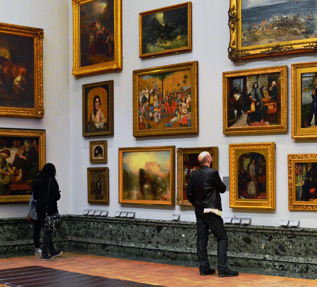
The Tate Britain gallery has a large selection of British art through history from the 1800’s to present and work from artists such as Francis Bacon, Henry Moore, and Wolfgang Tillmans.

Image result for tate britain rachel whiteread
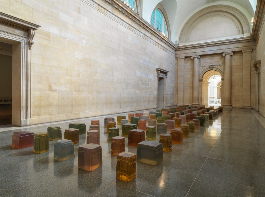
Tate Britain had an exhibition on of Rachel Whiteread’s oeuvre and a selection of work chosen by Whiteread from the Tate collection. I felt the work chosen was corresponding to Whiteread’s own aesthetic with the everyday object-based work of Barry Flanagan’s Rope or Sarah Lucas’ Beyond The Pleasure Principle as well as the rawness of material with Rebecca Warren’s Log Lady in unfired clay and Lynda Bengils’ Quartered Meteor in lead. One of the selected pieces was mounted on a large space of wall in solitude which felt very out of place and on first glance I dismissed it as it looked like some twee fairy tale painting from the 1800’s but on closer inspection I saw it was Richard Dadd’s The Fairy Feller’s Master-Stroke which I knew was made in an asylum he was sent to after he became insane and murdered his father. It’s a fascinating piece with exquisite detailing on such a small scale [540x394mm].

Image result for Richard Dadd The Fairy Feller’s Master-Stroke

It’s a busy painting full of fairy tale characters with blades of grass panted across it like you’re peering into something hidden. There’s a strangeness to the painting, some of the characters are sinister looking and most are in two’s even some objects are in two’s. at the centre there’s a small cowering elf looking man which is said to be a portrait of Richard Dadd himself looking cross-eyed, sad and confused then to the right of him there’s a hidden face made up of people and objects in a surreal way.

task 8

APPROPRIATION

Tom Cruise On: Tom Cruise Scientology

My appropriation piece is a 9:34 projected video on loop of Tom Cruise talking about Scientology in 2008 in an interview which the church of Scientology tried to suppress probably because Cruise comes off as an insane person.
I think it would be interesting if this was projected in a gallery space because it’s amusing to see Tom Cruise’s obnoxious laughs and the repetitively tense mission impossible theme song playing over a disorientating, incoherent explanation of Scientology with horrendous transitions and low production quality. Videos in galleries tend to be drab and depressing so it’d be a good break to just have a laugh at an egotistical actor and the most toxic cult to hit Hollywood since the Manson family.
It could also trigger a response from Scientology which would be funny, maybe get sued, harassed, and spied on.
I got the idea from ‘Candice Breitz – Love Story / Alec Baldwin Julianne Moore’ in which Alec Baldwin and Julianne Moore rub their egos through the words of refugees.